What Is Flatlay Flower Styling And Why It Works For Home DCor
Understanding The Art Of Flat Lay Flowers In Interior Styling
Flatlay flower styling involves arranging botanical elements on a horizontal surface and viewing them from directly above. This technique uses a birds eye view to create a two dimensional composition from three dimensional objects. Interior stylists use this method to document seasonal changes or plan room color palettes. It relies on the alignment of stems, petals, and leaves to create a balanced image.
This styling method roots itself in the Dutch Golden Age of still life painting. Modern designers use it to showcase the geometric forms of nature. You place flowers on a flat plane to remove the distractions of depth and shadow. This focus allows the viewer to see the specific textures and colors of each bloom. It serves as a tactical blueprint for decorating surfaces like coffee tables and consoles.
Why Flatlay Arrangements Create A Sense Of Calm And Visual Order In Living Spaces
Visual order comes from the predictable placement of objects. Flatlay flower styling uses grid patterns or radial symmetry to organize organic chaos. When you arrange flowers in this way, you control the negative space around them. This level of control reduces visual noise in a room. It provides a focal point that feels stable and intentional rather than cluttered or random.
The human brain prefers organized patterns over disorganized heaps. Using flatlays in home décor creates a rhythm that the eye can easily follow. This technique applies the principles of Minimalism and Zen design by stripping away excess. You create a clear hierarchy of elements that promotes a sense of quiet. Proper spacing between each plant component ensures the final display looks clean and professional.

Choosing The Right Flowers For A Stunning Flowers Flat Lay Display
Selecting Flower Varieties That Hold Their Shape And Color In A Flat Lay
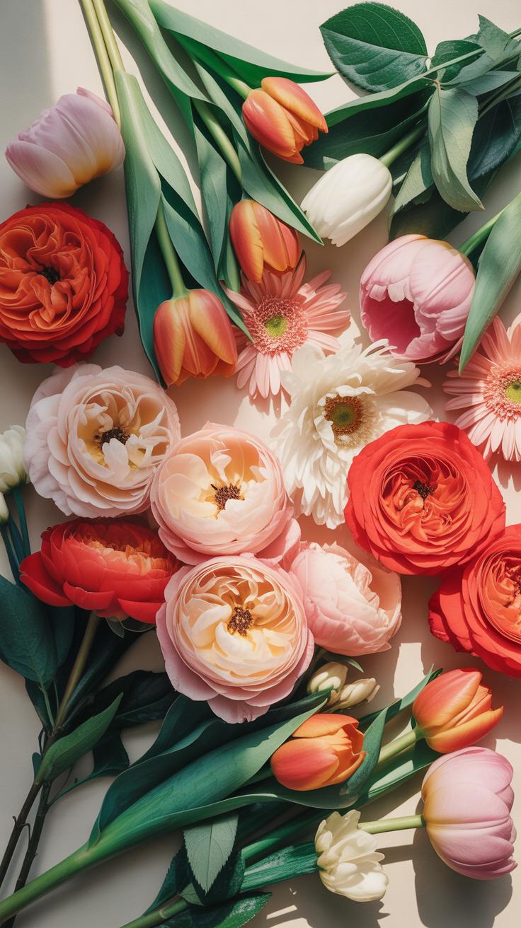
Flatlay styling requires resilient blooms that thrive without a direct water source. Choose varieties with sturdy stems and stiff petals to prevent immediate wilting. Modern minimalist design favors Ranunculus and Anemones for their structural integrity. These flowers maintain their architectural form for hours on a flat surface. Avoid delicate wildflowers that collapse within minutes. Select flowers with flat bases to ensure they sit flush against your background.
Color stability is a critical factor for high-quality photography. Roses and Carnations offer dense petal counts that hide bruising and retain pigment under bright studio lights. Professional stylists use these species because they do not discolor when handled. Avoid thin-petaled varieties like Poppies for long shoots. Their edges curl and darken quickly when exposed to air. Stick to waxier textures to ensure the arrangement stays fresh throughout the entire styling process.
Seasonal Flower Picks That Work Best For A Cohesive And Fresh Arrangement
Each season dictates the texture and durability of your Flatlay Flower Styling. Spring arrangements benefit from Tulips and Hellebores which reflect the Dutch Still Life tradition of botanical accuracy. These stems provide natural curves that create movement in a static frame. Summer demands heat-tolerant options like Zinnias or Lisianthus. These varieties resist the drooping caused by rising indoor temperatures during midday shoots. Proper seasonal selection ensures the plant material looks vital.
Autumn styling shifts toward dried elements and hardy late-season blooms like Dahlias. These flowers offer complex geometry and deep tones that fit the Arts and Crafts movement aesthetic. Winter layouts rely on evergreens and forced bulbs like Amaryllis for structural weight. Using out-of-season flowers often results in weak specimens that fail to photograph well. Always source local produce to guarantee the shortest time from harvest to the styling board for maximum visual impact.

Spring Flat Lay Inspiration Bringing The Garden Indoors
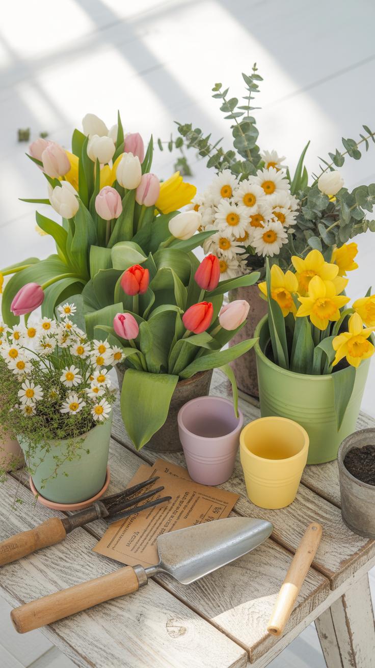
How To Capture The Lightness Of Spring Through Soft Pastels And Delicate Blooms
Spring styling requires a shift toward high-key lighting and low-saturation palettes. Designers use the Rococo movement as a historical reference for this look. Focus on hues like pale blush, soft ochre, and muted lavender. These colors reflect natural sunlight better than dark tones. You must select flowers with high translucency. Petals that allow light to pass through create the required airy feeling for the camera sensor.
Technical execution relies on negative space. Do not crowd the frame with heavy foliage or thick branches. Use thin-stemmed varieties like Sweet Peas or Icelandic Poppies. These plants provide organic lines without visual bulk. Position your light source from the side to highlight the delicate texture of the petals. Avoid harsh shadows by using a white foam board as a reflector. This setup keeps the final image looking clean and professional.
Styling Tips For Creating An Airy And Fresh Spring Flat Lay At Home
The layout must mimic the growth patterns found in a natural garden. Use a white or light linen background to maximize brightness. Place your largest bloom first as the focal point. Build the rest of the composition around this center. Ensure every item has room to breathe. Proper spacing prevents the viewer from feeling overwhelmed by the visual data in the frame.
- Geometric Grid Alignment: Use a subtle grid to place small items like seeds or individual petals. This technique creates a sense of order and cleanliness. It balances the chaotic nature of organic flower shapes with human-led design principles.
- Negative Space Utilization: Leave at least forty percent of the background visible. This white space allows the eye to rest and emphasizes the subject. In professional photography, this creates room for digital text overlays if the image is used commercially.
- Textural Contrast: Combine soft petals with hard objects like vintage gardening shears or ceramic dishes. This contrast adds depth to the flat image. It prevents the composition from looking flat or one-dimensional when viewed on a digital screen.
- Natural Directional Flow: Arrange stems so they lead toward one corner of the frame. This creates a sense of movement and rhythm. It guides the viewer through the image in a logical way that mimics how people read a page.
- Color Blocking Strategies: Group similar pastel shades together rather than mixing them randomly. This creates a more sophisticated and modern aesthetic. It prevents the flat lay from looking like a messy collection of scraps and focuses on the color story.
Finalize your composition by removing any damaged or wilted leaves. Spring scenes must look vital and healthy to be effective. Check your overhead angle to ensure the lens is perfectly parallel to the floor. Use a tripod with an extension arm for the most stable shot. This stability allows for a lower ISO setting. Low ISO results in a crisp image with zero digital noise.

Floral Flat Lay Inspiration Color Palettes That Elevate Any Room
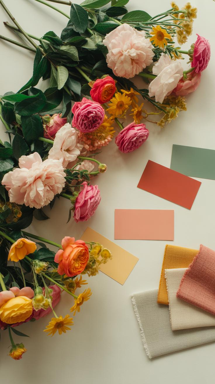
How To Build A Cohesive Color Story Using Fresh Or Dried Flowers In Your Flatlay
Select a dominant hue based on the primary surface color of your layout. Use the 60-30-10 rule to balance your floral selections. Sixty percent of the frame should feature your main flower color. Thirty percent should provide secondary support through foliage or smaller buds. Ten percent must act as a bold accent to break visual monotony. This method prevents the composition from looking cluttered or disorganized.
Match the texture of your flowers to the color temperature of your room. Cool tones like lavender and blue eucalyptus work best in brightly lit spaces with white walls. Warm tones like terracotta dried ferns and yellow ranunculus suit rooms with natural wood or brick. Use color theory to bridge the gap between organic materials and man-made backgrounds. A consistent palette communicates professional intent and creates a high-end visual result.
Flowers are the sweetest things God ever made, and forgot to put a soul into. Arrange them with love to bring the timeless beauty of a summer garden into the quiet corners of your home.
— Henry Ward Beecher
Contrasting Versus Complementary Color Palettes And Their Effect On Mood And Style
Complementary palettes sit opposite each other on the color wheel. Pair blue thistles with orange poppies to create high visual tension and energy. This technique pulls the eye toward specific focal points immediately. It works well for modern and minimalist styles where the flowers must stand out against plain backgrounds. Use these pairings when you want the arrangement to command the room and dictate the overall atmosphere.
Analogous palettes use colors located next to each other on the wheel. Combine shades of red, pink, and peach for a soft and harmonious transition. This approach creates a sense of calm and order. It mimics natural growth patterns found in historical English gardens. Choose this method for traditional or cozy interiors. It allows the floral flat lay to blend into the existing decor without creating jarring visual interruptions.
Floral Product Photography Techniques That Double As Home Styling Inspiration
How Professional Floral Product Photography Principles Can Inform Your Home DéCor Arrangements
Professional floral photographers use the Rule of Thirds to guide the eye. This grid system works for coffee tables just as well as camera lenses. Place your primary bloom at a grid intersection rather than the exact center. This creates visual tension and interest. You can apply this by grouping odd numbers of stems. Three flowers always look better than two or four.
Directional flow is another key photography tactic. Place stems so they point toward other décor items like books or candles. This creates a path for the viewer to follow across the surface. Use varying heights to mimic the natural growth of plants. This prevents the arrangement from looking flat or artificial. Strategic placement ensures your home styling feels intentional and professional.
Using Natural Light And Surface Textures To Enhance Your Floral Flatlay At Home

Lighting determines the success of any floral arrangement. Soft, indirect north-facing light is best for capturing true petal colors. Harsh midday sun creates deep shadows that hide fine details. Position your styling surface near a large window. Use a white foam board to bounce light back into shadowed areas. This technique reveals the complex textures of different flower species.
Select surfaces that contrast with your floral textures. Rough reclaimed wood makes soft silk petals pop. Smooth marble provides a clean backdrop for jagged greenery or thorns. These material choices come from the Dutch Still Life movement. Painters used high contrast to highlight life and decay. Match your background to the mood of the season. Darker woods work for winter while light linens suit spring.
Working With Colorful Wildflowers Arranged On White Backgrounds For A Clean Modern Look
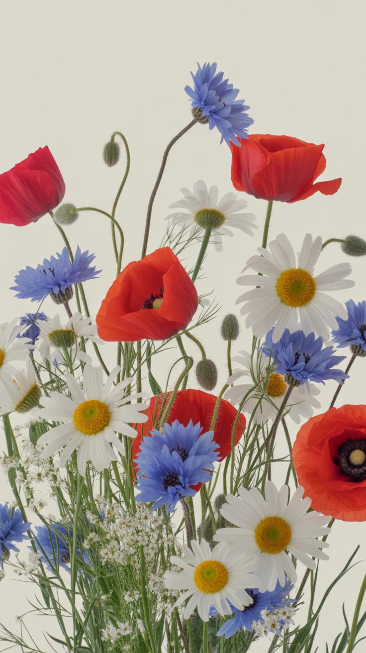
Why A White Or Neutral Surface Makes Colorful Wildflowers The Natural Focal Point
White surfaces function as a high-contrast canvas for organic subjects. Modern aesthetics rely on the absence of visual noise to emphasize color accuracy. A neutral background reflects light evenly across the petals. This prevents unwanted color casts from bleeding into the blooms. It forces the human eye to track the irregular shapes of the wildflowers. You remove distractions and create a clinical focus on the plant material.

Selecting a matte white surface eliminates harsh glares during photography. Glossy finishes create reflections that compete with the floral texture. Neutral tones maximize the saturation of various wildflower hues like blues, yellows, and purples. This technique follows minimalist design principles popularized by the Scandinavian movement. You control the narrative by isolating the subject. Direct light on a white base ensures every petal edge remains crisp and defined.
Sourcing And Arranging Wildflowers To Achieve A Naturally Scattered Yet Intentional Composition
Sourcing wildflowers requires a focus on stem diversity and seasonal availability. Regional species provide unique silhouettes that more common store-bought flowers lack. Collect specimens with varying heights and stages of growth. Include closed buds and full blooms to mimic nature. Do not over-prune the foliage. Raw textures contribute to the authentic feel of the layout. Authentic wildflowers often feature thin, delicate stems that require careful handling.
The arrangement must look random but follow geometric balance. Avoid placing items in a straight line or perfect circle. Use the rule of thirds to position larger focal flowers first. Fill the gaps with smaller sprigs to create a sense of movement across the frame. Leave significant white space between clumps of color. This prevents the image from feeling cluttered. Every stem should point in a different direction to suggest natural growth patterns.
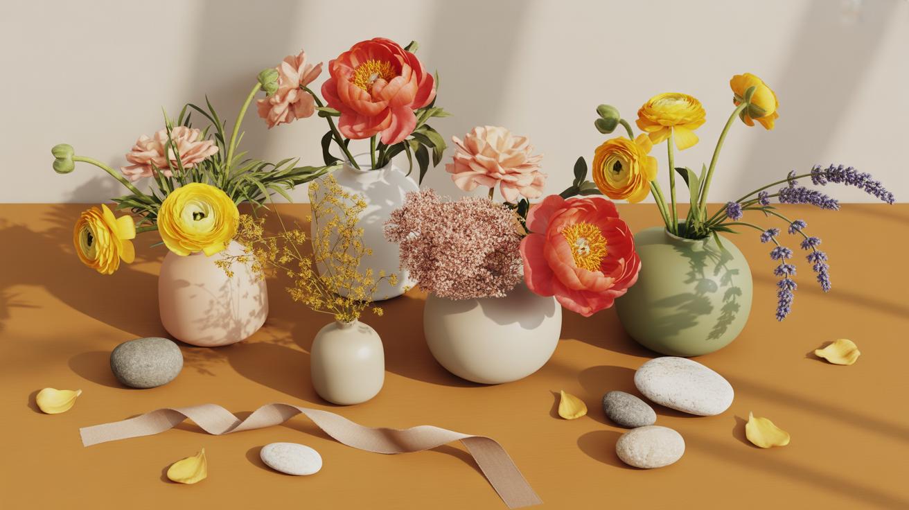
The Peony Flat Lay Styling One Of The WorldS Most Beloved Blooms
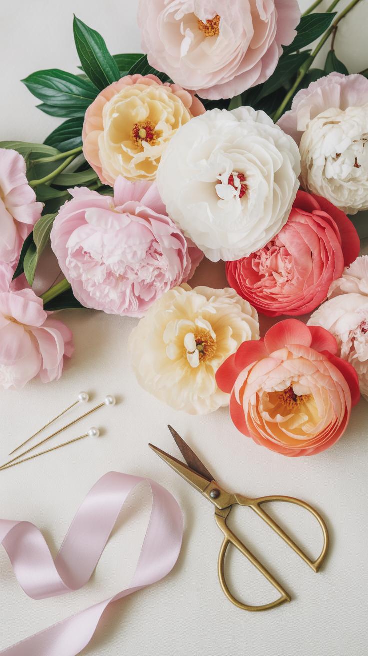
What Makes Peonies Ideal For Flatlay Styling Due To Their Layered Petal Structure And Full Form
Peonies possess a high petal count and dense structural volume. This makes them excellent for top-down photography. Their circular shape creates a clear focal point in a composition. You can use their natural symmetry to anchor the center of a frame. The layered petals provide depth without needing complex lighting. This structural density ensures the flower looks substantial from any camera angle.

The transition from a closed bud to a full bloom offers various textures. Tight buds add a minimalist geometric element to your layout. Half-open blooms provide a more dynamic and ruffled look. Fully open flowers cover large surface areas and hide gaps in the design. Professional stylists use these different stages to create visual balance. These flowers maintain their shape well on flat surfaces during long shoots.
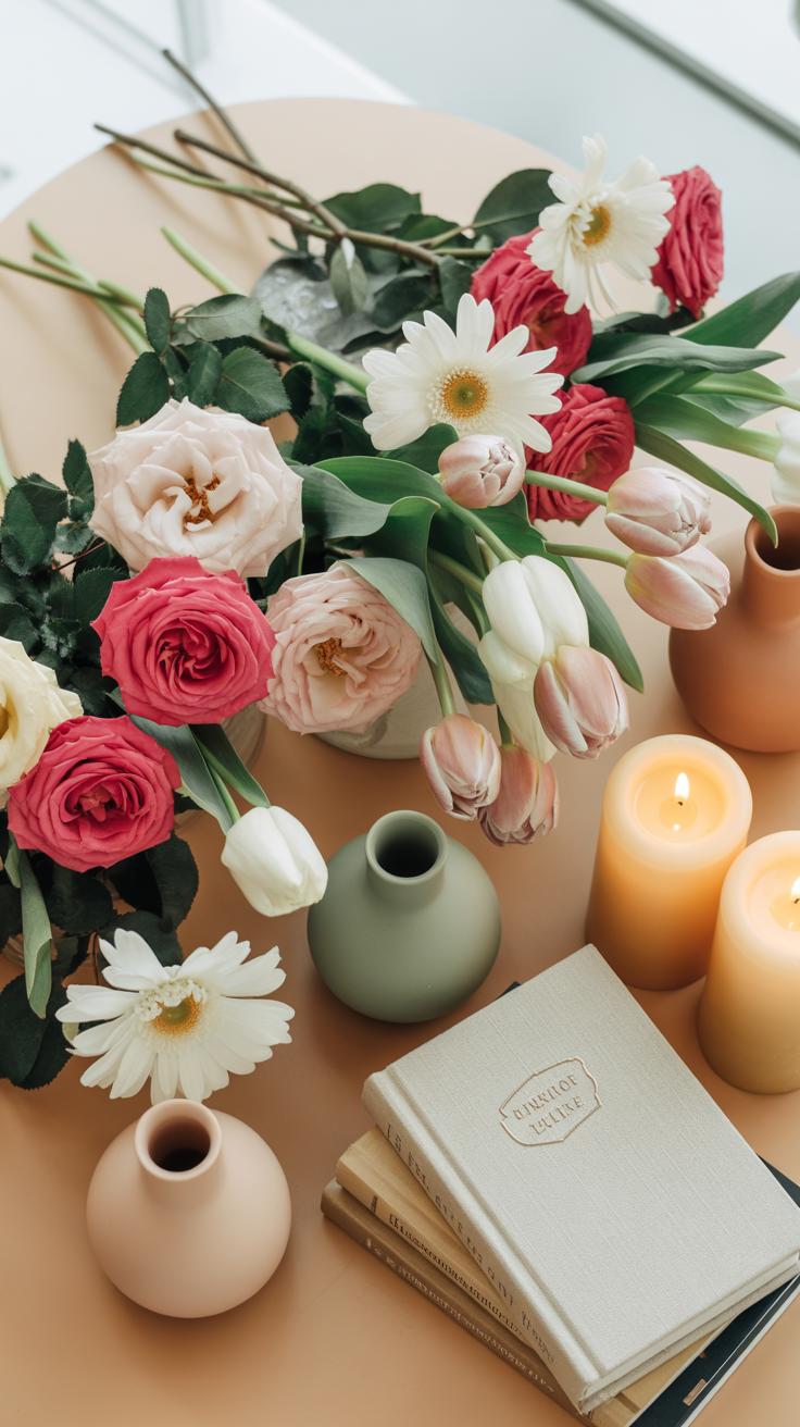
Essential Companions For A Peony Flatlay Including Foliage, Ribbons, And Accent Blooms
Peonies require specific supporting elements to offset their heavy visual weight. Combining large blooms with delicate textures creates necessary contrast. Use secondary flowers to fill negative space around the primary stems. Natural materials ground the composition and prevent it from looking artificial. Choose accessories that complement the matte texture of the petals. High-quality materials improve the overall professional quality of the final image.
- Eucalyptus Foliage: Silver dollar or seeded eucalyptus provides a muted green base. The dusty texture of the leaves does not compete with the shine of the petals. These branches help create an organic flow and direct the eye through the layout.
- Silk Ribbons: Hand-dyed silk ribbons add a soft vertical or curved line to the frame. Use raw edges to provide an organic feel. The fabric reflects light softly and helps connect different floral elements within the flat lay composition.
- Ranunculus: These secondary blooms share a similar petal structure but at a smaller scale. They act as perfect transitional flowers. Using smaller rounds helps bridge the gap between large peonies and tiny filler plants or buds.
- Lace Textiles: Vintage lace or linen napkins provide a textured background layer. These fabrics soften the hard surface of a table or floor. The intricate patterns add detail to the negative space without distracting from the main floral subjects.
- Sheared Scissors: Metal floral shears serve as a functional prop. They suggest a work-in-progress scene and add a sharp industrial texture. Placing them at an angle creates a leading line that points toward the main peony bloom.
Balance these items to avoid overcrowding the frame. Keep the peony as the largest object to maintain a clear hierarchy. Distribute the smaller accents like ribbons and foliage in a way that feels natural. Avoid placing heavy items in the corners where they might pull focus away. A successful flat lay uses these companions to support the main flower rather than hide its features.
Spring Flat Lay Photography Tips For Documenting Your Home Floral Styling
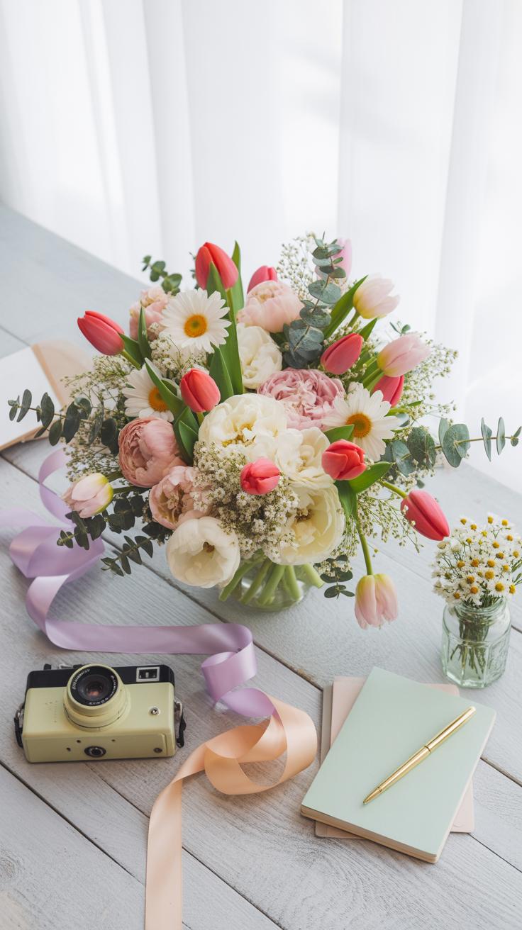
How To Use Your Smartphone Or Camera To Capture Flatlay Flower Arrangements With Clarity
Achieving professional clarity requires mechanical stability and proper lens alignment. You must hold your device perfectly parallel to the floor to avoid keystone distortion. Use a tripod with an overhead arm or a stable step stool to stay steady. Engage the grid overlay on your screen to ensure the horizon lines are straight. Sharp focus on the flower pistils creates the strongest visual impact for the viewer.

Sensor light management dictates the final image quality. Use natural side lighting from a window to define texture without creating harsh shadows. If using a smartphone, tap the screen on the brightest bloom to set the exposure manually. Avoid digital zoom because it degrades pixel quality and introduces noise. Shoot in a RAW format or a high-resolution setting to preserve the fine details of the spring petals.
Composition Techniques Like The Rule Of Thirds And Negative Space In Spring Flat Lay Photography
The rule of thirds creates a balanced path for the eye. Divide your frame into nine equal rectangles using two horizontal and two vertical lines. Place your primary spring bloom at one of the four intersection points. This off-center placement feels more natural than a centered subject. It allows the viewer to explore the stems and secondary foliage. Strategic placement improves the overall flow of the image.
Negative space acts as a visual breather in busy floral arrangements. Leave empty areas on the background to highlight the delicate shape of the flowers. Do not crowd the edges of the frame. High-contrast backgrounds like light linen or dark wood emphasize the organic curves of the plants. Clean space prevents the composition from looking cluttered or messy. Focus on the relationship between the objects and the void.
Flatlay Photography As A Decorative Tool Framing And Displaying Your Floral Art
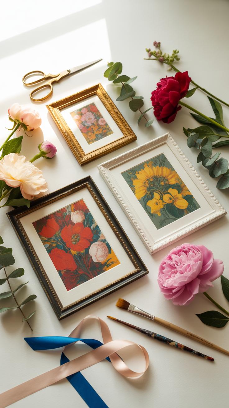
How To Turn Your Best Flatlay Photography Shots Into Framed Wall Art For Your Home
High resolution files are mandatory for quality wall art. Adjust your camera settings to capture maximum detail before you shoot. Transfer the raw files to a computer for editing. Use software to correct the white balance and sharpen the edges of the petals. High contrast helps the floral shapes pop against the background. Save the final image in a lossless format to ensure clarity.
Select a professional printing service that uses archival inks. These inks prevent fading from sunlight exposure over time. Choose a heavy weight paper with a matte or luster finish. This reduces glare when you hang the art near windows. Test a small print before ordering a large scale version. Precise color matching preserves the natural tones of the original floral arrangement in your home.
Choosing The Right Print Format And Frame Style To Complement Your Interior Design Theme
Match the frame material to your existing furniture. Natural wood frames suit Scandinavian or rustic styles. Use black metal frames for a modern or industrial aesthetic. Ornate gold frames reflect the traditional Baroque style. Ensure the frame depth does not overshadow the image. A thin profile keeps the focus on the flowers. Consistency across multiple frames creates a cohesive gallery wall layout.
The mat board provides a visual break between the art and the frame. Use acid free mats to protect the print from yellowing. A wide white mat directs the eye toward the center of the flatlay. Consider acrylic glazing instead of glass for large prints to reduce weight. This makes mounting easier and safer. Proper framing transforms a digital file into a permanent design element for your living space.
Frequently Asked Questions

What exactly is flatlay flower styling and how do I start?
Flatlay flower styling is the art of arranging blooms and greenery on a flat surface to be photographed from a bird’s-eye view. To begin, choose a neutral background like a linen cloth or wooden tabletop. Focus on a central “hero” flower and build outward with smaller filler stems. This technique creates a serene, editorial look that adds a professional, artistic touch to your home’s digital or physical decor displays.
How can I create a balanced composition using flower flatlays?
Achieving the perfect balance in flatlay flower styling requires a mix of textures and intentional spacing. Start by placing your largest focal flowers in a triangular pattern to guide the eye across the frame. Fill the gaps with delicate sprigs, petals, or lifestyle props like journals and candles. Remember to use “negative space” so the arrangement doesn’t feel cluttered, ensuring every botanical element has enough room to breathe and shine.
Can I achieve a high-end floral look on a limited budget?
Absolutely! You don’t need expensive florist bouquets for beautiful flatlay flower styling. Forage in your own backyard for interesting leaves, wildflowers, or even dried herbs from the kitchen. Grocery store bundles are also great; simply take them apart and use individual stems to maximize their impact. By focusing on a cohesive color palette rather than price, you can create a luxurious, stylized aesthetic that elevates your home decor without overspending.