What Are Neutral Floral Palettes And Why They Work So Well
Defining Neutral Tones In The Context Of Floral Design
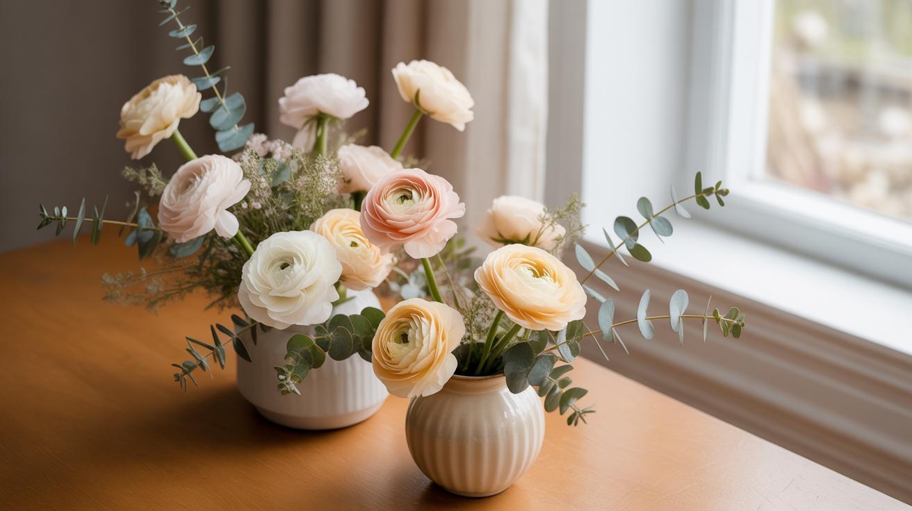
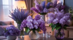
Neutral floral palettes rely on desaturated hues found in nature. These colors include cream, beige, tan, and taupe. Designers also categorize soft greys and muted browns as neutrals. These shades lack high intensity or dominant primary pigments. They serve as a stable foundation for any arrangement. Professionals use these tones to create balance and visual rest within a complex floral display.
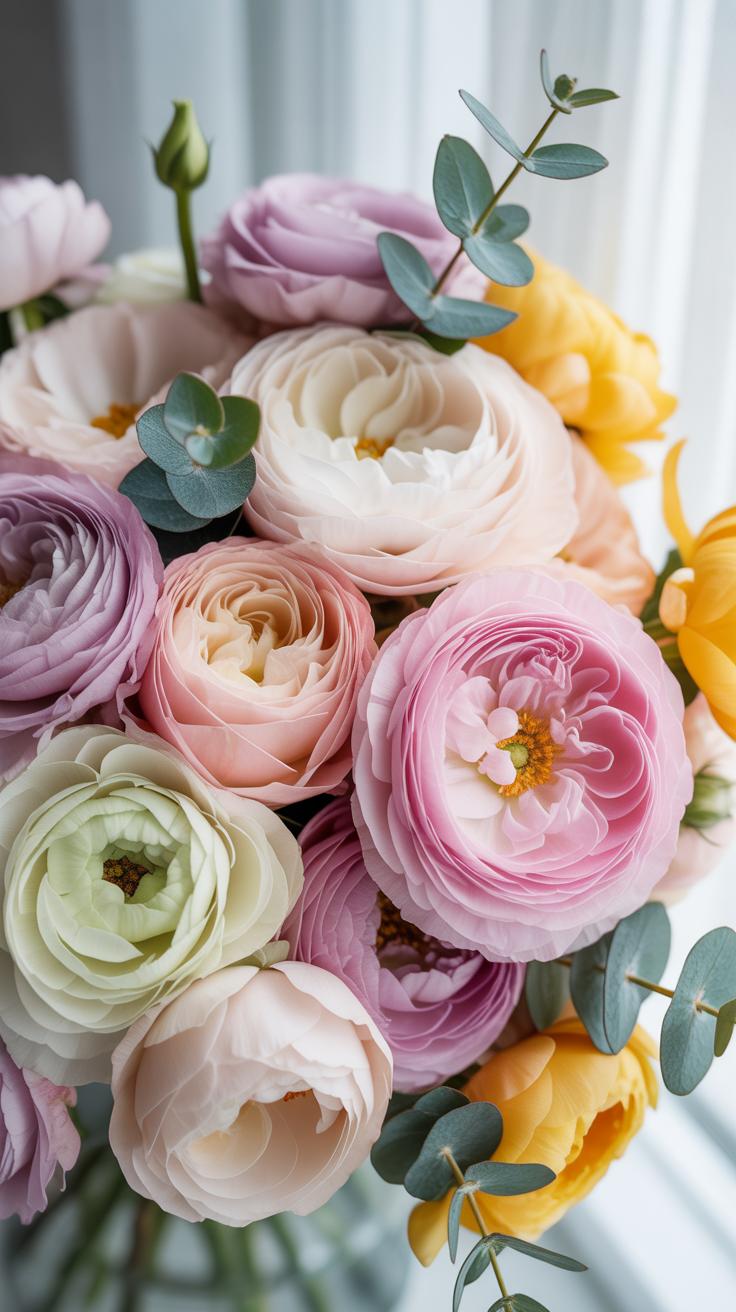
In modern floristry, white is the primary anchor for neutral palettes. Pure white, ivory, and alabaster provide different levels of warmth. Greenery also functions as a neutral when used correctly. Muted foliage like eucalyptus or dusty miller provides a cool-toned base. These elements do not compete for attention. They allow the form and texture of each flower to take the lead during the design process.
Why Neutral Floral Palettes Are Timeless And Universally Flattering
Neutral palettes remain popular because they adapt to any environment. They do not clash with existing interior decor or seasonal trends. This versatility makes them a safe choice for high-stakes events like weddings and corporate galas. These colors mimic the simplicity found in classical European garden styles. They evoke a sense of calm and sophistication without relying on loud colors to grab attention.
These palettes emphasize texture over pigment. Without bright colors to distract the eye, the viewer notices the delicate edges of a petal or the curve of a stem. This focus on detail creates a high-end look at a lower cost. You can mix expensive blooms with common varieties seamlessly. Neutral tones blend different flower species into a cohesive unit. This approach works in every lighting condition and photograph.

Understanding The Cream Color Combo As A Foundation For Floral Arrangements
How Cream Tones Create Softness And Depth In Flower Arrangements
Cream tones act as a buffer between stark whites and darker foliage. Pure white reflects the most light and often washes out detail in photos. Cream contains yellow and brown undertones that absorb light. This creates a bridge for the eye to follow. You use cream to build a three-dimensional shape without using harsh colors. It mimics the natural highlights found in nature.
Florists use cream to add weight to the center of a design. Light colors usually look larger and closer to the viewer. By placing cream blooms next to recesses, you create a sense of depth. This technique comes from Dutch Golden Age painting styles. Designers use these shades to mimic light hitting a surface. It adds a professional layer to simple clusters.
Pairing Cream With White And Ivory Blooms For A Cohesive Look
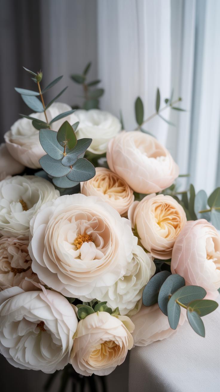
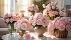
Pairing cream with white and ivory creates a monochromatic layer. This approach relies on texture rather than hue. Use stark white for the focal points to draw immediate attention. Fill the gaps with ivory and cream to soften the transition. This prevents the arrangement from looking like a flat white mass. It looks intentional and structured instead of scattered.
Texture plays a vital role when working within this narrow color range. Use smooth petals like tulips next to ruffled carnations or roses. The slight color shift between cream and ivory defines the edges of each flower. Without these subtle shifts, individual blooms disappear into the background. Professional designers use this palette to create high-end looks with basic materials. It ensures a clean and timeless result.

Working With A Cream And Beige Color Palette In Your Floral Designs
The Visual Harmony Between Cream And Beige In Fresh And Dried Florals
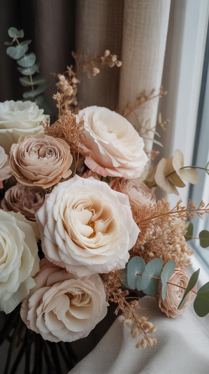
Cream serves as a warm white that removes the harshness of pure bleached tones. Beige provides the necessary depth to ground the design. In fresh floral arrangements, these colors create a Bridge between green stems and colorful accents. They mimic natural light patterns by providing soft highlights. Designers use this combination to achieve high end results without the visual fatigue of high contrast palettes.
In dried arrangements, beige and cream are the foundational colors. Most plant material fades to these shades naturally through the dehydration process. This creates a sustainable aesthetic that lasts for months. You must balance textures to make this work. Mix smooth cream petals with rough beige seed pods. This contrast prevents the design from looking flat. It ensures the eye moves across the entire floral piece.
Best Flower Varieties That Naturally Complement A Beige Cream Color Palette
Successful Neutral Floral Palettes rely on specific species that carry these pigments naturally. You cannot rely on dyes if you want professional results. Select flowers with high petal counts to maximize the surface area of the color. This creates a dense visual weight. Varieties must be chosen based on their ability to hold their shape in both hydrated and dried states for maximum versatility.
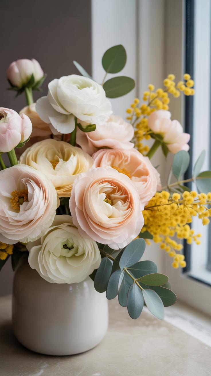
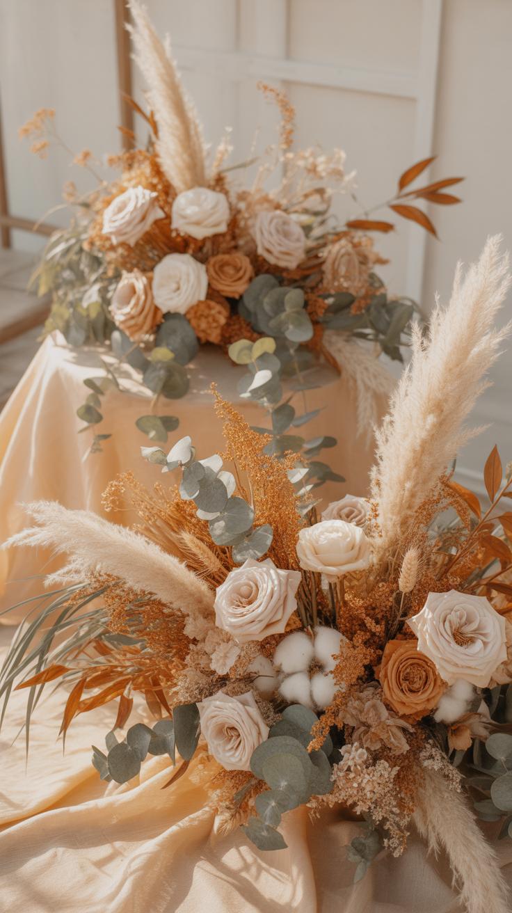
- Quicksand Roses: This variety is the industry standard for beige tones. It features a sandy hue with subtle pink undertones that blend perfectly with cream accents. The large head size and high petal count provide significant structural volume in any professional arrangement.
- White Majolica Spray Roses: These flowers offer a soft cream color rather than a stark white. Multiple blooms on a single stem allow for easy filling of gaps. They provide a delicate texture that softens the more rugged appearance of dried beige elements.
- Dried Pampas Grass: This material introduces the essential beige verticality needed in modern designs. Its plumes offer a soft, feathery texture that contrasts against solid floral shapes. It is highly durable and serves as a permanent architectural base for neutral installations.
- Cream Lisianthus: This flower provides a ruffled texture that mimics silk. Its cream petals are often tinged with a slight green or pale yellow at the base. This adds a layer of organic realism to the palette that prevents the design from looking artificial.
- Bleached Ruscus: This greenery is treated to remove chlorophyll, resulting in a crisp cream or ivory shade. It provides a sharp, leafy silhouette that remains stable over time. Use it to add directional movement and bright highlights to a darker beige focused base.
Sourcing these specific varieties ensures your Neutral Floral Palettes remain consistent. Avoid mixing vibrant whites with these muted tones as it disrupts the visual flow. Focus on layering different heights and shapes within this narrow color range. Use the roses as focal points and the grasses as fillers. This strategic placement creates professional depth. It turns a simple two color scheme into a sophisticated botanical work.
Building A Harmonious Color Palette With Neutral Florals Step By Step
Layering Light, Mid, And Deep Neutrals For Visual Balance
Successful neutral design requires a clear value scale. Start with light tones like cream or ivory to establish highlights. These shades reflect light and create focal points within the arrangement. Use these bright elements to define the shape and boundaries of your work. Without these light anchors, the design lacks clarity and looks muddy. Light colors provide the necessary contrast for darker stems to pop.
Add mid-tone beiges and deep browns to create depth. Mid-tones bridge the gap between bright highlights and dark shadows. They make the transition smooth and natural. Deep shades like espresso or dried tobacco provide structural weight at the base. This layering technique mimics natural light patterns found in English garden styles. Proper value distribution ensures the eye moves through the entire piece without getting stuck in one spot.
Using Foliage And Texture To Elevate A Harmonious Neutral Arrangement
Foliage provides the essential framework for neutral palettes. In the Dutch Still Life tradition, greenery serves as a dark backdrop to make muted petals visible. Choose leaves with matte or glossy finishes to vary the light reflection. Dusty miller offers a silvery felt texture that complements cool whites. Dried eucalyptus provides a muted green that grounds warmer cream tones. Foliage creates the necessary negative space in your design.

Texture replaces the need for bright colors. Combine smooth petals with rough elements like dried seed pods or pampas grass. These contrasting surfaces create visual interest through touch and shadow rather than pigment. Modern minimalist movements rely on this tactile variety to keep monochromatic schemes from looking flat. Use serrated leaves or fuzzy stems to break up solid blocks of color. Texture adds a professional finish to any simple neutral arrangement.
Exploring Color Schemes And Colour Palettes Inspired By Nature For Beginners
How Nature Inspired Color Schemes Help Beginners Make Confident Choices
Nature provides a proven blueprint for visual balance. Beginners often struggle with color theory because they try to force unnatural combinations. Nature-inspired schemes eliminate this guesswork by using colors that exist together in the wild. You can see how stone, wood, and dried foliage create harmony without clashing. Using these established pairings gives you immediate confidence in your design decisions.
Professional florists look to the landscape to find successful ratios. A forest floor shows you exactly how much deep brown should support a pale cream accent. This historical approach mirrors the English Landscape movement, which prioritized local, organic tones over artificial brightness. By following these biological patterns, you avoid common rookie mistakes. You create arrangements that look grounded and intentional rather than messy or disjointed.
In the sweet gardens of the past, we find that the simplest tones of cream and dusty rose speak the most profound beauty. Beginning with nature’s quietest colors allows your creativity to bloom with a soft, timeless grace.
— Tasha Tudor
Translating Earthy Outdoor Tones Into Practical Floral Color Design Inspiration
To apply these tones, look at raw materials like terracotta, clay, and sand. These earthy hues serve as the foundation for Neutral Floral Palettes. You must identify the dominant undertone in your environment to select your primary flower color. If you use a warm wooden vessel, select cream petals with yellow undertones. If using gray stone, choose cool whites with hint of green or blue.
Practical application requires layering textures to compensate for a limited color range. Use dried grasses, seed pods, and woody stems to add depth. This technique simulates the natural decay and growth found in a meadow. You achieve a high-end look by focusing on subtle shifts in shade rather than bold contrast. This strategic layering ensures your work looks professional and sophisticated while remaining simple to execute.
Designing A Flower Color Scheme That Feels Effortless And Elegant
Choosing A Dominant, Secondary, And Accent Flower For Your Color Scheme
Select your dominant flower first to set the visual foundation. This flower occupies the most physical space and establishes the primary hue. Choose a large bloom like a white hydrangea or cream rose. This choice dictates the tone for the entire arrangement. It creates a solid base of color that draws the eye. Maintain a focus on mass and texture here.

The secondary flower provides depth and supports the dominant bloom. Pick a medium sized flower in a slightly different shade. Pale peach ranunculus or tan carnations work well for this role. Use these to bridge the gap between your base and the details. Finally, add small accent flowers in contrasting textures. These refine the palette without overwhelming the established neutral theme.
Common Beginner Mistakes When Selecting A Flower Color Scheme And How To Avoid Them
Beginners often fail to account for the impact of green foliage on neutral palettes. Green acts as a strong color that can disrupt a monochromatic look. If you want a pure neutral style, choose muted greens or silver leaves. This keeps the focus on the florals. Failing to plan for these shifts results in a messy and unintentional appearance.
- Ignoring Value Contrast: Beginners often pick flowers with the exact same brightness level. This makes the arrangement look like a flat blob of color. You must mix light, medium, and dark tones within your chosen neutral range to create necessary visual depth.
- Overlooking Bloom Texture: Using only smooth petals creates a boring result. Mix rough, velvety, and papery textures to add interest without adding more colors. Variety in surface quality makes a neutral palette feel sophisticated and intentional rather than plain or cheap.
- Forgetting Secondary Colors: Many people stop at one shade of white or beige. A professional palette requires transition colors like sand, taupe, or ivory. These small shifts in hue prevent the design from looking clinical. They add a natural warmth that improves the overall aesthetic.
- Neglecting Stem Strength: New designers often choose flowers based on color alone. They forget that some neutral blooms have weak stems. You must ensure your dominant flowers can support their own weight. This prevents the arrangement from drooping and losing its intended shape over time.
- Using Too Many Species: Mixing ten different types of flowers creates visual chaos. Stick to three or four species to maintain a cohesive look. This restraint allows each flower to stand out. It ensures your neutral palette looks curated rather than like a random collection of stems.
Avoid the urge to add bright colors when the palette feels too simple. Stick to your neutral plan and adjust the lighting or vessel instead. A common error is adding a single red or blue flower to fix a dull design. This breaks the elegant aesthetic immediately. Rely on shadows and highlights within the neutral spectrum to create the desired impact.
Fall Wedding Florals Color Schemes Using Warm Neutral Palettes
Why Warm Neutrals Are Among The Most Popular Fall Wedding Florals Color Schemes

Warm neutrals dominate fall weddings because they mimic the natural lifecycle of seasonal plants. Dried grasses and spent botanicals offer beige, tan, and cream tones. These colors provide a stable base for any venue. They reflect low autumn light better than cool tones. Professional florists use these shades to create depth. This approach reduces the need for expensive out of season blooms.
These palettes align with the principles of Organic Modernism. This movement emphasizes raw materials and earthy textures. Warm neutrals connect the event to the environment. They bridge the gap between summer brightness and winter darkness. Using these tones ensures the floral arrangements do not clash with changing outdoor foliage. This strategy creates a cohesive look for photography. Designers rely on these facts to ensure visual longevity.
How To Adapt Neutral Floral Palettes To Suit Different Wedding Theme Colors
Adapting neutral palettes requires a focus on base tones and accents. For a minimalist theme, use bleached white and sand. This setup keeps the look clean and sharp. For a rustic theme, add brown and clay tones. These choices ground the design in a natural setting. Florists change the density of the flowers to fit the mood. Light arrangements feel modern. Denser setups feel traditional.
Texture is the primary tool for adaptation. Smooth petals like roses suggest elegance and formal themes. Dried elements like pampas grass or bunny tails signal a bohemian style. You must match the floral texture to the fabric of the linens. Velvet linens require heavy, dark neutrals. Silk ribbons work best with light, airy tones. This technical alignment prevents the flowers from looking out of place. Use these rules to maintain design consistency.
Practical Color Design Inspiration For Beginners Ready To Try Neutral Florals
Simple Mood Board Techniques To Visualize Your Neutral Floral Palette Before Buying

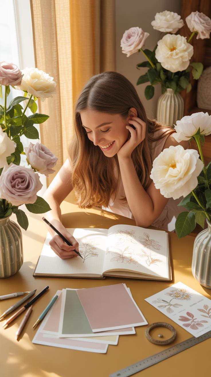
Physical mood boards prevent expensive errors in floral design. Collect actual scraps of linen, dried seed pods, and paint chips. Place these items under different light sources. Morning sun changes how a cream petal looks compared to evening shadows. Testing materials together reveals if your whites clash or harmonize. Seeing the actual textures clarifies which flowers will work best in your space.
Digital mood boards offer speed during the planning phase. Use high resolution photos of specific flower varieties like Quicksand roses or white anemones. Group these images to check the balance of tones. Ensure the dark accents do not overpower the light shades. This step identifies gaps in your color range. You can adjust the mix before you place a wholesale order.
Where To Find Reliable Color Design Inspiration For Neutral Floral Projects
Look to Dutch Golden Era paintings for masterful use of light and shadow. These historical works show how cream and white flowers pop against dark backgrounds. Study the way old masters used ochre and brown to ground brighter elements. This technique translates directly to modern floral staging. You learn how to use depth to make a neutral palette look expensive and deliberate.
Interior design showrooms provide real world examples of neutral layering. Observe how professional designers mix beige, tan, and ivory textiles. These professionals use texture to replace color. Apply this rule to your floral selections. Choose flowers with different petal shapes and foliage with varying finishes. Matching your floral tones to high end architectural finishes ensures a cohesive look. Tactical observation builds your design instincts quickly.
Frequently Asked Questions

What are the best flower varieties for creating neutral floral palettes?
For beginners, the best flowers to use are those with natural cream, white, and soft beige tones. Consider starting with white ranunculus, cream roses, or “Cafe au Lait” dahlias as your focal points. Incorporating dried elements like pampas grass or bleached ruscus adds texture and depth. These versatile choices make designing neutral floral palettes incredibly simple, allowing you to create a sophisticated look that seamlessly complements any interior design style.
How do I arrange a neutral bouquet without it looking washed out?
The secret to vibrant neutral floral palettes is layering various textures and shades. Instead of using only one white tone, mix ivory, sand, and taupe to create visual interest. Use greenery with silvery undertones, like eucalyptus or dusty miller, to provide soft contrast. By varying the heights of your stems and adding architectural elements like dried seed pods, you ensure your arrangement looks intentional, professional, and full of life.
Are neutral floral arrangements more expensive than colorful ones?
Not at all! In fact, neutral flowers are often more accessible year-round. You can save money by using affordable fillers like baby’s breath, white carnations, or queen anne’s lace, which look high-end when grouped together. Foraging for dried branches or grasses in your backyard is another budget-friendly way to enhance your design. Neutral tones are timeless and versatile, meaning you can repurpose your vessels and bases for every season without extra cost.