Understanding Two Tone Floral Arrangements The Art Of The Beautiful Flower Arrangement
What Defines A Two Tone Floral Arrangement And Why It Works
A two tone floral arrangement uses two specific colors to create visual impact. Designers select a primary hue and a secondary accent to establish focus. This method relies on color theory principles like contrast or harmony. You use high contrast pairing to grab attention immediately. Conversely, you use analogous colors to create a soft look. This strategy simplifies the design process for professional florists.
Effective arrangements use these dual tones to direct the eye through the display. One color often serves as the base while the second adds depth or highlight. This structure eliminates visual clutter and ensures a clean aesthetic. Using only two colors makes the flower shapes stand out more clearly. It provides a professional finish that works in both modern and traditional settings.
The History And Evolution Of Dual Color Floral Design In Art And Culture
Dual color floral design has deep roots in historical art and elite society. During the Dutch Golden Age, painters featured high contrast flowers to show texture. Artists used light and dark tones to create a sense of three dimensional depth. This period established the standard for using color to show value. Florists later adapted these classical painting techniques into physical arrangements for wealthy patrons.
Victorian era floriography used specific color pairs to send secret messages. A red and white mix often symbolized unity or focused intent. The Modernist movement later stripped away complex patterns in favor of bold color blocks. Today, minimalist trends continue this focus on restricted palettes. Designers use two tones to achieve a high end look with fewer materials. Experience shows that limiting colors increases the perceived value of the work.

The Science Of Color Theory Behind Gorgeous Flower Arrangements
How The Color Wheel Guides Two Tone Pairings In Floral Design
The color wheel provides a strict mathematical framework for selecting flower pairs. This tool organizes colors based on their relationship to the light spectrum. Designers use the wheel to determine which hues naturally vibrate against each other. For two tone arrangements, the distance between two colors on the wheel dictates the visual tension. This system removes guesswork and ensures professional results.
Floral artists rely on primary, secondary, and tertiary classifications within the wheel. You must identify the base hue of your primary bloom first. Then you locate its partner by following established geometric paths across the wheel. This method creates structural balance in any arrangement. High contrast pairings attract the eye immediately. Lower contrast pairings create a sense of calm. The wheel dictates the mood.
Complementary Vs. Analogous Color Schemes: Choosing The Right Duo For Your Blooms
Complementary schemes use two colors directly across from each other on the wheel. This setup offers the highest possible contrast for a two tone design. Common examples include blue delphinium paired with orange lilies. This strategy creates a focal point that demands attention. Use this approach for high impact events or bold branding. It produces a sharp and energetic visual effect.
Analogous schemes use colors that sit next to each other on the color wheel. This choice creates a soft and harmonious transition between blooms. An example is pairing red roses with orange ranunculus. This technique mimics natural color gradients found in the wild. It works best for sophisticated and low stress environments. These pairings feel unified and consistent. Choose this for a cohesive look.

Best Flower Varieties For Creative Flowers In Two Tone Combinations
Top Flower Varieties That Naturally Exhibit Two Tone Coloring
Bi-color roses and tulips offer immediate visual depth without extra labor. Many rose varieties feature petals with a lighter interior and a darker outer edge. This trait creates a natural gradient effect in the bouquet. You should utilize varieties like the Cherry Brandy or High Magic rose for consistent results. These flowers provide a reliable structural base for high-contrast commercial and wedding designs.
Lisianthus and Parrot tulips show distinct color breaks across their petals. These patterns result from genetic traits or specific breeding techniques. Designers use these varieties to bridge the gap between two different primary colors in a palette. You must select flowers with clear color separation to maintain professional standards. Avoid blooms with muddy or faded transitions. Precise color demarcation ensures the visual impact remains sharp and intentional.
Pairing Contrasting Single Color Blooms To Achieve A Striking Two Tone Effect
Strategic pairing involves placing high-value light colors next to deep saturated tones. You must consider the color wheel to select opposite hues for maximum tension. Using a dark purple anemone with a crisp white ranunculus creates a classic look. This tactic forces the eye to recognize the distinct shape of each flower. Professionals use this method to build depth when natural bi-color options are not available.

Texture affects how the eye perceives these two-tone combinations. You should pair smooth petals with rough or serrated greens to enhance the color split. Dark foliage like eucalyptus helps pop bright blooms such as yellow craspedia. Place larger masses of one color against smaller pops of a second color. This ratio creates a clear focal point. Controlled placement prevents the arrangement from looking cluttered or disorganized.
Designing Floral Centrepieces Two Tone Arrangements For Tables And Events
How To Structure A Two Tone Floral Centrepiece For Weddings And Celebrations
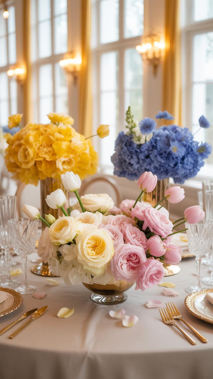
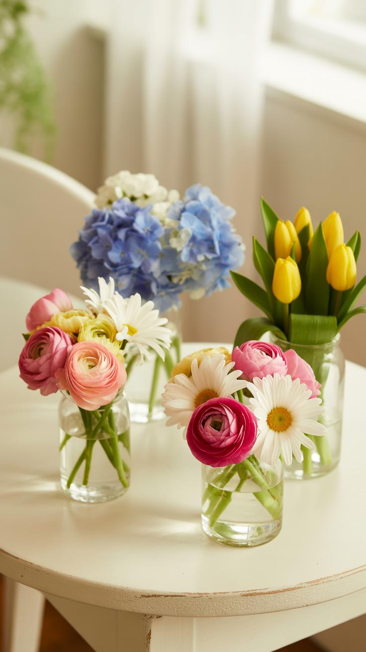
Effective two tone design requires a strict 70/30 distribution ratio. Select a primary color to anchor the base and a secondary color for visual tension. Use mass flowers like roses or hydrangeas to establish the main color block. Place these stems first to create a solid foundation. This method ensures the eye identifies the primary color immediately before noticing the secondary accents.
Integrate the second color using focal flowers with distinct shapes. Position these stems at varying depths to avoid a flat appearance. Grouping similar colors together creates bold impact for large event spaces. This technique prevents the arrangement from looking messy or blurred from a distance. High contrast pairings work best for formal celebrations. Maintain clear boundaries between the two colors to preserve the specific two tone effect.
Flowers always make people better, happier, and more helpful; they are sunshine, food and medicine for the soul.
— Luther Burbank
Choosing The Right Vessels And Heights To Elevate Your Two Tone Centrepiece Display
Vessel selection dictates the visual weight of two tone floral work. Use neutral containers like clear glass, white ceramic, or brushed metal. These materials do not compete with the two colors of the stems. Darker vessels provide a heavy base for lighter floral combinations. Taller pedestals lift the arrangement to eye level but require stable internal mechanics. Use floral foam or chicken wire to secure heavy stems.

Varying height across a table prevents visual boredom. Use a mix of low compote bowls and tall glass trumpets. Low arrangements allow for easy conversation between guests while highlighting color texture. Tall displays create vertical drama and fill high ceilings. Always ensure the two tone pattern remains consistent across different heights. Use the same color proportions in every vessel to maintain a cohesive look throughout the entire event venue.
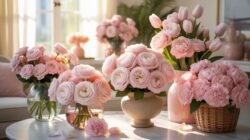
Fresh Floral Centerpieces Keeping Two Tone Blooms Vibrant And Long Lasting
Essential Care Tips To Preserve The Color Contrast In Fresh Two Tone Arrangements
Two tone flowers require specific maintenance to keep their distinct pigment boundaries sharp. Fading often occurs when the plant lacks sufficient hydration or sugar to support the secondary color. High temperatures accelerate cellular breakdown, causing the darker edges of picotee petals to bleed into the lighter base. You must stabilize the environment to lock in the visual punch of these specific varieties.
- Water Temperature Control: Use lukewarm water when first placing stems into a vase. This temperature removes air bubbles from the xylem and ensures the vascular system transports nutrients quickly. Fast hydration prevents the petal tips from drying out and losing their secondary color intensity.
- Stem Recutting Technique: Cut stems at a forty five degree angle every two days. Use sharp floral shears to avoid crushing the water conducting tissues. This fresh surface allows the flower to pull in more water. Improved flow keeps the two tone patterns crisp and prevents early wilting or color blending.
- Anti Ethylene Treatment: Keep your centerpieces away from ripening fruit and dying foliage. These items release ethylene gas which triggers rapid aging in flowers. For two tone blooms, this gas forces the colors to turn brown and muddy. Removing spent leaves below the water line stops the buildup of gas and bacteria.
- Placement Geography: Place your floral arrangements in cool spots away from direct sunlight. Ultraviolet rays bleach the sensitive pigments found in bicolor roses and tulips. Intense heat also speeds up evaporation from the petals. A consistent cool temperature preserves the chemical bonds that create the high contrast look you desire.
- Nutrient Balance: Use professional floral food to provide the necessary carbohydrates to the blooms. These packets also contain acidifiers that balance the water pH. Correct acidity levels help the petals maintain their vibrant bicoloration. Without these additives, the lighter shades in the arrangement often turn yellow or gray prematurely.
Consistent water changes prevent bacterial growth that clogs the stems. If you ignore the water quality, the flower cannot maintain the turgor pressure needed to display its pattern. Bacteria produce blockages that starve the bloom of life. Clean the vase with bleach between uses to kill any lingering pathogens. This simple step ensures your two tone investment remains a high impact focal point for several days.
Seasonal Flower Choices That Keep Your Fresh Floral Centerpieces Looking Their Best
Spring offers the best window for two tone variety and durability. Tulips and ranunculus feature strong natural contrasts during this period. These bulbs store energy that allows the blooms to maintain their color edges even after being cut. Selecting seasonal flowers ensures the stems are hardy and less likely to suffer from the stress of shipping. This reduces the risk of petal bruising.
Summer requires more robust choices to survive the heat. Bicolor roses and zinnias are tactical options because they have thicker petals. These varieties resist wilting better than delicate spring blossoms. Modern breeding programs have focused on extending the vase life of these specific cultivars. Relying on heat tolerant species prevents your centerpiece from drooping and losing its visual impact during outdoor events or warm afternoons indoors.
Floral Arrangements Modern Contemporary Takes On Two Tone Design
Minimalist And Architectural Approaches To Modern Two Tone Floral Arrangements
Modern minimalism relies on negative space and clean lines. Use two colors to define the shape of the work. Select stems with strong verticality like Calla Lilies or Allium. Place these focal flowers at different heights to create a clear geometric path. This method focuses on the structural silhouette rather than bulk. It highlights the natural form of each individual bloom through strategic placement.

Eliminate all unnecessary filler to maintain visual clarity. Designers often group one color at the base for weight and use the second color for height. This color blocking creates a sharp visual break. It mimics modern architecture by emphasizing form and function over decoration. Use monochrome vessels to keep the focus on the two-tone palette. This approach ensures the design remains sophisticated and uncluttered for high-end environments.
Incorporating Foliage, Dried Elements, And Textural Contrast In Contemporary Two Tone Designs
Texture acts as a secondary design element in modern two-tone work. Mix fresh blooms with dried materials like bleached Ruscus or preserved palms. These dried elements often provide the first tone, usually a neutral sand or white. Pair them with a vibrant fresh flower to create a stark color contrast. This combination adds physical depth and a sense of permanence to the arrangement through varied surface qualities.
The use of foliage has shifted from filler to a primary color source. Dark green Monstera leaves or silver Eucalyptus serve as a solid color block. Against this backdrop, set a single species of bright flower. This creates a high-contrast look that feels organic but controlled. Use matte textures against glossy petals to increase visual interest. This technique ensures the two-tone theme remains prominent while adding necessary tactile layers.
Simple Arrangements Beginner Friendly Two Tone Floral Projects Anyone Can Try
Step By Step Guide To Creating Your First Two Tone Hand Tied Bouquet
Start by selecting one primary focal flower and one secondary filler flower. Choose colors that sit opposite on the color wheel for high contrast. Group three stems of the primary flower in your non-dominant hand. Rotate the bundle slightly after adding each new stem. This spiral technique ensures even distribution. Maintain a firm grip at the binding point to keep the structure secure and organized.
- Stem Stripping: Remove all leaves and thorns from the bottom two-thirds of every stem. Foliage submerged in water creates bacteria that kills flowers fast. Clean stems also allow for a tighter and more professional binding point in the hand-tied design.
- The Spiral Technique: Place each new stem at a forty-five degree angle against the central bunch. Always add stems in the same direction around the circle. This creates a structural skeleton that supports the weight of the blooms without crushing the delicate internal tissue.
- Two Tone Balancing: Alternate your primary color and secondary color in a systematic pattern. Do not cluster the same colors together in one spot. Distribute the two tones evenly to create visual rhythm and prevent the arrangement from looking heavy on one side.
- Binding Point: Secure the bouquet at the narrowest point of the stems using floral tape or waterproof twine. Wrap the binding material tightly three times to prevent shifting. Cut the wire or twine cleanly to avoid snagging the delicate stems or your skin.
- Final Trim: Cut the stems to a uniform length using sharp bypass shears. A clean slant cut increases the surface area for water absorption. Ensure the bouquet can stand upright on its own if possible. This indicates a balanced weight distribution within the spiral.

Inspect the arrangement from above to identify any gaps in the color pattern. Insert remaining filler stems into these open spaces to reinforce the two-tone theme. Check the binding point one last time for stability. Place the finished bouquet in cool water immediately. Proper hydration keeps the petal edges crisp and maintains the vibrant saturation of your chosen colors.
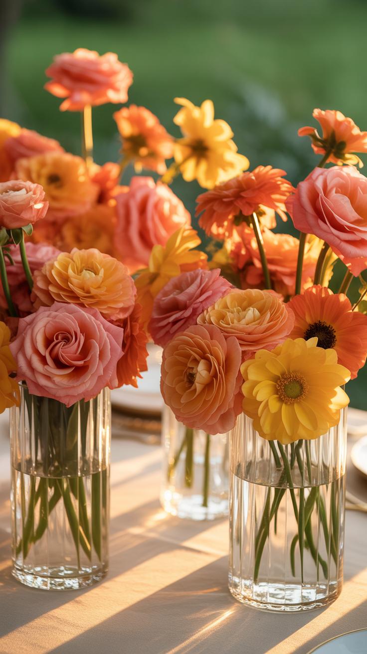
Budget Conscious Two Tone Simple Arrangements Using Grocery Store And Garden Blooms
Grocery store bundles often feature basic carnations or alstroemeria in single colors. Buy two separate monochromatic bunches to create a controlled two-tone effect. Look for flowers with firm heads and closed buds for maximum longevity. Mix these affordable finds with greenery or branches clipped from your own backyard. Local foliage adds texture and fills space without increasing your total project cost.
Focus on a simple ratio of sixty percent primary color and forty percent secondary color. This prevents the design from looking cluttered or unplanned. Strip the stems and arrange them in a clean glass jar or ceramic mug. Use clear grid tape across the mouth of the vessel to hold stems in place. This method allows beginners to achieve professional spacing with very few materials.
Flower Inspiration Iconic Two Tone Floral Arrangement Styles From Around The World
How Japanese Ikebana And European Styles Influence Two Tone Floral Composition
Japanese Ikebana focuses on line and negative space. It often uses a single branch against a bold bloom. This creates a two tone look through structural contrast. Practitioners select colors based on seasonal shifts. Dark woody stems provide the primary tone. Bright flowers provide the secondary accent. This method forces the viewer to notice the relationship between wood and petal colors.
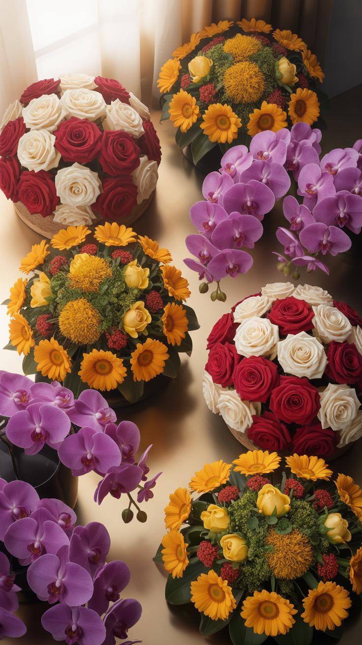
European design styles take a different path. These styles emphasize volume and density. The Flemish or Baroque traditions use deep reds against cream whites. This creates high visual tension. Designers layer different species to build color blocks. They use dark greenery to frame light blossoms. This technique relies on heavy saturation and mass. It offers a more crowded and opulent two tone effect.
Drawing Flower Inspiration From Nature, Art, And Interior Design Trends
Nature provides the strongest blueprints for bi-colored palettes. Look at the forest floor for organic pairings. Dark soil and bright moss offer a natural two tone guide. Many flowers grow with natural gradients like the bearded iris. These plants show how to mix dark purples with bright yellows. Mimicking these natural patterns ensures the arrangement looks grounded. It removes the guesswork from color selection.
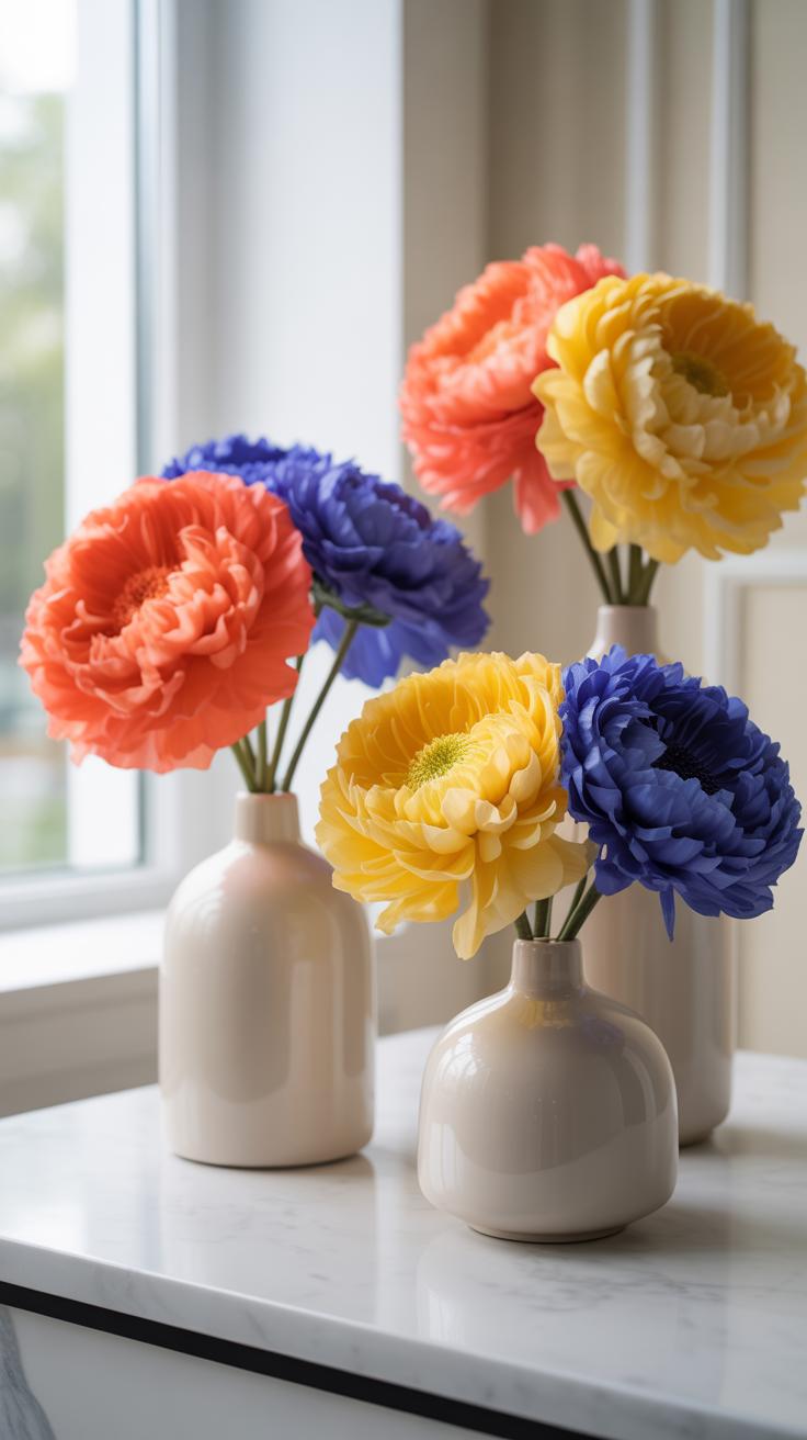
Interior design and modern art also drive these trends. Modern minimalist homes demand high contrast colors. A stark white room needs deep blue or black flora. Designers look at the color wheel for complementary matches. They use art movements like Bauhaus for inspiration. These movements favor primary color blocks. Matching flowers to upholstery or paint creates a cohesive environment. This strategy turns a simple bouquet into a tactical design element.
Floral Centerpiece Styling Displaying And Photographing Two Tone Arrangements At Home
How To Style A Two Tone Floral Centerpiece To Complement Your Home DéCor
Select a neutral vessel to prevent visual conflict. Clear glass or solid matte ceramics allow the dual colors of the petals to remain the focus. Follow the principles of the Dutch Golden Age by placing the darkest bloom at the center of the base. This creates a strong foundation. Use the secondary color to draw the eye upward and outward toward the room.
Place the arrangement against a solid wall to minimize background noise. High contrast environments work best for bi-color flowers. A dark navy wall makes white and purple petals pop. Light gray backgrounds highlight yellow and red variations. Ensure the table linen does not match the flower colors exactly. Use a complementary tone to provide a subtle base that supports the floral hues.
Photography And Presentation Tips To Showcase The Full Beauty Of Your Two Tone Blooms
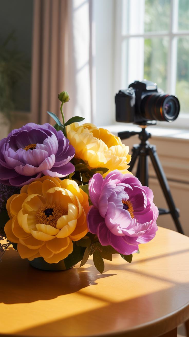
Use natural side lighting to define the color boundaries on each petal. Avoid direct overhead lights. Hard shadows hide the transition between the two tones. Position the camera at eye level with the arrangement. This perspective captures the internal depth of the bloom. Macro lenses reveal the intricate veining where the colors meet. This detail is essential for documenting high quality two tone specimens.
Control the depth of field to isolate the primary flower. A blurred background removes distractions from your home furniture. Focus on the sharpest edge of the bi-color gradient. Use a tripod to ensure total stillness during long exposures in low light. Check the white balance settings on your camera. Improper white balance distorts the actual hues of the petals and ruins the visual accuracy of the photograph.
Frequently Asked Questions

What exactly are two tone floral arrangements?
Two tone floral arrangements are displays that focus on a primary color pairing to create visual depth and contrast. Unlike monochromatic bouquets or multi-colored wildflower styles, this design choice uses two specific hues—such as blush pink and deep burgundy—to lead the eye. This technique is a favorite in modern home decor because it offers a sophisticated, curated look that feels both intentional and incredibly stylish in any room.
How do I choose the best flowers to create a balanced two-tone look?
To master two tone floral arrangements, start by selecting one “mass” flower in your light shade and a “filler” or “accent” flower in your darker shade. A classic ratio is 60% of your primary color and 40% of your secondary color. Look for blooms with natural gradients, like variegated tulips or carnations, to bridge the gap between your two chosen colors and create a seamless, professional-grade transition in your vase.
Can I create a high-end two-tone display on a limited budget?
Absolutely! You can achieve a luxury aesthetic without overspending by using inexpensive greenery to provide structure and focusing your budget on just two types of flowers. Visit a local grocery store and pick up a bunch of white hydrangeas and a set of bright blue delphiniums. By limiting your palette and sticking to affordable, high-volume stems, you can design stunning displays that look like they came from a high-end boutique florist.