Understanding The Foundations Of Ceramic Home Decor
What Makes Ceramic A Timeless Decorating Material
Ceramic remains a core material because of its geological composition. Manufacturers use clay and minerals fired at high temperatures to create chemical changes. This process results in a durable product that resists heat and decay. Ancient civilizations used earthenware for storage because it protected contents from external elements. Today, these same structural properties make ceramic a reliable choice for long term interior decoration.
The material serves as a bridge between art and utility. Fine porcelain and rugged stoneware offer different tactile experiences. Porcelain provides a smooth surface that reflects light. Stoneware creates a raw earthy feel through visible grains and textures. Designers choose ceramic because it does not age or lose color like plastics or wood. It offers a permanent solution for adding vertical interest to any room.
How Ceramic Vases Fit Into The Broader World Of Home Styling
Ceramic vases function as structural anchors in modern design. They provide necessary weight and height to flat surfaces like tables or mantels. Stylists use these objects to break up horizontal lines in a room. A well placed vase creates a focal point that draws the eye upward. This technique helps balance the scale of large furniture pieces with smaller decorative elements.
These objects play a critical role in defining a specific design movement. Minimalist styles favor monochromatic matte finishes with clean geometry. Brutalist or rustic styles utilize rough surfaces and organic shapes. Using ceramic allows you to introduce different textures without introducing clashing colors. It offers a versatile way to repeat a color palette throughout a home. Use these pieces to unify rooms through consistent material choices.

Choosing The Right Flower Vase Ceramic For Your Space
Matching Vase Shape And Size To Your Room Proportions
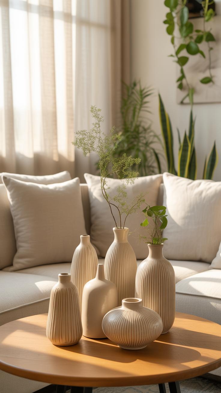
Room scale dictates vase selection. Large ceramic vessels require open floor space or heavy furniture to maintain balance. Small bud vases disappear in large rooms but work well on narrow shelves. High ceilings demand tall, cylindrical floor vases to draw the eye upward. Low furniture suits wide, squat vessels. Measure your surface area before buying. A vase should never occupy more than one third of a table surface.
Visual weight matters as much as physical size. Dark glazed ceramics feel heavier and ground a light room. Sandstone or white biscuit ware feels lighter and suits smaller apartments. Match the vase diameter to the width of the supporting furniture. A thin vase on a massive dining table looks weak. A wide bowl on a thin pedestal creates a tipping hazard. Use geometric shapes to mirror your room architecture.
The centerpiece of every room should be a vessel that holds not just flowers, but the quiet stories of our lives. A thoughtful arrangement brings the earth’s clay and nature’s soul into a perfect, timeless harmony.
— Bunny Williams
Selecting The Best Floral Arrangements To Complement Ceramic Vases
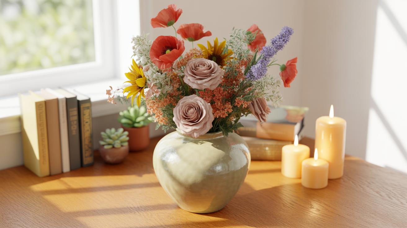
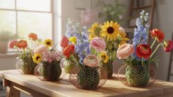
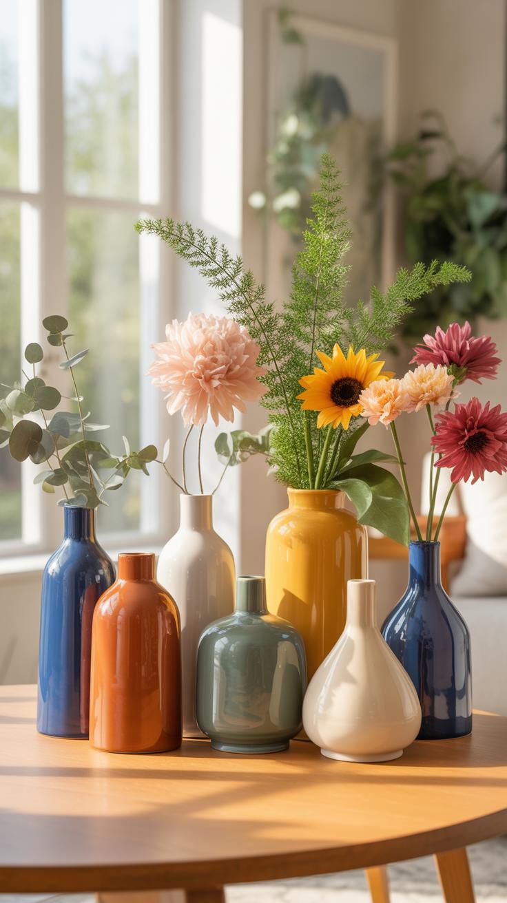
Ceramic texture determines the floral choice. Rough stoneware and terracotta pair well with dried grasses or woody branches. This reflects the organic roots of the Arts and Crafts movement. Smooth porcelain requires refined flowers like lilies or orchids. The vase opening size controls the stem count. Narrow necks support single stems. Wide mouths need dense bunches to prevent the flowers from drooping. Balance the flower height against the vase height.
Flower color must work with the ceramic glaze. Use primary colors for Mid-Century Modern pieces to maintain historical accuracy. Monochromatic styling uses white flowers in white ceramic for a clean look. The arrangement height should be roughly one and a half times the height of the vase. Heavy ceramic bases allow for top-heavy blooms that glass cannot support safely. Always trim stems to suit the specific ceramic vessel depth.
Working With Beige Vase Decor For A Neutral And Elegant Look
Why Neutral Tones Like Beige Create A Calming Interior Aesthetic
Beige operates on a low frequency in the visual field. This color reduces optic strain and lowers cortisol levels in a living space. It reflects light without the harsh glare of pure white. Modernist architects used these tones to bridge the gap between structure and nature. A beige vase serves as a visual anchor that does not compete for the eye’s attention.
The neutral palette eliminates decision fatigue in interior design. Using beige allows the form and silhouette of the ceramic to take priority over the color. Minimalist movements like Japandi rely on these muted tones to foster focus and meditation. You achieve a timeless look because beige does not cycle in and out of style like bold primary colors. This color maintains a steady emotional atmosphere.
Pairing Beige Ceramic Vases With Textures, Fabrics, And Natural Elements
Contrast is the engine of neutral design. You must pair smooth beige glazes with coarse materials to prevent a flat appearance. Place a polished ceramic vase on a raw wood table or a stone plinth. This creates a tactile hierarchy. Use linen or wool backdrops to enhance the warmth of the clay. The interaction between light and rough surfaces adds necessary depth to the room.

Incorporate organic materials to ground the ceramic piece. Dried grasses like pampas or eucalyptus stems provide a structural contrast to the rounded vase walls. These natural elements emphasize the earth-based origins of the pottery. Use darker wood species like walnut to make the beige pop. Strategic layering of different textures ensures the neutral scheme feels intentional and professional rather than unfinished.
Styling A Ceramic Vase As A Dining Room Centerpiece
Guidance On Creating A Balanced And Inviting Dining Table Display
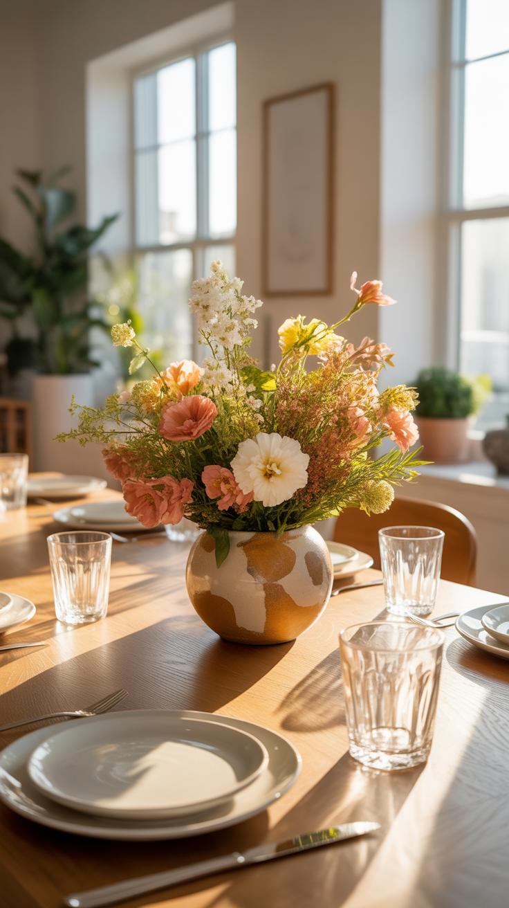
Dining table arrangements require specific scale management to avoid blocking sightlines. Select a vase height that sits below eye level when guests are seated. Use the rule of thirds to position the ceramic piece. Central placement creates formal symmetry. Off-center placement offers a modern look. A heavy stoneware base provides stability against table vibrations. Contrast the vase texture against the table material.
Effective displays use odd numbers of objects to create visual interest. Pair a large ceramic vessel with two smaller objects of varying heights. Use a tray to ground the grouping on large surfaces. High-fire ceramics offer durability for daily use near food and liquids. Focus on matte glazes to reduce glare from overhead dining lights. Simple shapes prevent the centerpiece from feeling cluttered or chaotic.
Seasonal Centerpiece Ideas Using Ceramic Vases For Year Round Appeal

Adapt the centerpiece by changing filler materials rather than the vessel itself. Use heavy earthenware during winter months to ground the room. Fill these with bare branches or evergreen sprigs for architectural height. Spring requires lighter aesthetics like celadon or white porcelain. These materials reflect natural light and support delicate flora. Match the ceramic weight to the visual heaviness of the current season.
Summer styling benefits from unglazed terracotta or bright slip-trailed patterns. These styles reference Mediterranean traditions and handle heat well. Autumn calls for reactive glazes in earth tones like ochre or rust. These finishes mimic the natural decay of the season. Always clean the interior of the vase between seasonal rotations. Mineral deposits can damage the ceramic surface over long periods. Proper maintenance ensures the centerpiece remains a core asset.
Incorporating A Retro Vase Into Modern And Eclectic Interiors
The History And Revival Of Retro Ceramic Vase Design Trends
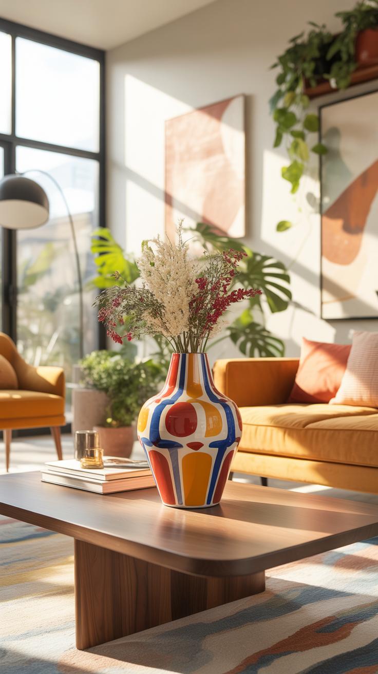
Mid-century modern design centers on the period between 1945 and 1970. During this time, designers moved away from ornate Victorian styles. They focused on organic shapes and clean lines instead. West German pottery became famous for its bold colors and thick glazes. These pieces often featured lava textures and deep reds. Collectors now seek these items for their unique physical presence and historical value.

The current revival of retro ceramics stems from a desire for authenticity. Mass production often lacks the character of hand-thrown or kiln-fired vintage pieces. Modern manufacturers now replicate 1960s silhouettes like the bottle shape and the gourd. Brutalist designs from the 1970s also see high demand today. These items use raw clay and jagged edges. They provide a stark contrast to smooth and shiny modern surfaces.
How To Blend Vintage Ceramic Pieces With Contemporary Home Decor
Successful styling requires a balance between old and new elements. You must treat a retro vase as a focal point in a modern room. Do not crowd the piece with other vintage trinkets. Place a textured 1970s vase on a sleek glass coffee table. This mix creates visual tension. It stops the room from looking like a museum display. Choose one dominant color to link the eras.
Scale matters when mixing different time periods in one space. Pair large floor vases from the mid-century era with low-profile contemporary sofas. This creates a pleasing height variation. Use the vase to break up the straight lines of modern furniture. If the vase has a loud pattern, keep the surrounding area neutral. This strategy ensures the vintage piece adds value without creating clutter. Proper placement respects the history of the object.
Exploring Artistic Pottery Decor As A Statement In Your Home
What Defines Artistic Pottery And How It Differs From Mass Produced Ceramics
Artistic pottery focuses on unique form and individual technique. Master potters use methods like wheel throwing or hand building to create one-of-a-kind pieces. These items often feature intentional variations in glaze and texture. Unlike factory goods, artistic ceramics show the maker’s hand through finger marks or slight asymmetries. These details signal quality and authenticity in high-end interior design and collectible art markets.
Mass-produced ceramics rely on slip casting and automated kilns for total uniformity. Modern factories prioritize speed and low costs over material depth. These pieces lack the structural integrity and complex chemical glazes found in studio pottery. In contrast, artistic works often reference specific movements like Mid-Century Modernism or Japanese Wabi-sabi. Designers choose these pieces to add weight and character to a room that commercial items cannot provide.
Tips For Displaying Handcrafted Pottery Vases As Focal Points
Strategic placement determines the impact of handcrafted pottery. Large-scale vases require physical space to breathe and draw the eye. You should treat these objects as sculptures rather than mere containers for flowers. Use lighting to catch the texture of the clay or the depth of the glaze. This technical approach ensures the piece anchors the room and establishes a clear visual priority.
- Isolate the Object: Place a single large vase on a pedestal or sideboard. Removing surrounding clutter prevents visual noise from distracting the viewer. This isolation forces the eye to focus on the silhouette and craftsmanship of the specific piece.
- Utilize Negative Space: Surround high-quality pottery with empty surface area. Leaving physical gaps around the vase creates a gallery-like atmosphere. This technique signals that the object is valuable and deserves individual attention within your home layout.
- Apply Directional Lighting: Use recessed ceiling lights or small spotlights to illuminate the vase. Sharp angles highlight surface irregularities and hand-carved details. Proper light placement creates shadows that define the three-dimensional form of the ceramic work.
- Vary Height Levels: Group vases in odd numbers using different elevations. Combine a tall floor vase with a smaller vessel on a nearby table to create a vertical connection. This method guides the eye through the space and adds structural interest.
- Contrast Against Backdrops: Set light-colored stoneware against dark walls or dark glazes against neutral surfaces. High color contrast makes the outline of the pottery pop. This tactic ensures the artistic shape remains the primary focus of the entire wall or corner.
Avoid overcrowding surfaces when displaying studio pottery. Too many items together dilute the individual power of a handmade work. Pair your vase with materials that offer a different texture, such as raw wood or smooth metal. This contrast emphasizes the earthy quality of the fired clay. Correct styling proves that a single well-made vase can define the mood of an entire living area.
Understanding Ceramic Work Glazes Finishes And Textures That Style Best
How Different Glaze Types Affect The Visual Impact Of A Ceramic Vase
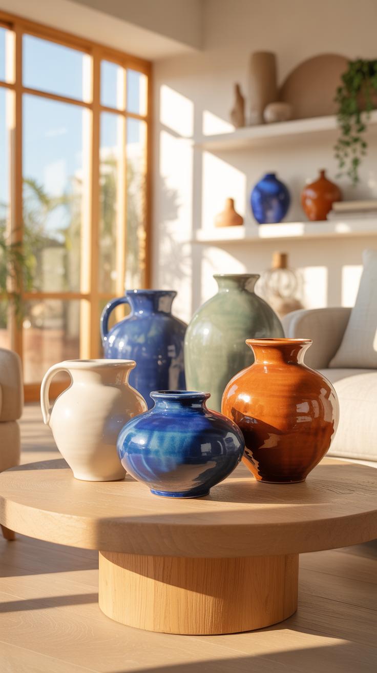
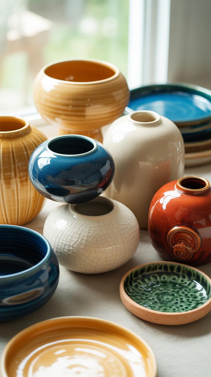
Reactive glazes create unique color shifts during the firing process. These glazes use metallic oxides that melt and flow at high temperatures. This creates variegated patterns and pools of color. You use these pieces as solo focal points. They provide natural complexity without extra accessories. The visual weight of a reactive glaze draws the eye quickly. It grounds a room and defines the color palette.
Crystalline glazes grow actual zinc silicate crystals inside the kiln. These appear as starburst patterns on the surface of the clay. This technique requires precise temperature control and specific cooling cycles. Use these vases in formal or minimalist settings. They offer a refined aesthetic that mimics natural stone or gemstones. The complexity of the surface allows the vase to act as art. Pair them with simple stems.
Matte Vs. Glossy Finishes: Choosing The Right Surface For Your Decor Style
Matte finishes absorb light and provide a soft tactile experience. Designers use these in Modernist and Scandinavian styles to emphasize form over shine. A matte surface hides fingerprints and dust better than a high gloss. It communicates a grounded and organic feel. Place matte vases in brightly lit areas to prevent glare. They work best with dried florals or textured branches to maintain a natural look.
Glossy glazes reflect light and increase the perceived brightness of a room. This finish dates back to ancient glazing traditions like Chinese celadon or porcelain. High shine surfaces create sharp highlights and deep shadows. Use glossy vases in dark corners or transitional spaces to bounce light. They add a sense of luxury and cleanliness to a display. Contrast glossy vases with rough wooden surfaces to create visual balance.
Using A Decorative Pot Beyond Flowers Creative Styling Alternatives
Styling Ceramic Pots With Dried Botanicals, Branches, And Sculptural Objects
Ceramic vessels function as standalone art pieces. You do not need water or fresh flora to create impact. Dried botanicals like pampas grass or eucalyptus provide texture without maintenance. These materials last for years and suit minimalist aesthetics. Place tall, architectural branches in heavy stoneware to create vertical lines. This technique draws the eye upward and fills empty corners effectively.
Sculptural objects transform a hollow pot into a curated display. Use stone spheres, wooden beads, or metal rods to add contrast to the ceramic finish. Mixing materials prevents the design from looking flat. Consider the weight of the insert to ensure the pot remains stable. Large floor vases work best with heavy timber branches. Small tabletop pots benefit from delicate, preserved seed pods or tumbleweeds.
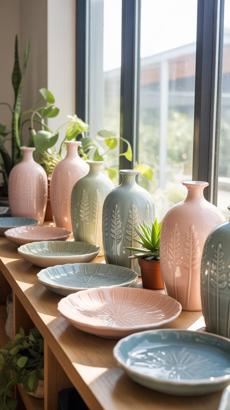
Creative Ways To Group And Layer Decorative Pots For Visual Depth
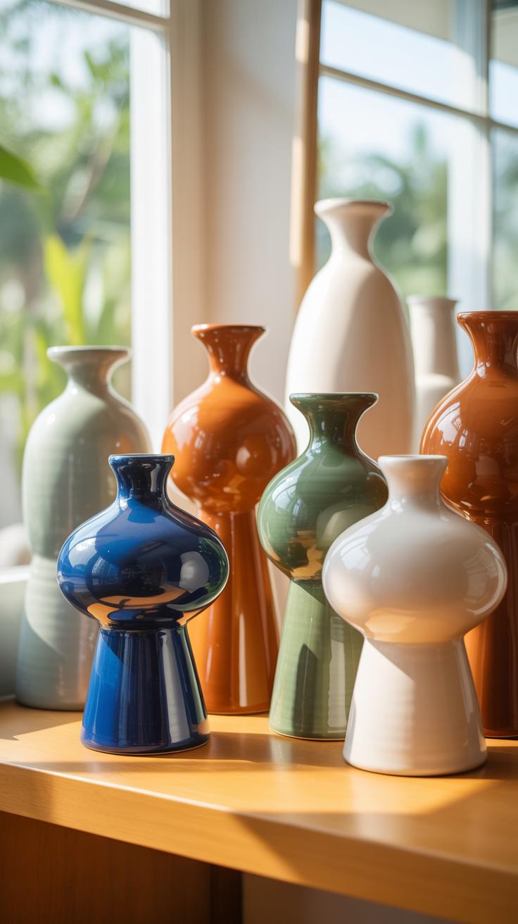
Grouping pots requires a strategy based on scale and proportion. Professionals use the rule of three to create balance. Set various heights together to lead the eye through the space. Use odd numbers to avoid forced symmetry. Layering involves placing larger vessels in the back and smaller ones in front. This creates a sense of physical depth on shelves or consoles.
- Varying Heights: Select three vessels with distinct tall, medium, and short profiles. This staggered arrangement prevents the eye from hitting a flat horizontal line. It forces the viewer to scan the entire display across different vertical planes.
- Textural Contrast: Pair a high-gloss glazed pot with a matte, unrefined terracotta piece. The difference in light reflection adds visual interest without needing bright colors. Smooth surfaces emphasize the rugged nature of handmade or sand-blasted ceramic finishes.
- Monochromatic Palettes: Stick to one color family but use different shades and tones. A collection of cream, beige, and tan pots looks intentional and sophisticated. This approach relies on shape and shadow rather than pigment to define the boundaries of each object.
- Overlapping Placements: Position the edge of a smaller pot slightly in front of a larger one. This physical overlap connects the pieces into a single cohesive unit. It mimics the natural depth found in professional art galleries and high-end retail displays.
- Geometric Mix: Combine round, bulbous vases with sharp, angular vessels. Mixing soft curves and hard edges creates a dynamic tension. This technique works well in modern or brutalist interiors where form is the primary focus of the room.
Consistent finishes tie disparate shapes together. If the shapes vary wildly, use a uniform glaze to anchor the collection. If the colors vary, keep the silhouettes similar. Strategic layering prevents a flat look and adds a professional touch to any surface. Ensure the heaviest visual piece sits at the base of the arrangement. This provides a structural foundation for the entire display.
Achieving Sculptural Decor With Ceramic Vases As Art Objects
When A Ceramic Vase Becomes Sculpture: Form Over Function In Styling
A ceramic vase acts as sculpture when its physical shape dictates the design of a room. This approach prioritizes the silhouette and material over its ability to hold water or flowers. Modernist movements like Bauhaus established that form follows function. However, contemporary styling often reverses this. Bold silhouettes and raw textures allow the object to stand alone. You do not need greenery when the vase possesses strong visual weight.
Place these objects where light hits their contours to emphasize the three-dimensional quality. High-end ceramics often feature slip-casting or hand-coiling techniques that create unique ridges and shadows. These details matter more than color. Choose matte finishes to absorb light or glazed surfaces to reflect it. A sculptural vase acts as a primary focal point. It commands attention through its mass and geometry rather than its contents.
How To Curate A Sculptural Ceramic Display On Shelves And Surfaces
Effective curation relies on the rule of three and varying heights. Group vases with different neck styles and body widths to create visual tension. Use a mix of Brutalist shapes and organic curves to balance the display. Ensure each piece has enough negative space to breathe. Crowding these objects ruins their sculptural impact. Stick to a monochromatic palette to highlight the differences in shape and texture.
Position larger, heavier vases at the base of your shelving or on floor consoles. Place smaller, intricate pieces at eye level where the viewer can appreciate the craft. Use directional lighting to cast shadows that extend the visual reach of the object. This technique turns a simple shelf into a gallery-style installation. Avoid adding small trinkets near these vases. Clean lines maintain the professional and sophisticated look of an art collection.
Practical Styling Rules For Perfecting Your Ceramic Vase Arrangements
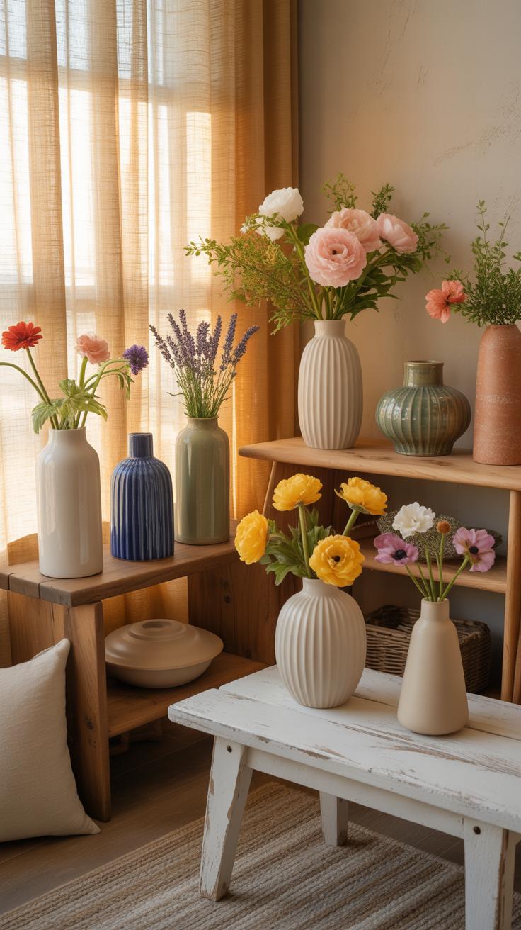
The Rule Of Odd Numbers And Scale: A Designer’S Approach To Vase Grouping
The rule of odd numbers creates visual tension that forces the eye to move. Grouping three or five vases prevents the brain from pairing objects into boring sets. Use varying heights to establish a clear hierarchy. A tall floor vase provides a vertical anchor for smaller tabletop pieces. This technique mimics natural growth patterns found in organic landscapes. It ensures your arrangement feels intentional rather than cluttered.
Scale dictates the relationship between the ceramic vessel and its environment. Large rooms require oversized stoneware to maintain presence. Small, delicate porcelain pieces disappear in wide open spaces. Match the diameter of the vase base to the surface width. Use massive vessels for entryways to signal importance. Scale also applies to the floral fillers. Ensure the height of your stems reaches one and a half times the vase height.
How Lighting, Color Contrast, And Negative Space Enhance Ceramic Vase Styling
Lighting reveals the physical texture of ceramic glazes. Side lighting emphasizes the tactile quality of pitted volcanic glazes or ribbed terra cotta. Overhead light flattens the form and hides craftsmanship detail. Place matte vessels near natural light sources to absorb glare. Use focused spotlights for high-gloss celadon or metallic finishes. Correct light placement transforms a simple clay object into a dimensional sculpture. This makes the material look expensive.
Contrast and negative space define the silhouette of the arrangement. Place a dark basalt vase against a light wall to highlight its outline. Allow empty space between grouped vessels to let the shapes breathe. Crowding vases destroys their individual character. Use the gaps to create a balanced rhythm across a mantle or shelf. Negative space acts as a frame for the ceramic work. It makes the styling look clean and professional.
Frequently Asked Questions

What are the basic rules for beginners starting with ceramic vase styling?
When beginning your journey into ceramic vase styling, focus on the rule of threes and varying heights. Grouping three vases of different sizes creates an instant visual interest that feels balanced yet organic. Start with neutral tones like cream or terracotta to ensure versatility across your home. Remember to consider the scale of your furniture; a tiny bud vase might get lost on a large dining table, while a floor vase commands attention.
How do I choose the right floral stems to enhance my ceramic vase styling?
Effective ceramic vase styling depends heavily on the opening of the vessel. For narrow-necked bottles, a single architectural branch or a delicate dried bloom works beautifully. For wide-mouthed crocks, use a grid of florist tape to support lush, rounded bouquets like hydrangeas or peonies. Ensure the height of your stems is roughly one-and-a-half times the height of the vase to maintain a professional, high-end look that feels intentional and curated.
How can I style ceramic vases beautifully without spending a lot of money?
You don’t need designer price tags to achieve a high-end look. Visit thrift stores for interesting silhouettes and use textured spray paint to give them a modern, matte ceramic finish. For greenery, forage stems from your own backyard or use dried eucalyptus which lasts for months. Repurposing vintage pitchers or clay pots as vases is a budget-friendly way to add character and soulful charm to your shelving or coffee table displays.