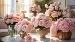
Understanding The Coral Color Palette For Coral Floral Arrangements
What Makes Coral A Unique And Versatile Color In Floristry
Coral acts as a high-impact bridge in floral design. It provides more warmth than standard pink and more softness than pure orange. This balance makes it a primary tool for designers who need to create visual depth without overwhelming the eye. You can use it to ground vibrant tropical displays or to add a focal point to neutral, muted palettes.
Technically, coral creates a strong bridge between warm and cool tones. It reflects light differently depending on the surrounding foliage. Designers use coral because it mimics the natural blush found in many high-value blooms. It functions as a seasonal transition color. It works for spring brightness and summer heat. It also fits autumn richness when paired with darker wood tones or deep bronze accents.
How Coral Sits Between Pink, Orange, And Peach On The Color Spectrum
Coral occupies a specific space on the color wheel between red-orange and orange-pink. It is a tertiary hue that blends the energy of orange with the softness of pink. In professional floristry, you identify coral by its distinct saturation. It lacks the faded quality of peach but avoids the neon intensity of hot pink. This position allows for seamless monochromatic gradients.
Strategic use of coral requires understanding these neighboring shades. Peach contains more white and yellow, making it a tint. Orange is a secondary color with high intensity. Pink is a primary red tint. Coral combines these elements to provide a saturated yet natural look. Floral designers leverage this middle ground to blend clashing colors. It harmonizes sharp contrasts and creates a smooth visual flow.
Best Flowers To Use In Coral Flower Arrangements
Top Flower Varieties That Naturally Bloom In True Coral Shades
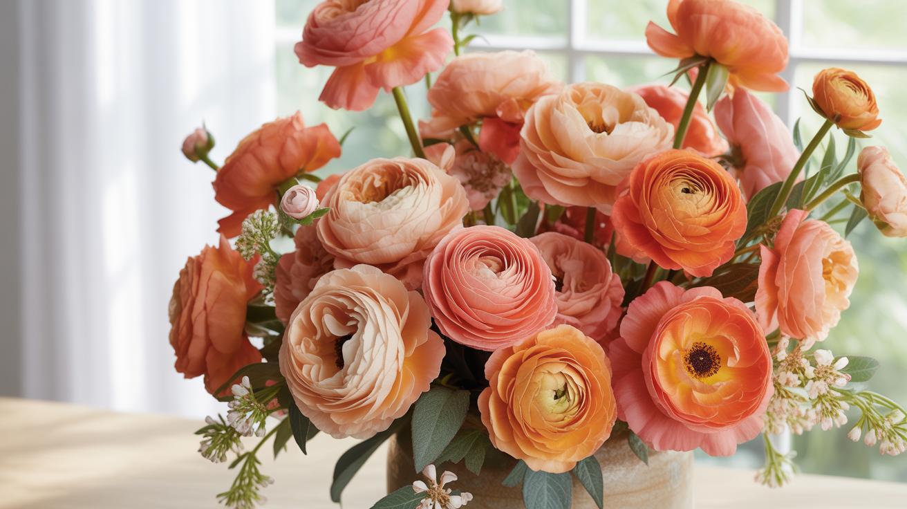
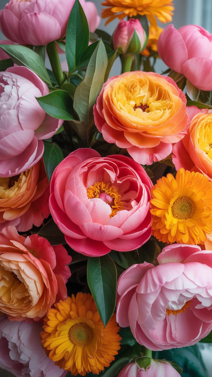
Specific flower species produce natural pigments that range from soft peach to vibrant salmon. You must select varieties known for genetic coral traits to avoid dyeing or tinting. Historical breeding efforts in the twentieth century expanded these color options significantly. Professionals prioritize flowers with high petal counts and strong stems. These traits ensure the arrangement maintains its structural integrity and color saturation over time.
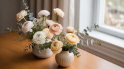
- Coral Sunset Peony: This variety serves as a premier focal point. It opens from a deep orange-pink into a bright coral gold. The large bowl shape provides significant visual weight. Its color shifts naturally as the bloom matures over several days in water.
- Cinema Carnation: This flower offers a vintage dusty coral tone. It provides a ruffled texture that captures light effectively. Designers value this variety for its exceptional vase life and sturdy stem strength. It bridges the gap between pink and orange tones perfectly.
- Free Spirit Rose: This rose features thick wavy petals with a distinct coral hue. It has a high petal count that creates a lush appearance. The outer petals often show hints of gold or pink. It is a reliable choice for high-end event work.
- Viking Gerbera Daisy: These daisies provide a flat circular shape and bold coral saturation. The dark center creates a sharp contrast against the bright petals. They work well for modern designs that require clean lines. Use them to establish a consistent color rhythm.
- Coral Charm Peony: Similar to the Sunset variety but with a lighter semi-double form. It is a classic choice for spring arrangements. The petals fade to an ivory cream as they age. This transition adds dynamic interest to a living floral display.
Natural coral flowers often change color as they bloom. This process is called shattering or fading. You must account for this shift when planning your timeline. Use flowers at different stages of openness to ensure a diverse palette. Always source from growers who specialize in these specific cultivars. This ensures the hue matches your design requirements without relying on artificial enhancements or sprays.
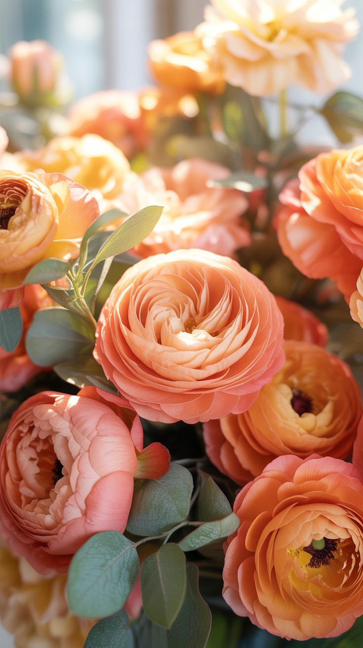
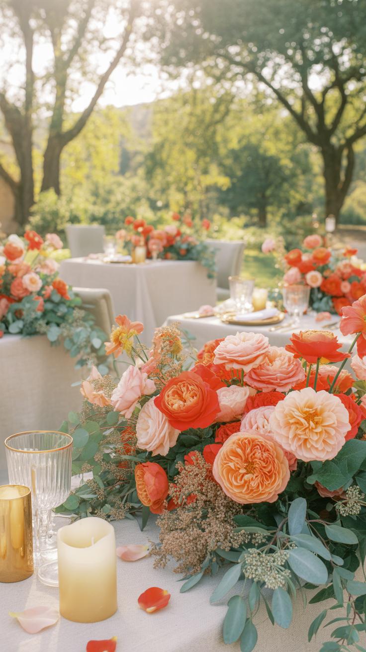
Mixing Focal Flowers With Filler Blooms For A Full Coral Display
Focal flowers dominate the visual field but require secondary elements to build volume. Use filler flowers to bridge gaps and add depth. Small blooms like spray roses or hypericum berries work well here. These secondary pieces should match the coral hue or provide a neutral backdrop. This technique creates a cohesive look without overwhelming the viewer. Proper spacing prevents the arrangement from appearing cluttered.
Balance is the most critical factor when building your display. Place large focal blooms first to establish the shape and size. Fill the remaining space with airy textures like Queen Annes Lace or seeded eucalyptus. This contrast highlights the bold coral colors while softening the overall silhouette. Professional florists use this layering method to create professional results. Every stem must have a clear purpose in the final design.

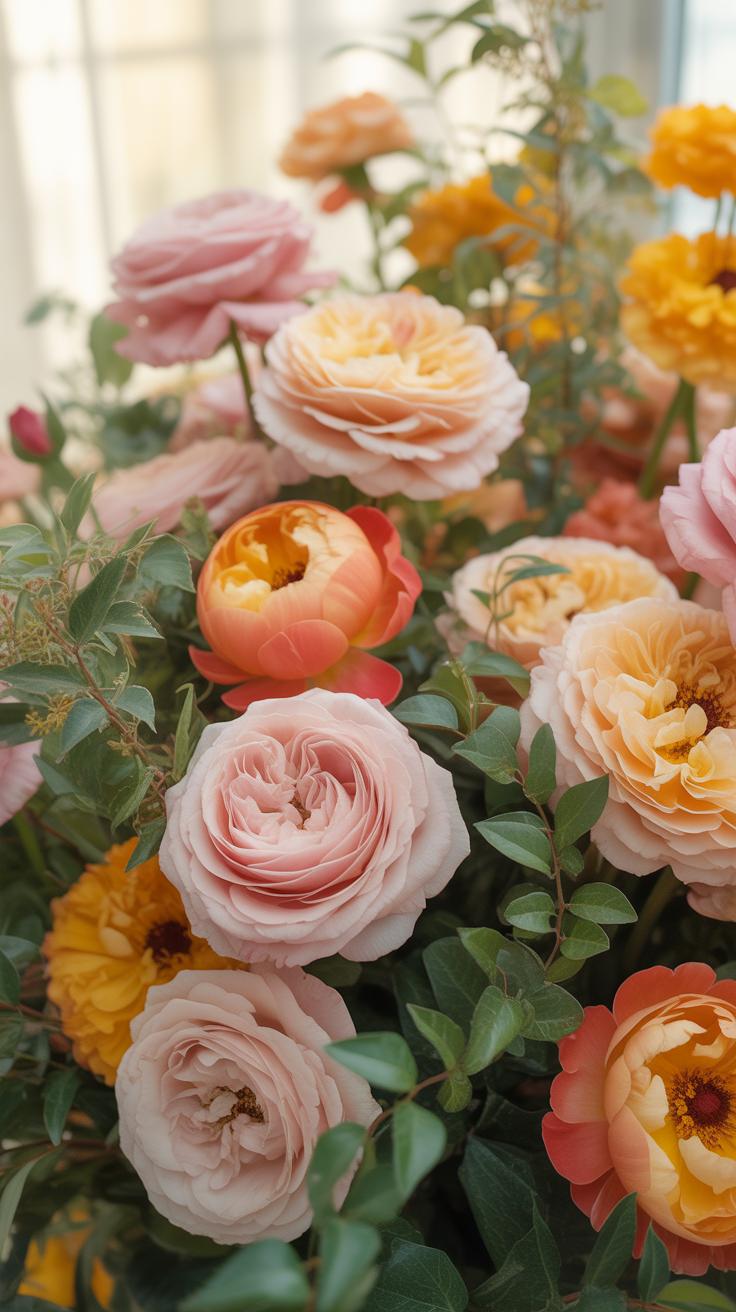
Designing With Floral Pink And Orange Flowers For Maximum Visual Impact
How To Balance Floral Pink And Orange Flowers Without Overwhelming The Eye
Successful coral floral arrangements depend on precise color ratios. Do not use equal parts pink and orange. This creates visual competition that tires the eye. Instead, pick one dominant hue as your primary base. Use the second color as a targeted accent. This strategy follows the principles of color theory to ensure the viewer can process the design quickly and effectively.
Neutral transitions stabilize high-energy palettes. Integrate foliage or secondary flowers in muted tones like dusty green or cream. These colors act as a visual buffer between the vibrant pinks and oranges. They prevent the bright pigments from blurring together into a messy blob. Proper spacing allows each individual bloom to maintain its structural identity within the larger coral floral arrangement.
Using Contrast And Depth To Elevate Your Pink And Orange Flower Arrangements
Depth requires varying the saturation levels of your selected flowers. Pair a pale peach with a deep, saturated magenta. This contrast creates a three-dimensional effect that draws the eye into the center of the arrangement. Use the darker shades at the base to anchor the design. Place lighter, airy blooms near the top and edges to create a sense of movement.
Texture provides a secondary layer of contrast without adding more color. Mix smooth petals like ranunculus with ruffled textures like carnations or spray roses. These physical differences catch light differently and create natural shadows. These shadows produce depth and prevent the orange and pink tones from looking flat. Strategic layering ensures your arrangement looks professional and intentional rather than cluttered or disorganized.
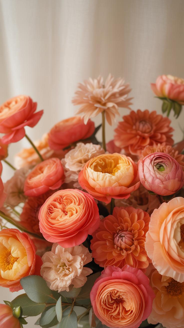
Creating Peach Floral Arrangements That Complement A Coral Theme
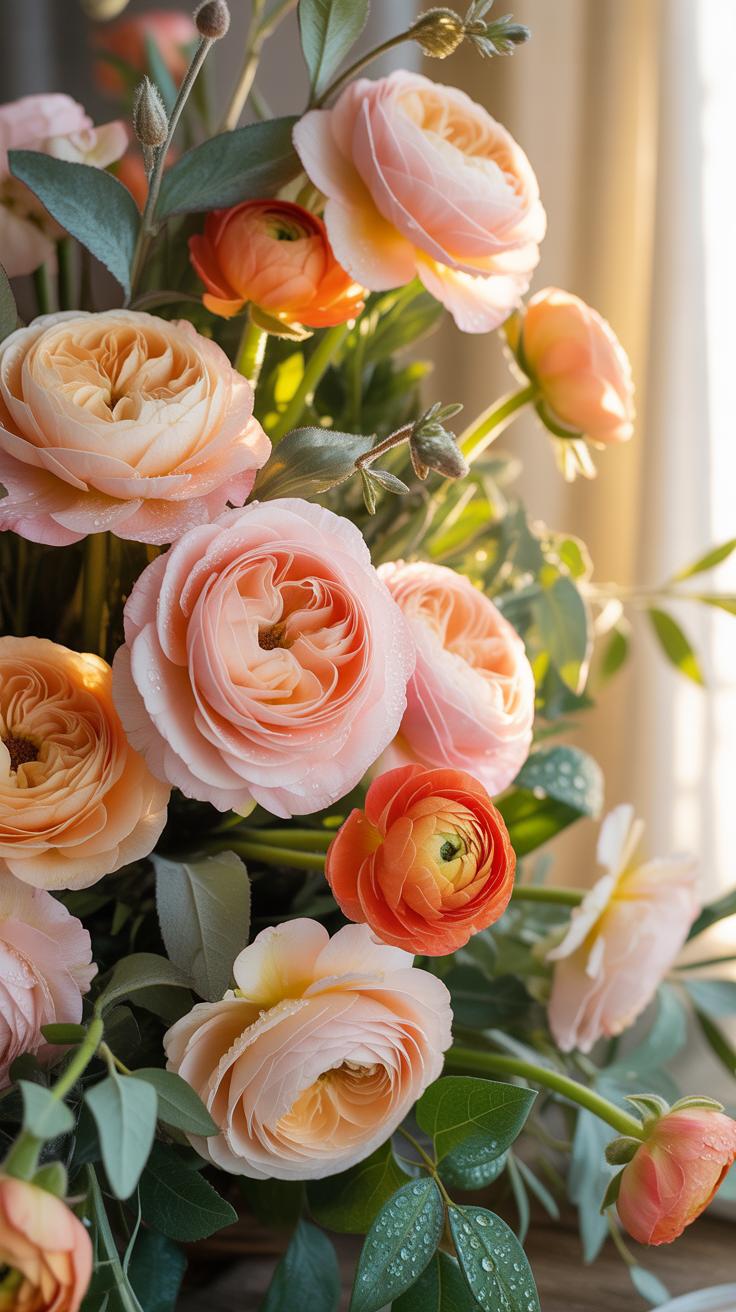
Why Peach And Coral Work Harmoniously Together In Floral Design
Peach and coral share a base of orange and white undertones. Coral provides a saturated pigment that draws the eye immediately. Peach acts as a tint of that same hue. This creates a monochromatic gradient. It prevents the arrangement from looking flat or chaotic. Using these colors together creates visual depth without clashing. It mimics natural color shifts found in sunset lighting.
Designers use peach to bridge the gap between bright coral and lighter cream tones. This transition softens the visual impact of high intensity coral flowers. This technique follows the principles of analogous color theory. It ensures the centerpiece feels cohesive and balanced. Peach serves as a middle value. It allows the coral to remain the focal point while providing necessary supporting color mass.
Choosing Greenery And Neutral Accents To Anchor Peach Floral Arrangements
Greenery provides a necessary boundary between warm peach and coral tones. Gray-green foliage like eucalyptus or dusty miller works best. These muted greens sit opposite the orange spectrum on the color wheel. They create a complementary contrast that makes the warm petals pop. Avoid bright yellow-greens. They compete with the warmth of the flowers and distract the viewer from the design.

Neutral accents like dried grasses or white ranunculus provide structural stability. Use bleaching or dried elements for a modern aesthetic. These textures break up the solid blocks of color. They provide a resting place for the eye within the design. High contrast neutrals ensure the peach tones do not wash out. Proper anchoring prevents the arrangement from looking like a singular blur of warm color.
Pink Orange Floral Arrangements Techniques For A Cohesive Look
Structural Techniques For Building Balanced Pink Orange Floral Arrangements
Building a cohesive layout requires a strict three tiered approach. Start with a firm skeleton of foliage to define the perimeter. Place primary blooms like coral peonies or orange ranunculus at varying heights. This creates depth and prevents a flat appearance. Use the darker orange tones at the base to provide visual weight. Place lighter pink shades toward the top and edges to draw the eye upward.
Radial tension ensures the design stays centered and stable. Every stem must point toward a central axis within the container. Use massing techniques to group similar colors together for high impact. This mimics natural growth patterns and prevents the arrangement from looking disorganized. Balance the visual heat of the orange with neutral greenery. A ratio of sixty percent warm tones to forty percent filler maintains professional standards.
Selecting The Right Vessel And Foam Base For Your Arrangement Style
Choice of vessel dictates the mechanics of the build. Deep ceramic or stone containers support heavy stems and hold ample water. Use moisture retentive floral foam for precise placement in complex designs. Soak the foam fully before cutting it to fit the vessel tightly. Tape the foam down with waterproof adhesive to ensure the weight of large blossoms does not tip the entire structure over.
Modern styles often utilize chicken wire or pin frogs for a more natural drape. These tools allow for thinner stems and greater movement than traditional foam. Clear glass requires clean stem stripping to prevent bacterial growth and cloudy water. Ensure the vessel color complements the pink orange palette. Neutral grays, whites, or earthy terracottas work best. Avoid competing colors that distract from the coral floral arrangements center of focus.
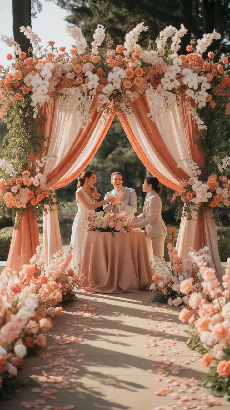
Coral Floral Arrangements For A Peach And Coral Wedding
How To Style Ceremony And Reception Florals For A Peach And Coral Wedding
Anchor the ceremony space with high-contrast saturation. Use dark coral peonies against light peach ranunculus to create visual depth. Place these arrangements at eye level on pedestals or aisle markers. This technique ensures the colors do not wash out under bright natural light. Select matte containers like terracotta or stone. These materials absorb light and allow the vibrant floral pigments to stand out.

Transition to the reception by varying the height of tabletop centerpieces. Use low, dense arrangements for guest tables to encourage conversation. Incorporate peach garden roses as the base layer for mass. Intersperse tall glass vases with coral snapdragons or gladiolus to add vertical movement. This layered approach mimics natural growth patterns. It provides a sophisticated look that keeps the venue from appearing flat or monotone.
To paint with living things is the most beautiful art of all, where coral blooms glow like memories of a summer sunset.
— Gertrude Jekyll
Bridal Bouquet Ideas That Bring Together Coral And Peach Blooms Beautifully
Construct a balanced bridal bouquet using the Rule of Thirds. Devote two-thirds of the arrangement to soft peach tones like Juliet roses. Use the remaining third for bold coral accents like Sunset coral peonies. This ratio prevents the intense coral from overpowering the bride. Secure the stems with a silk ribbon that matches the lighter peach shade. This draws the eye upward toward the focal flowers.
Integrate textural shifts to define the shape of the bouquet. Mix velvet-petaled peach carnations with glossy coral hypericum berries. Use silver-toned greenery like eucalyptus to separate the warm tones. This neutral barrier prevents the peach and coral from blending into a single orange blur. Keep the handle slim for comfort during the ceremony. A tight binding ensures the structural integrity of the heavy-headed blooms throughout the day.
Planning Floral DCor For A Coral Pink Wedding Or Coral Color Wedding
Tablescapes And Centerpiece Concepts For A Coral Pink Wedding Aesthetic
Centerpiece design for coral weddings requires strict attention to container selection. Use clean glass or white ceramic to allow the warm tones to pop. Dark wood bases provide a rustic contrast that grounds the bright coral hues. Use height variation to keep the visual path interesting. Tall glass flutes with submerged blooms work well for modern themes. Low, compact bowls create intimate spaces for guest conversation.

Pair coral blooms with neutral linens. White or cream tablecloths prevent the vibrant colors from overwhelming the room. Gold or copper flatware complements the orange undertones in coral flowers. Place single stems in small bud vases to extend the color palette across the entire table. This technique ensures consistent color distribution. Avoid clashing with red or deep purple accents. Stick to green foliage for a classic, professional look.
Seasonal Flower Availability To Consider When Planning A Coral Color Wedding
Floral procurement depends entirely on the calendar. Planners must match flower species to their natural growing cycles to ensure quality and lower costs. Coral varieties are most abundant during the spring and summer months. Importing out of season increases the risk of wilt and doubles the price. Local sourcing ensures stems stay stiff and vibrant throughout the wedding event. Choose hardy species for outdoor venues.
- Coral Charm Peonies: These large blooms are available during late spring and early summer. They change color from deep coral to ivory as they open. This shift provides a dynamic look for weekend long events.
- Sunset Zinnias: Available during the hot summer months, these flowers tolerate high heat without drooping. They offer a flat, disc shaped form that creates texture. Use these for sturdy outdoor centerpieces or bouquets.
- Ranunculus: These multi petaled flowers peak in late winter and early spring. They provide a refined, structured look for formal arrangements. Their thick stems make them excellent for handheld bouquets that must survive the day.
- Dahlias: Look for these during the late summer and early autumn. They offer geometric precision and large heads that fill space quickly. They come in many shades that range from pale peach to vibrant coral.
- Hypericum Berries: These accents are available year round but look best in late summer. Use them to add texture and a secondary coral tone to greenery heavy designs. They are durable and resist bruising during transport.
Smart planners use roses as a reliable backup when seasonal blooms fail. Varieties like Free Spirit or Miss Piggy provide consistent coral shades year round. Always verify the specific variety with the wholesaler six weeks early. Market fluctuations affect the supply of rare imports. Stabilize your design with greenery if primary focal flowers are scarce. This strategy maintains the aesthetic while respecting the budget.
Caring For And Preserving Your Coral Floral Arrangements
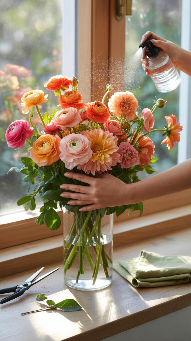
Essential Post Arrangement Care Tips To Extend The Life Of Fresh Coral Blooms
Hydration is the primary factor for maintaining coral pigments in fresh cut flowers. Cut stems at a sharp forty five degree angle under running water to prevent air embolisms. Use clean shears to avoid crushing the vascular tissue of the plant. Change the water every twenty four hours to stop bacteria growth. Bacteria block the stems and cause coral petals to wilt and brown.
Temperature control prevents premature aging of the blooms. Keep arrangements away from direct sunlight and heat drafts. High heat causes rapid transpiration and fades deep coral hues to a pale orange. Remove any foliage that sits below the water line to maintain clarity. Use professional grade floral preservative to provide sugar and acid balance. These steps keep the vascular system open and functional.
When To Consider Dried Or Artificial Flowers For Long Lasting Coral Displays
Choose dried or artificial coral flowers for high traffic areas or permanent installations. Natural coral pigments in fresh flowers like peonies and poppies oxidize quickly when exposed to air. Artificial silk or polymer options maintain color consistency indefinitely. These materials work best for corporate lobbies or seasonal home staging where maintenance is impossible. They eliminate the risk of water damage to antique furniture or textiles.
The Victorian era popularized dried floral preservation for long term display. Modern techniques like silica gel drying preserve the exact structure of coral roses and zinnias. Use these methods when the specific color match is critical for a design scheme. Dried arrangements require zero water and only occasional dusting with compressed air. This approach provides a high return on investment for large scale events and retail window displays.
Frequently Asked Questions

What are the best flower varieties for creating coral floral arrangements?
To achieve the perfect peach-pink balance, look for varieties like ‘Miss Piggy’ or ‘Free Spirit’ roses, which are famous for their vibrant sunset hues. Peonies in ‘Coral Charm’ are another spectacular choice for texture. Incorporating ranunculus or snapdragons in these warm tones adds depth and movement, ensuring your coral floral arrangements look professionally curated and seasonally appropriate for everything from spring brunches to summer weddings.
How do I choose a color palette that complements coral flowers?
Design stunning coral floral arrangements by pairing them with soft eucalyptus greens or dusty miller for a romantic, muted contrast. If you prefer a bolder look, try combining coral blooms with vibrant turquoise accents or deep navy blue vases to make the warm tones pop. For a classic, sophisticated aesthetic, stick to a monochrome palette by layering various shades of apricot, peach, and terracotta to create sophisticated visual interest.
Can I create a high-end coral look on a limited budget?
Absolutely! You can achieve a luxurious look without the designer price tag by using affordable “filler” flowers in warm tones. Carnations and spray roses are cost-effective options that come in beautiful peach and coral shades. Additionally, foraging for local greenery or using seasonal fruit like halved peaches and citrus in your display can add an upscale, artisanal touch to your centerpiece without requiring an expensive floral order.