Why Floral Bedding Ideas Are The Perfect Starting Point For A Cozy Bedroom Makeover
The Timeless Appeal Of Floral Patterns In Bedroom Design
Floral patterns have dominated textile design for centuries. This trend persists because botanical motifs bridge the gap between nature and indoor living. Historical movements like the British Arts and Crafts movement prioritized these organic forms to counter industrial rigidity. Today, floral bedding remains a staple because it offers visual variety that geometric patterns often lack. Designers use these prints to create a sense of heritage and permanence.
Choosing floral patterns provides a reliable design foundation. These motifs do not go out of style quickly. They offer a versatile range of scales from small ditsy prints to large scale botanical illustrations. This variety allows homeowners to select a style that fits their specific architecture. Standard cotton or linen fabrics with floral prints provide durability and breathability. These materials ensure the bedding functions well while maintaining its aesthetic value over time.
How Floral Bedding Sets The Tone For The Entire Room
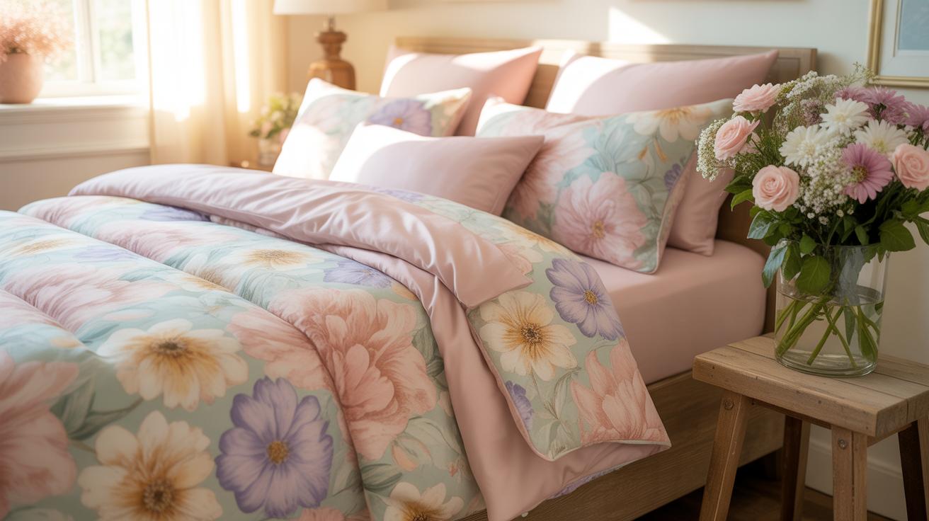
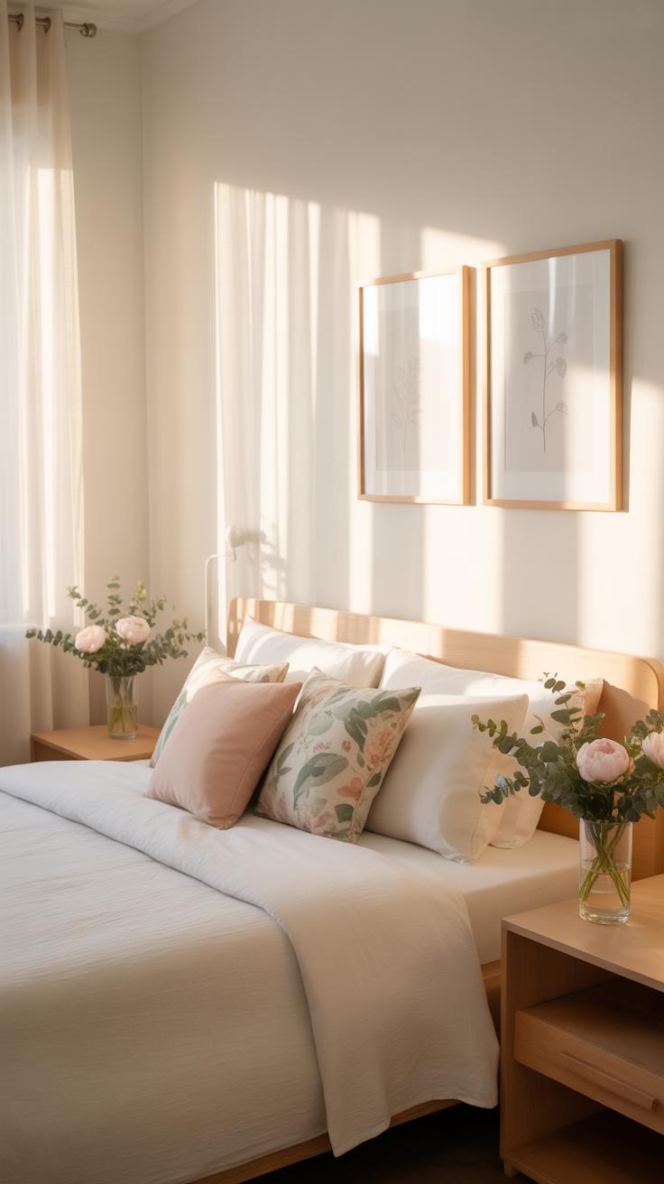
Floral bedding acts as the primary focal point in a bedroom. The bed occupies the largest surface area in the space. Therefore, the pattern you choose dictates the color palette for the walls and flooring. A bold floral print provides several accent colors you can pull for rugs or curtains. This strategy simplifies the decorating process for beginners. It eliminates the need to guess which colors work together in a room.
Setting the tone requires balancing the floral scale with the room size. Large prints create a modern and dramatic feel. Smaller patterns evoke a traditional or country atmosphere. The density of the floral design also affects the perceived temperature of the room. Sparse patterns feel airy and cool. Dense patterns feel heavy and warm. By selecting a specific floral style, you establish a clear design direction without purchasing expensive furniture or hardware.

Understanding The Basics Of Floral Bedding Before You Shop
What To Look For In Quality Floral Bedding Sets
Focus on the print method and thread count to determine product longevity. High quality floral patterns use reactive printing or yarn dyeing rather than surface pigments. Sharp details and clear color boundaries indicate superior manufacturing. Check the reverse side of the fabric to see how deep the ink penetrates. Faded or blurry edges on the pattern signal a lower grade of production that will degrade quickly.
Analyze the construction of the seams and the closure systems. Quality sets feature reinforced stitching and hidden zippers or oversized buttons. Single-needle stitching often fails under tension during laundering. Look for high thread counts between 300 and 500 for a balance of strength and breathability. Avoid excessively high numbers that use thin, multi-ply threads. These threads break easily and create a rough texture over time.
Common Fabric Types Used In Floral Bedding And What They Mean For Comfort
Cotton remains the standard for floral bedding because it takes dyes well. Long-staple cotton like Pima or Egyptian provides a smooth surface for intricate floral prints. This material breathes well and regulates temperature throughout the night. It also resists pilling better than synthetic blends. Choose cotton if you prioritize skin health and moisture wicking. It becomes softer with every wash cycle without losing its structural integrity.
Linen and sateen offer different tactile experiences for floral designs. Linen provides a textured, matte look that fits rustic or vintage floral styles. It is durable but wrinkles easily due to its stiff fiber structure. Sateen uses a specific weave to create a slight sheen and silky feel. This weave highlights the vibrancy of colorful flower patterns. Select sateen for a formal look or linen for a relaxed, lived-in aesthetic.

Choosing The Right Floral Duvet Cover For Your Bedroom Style
How To Match A Floral Duvet Cover To Your Existing Bedroom Colors
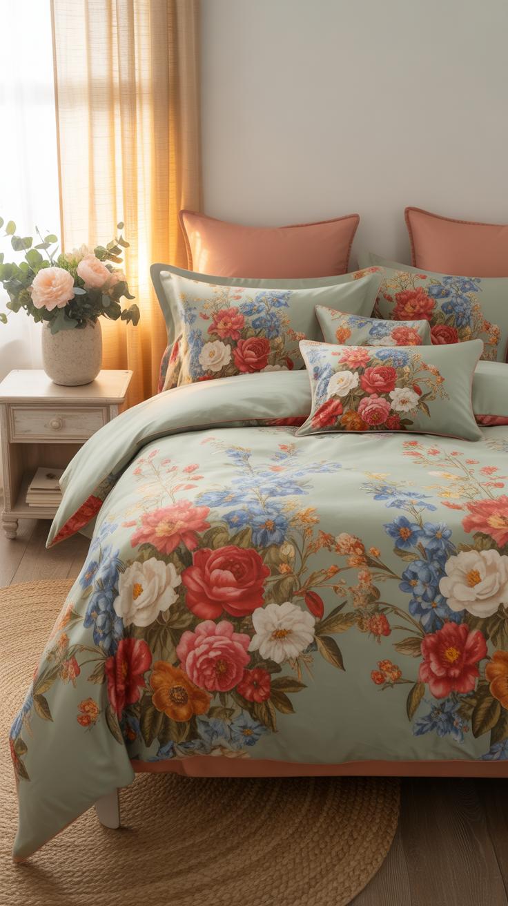
Select a floral print that contains the dominant color of your walls. This creates a cohesive look without clashing. If your walls are neutral, choose a duvet with a bold base color. This makes the bed the focal point of the room. Use the secondary colors in the floral pattern for your throw pillows. This technique ties the entire color palette together.
Contrast is a powerful tool for visual balance. Pair cool blue floral patterns with warm wood furniture. This balances the temperature of the room. Avoid matching colors exactly to every piece of furniture. A slight variation in shade adds depth to the design. Always check your fabric swatches under natural light. Artificial light changes how colors appear on cotton and linen materials.
Small Vs. Large Floral Prints: Which Works Best For Your Space
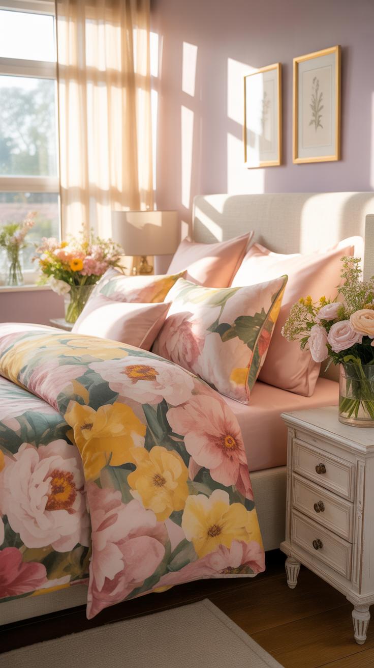
Small floral prints work best in compact bedrooms. These patterns are often called ditsy prints. They originated in the 1920s and provide a vintage aesthetic. Small scales prevent the bed from overwhelming the room. They create a textured look that hides wrinkles well. Use these prints if you want a traditional or cottage style. Small patterns offer a calm and rhythmic visual experience.

Large floral prints demand attention in spacious rooms. These oversized motifs often draw from Chinoiserie or Dutch Golden Age art. Large scales make a strong modern statement. They work effectively on high beds with significant surface area. Do not use large prints in tiny rooms as they make the space feel cramped. Choose large patterns to establish a bold theme quickly. They act as art for your bed.
How To Build A Cozy Bedroom With Floral Decor Without Overwhelming The Space
Balancing Floral Patterns With Solid Colors For A Harmonious Look
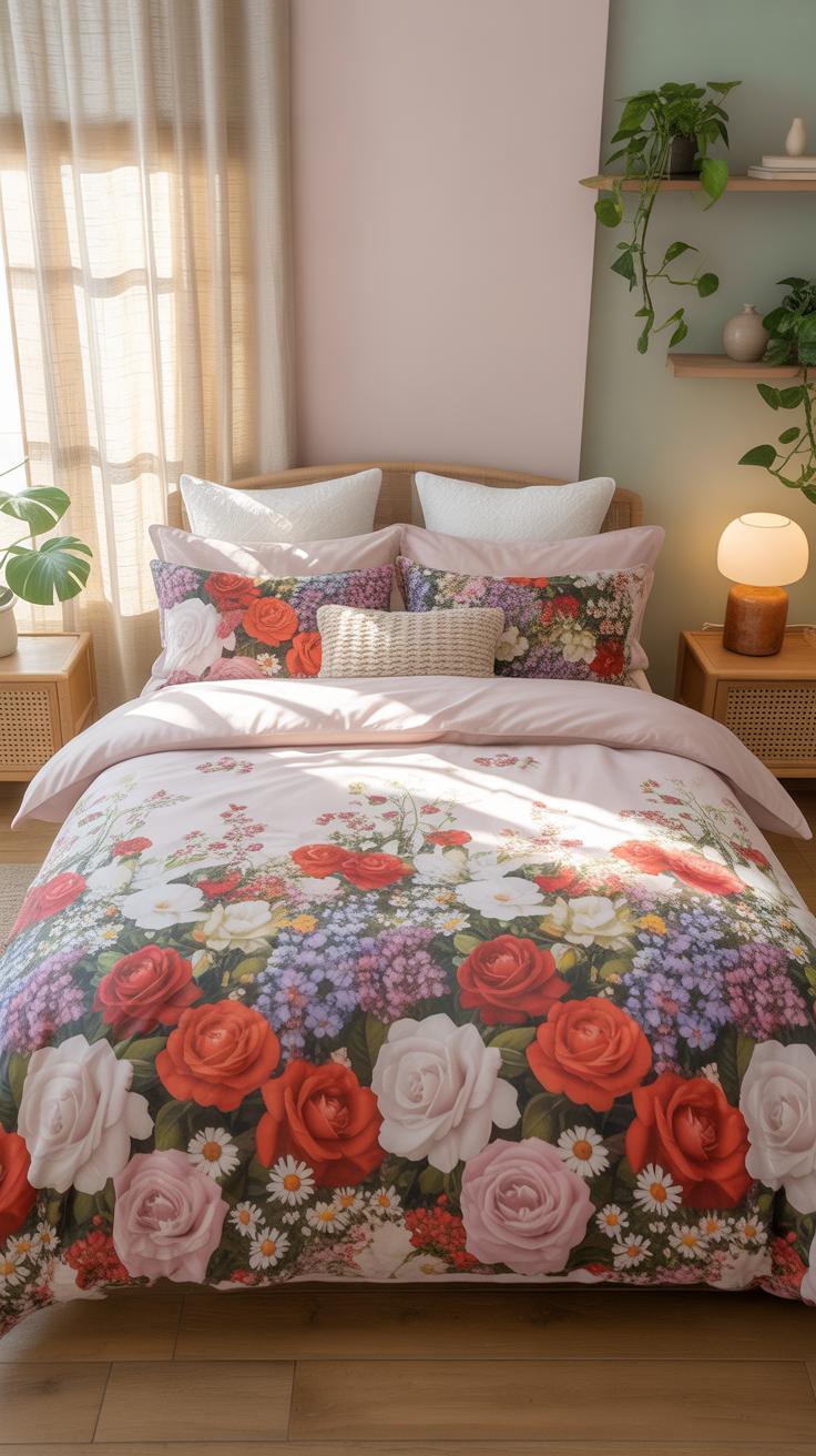
Floral bedding demands a visual anchor to prevent a chaotic atmosphere. Use solid colors to break up complex botanical prints. Select a neutral base color from the background of your floral pattern. This technique grounds the room and directs the eye. Match your sheets or coverlet to this solid tone. It creates a professional look that stabilizes the busy design.
Modern design principles rely on the sixty-thirty-ten rule for color distribution. Assign sixty percent of the room to a solid primary neutral. Dedicate thirty percent to your floral bedding as the focal point. Use the remaining ten percent for sharp accent colors found within the petals or leaves. This ratio prevents the floral patterns from dominating the entire space. It ensures a calculated and balanced aesthetic.
Layering Textures Alongside Floral Bedding To Add Warmth And Depth
Texture provides the physical substance that floral prints lack on their own. Combining different materials prevents the room from looking flat or dated. Pair a cotton floral duvet with a chunky wool knit throw or a heavy linen quilt. These tactile changes create shadows and highlights. The contrast between smooth fabric and rough weaves adds immediate sophistication to any basic bedroom setup.

History shows that successful interior design uses material weight to create comfort. Incorporate natural fibers like silk, velvet, or leather in small doses. These materials interact with light differently than standard printed cotton. Place a velvet bolster pillow against a floral headboard to establish depth. This strategic layering mimics the complexity found in high-end design movements. It elevates the bedding from a simple print to a curated environment.
Beginner Friendly Tips For Styling A Floral Bedroom From Scratch
Simple Rules Beginners Should Follow When Decorating A Floral Bedroom
Start with one dominant floral pattern to avoid visual confusion. This primary print sets the color palette for the entire room. Beginners often fail by mixing too many competing scales. Use a large-scale print for the duvet and keep secondary patterns small or geometric. Consistent background colors unify different textiles. Stick to a limited palette of three colors to maintain a clean look.
- Scale Control: Select one large floral print for the main bed cover. Use smaller ditsy prints or stripes for sheets and shams. This prevents the patterns from fighting for attention.
- Color Pulling: Identify the secondary colors within the floral print. Use these specific shades for your solid colored blankets and rugs. This creates a cohesive design without guesswork.
- Negative Space: Balance busy patterns with solid blocks of color. White or cream walls provide a rest for the eyes. Avoid covering every surface in floral prints to keep the room modern.
- Texture Variation: Mix different fabric weights and weaves. Pair a smooth cotton floral duvet with a chunky knit wool throw. Texture adds depth when you use limited color palettes.
- Grounding Elements: Use wood or metal furniture to anchor the soft patterns. Natural oak or dark iron frames stop the room from looking too delicate. Structural lines balance organic flower shapes.
Follow the rule of three when mixing patterns in a space. This technique comes from classic interior design principles found in English Country styles. Combine your main floral with a stripe and a solid. Ensure at least one color appears in every piece. This strategy creates a professional look without requiring an expensive designer or advanced artistic skills.
How To Use Accent Pillows And Throws To Complement Your Floral Bedding
Accent pillows provide the easiest way to change the room mood. Select pillows in a solid color found in the floral petal or leaf. Place larger square pillows at the back and smaller rectangular ones in front. This layering technique builds height and interest on the bed. Avoid using pillows with the exact same floral print as the duvet cover.
Throw blankets add necessary weight to the foot of the bed. Choose a throw in a heavy texture like waffle weave or cable knit. Drape the blanket horizontally across the bottom third of the mattress. This breaks up the floral pattern and grounds the bed visually. Use a darker shade for the throw to hide wear and provide a strong visual base.
Exploring The Cottagecore Rooms Bedrooms Aesthetic With Floral Bedding
What Is The Cottagecore Aesthetic And Why Floral Bedding Fits It Perfectly
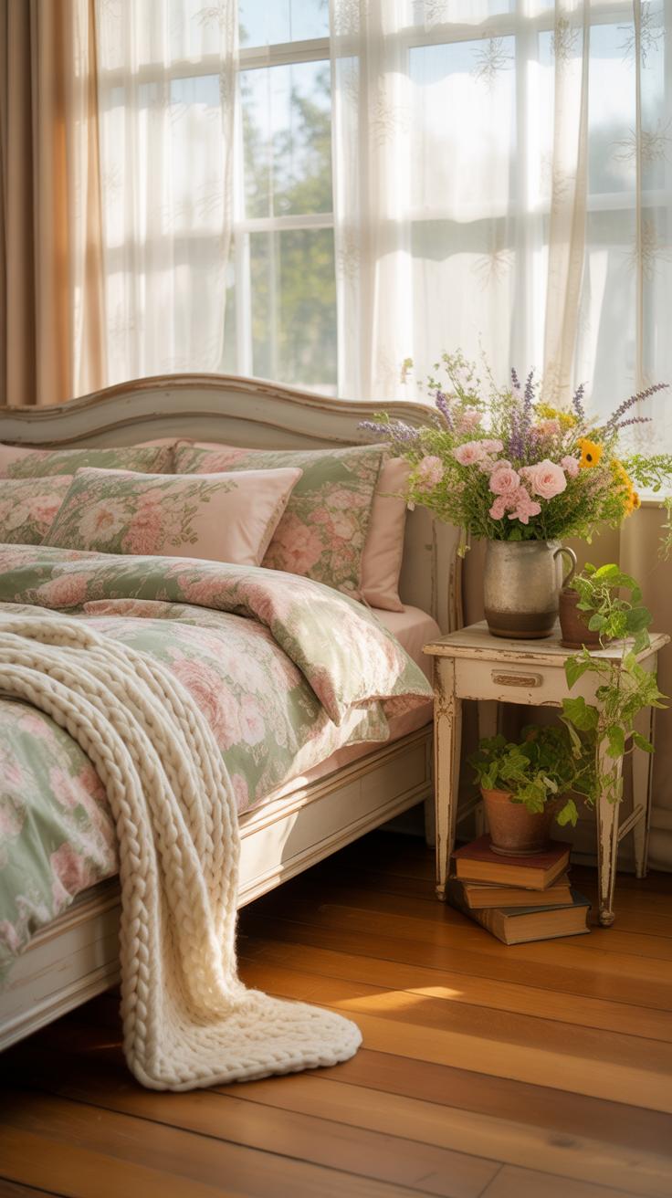
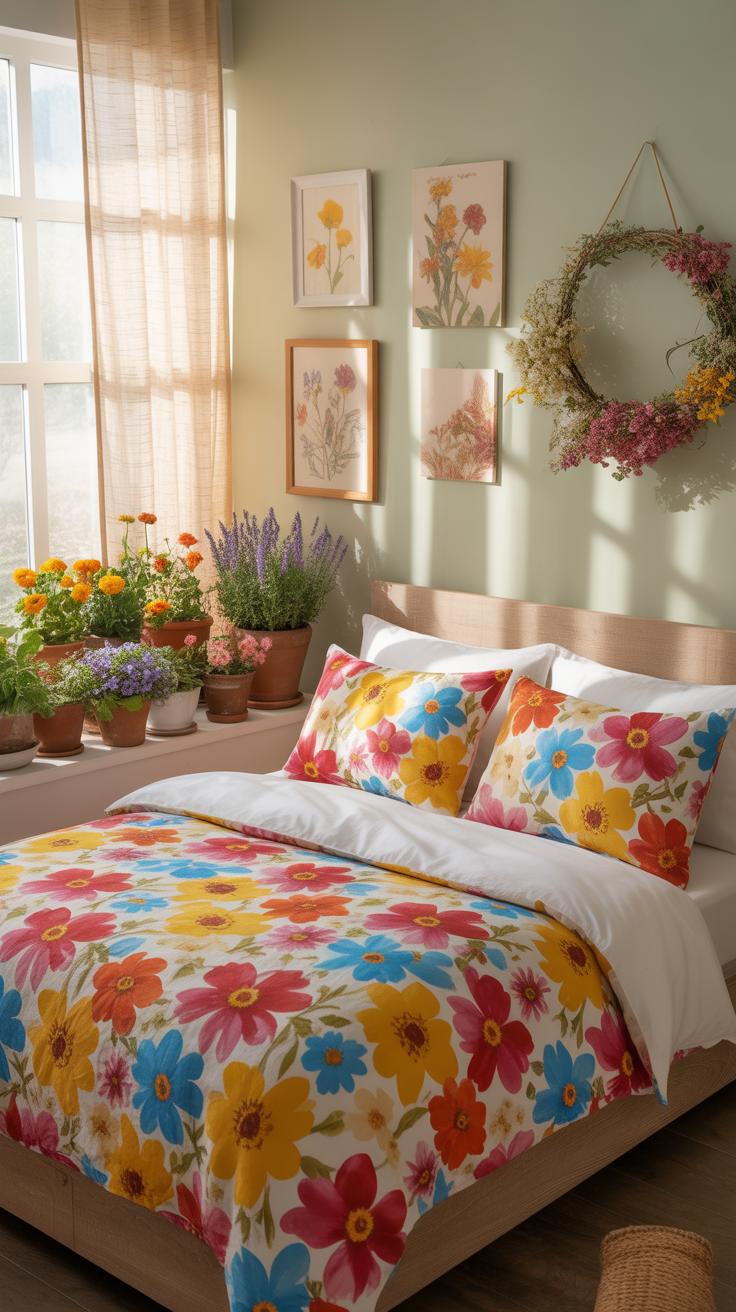
Cottagecore is a modern design movement that celebrates traditional rural life. It draws heavily from the English countryside style and Arts and Crafts principles. This aesthetic rejects modern minimalism in favor of comfort and history. Floral patterns are the foundation of this look. They bridge the gap between indoor living and the natural world. Botanical prints create a sense of heritage and calm.
Floral bedding serves as the primary visual anchor in a Cottagecore bedroom. The style relies on nostalgia to create a lived-in feel. Small-scale ditsy prints or larger botanical illustrations provide the necessary texture. These patterns mimic the gardens found near historical cottages. Choosing high-quality cotton or linen reinforces the connection to nature. This choice ensures the room feels authentic rather than like a temporary trend.
A flower does not think of competing with the flower next to it, it just blooms. Transforming your bedroom into a sanctuary of petals is as simple as letting nature guide your hand.
— Zen Shin
Key Decor Elements That Complete A Cottagecore Floral Bedroom

Successful Cottagecore design requires layering different textures and materials. Start with a solid wood or wrought iron bed frame to ground the space. These materials offer the structural weight needed to balance light floral fabrics. Use natural fibers like wool rugs and lace curtains to add depth. Avoid synthetic finishes that look too shiny or plastic. Stick to matte surfaces that age well over time.
Lighting and accessories must support the floral theme without overwhelming it. Use warm-toned bulbs to mimic natural light or candlelight. Distressed furniture pieces provide a sense of history and utility. Incorporate dried flowers or botanical art to echo the patterns on your bedding. This repetition creates a cohesive visual narrative. Keep the color palette muted to maintain a relaxing environment. Every item should feel gathered and purposeful.
Bedroom Decor Cozy Essentials That Pair Well With Floral Bedding
Lighting Choices That Enhance The Cozy Feel Of A Floral Bedroom
Select bulbs with a color temperature between 2700K and 3000K. This warm light mimics the sunset and historical incandescent filaments. It prevents floral patterns from looking clinical or washed out. Position light sources at eye level using bedside lamps or wall sconces. This creates a layered effect that highlights the texture of the fabric. Avoid overhead fixtures that flatten the visual depth of the print.

Incorporate dimmable switches to control the intensity of the light throughout the evening. Soft lighting reduces the contrast between bold floral designs and solid walls. Use pleated fabric shades to diffuse light evenly across the room. These shades reference traditional design movements like the English Country style. Proper diffusion ensures the bedroom feels functional for reading while maintaining a calm environment. Strategic placement eliminates harsh shadows on the bedding surface.
Natural Elements And Plants That Work Beautifully Alongside Floral Bedding
Pair floral patterns with solid green foliage to balance the visual energy. Live plants like the Snake Plant or ZZ Plant provide a structural contrast to soft petal motifs. Use raw wooden furniture to ground the room. Mid-century modern or rustic oak finishes provide a neutral backdrop. These materials prevent the floral patterns from overwhelming the space. Natural wood grains add a layer of organic texture that complements fabric fibers.
Utilize clay or terracotta pots to introduce earthy tones into the decor palette. These materials pull warmth from the floral print and ground the design. Keep the plant selection simple to avoid clashing with the busy bedding patterns. Large-leaf varieties offer a bold visual break from intricate floral details. This technique creates a cohesive look by blending manufactured prints with real biological forms. Focus on height variety to draw the eye upward.
Seasonal Floral Bedding Ideas To Refresh Your Bedroom Throughout The Year
Spring And Summer Floral Bedding Palettes That Feel Light And Airy

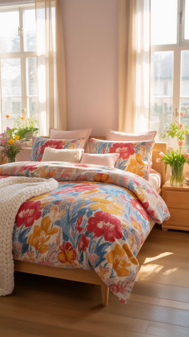
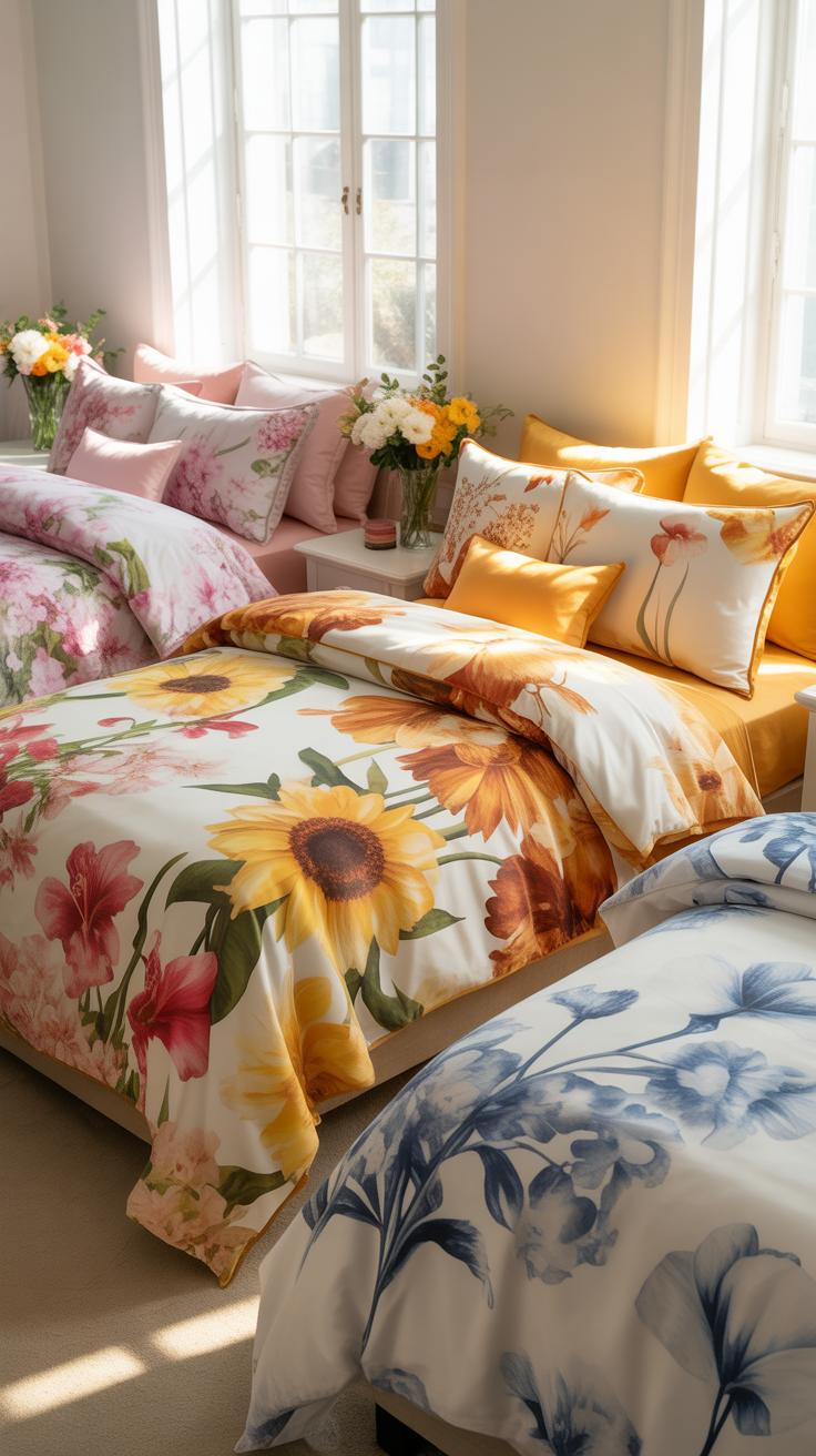
Spring and summer require breathable fabrics like cotton percale or linen. These materials allow air flow and moisture wicking. For spring, select small scale prints often called ditsy florals. Use pastel color palettes like lavender, mint, and soft yellow. This style mirrors the Art Nouveau movement where natural forms meet clean lines. Ensure the background fabric is white or cream to reflect sunlight.
Summer shifts toward bolder botanical prints. Large leaf patterns and tropical florals work best. Use high contrast colors like coral against sage green. This approach follows the Coastal design aesthetic which prioritizes open space. Avoid heavy quilts or thick polyester blends during these months. Stick to low thread counts between two hundred and four hundred. This range provides the most comfort in high temperatures.
Autumn And Winter Floral Bedding Combinations For A Warm, Cozy Bedroom
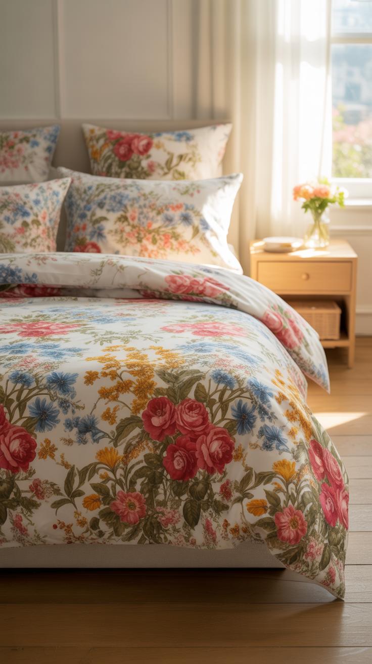
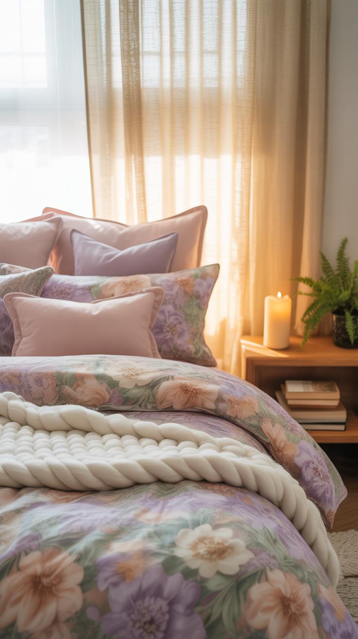
Winter floral bedding relies on dark grounds to create weight. Choose navy, charcoal, or forest green backgrounds. These colors absorb heat and visually ground the room. Select patterns featuring oversized blooms like peonies or roses. This style draws from Dutch Golden Age still life paintings. Use heavier fabrics like cotton flannel or velvet. These materials trap body heat and provide necessary insulation.
Layering is the main tactic for autumn transitions. Start with a neutral floral sheet set. Add a heavy pick stitch quilt or a wool throw. Use earth tones like ochre, terracotta, and burnt orange. These shades represent natural decay seen in the seasonal cycle. Avoid bright whites or thin silks that feel cold to the touch. Focus on texture to add physical warmth without cluttering the bed space.
Budget Friendly Ways To Create A Beautiful Floral Bedroom On Any Income
Where To Find Affordable Floral Bedding Sets Without Sacrificing Quality
High volume retailers offer the best price to quality ratio for floral shoppers. Target and IKEA dominate this space by utilizing mass production to lower unit costs. Look for 100 percent cotton or cotton blends to ensure durability over multiple washes. These stores frequently update collections based on seasonal design trends. You get modern patterns without paying the premium associated with designer labels or specialty boutiques.
Off-price retailers like TJ Maxx or HomeGoods provide access to high end inventory at steep discounts. These stores sell overstock from luxury brands. Inspect the thread count and fabric weave before purchasing. Sateen weaves offer a smooth feel while percale stays cool. Check the clearance section during seasonal transitions in January and July. You can find high quality floral sets for a fraction of their original retail price.
DIY Floral Bedroom Decor Ideas That Cost Very Little But Look Stunning
You can transform a plain room into a floral sanctuary using basic materials and focused effort. Low cost decor relies on repetition and scale rather than expensive singular items. Use existing items or inexpensive craft supplies to mirror the patterns found in your bedding. This creates a cohesive design look without a professional decorator. Focus on the walls and furniture surfaces to maximize visual impact.
- Nature Pressed Wall Art: Collect local wildflowers and press them between heavy books for two weeks. Mount the dried specimens on acid free paper and place them in simple glass frames. This technique provides authentic botanical decor for the cost of basic frames.
- Fabric Scrap Pillow Covers: Buy floral fabric remnants from local craft stores at a heavy discount. Sew simple envelope closures to create custom throw pillows that match your bedding. This allows you to introduce high quality patterns without buying brand new designer pillows.
- Stenciled Wooden Furniture: Apply floral stencils to old nightstands or headboards using chalk paint. This method revives worn furniture and integrates it into your theme. Sand the surface lightly before applying paint to ensure the floral pattern adheres properly and resists chipping.
- Botanical Decals: Use removable vinyl floral decals to create a focal point behind the bed. These stickers offer a wallpaper look without the high cost or permanent commitment. Choose matte finishes to avoid a plastic appearance and ensure the colors match your primary bedding.
- Embellished Plain Curtains: Sew floral trim or ribbon along the edges of inexpensive white curtains. This small detail ties the window treatments to the floral bedding. It elevates basic window coverings and makes them look like custom designer pieces for just a few dollars.
Balance these DIY elements to avoid cluttering the visual space. Choose one large project or three small ones to maintain professional design standards. Stick to a consistent color palette derived from your main duvet or quilt. Using the same floral motifs across different mediums creates a unified aesthetic. This strategic approach ensures your bedroom looks expensive and curated despite a very limited total project spend.
Common Mistakes Beginners Make With Floral Bedding And How To Avoid Them
Why Mixing Too Many Competing Patterns Can Disrupt Your Bedroom’S Visual Balance
Beginners often select multiple bold floral prints without a unifying element. This error creates visual noise and prevents the eye from resting. A successful design requires a clear focal point. If the duvet features a large botanical print, the pillows and shams should remain neutral or use a subtle texture. Mixing patterns without a common color palette causes the room to feel cluttered.
Professional designers apply the sixty-thirty-ten rule to manage color and pattern density. Sixty percent of the room should be a dominant color. Thirty percent is the secondary color, often found in the floral bedding. The final ten percent serves as an accent. Use solid colors to break up busy patterns. This technique creates a cohesive look and ensures the floral elements enhance rather than overwhelm the space.
How To Avoid Choosing The Wrong Scale Of Floral Print For Your Room Size
The scale of a floral print must match the physical dimensions of the furniture and the room. Large-scale oversized florals overwhelm small guest rooms and twin beds. They make the space feel cramped and disorganized. Conversely, tiny ditsy prints disappear in large master suites. These small patterns lose their impact when viewed from a distance. Scale dictates how the brain processes the layout.
Evaluate the ceiling height and floor space before buying bedding. Small rooms benefit from medium-scaled patterns with plenty of negative space. This strategy makes the room appear larger by showing more of the background color. In large rooms, use bold and expansive prints to fill the visual void. Always balance the print size with the actual surface area of the duvet to maintain proportion.
Frequently Asked Questions

How do I choose a floral pattern if I am new to interior design?
For beginners, the best approach is to start with a “micro-floral” print or a soft watercolor design. These smaller, subtle patterns act as a neutral base, making it easier to coordinate with your existing furniture. When exploring floral bedding ideas, look for a color palette that shares at least one shade with your bedroom walls to ensure the new design feels cohesive and intentional rather than overwhelming for the space.
Can I find beautiful floral bedding if I am on a tight budget?
Absolutely! You don’t need a designer budget to refresh your room. Many affordable retailers offer high-quality microfiber or cotton-blend options that look high-end. Another great tip for beginners is to purchase floral pillow shams or a patterned quilted throw instead of a full comforter set. This allows you to experiment with different floral bedding ideas and seasonal styles for a fraction of the cost while still achieving a stunning botanical transformation.