What Makes A Floral Gallery Wall Work In Any Home
The Core Elements That Define A Cohesive Floral Gallery Wall
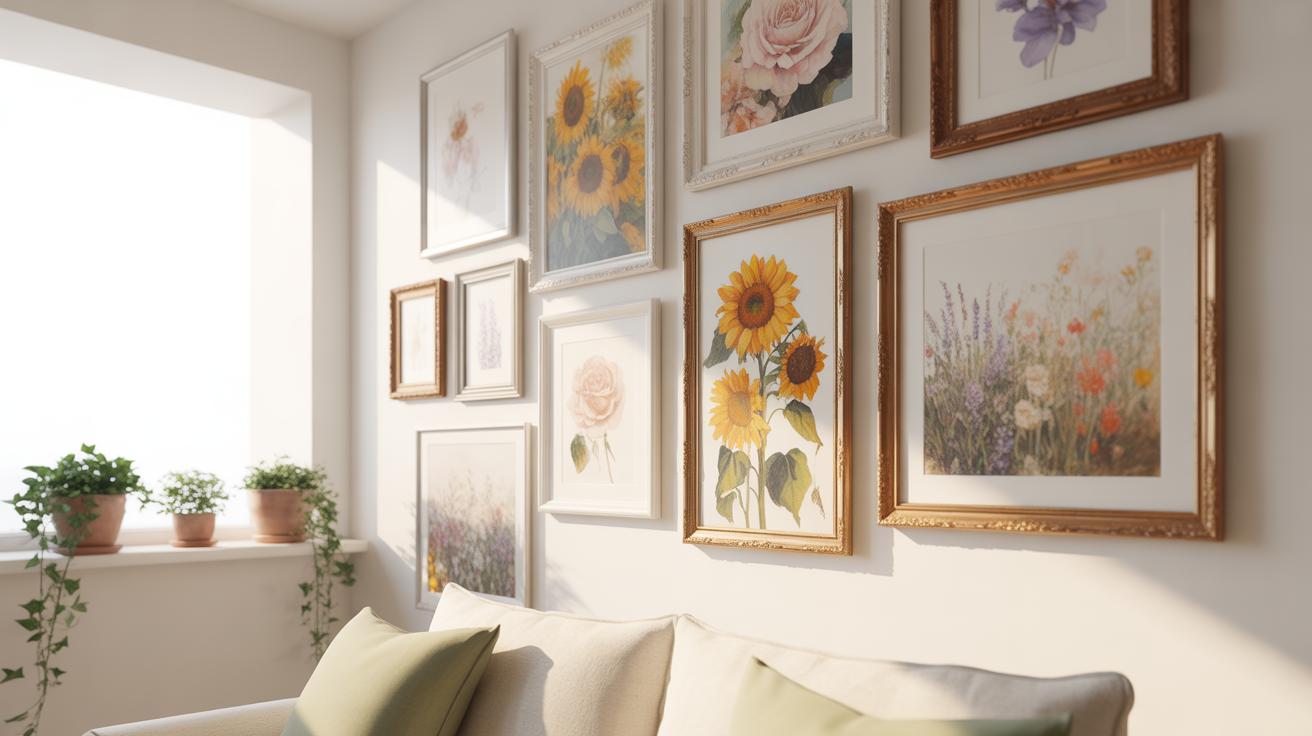
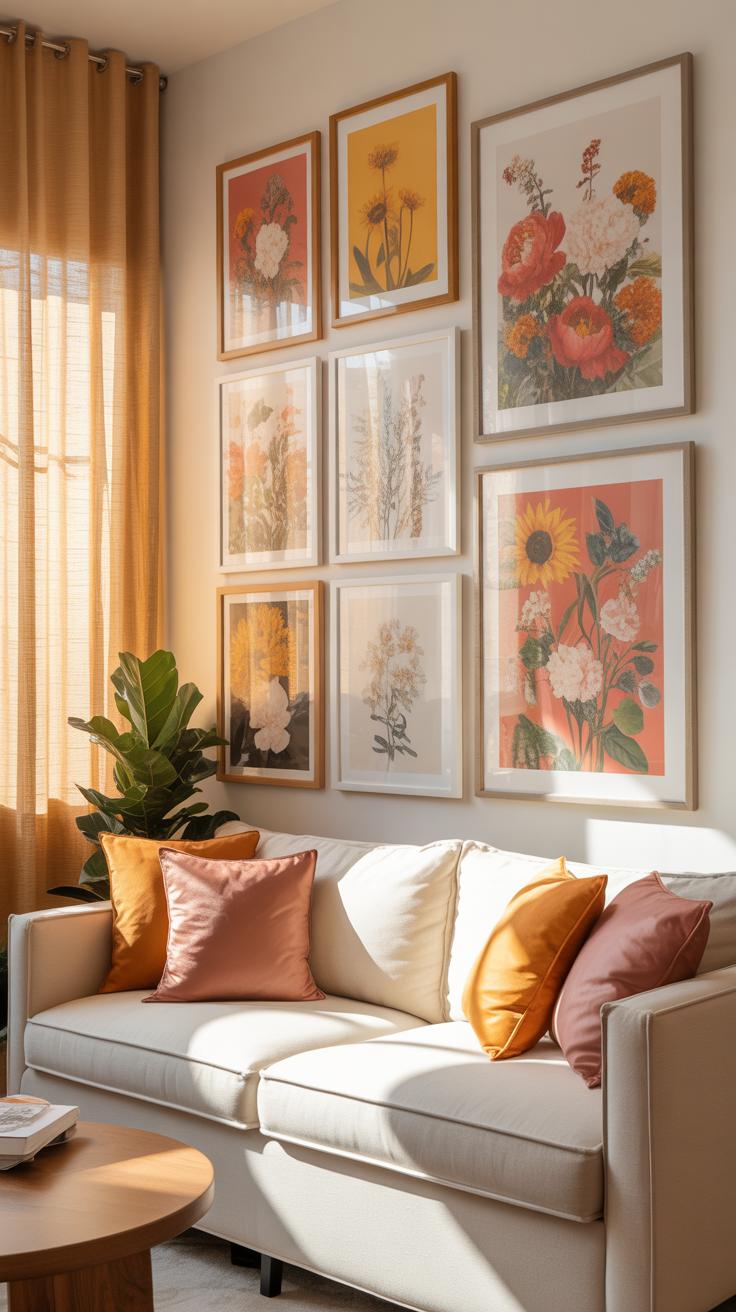
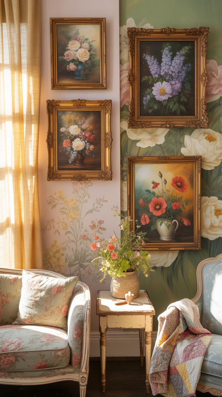
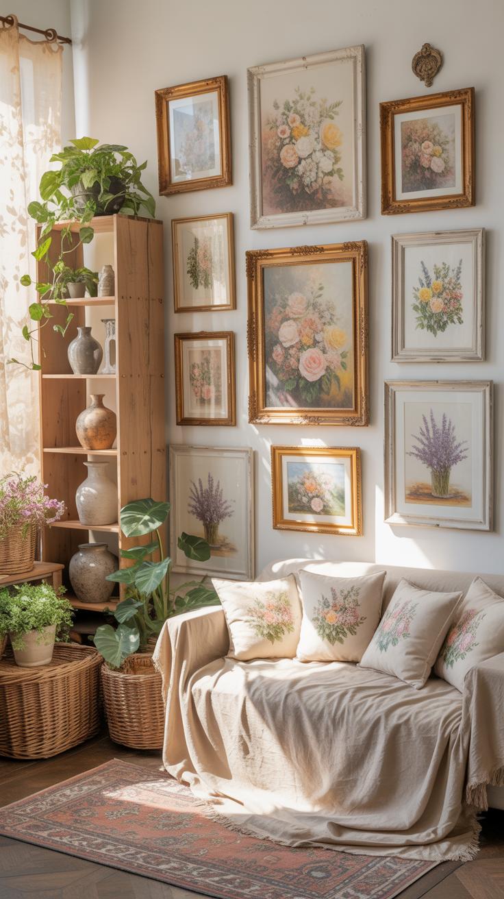
A successful floral gallery wall relies on structural balance and varied media. You must mix different types of floral representations to create depth. Combine high-resolution photography with pressed botanicals or vintage etchings. This mix prevents the display from looking like a flat wallpaper. Use frames with consistent depths or colors to anchor the diverse subjects. Strong layout choices ensure the eye moves naturally across the wall.
Scale is the final critical element for any floral arrangement. You should place a large anchor piece in the center or slightly off-center to ground the collection. Surround this focal point with smaller studies of stems or buds. This hierarchy mimics natural growth patterns found in real gardens. Distribute visual weight evenly so no single corner feels too heavy. Proper spacing keeps the individual floral details from becoming visual clutter.
How To Choose A Visual Theme That Ties Your Floral Pieces Together
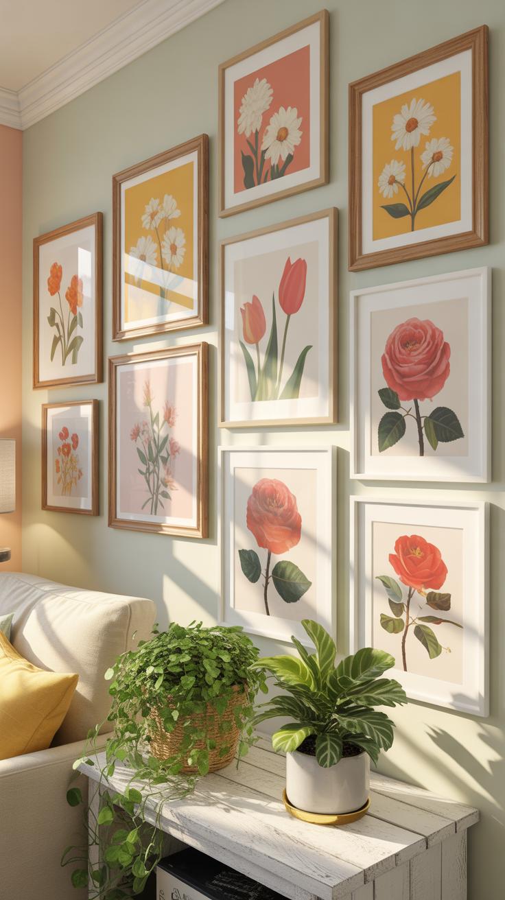
A visual theme provides the logic for your entire collection. You can choose a theme based on a specific botanical era or a color palette. For example, Victorian botanical illustrations use scientific precision and muted tones. In contrast, modern abstract florals use bold shapes and bright colors. Stick to one style to keep the wall looking intentional. Mixed themes often confuse the viewer and reduce the impact of the art.
Color coordination serves as the most effective anchor for your floral gallery. Select two or three dominant colors found in the petals or leaves of your prints. Ensure these colors repeat throughout the display to create a rhythm. You can also group plants by their natural habitat or season. This approach creates a narrative that guides the viewer through the display. Consistency in your theme makes the hardware and frames feel like part of the art.
Beginner Friendly Floral Gallery Wall Ideas To Start With
Simple Layout Arrangements That Look Polished Without The Guesswork
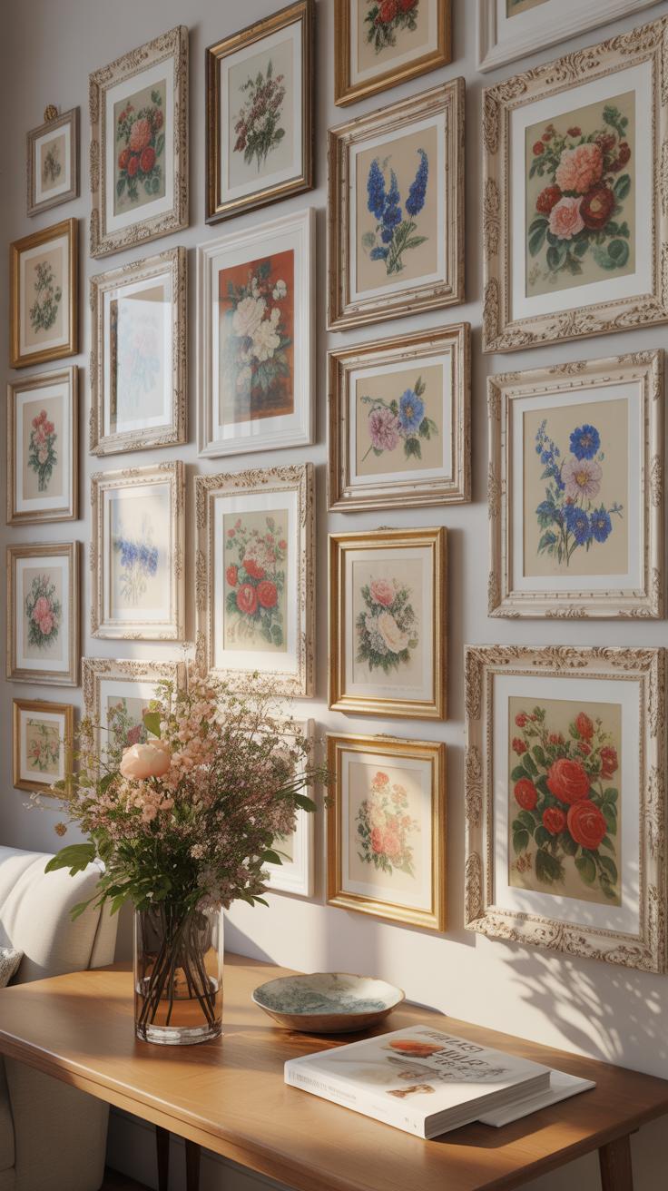
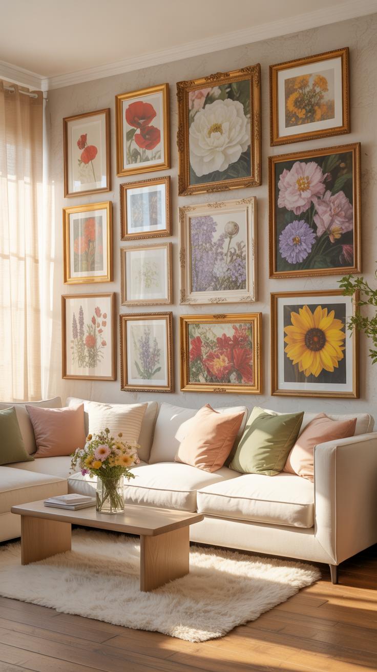
Grid layouts offer the highest success rate for beginners. This method uses a structured rows and columns format. You must use identical frame sizes and matching spacing between each unit. This approach mirrors the disciplined botanical studies of the Victorian era. It forces a clean look even if the floral prints vary in color. A three-by-three grid fills a standard wall space effectively.
Triptych arrangements provide a faster alternative for smaller spaces. Secure three vertical frames in a horizontal line. Maintain exactly two to three inches between each frame. This linear setup works well over furniture like sofas or consoles. It creates a focal point without requiring complex planning. Align the center of the middle frame at eye level. This height usually sits sixty inches from the floor.
Affordable Floral Prints And Where To Find Them For Your First Wall
Public domain archives provide high-quality botanical illustrations for free. Sites like the Biodiversity Heritage Library host thousands of historical plates. These files date back centuries and feature accurate scientific details. You can download high-resolution scans and print them at a local shop. This method saves money on licensing fees. It also allows you to choose specific species that match your room color palette.
Digital marketplaces offer instant downloads of curated floral sets. Search for vintage botanical bundles to get a cohesive look quickly. Many sellers specialize in restored 19th-century prints. Thrift stores and used bookstores are also viable sources for physical materials. Look for old nature encyclopedias or gardening books with intact plates. You can cut these pages out and frame them for a low-cost authentic aesthetic.
How To Style A Vintage Floral Gallery Wall With Character
Sourcing Vintage Floral Art And Botanical Prints That Feel Authentic
Find authentic botanical prints by looking for 18th and 19th-century scientific illustrations. Pierre-Joseph Redouté and Maria Sibylla Merian produced the most accurate historical works. Seek out original copperplate engravings or lithographs from old encyclopedias at estate sales. These prints show precise anatomical details of plants. Genuine aged paper has a distinct weight and natural yellowing that modern digital reproductions cannot perfectly replicate.
Verify authenticity by checking for visible plate marks or registration lines from the printing process. Look for Latin nomenclature printed at the bottom of the page. This reflects the scientific standard of the Victorian era. Avoid bright white papers or glossy finishes common in cheap modern reprints. Use acid-free mats to preserve the paper if you find original pages. Focus on high-quality scans of public domain archives for a budget-friendly alternative.
Mixing Frame Styles And Finishes To Enhance A Vintage Floral Gallery Wall
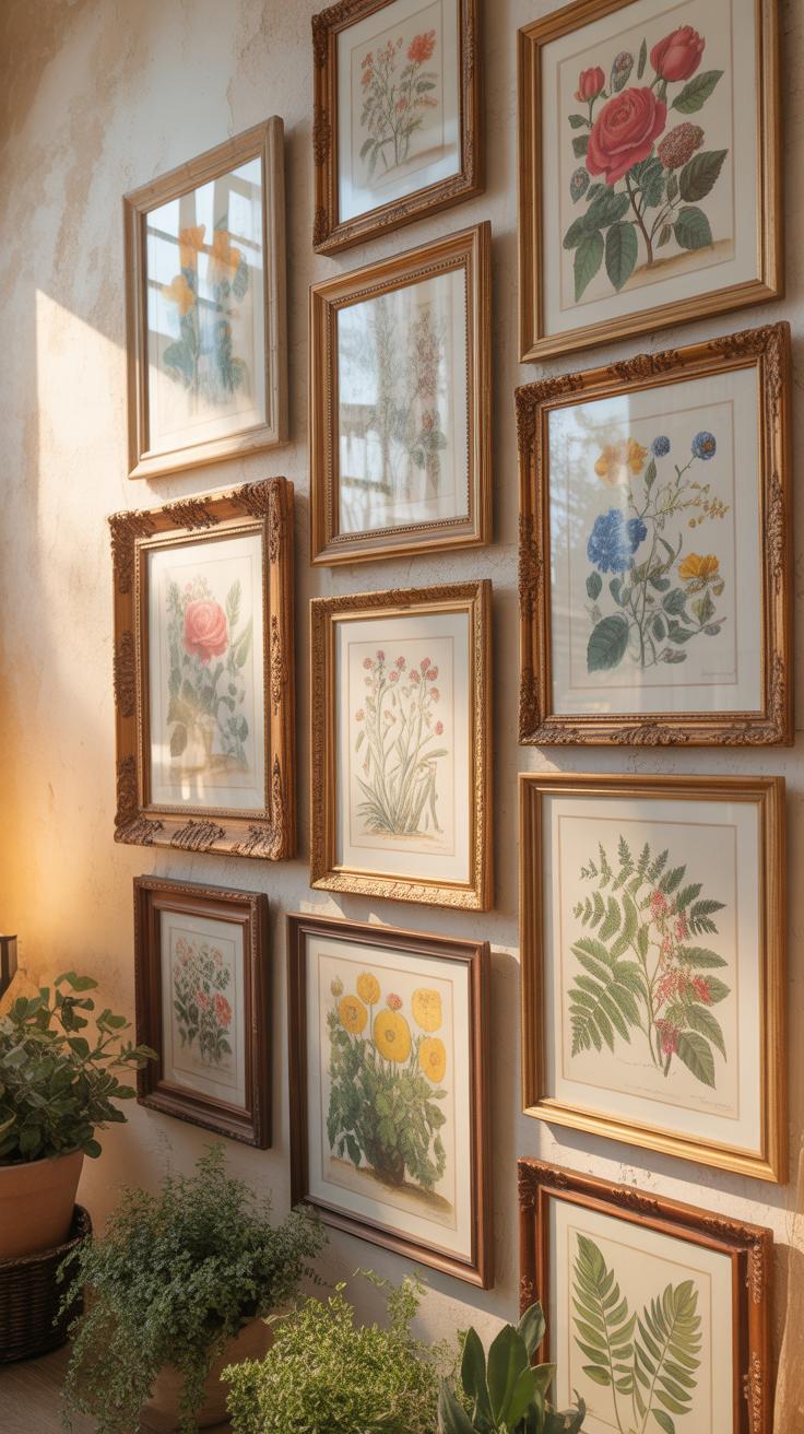
Mixing frames adds depth and history to a gallery wall. Use a combination of gilded wood, dark mahogany, and tarnished brass finishes. These materials represent different design eras like the Rococo or Edwardian periods. Avoid matching sets because they look clinical and mass-produced. Select frames with varied profiles to create visual contrast. Heavy ornate frames ground larger prints while thin metallic frames work for smaller delicate sketches.

Pay attention to the patina on the frame surfaces. Real vintage frames often show minor chips or oxidation which adds character. Contrast a deep shadow box frame with a flat beaded edge frame to break the visual plane. Ensure the weight of the frame matches the visual scale of the floral subjects. Incorporate wood with visible grain to provide a natural texture. This creates a curated look that suggests the collection grew over many years.
Creating A Vintage Floral Art Gallery Wall Using Botanical Illustrations
The History And Appeal Of Botanical Illustration As Wall Art
Botanical illustration started as a scientific tool. Doctors and herbalists needed accurate drawings to identify medicinal plants. During the Age of Enlightenment, explorers hired artists to document new species. These works prioritize accuracy over creative expression. Using these prints today connects your room to centuries of biological study. They offer a formal look that newer floral patterns often lack.
The appeal lies in the technical detail of the linework. Traditional explorers used copperplate engraving and hand-colored lithography. These methods created sharp edges and realistic colors. Vintage illustrations bring a sense of order to a gallery wall. They work well in modern homes because they balance organic shapes with structured layouts. This style bridges the gap between scientific history and high-end interior design.
How To Arrange Botanical Prints For A Layered And Timeless Display
Start with a grid layout for these prints. Botanical art looks best when you repeat its formal structure. Use matching frames to create a clean and organized appearance. Dark wood or thin gold frames suit the historical nature of the paper. Keep the spacing tight between frames to make the collection feel like one large piece. This creates a strong focal point.
Mix different sizes to add visual depth to the wall. Put larger prints in the center and smaller ones around the edges. Use off-white or cream mats to mimic the look of aged paper. Avoid bright white mats because they clash with vintage ink tones. Lay your frames on the floor first to test the arrangement. This prevents mistakes and ensures the final display looks professional.
Vintage Floral Wall Decor Inspiration For Every Room In The House
Room By Room Guide To Placing Floral Wall Decor For Maximum Impact
Place vintage botanical prints at eye level in high traffic entryways to set an immediate stylistic tone. Use large scale Victorian era lithographs to anchor a living room sofa. These heavy frames require wall studs for safety. Small kitchen nooks benefit from grouped herb illustrations. Ensure every frame sits at least six inches away from door frames or corners to prevent a cluttered look.
Bedrooms require a more symmetrical arrangement to promote visual calm. Center a primary floral piece above the headboard and flank it with smaller sketches. In hallways, use a linear layout to guide movement through the space. Avoid placing delicate paper prints in bathrooms with high humidity unless you use moisture resistant sealing. Proper spacing ensures each individual piece maintains its historical and visual significance.
Color Palette Tips To Match Vintage Floral Wall Decor With Existing Interiors
Match the cream or sepia tones of aged paper with warm neutral wall paints. Identify the dominant flower color in the art and repeat it in room accents like pillows or rugs. For Arts and Crafts movement prints, use earthy greens and deep ochre on adjacent walls. This creates a cohesive look that honors the original design period. Do not mix bright neon colors with muted vintage pigments.
Darker wood frames like mahogany or walnut complement 19th century botanical styles. If your room has modern white furniture, use light oak or thin black frames to bridge the gap. Look at the undertones of the stems and leaves in the artwork. Use those specific shades for your trim or molding. This tactical alignment makes the gallery wall look Integrated rather than like a late addition.
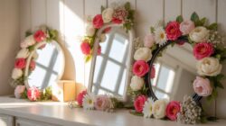
Adding Framed Dried Flowers To Your Gallery Wall For A Natural Touch
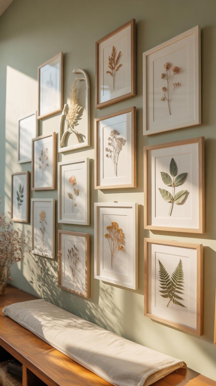
How To Press And Frame Dried Flowers At Home Step By Step
Pressing flowers preserves organic textures for your gallery wall. You must choose fresh blooms without surface moisture to prevent mold. Place the flowers between sheets of absorbent parchment paper. Use a heavy wooden press or thick books to apply even pressure. This process takes two to four weeks depending on the thickness of the plant material. Patience ensures the petals become paper-thin.
- Selection: Pick flowers at their peak bloom during the morning after dew evaporates. Avoid wilted or damaged petals because defects become more visible once dried. Flat-faced varieties work best for beginners.
- Layering: Place the flowers face down on acid-free blotting paper or parchment. Cardboard spacers help air circulate between multiple layers of specimens. Ensure no two flowers touch or they will fuse together.
- Compression: Apply heavy weight using a flower press or stack of encyclopedias. Tighten the bolts on a press every few days as the flowers lose moisture and shrink. Consistent pressure is vital for a flat finish.
- Mounting: Use a small drop of acid-free glue or clear adhesive strips to secure the dried specimen to a backing card. Precision tweezers help you handle the fragile petals without causing any structural breakage.
- Framing: Select a double-glass floating frame to highlight the organic edges of the plant. Ensure the glass is UV-resistant to prevent the natural pigments from fading when exposed to sunlight on your wall.
Proper framing protects these delicate specimens from humidity and dust. Use a sealing tape on the back of the frame to create an airtight environment. This prevents insects from damaging the organic matter over time. Positioning these frames alongside traditional prints adds physical depth to your display. Natural elements break the monotony of flat paper art and create a sophisticated focal point.
Best Flower Varieties To Press And Frame For Long Lasting Wall Displays
Selecting the right species determines the longevity of your gallery wall. Thin-petaled flowers like cosmos, pansies, and violas dry quickly and retain their shape perfectly. These varieties lose very little color during the dehydration process. Avoid thick succulents or heavy roses unless you plan to deconstruct the petals first. Moisture trapped in thick centers leads to browning and rot within the frame.
Focus on flowers with a high color saturation for the best visual impact. Larkspur and delphiniums maintain deep blues and purples for years. Ferns and eucalyptus provide stable green tones that complement floral arrangements without shedding. These hardy choices withstand the pressing process without losing their structural integrity. Always use acid-free materials during the mounting phase to stop the botanical elements from reacting with the paper.
Building A Cottagecore Decor Gallery Wall With Floral Art
What Cottagecore Decor Means And Why Florals Are Central To The Aesthetic
Cottagecore is an internet-driven aesthetic that prioritizes a return to traditional skills and rural life. It draws heavy inspiration from the English countryside and the Romantic movement of the nineteenth century. The style emphasizes a connection to nature and domesticity. It uses nostalgia to create a sense of comfort. This movement rejects modern industrial looks in favor of old-world charm and handmade items.
Florals are the core of this aesthetic because they represent the garden and the local landscape. Botanical prints and pressed flowers serve as direct links to the outdoors. These elements bring the natural world inside the home. Historically, floral patterns appeared on wallpaper and textiles to brighten dark rooms. In Cottagecore, these motifs reinforce the theme of personal growth and simple, land-based living.
Flowers are a proud assertion that a ray of beauty outvalues all the utilities of the world. Even a few simple blooms on your wall can turn a house into a soulful home.
— Ralph Waldo Emerson
Combining Textures, Fabrics, And Floral Art To Achieve A True Cottagecore Feel
To build a deep gallery wall, you must mix different physical materials. Do not rely solely on paper prints. Use wooden frames with visible grain or chipped paint to add history. Incorporate fabric elements like small embroidery hoops or linen swatches. These different textures break any visual monotony. They make the wall feel like a collection gathered over time rather than a single purchase.
The arrangement should feel organic rather than perfectly symmetrical. Place botanical sketches next to dried flower shadow boxes. Use different frame sizes to mimic a vintage thrift store find. This layering creates depth and movement. It grounds the floral art in a physical space. Proper material mixing ensures the display looks authentic. Avoid shiny plastics or mass-produced metals. Stick to natural wood, glass, and cotton fabrics.
How A Floral Gallery Wall Contributes To A Cozy House Atmosphere
The Psychological Effect Of Nature Inspired Art On Comfort And Wellbeing
Biophilic design principles prove that visual links to nature reduce physiological stress. Viewing floral imagery lowers cortisol levels and stabilizes heart rates. This biological response creates a sense of safety within a living space. Humans possess an innate preference for organic shapes over rigid geometric lines. Floral art satisfies this preference by softening the harsh angles of modern interior architecture and construction materials.
Wall art featuring botanical subjects triggers positive emotional recall. Most cultures associate flowers with growth and life cycles. This connection fosters a grounded environment that feels lived-in rather than sterile. Large-scale floral prints act as focal points that draw the eye toward natural colors. These shifts in visual attention help the brain transition from work-related stress to a state of domestic relaxation and mental recovery.
Practical Styling Tips To Make Your Floral Wall Feel Warm And Inviting
Proper execution of a floral gallery wall requires balancing texture and light. Use matte finishes on prints to prevent glare from overhead lighting. Harsh reflections break the illusion of softness and create visual tension. Incorporate three-dimensional elements like pressed flowers in glass frames to add depth. Physical layers make a wall feel intentional and curated rather than flat. This approach builds a tactile quality into your room.
- Mixed Frame Materials: Use wood or tarnished metal frames instead of plastic or high-gloss finishes. Raw oak or walnut grain adds a natural warmth that complements botanical themes. This variety avoids a cold, corporate look.
- Layered Lighting Focus: Install picture lights or warm-toned LED strips to illuminate the art. Soft light mimics the golden hour outdoors and enhances the color depth of the petals. Avoid cool blue light which flattens organic details.
- Organic Asymmetrical Layouts: Arrange frames in a fluid pattern rather than a strict grid. Mimic the way plants grow in nature by letting the edges of the gallery “creep” across the wall. This layout feels more relaxed and approachable.
- Textile Integration: Hang a small woven tapestry near the floral prints to bridge the gap between hard frames and soft furniture. Fabric absorbs sound and provides a physical warmth that enhances the cozy atmosphere.
- Consistent Color Palette: Select prints that share a common undertone like sage green or dusty rose. A cohesive color story prevents visual clutter and allows the eye to move easily across the display. This harmony creates a restful environment.
Spacing is a critical tactical decision for a cozy atmosphere. Keep frames within two to three inches of each other to maintain a tight visual cluster. Large gaps between art pieces create a sense of emptiness and coldness. Tight grouping mimics a dense garden and pulls the room together. Always hang the center of the display at eye level to ensure the art feels connected to the seating area.
Using Inspirational Wall Art Alongside Florals To Personalize Your Space
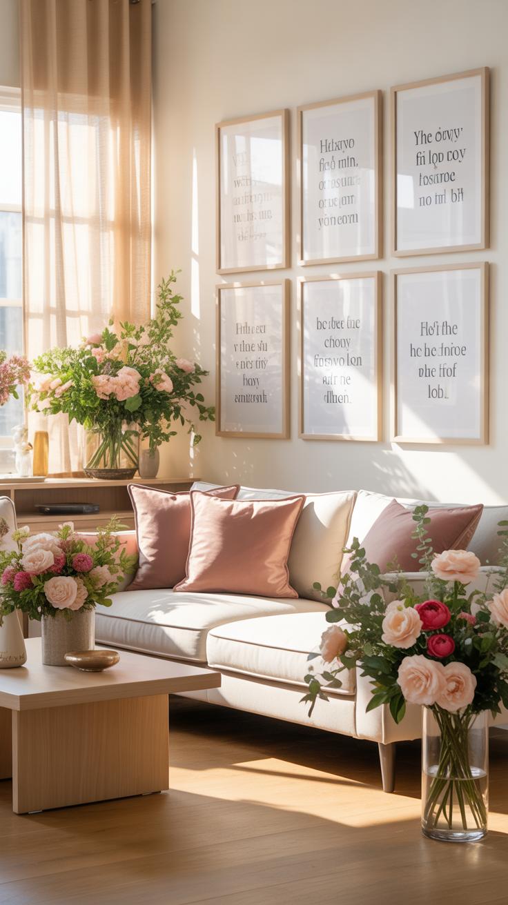
How To Pair Inspirational Wall Art Quotes With Floral Prints Without Clashing
Pairing text with botanical art requires strict visual hierarchy. You must prevent the typography and the floral patterns from competing for attention. Select one dominant element. If the floral print uses complex Dutch Golden Age realism, use a simple sans-serif font for the quote. If the text is bold and decorative, pair it with muted line drawings. This balance ensures the eye moves naturally across the wall.
Consistency in color palettes links disparate mediums. Match the font color to a specific pigment found in the floral petals or leaves. Use the same frame material for both the text and the art to create a unified look. Oak or black metal frames work best for modern displays. Proper spacing prevents the wall from feeling cluttered. Leave at least two inches of white space between each frame to maintain clarity.
Making Your Gallery Wall Tell A Personal Story Through Art And Flower Choices
Effective gallery walls use symbolism to convey meaning. Victorian floriography assigned specific meanings to every flower. Inclusion of a red rose signifies deep affection while ivy represents fidelity. You can select flowers that correspond to specific family birth months or life events. This transformation moves the wall from simple decoration to a historical record. It adds depth that generic store-bought art lacks.
Personalize the narrative by mixing modern photography with vintage botanical plates. Use prints of flowers from your actual garden or wedding bouquet to increase emotional value. Mix these with quotes that reflect your personal philosophy or family values. Tactical placement of these elements creates a focal point in the room. The combination of nature and language creates a powerful biographical statement. It turns a living space into a reflection of your identity.
Frequently Asked Questions

How do I start a floral gallery wall if I have no design experience?
Starting is easier than you think! Begin by choosing a central “anchor” piece, such as a large botanical print or a vintage framed pressed flower. From there, radiate outward with smaller accents. To ensure success with your floral gallery wall ideas, stick to a cohesive color palette, like soft pastels or moody botanicals, which helps the disparate elements feel unified and professionally curated even for a total decorating novice.
What is the best way to arrange the frames without damaging my walls?
To execute your floral gallery wall ideas perfectly, use the “paper template” method. Trace each frame onto kraft paper, cut it out, and tape the shapes to your wall using painter’s tape. This allows you to visualize the layout and swap positions without committing to nail holes. Once you love the arrangement, simply drive the nails through the paper, tear the paper away, and hang your beautiful floral art securely.
Can I create a beautiful floral gallery wall on a tight budget?
Absolutely! You don’t need expensive original art to achieve a high-end look. Consider framing affordable wildflower seed packets, pages from old botanical books found at thrift stores, or even dried stems from your own garden. Mixing inexpensive thrifted frames with a fresh coat of spray paint is another fantastic way to bring your floral gallery wall ideas to life without spending a fortune on custom framing or luxury boutique prints.