The Timeless Appeal Of Flower Art Painting In Modern Interiors
How Botanical Painting Traditions Influence Contemporary Floral Print Decor
Botanical art began as a scientific tool. Artists in the seventeenth and eighteenth centuries painted plants for medical and scientific records. These creators used extreme detail to show every part of a flower. This technical accuracy remains the foundation for modern Floral Print Decor. Designers today use these vintage scientific plates to bring a sense of history and realism into minimalist rooms.
Modern printing tech scales these old designs for large walls. You see this in oversized murals that mimic fine line lithography. Modern creators borrow the neutral backgrounds and precise shading found in Victorian herbariums. This creates a bridge between old world skill and new world style. High quality scans of original gouache paintings ensure that digital prints retain the hand painted feel of historical works.
Choosing The Right Flower Art Painting Style For Your Wall Space
Selection depends on your room architecture. Dutch Golden Age styles use dark backgrounds and high contrast colors. These work best in dining rooms or offices to create depth. Impressionist styles focus on light and movement rather than small details. These prints suit bedrooms where you want a soft feeling. Match the art style to the physical light levels of your specific room.
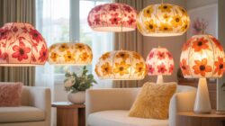
Scale dictates the visual impact of your Floral Print Decor. Large format prints serve as a focal point. They anchor a room and dictate the color palette for furniture. Smaller botanical series work well in hallways or gallery walls. Always measure your wall surface before picking a print size. Ensure the frame style matches the era of the art to maintain a cohesive and professional look.

Vintage Roses Wallpaper A Classic Trend Making A Strong Comeback
The History Behind Vintage Floral Wallpaper And Why It Still Resonates Today
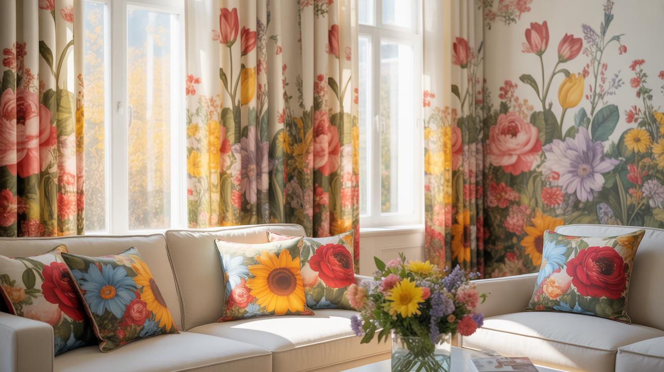
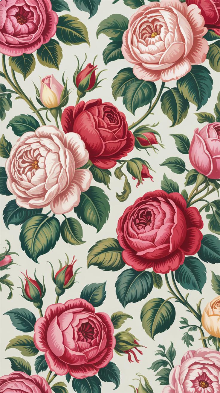
Floral patterns gained massive traction during the Victorian era. Advances in surface printing allowed factories to mass produce intricate rose designs for middle class homes. Designers like William Morris moved the trend toward organic, interlocking shapes. These patterns reflected a desire to bring nature indoors during the industrial revolution. The rose remained the primary symbol of English heritage and domestic comfort.
Modern homeowners choose vintage roses to ground sleek spaces. High tech lifestyles create a psychological need for soft, traditional imagery. Many manufacturers now use digital printing to recreate 19th century archival patterns. This tech offers better color depth than old block prints. You get the historical look without the toxic pigments found in original Victorian papers. It bridges the gap between old world style and new technology.
How To Style Vintage Roses Wallpaper In Living Rooms And Bedrooms
Large scale rose patterns work best on a single focal wall in the bedroom. Place the bed directly against this wall to anchor the room. Use solid colors on the remaining walls to prevent visual clutter. Choose bedding that pulls one secondary color from the wallpaper design. This creates a cohesive look without overwhelming the senses. Keep furniture lines clean to balance the busy print.
In living rooms, use vintage florals to define specific zones. A patterned wall behind a sofa creates a clear conversation area. Avoid matching the wallpaper to patterned rugs or curtains. This competition kills the impact of the Floral Print Decor. Stick to natural wood tones for flooring and shelving. These raw materials complement the botanical theme. Professional designers use wainscoting to break up the pattern and prevent a cramped feeling.
Art Deco Flowers Geometric Elegance Meets Floral Print Decor
Understanding The Art Deco Movement And Its Signature Floral Motifs
Art Deco emerged in the 1920s and 1930s as a rejection of organic Art Nouveau curves. It focused on industrial progress and streamlined forms. Designers simplified floral shapes into repeatable geometric patterns. They used hard edges and symmetrical layouts rather than realistic depictions. This shift turned traditional flowers into structured symbols. It made floral print decor look modern and high end during the machine age.
Standard motifs include fan shapes and stepped pyramids that mimic flower petals. Designers often used stylized lotuses or lilies to show wealth and global travel. These patterns utilize high contrast colors like gold on black or silver on deep green. The shapes are clean and sharp. This style removes all messy details found in nature. It provides a structured way to use nature in interior design schemes.
Incorporating Art Deco Flower Patterns Into Modern Home Styling
Modern styling requires a balance between vintage patterns and current minimalist goals. Use Art Deco floral wallpaper on a single accent wall to create a focal point. Choose velvet fabrics with metallic floral embroidery for throw pillows or chairs. This adds texture without cluttering the room. Stick to a restricted color palette to keep the look cohesive. Do not mix these sharp patterns with soft country styles.

Metal finishes are critical for matching Art Deco floral print decor. Use brass or chrome frames to complement the geometric flower shapes. Dark wood furniture provides the necessary weight to anchor these bold prints. Focus on symmetry when placing items. Put two matching floral lamps on either side of a sofa. This placement honors the original design intent of the movement. It ensures your space looks intentional and organized.
Scrapbook Paper Designs Inspiring The Next Wave Of Floral Wall Decor
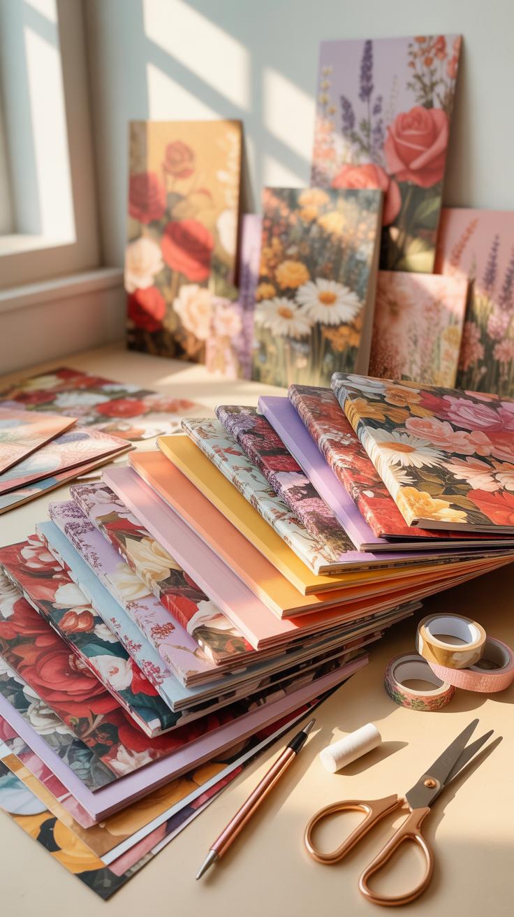
How Scrapbook Paper Designs Translate Into Full Scale Interior Decor Concepts
Scrapbook paper designs offer a blueprint for modern wallpaper and textile patterns. These small-scale prints use distinct repeat structures that designers now scale up for residential walls. The transition involves increasing the resolution of botanical illustrations and adjusting the color pallet for large rooms. Manufacturers pull from archival scrapbook motifs to create vintage-inspired Floral Print Decor. This process bridges the gap between hobbyist crafts and professional design.
Tactical application requires understanding spatial balance. High-density floral patterns from scrapbook traditions work best as accent walls or within framed moldings. Designers use these intricate prints to provide visual texture without the cost of hand-painted murals. The paper-to-wall translation relies on high-quality digital printing. This technology allows for the preservation of fine details like paper grain and ink bleed. It creates a tactile feel on flat surfaces.
DIY Floral Wall Art Projects Drawn From Scrapbook Aesthetic Traditions
DIY enthusiasts use scrapbook techniques to create custom wall features on a budget. These projects utilize layering and decoupage to add depth to flat surfaces. By applying scrapbook paper directly to wooden panels or canvases, you create modular art pieces. This method allows for frequent updates to room themes without permanent changes. It turns thin paper designs into durable and structured architectural elements for any living space.
- Decoupage Panels: Apply scrapbook sheets to plywood using matte adhesive. Seal the surface with a clear topcoat to prevent peeling. This creates a sturdy piece of art that mimics expensive high-end wallpaper without the long-term commitment.
- Grid Gallery Walls: Frame multiple individual scrapbook designs in identical frames. Arrange them in a tight grid to simulate a large-scale mural effect. This strategy works well for renters who cannot apply permanent wall coverings to their units.
- Shadow Box Florals: Cut individual flower shapes from textured scrapbook paper to create a 3D effect. Mounting these on foam spacers inside a deep frame provides physical depth. This technique adds a sophisticated sculptural element to standard flat wall decor.
- Washi Tape Borders: Use floral patterned tapes to create temporary frames directly on the wall. This mimics the decorative borders found in traditional scrapbooks. It is a low-cost way to define spaces or highlight existing artwork without using heavy hardware.
- Canvas Decoupage: Stretch fabric over a frame and glue scrapbook cutouts to the surface. The mix of fabric texture and paper prints creates a professional mixed-media look. It offers a unique way to incorporate specific color palettes into a room design.
Precision matters when executing these DIY projects. Use archival-quality adhesives to prevent yellowing over time. Measure your wall space before cutting paper to ensure the pattern repeat remains consistent across the surface. Proper sealing protects the paper from humidity and UV damage. These steps ensure that your homemade decor maintains its visual integrity. Following these practical methods results in a high-quality finish that rivals commercial wall products.
Wallpaper Aesthetic Trends Redefining Floral Print Decor In 2024 And Beyond
The Rise Of Maximalist Floral Wallpaper Aesthetic In Contemporary Homes
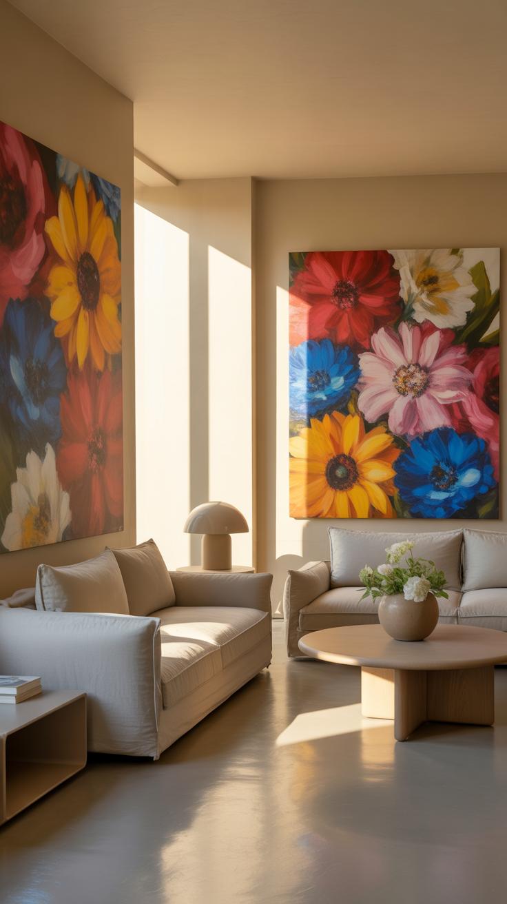
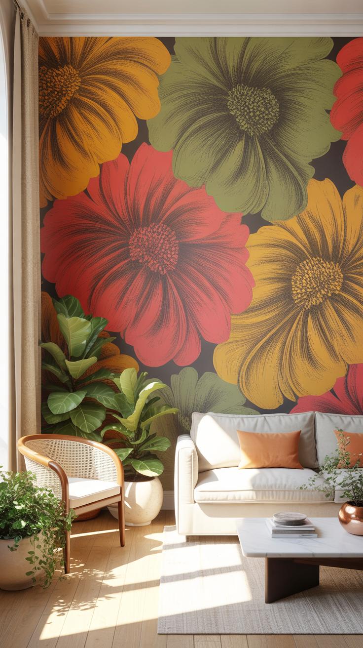
Maximalism rejects empty space. Homeowners now use large scale floral prints to create focal points. These designs use high contrast colors and dense patterns. This movement draws from the bold wallpaper styles of the Victorian era. Modern versions use digital printing to create sharper details. This technique allows for deeper saturation and more complex color layers. Large patterns make small rooms feel intentional and curated.
Strategic placement defines this trend. Designers apply these bold prints to ceilings and entryways to command attention. Dark backgrounds highlight the floral shapes and add depth to the walls. High quality vinyl and non woven substrates ensure durability in high traffic areas. These materials resist fading and allow for easy cleaning. This approach turns a basic wall into a primary design feature without needing extra furniture.
Flowers are a proud assertion that a ray of beauty outvalues all the utilities of the world. Bringing these patterns into our homes connects us to the timeless grace of nature.
— Ralph Waldo Emerson
Soft And Muted Wallpaper Aesthetic: When Florals Go Minimalist
Minimalist florals focus on negative space and light tones. This style uses thin lines and monochromatic palettes. It traces back to Scandinavian and Japanese design principles. These patterns provide texture without overstimulating the eyes. They work well in bedrooms and home offices where calm is necessary. Use these prints to add warmth to modern rooms that feel cold. This creates balance in the house.
Tactical application requires subtle color matching. Choose wallpapers with beige, sage, or soft grey tones. These colors blend with natural wood and stone materials. Faded prints mimic the look of aged frescoes or hand painted linen. This trend relies on the quality of the paper texture. Linen weave finishes add a tactile element to the visual design. It offers a sophisticated way to use nature motifs in professional environments.
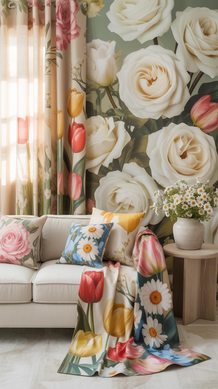
Textile Pattern Design Bringing Floral Prints From Walls To Fabrics
How Textile Pattern Design Translates Floral Motifs Across Upholstery And Soft Furnishings
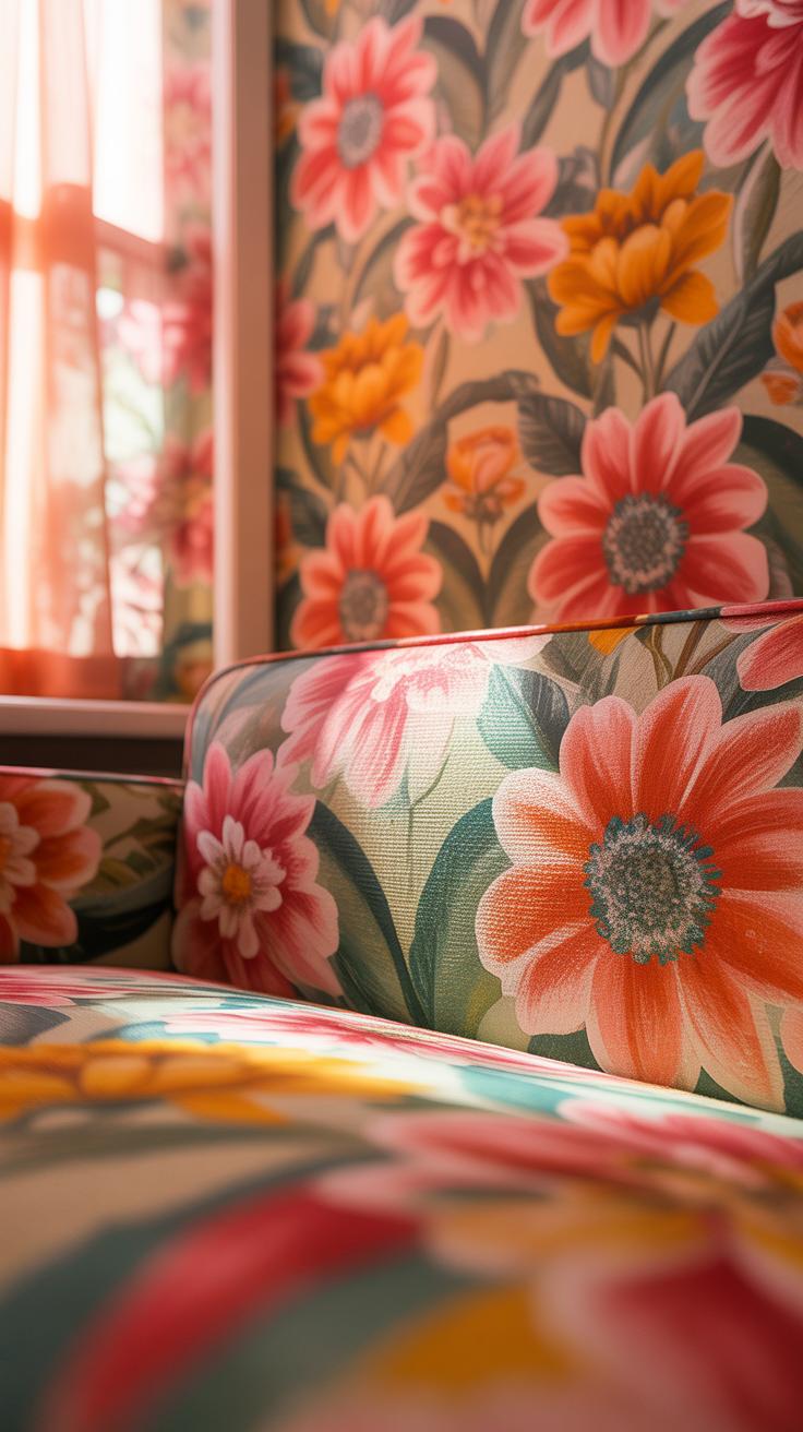
Textile pattern design uses specific scale adjustments to move floral prints from flat walls to three-dimensional furniture. Designers use toss patterns where motifs face multiple directions. This technique prevents the print from looking upside down when fabric folds over cushion edges. Heavyweight weaves like jacquard or tapestry provide the structural integrity needed for furniture. Digital printing allows for high detail on natural linens and cottons.
Screen printing remains a standard for high-end residential fabrics due to color depth. This process applies ink through fine mesh to create crisp botanical edges. Manufacturers often select larger scale prints for sofas to avoid visual clutter. Smaller floral patterns work best on throw pillows or dining chair seats. Proper pattern mapping ensures that the central floral motif sits in the middle of the backrest for visual symmetry.
Pairing Floral Textile Patterns With Solid Colors For A Balanced Interior Look
Effective pairing relies on a clear color hierarchy. Designers select one secondary color from the floral pattern to use for solid upholstery or drapery. This creates a visual anchor in the room. If the floral print has a white background, using white solids keeps the space airy. Mixing textures like velvet or leather with floral cottons adds necessary contrast. It prevents the room from looking flat or dated.
Balanced interiors use the sixty-thirty-ten rule for color distribution. The floral print often serves as the focal point while solids provide the background. Darker solid fabrics ground bright floral patterns in formal settings. Using solid piping on floral cushions defines the shape of the furniture. This strategy breaks up the pattern and allows the eye to rest. It ensures the floral print remains a choice rather than an overwhelming presence.
Arte Inspo How Creative Communities Are Shaping Floral Print Decor Movements
How Online Arte Inspo Culture Has Democratized Floral Decor Design
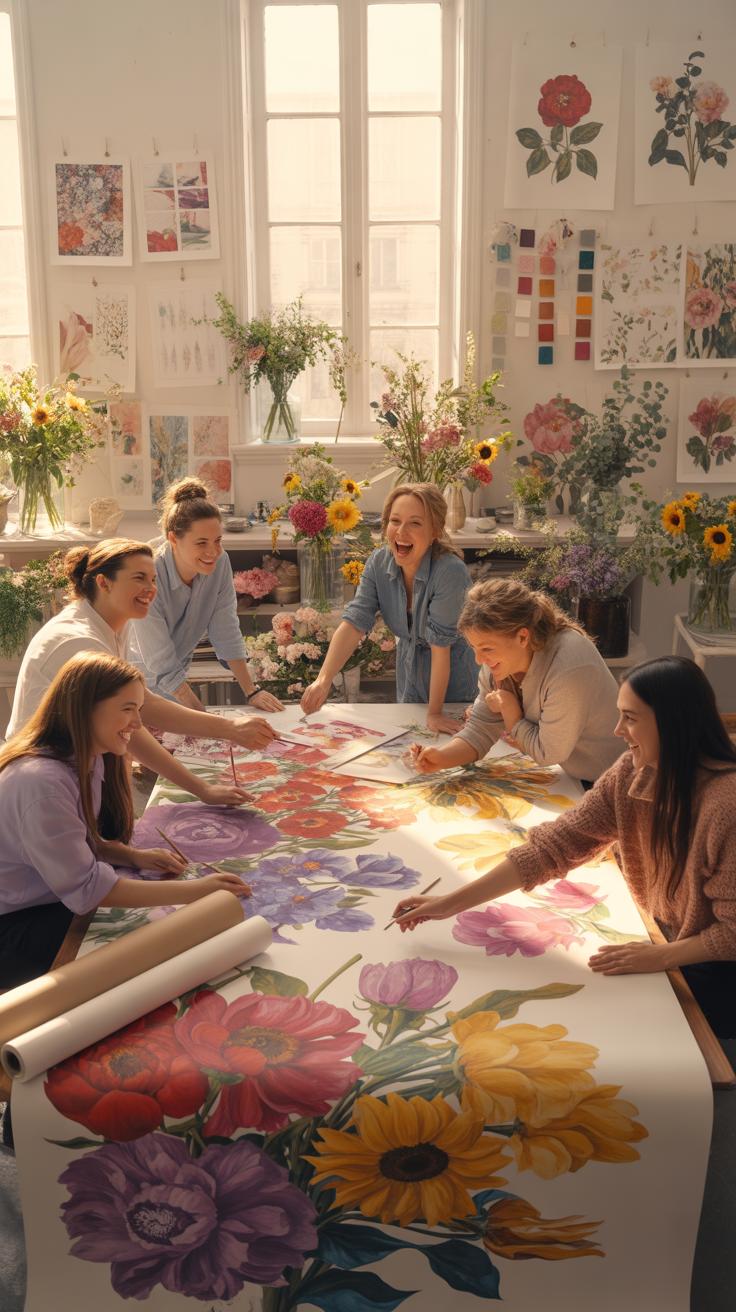
Digital platforms now bypass traditional gatekeepers in the textile industry. Independent artists share floral patterns directly with global audiences through social media. This shift allows niche styles like dark cottagecore or hyper-realistic botanical sketches to gain traction quickly. Traditional print houses no longer dictate every trend. Consumers now influence production cycles by engaging with digital art before it ever hits a physical fabric or wallpaper roll.
Crowdsourced design platforms have lowered the barrier to entry for creators. Technology allows users to customize scale and color palettes with a few clicks. This democratization means floral prints are no longer limited to standard retail offerings. Small-scale designers use digital printing to test bold concepts without high overhead costs. These creators often pull from historical archives to remix classic Victorian or Art Nouveau patterns for modern interior spaces.
Translating Arte Inspo Floral Concepts Into Real World Room Styling
Moving a digital concept into a physical room requires a focus on material and scale. High-resolution digital files allow for oversized floral murals that cover entire walls. These large-scale prints create a focal point in a room without clutter. Designers match the digital color values to specific paint codes to ensure a cohesive look. Success depends on choosing the right substrate like peel-and-stick vinyl or high-quality grasscloth for texture.
Tactical styling involves balancing busy floral prints with solid colors. Professionals use the 60-30-10 rule to manage visual weight. The floral print usually occupies the mid-range thirty percent of a space. This prevents the room from feeling closed in or overwhelming. Designers also look at the line work within the floral art. Sharp lines work well in modern spaces while softer blurred patterns suit traditional bedrooms and quiet living areas.
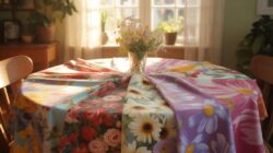
Floral Prints Pattern Understanding Scale Color And Placement In Decor
How Pattern Scale Affects The Look And Feel Of Floral Print Decor In Any Room
Large scale floral prints create an immediate focal point in a room. Use oversized botanical patterns on high ceilings or wide walls to fill empty space effectively. These designs draw the eye and ground the furniture. High contrast colors in large scales make a room feel smaller and more intimate. Designers use this tactic in large halls to reduce echoes and visual coldness.
Small scale floral patterns act as neutrals when viewed from a distance. Dense micro florals hide stains and wear well on high touch surfaces like upholstery or throw pillows. These patterns work best in small rooms such as powder rooms or entryways. They add texture without demanding total attention. Use small prints to soften hard lines in modern rooms. They provide depth without clashing with structural architectural elements.
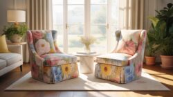
Top Tips For Mixing Multiple Floral Prints Patterns Without Overwhelming A Space
Successful pattern mixing requires a unified color palette to maintain order. Choose a primary color that appears in every selected floral fabric or wallpaper. This shared hue bridges different styles and prevents visual chaos. Scale variation is the second vital rule. Combine one large floral hero print with a medium geometric and a small ditsy floral to ensure the patterns do not compete for dominance.
- Vary the Scale: Select one large scale floral to serve as the lead pattern. Pair it with a medium scale print and a small scale accent. This prevents the eye from getting overwhelmed by competing shapes and sizes.
- Stick to a Color Palette: Ensure all chosen prints share at least two common colors. This creates a cohesive look even if the floral styles differ greatly. Consistent color acts as the anchor for the entire room design.
- Incorporate Solid Colors: Break up busy floral patterns with solid colored pillows or throws. Solids provide a visual resting place for the eye. This technique prevents the room from feeling cluttered or visually loud and keeps the focus clear.
- Balance Pattern Density: Mix open airy floral designs with dense packed patterns. An open floral wallpaper pairs well with a tight floral upholstery fabric. This contrast in density adds professional layers to a room without making it feel suffocating.
- Distribute Patterns Evenly: Avoid grouping all floral prints in one corner of the room. Spread the patterns across the space through curtains, rugs, and chairs. Consistent distribution keeps the visual weight balanced throughout the entire layout of the living space.
Placement dictates how the human eye processes multiple patterns. Use the boldest floral print on the largest surface area to set the tone. Deploy smaller prints on moving parts like cushions or side chairs. This hierarchy directs the viewer toward the most important design elements first. Layering patterns vertically from floor to ceiling creates a professional finished look. Always evaluate the room from the doorway to check for balance.
Sustainable Floral Print Decor Eco Friendly Choices For The Conscious Home
The Growing Demand For Sustainably Produced Floral Wallpapers And Printed Textiles
Modern homeowners now prioritize health and environmental impact when selecting Floral Print Decor. Traditional wallpaper production often relies on vinyl and toxic inks that release harmful gases. Smart buyers look for Forest Stewardship Council certifications to ensure wood pulp comes from managed forests. They also demand water-based inks that lack volatile organic compounds. This shift forces manufacturers to adopt cleaner production methods to stay competitive in today’s market.
Textile choices focus on natural fibers like organic cotton, linen, and hemp. These materials require less water and fewer pesticides than standard crops. Digital printing technology reduces water waste compared to traditional screen printing. This technique allows for detailed floral patterns without massive chemical runoff. You must verify third-party labels like Global Organic Textile Standard. These certifications prove the fabric meets strict environmental and social criteria from harvest to finished product.
How To Refresh Your Floral Print Decor Without Contributing To Interior Waste
Reducing waste requires a shift toward quality over quantity. Instead of replacing entire rooms, focus on reupholstering existing furniture with high-quality floral fabrics. This tactic keeps solid frames out of landfills. Choose timeless botanical patterns rather than short-lived trends to ensure longevity. Distinguish between fast fashion decor and durable goods. Investing in heavy-weight linens or recycled polyester blends extends the life of your interior items significantly.
Upcycling offers a tactical way to introduce new patterns. Use leftover floral wallpaper scraps to line the backs of bookshelves or drawers. This adds visual interest without buying new rolls of material. Look for vintage floral textiles at auctions or second-hand markets. These older pieces often feature superior craftsmanship and unique dyes not found in modern mass production. Repurposing these items preserves historical design while eliminating the carbon footprint of new manufacturing processes.
Frequently Asked Questions

How can I start incorporating floral patterns if I prefer a minimalist style?
If you are new to this look, start small by using floral print decor as a subtle accent rather than a focal point. Choose patterns with a neutral color palette, such as cream, beige, or soft grey, to maintain a clean aesthetic. A single botanical throw pillow or a delicate line-art floral print can add organic texture and warmth to a minimalist room without feeling overwhelming or cluttered.
What is the best way to mix floral prints with other patterns in a room?
To successfully mix patterns, vary the scale of your designs to create visual balance. Pair a large-scale floral print decor item, like an upholstered armchair, with smaller geometric prints like stripes or polka dots. Ensure all patterns share at least one common color to create a cohesive look. This approach prevents the space from looking chaotic while allowing your beautiful floral elements to stand out as the primary design feature.
Is it possible to update my home with floral accents on a tight budget?
Absolutely! You can easily embrace floral print decor without a full renovation. Consider affordable swaps like changing out your tea towels, refreshing your bedding with a floral duvet cover, or applying peel-and-stick botanical wallpaper to a small nook or the back of a bookshelf. Local thrift stores are also great places to find vintage floral vases or framed pressed flowers that add timeless charm to your home at a fraction of the cost.