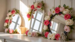
Why Floral Wallpaper Ideas Are Dominating Interior Design In 2024
The Timeless Appeal Of Floral Patterns In Home DéCor
Floral patterns maintain a steady presence in interior design because they mimic organic structures. Historical movements like Arts and Crafts used botanical prints to counter industrial coldness. Modern homeowners use these designs for similar reasons today. They provide a visual link to nature that remains popular regardless of changing styles. This consistency makes floral prints a safe investment for long-term property value and aesthetic stability.
Natural motifs work because the human brain recognizes and responds to organic shapes. Designers use these patterns to soften the sharp lines of modern furniture and architecture. This trend persists because it adapts to different scales. Small prints offer subtle texture while large murals create bold focal points. You can apply these patterns in traditional or contemporary settings without losing their relevance. Reliability drives the continued demand for floral designs.
How Floral Wallpaper Adds Depth, Warmth, And Personality To A Room
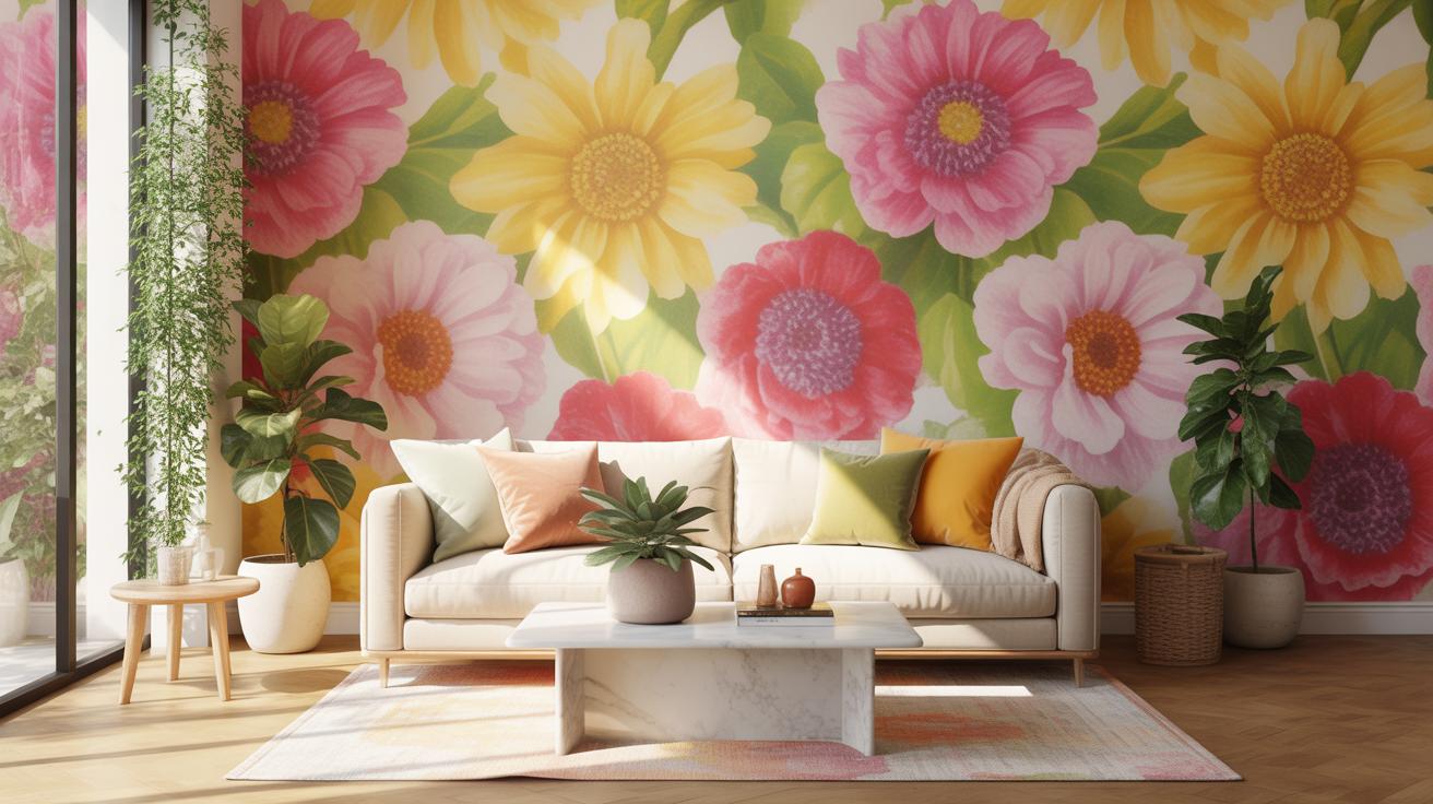
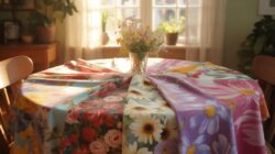
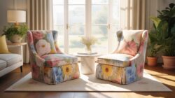
Floral wallpaper functions as a strategic tool to change how a room feels. Flat paint often makes walls look thin or cold. Multi-layered floral prints create an illusion of three-dimensional depth. This technique hides wall imperfections and architectural flaws. It forces the eye to move across the space rather than settling on a single flat surface. Proper scale selection ensures the room feels occupied and intentional.
Color palettes in floral designs inject warmth without the need for excessive decor. Warm tones in the pattern ground the room and create an inviting atmosphere. High-contrast botanical prints establish a clear personality for the space. This approach eliminates the need for expensive art or complex styling. You achieve a finished look by simply applying the paper. It is a high-impact tactical choice for any renovation project.
Best Spring Wallpaper Designs To Refresh Your Living Space
Soft Pastels And Blooming Botanicals That Define Spring Aesthetic
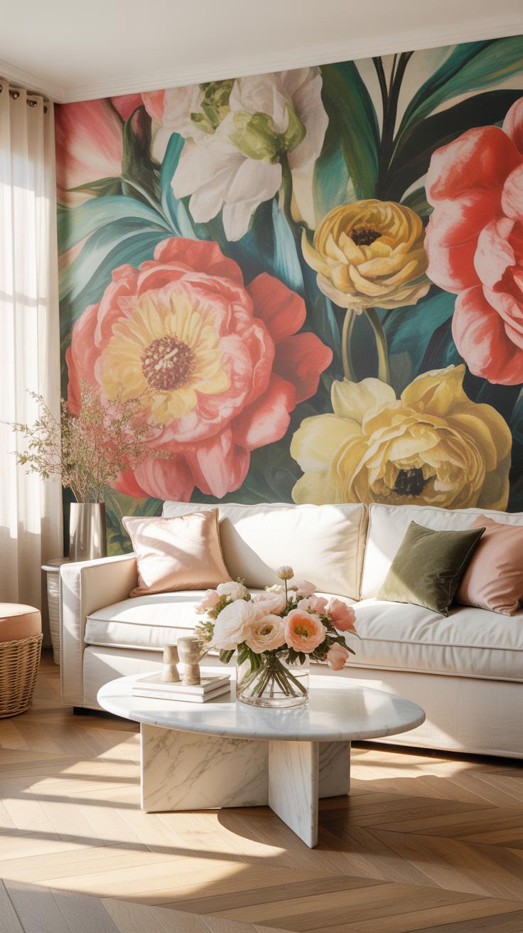
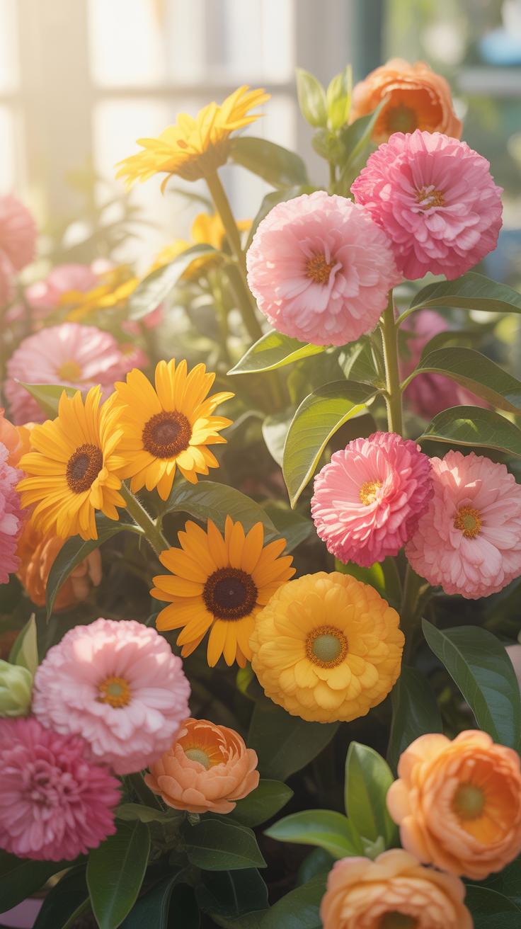
Soft pastel palettes drive the spring design market. Designers use mint green, pale blush, and butter yellow to mimic natural light. These colors reflect more light than darker tones. This makes a room feel larger and more open. Modern printing techniques allow for matte finishes that absorb harsh glare. You should choose high quality non woven paper for a smooth look.
Botanical accuracy matters in high end spring designs. Patterns often feature peonies, lilies, and cherry blossoms. These motifs come from 18th century French textile traditions. Modern updates use a clean white background to keep the look fresh. This approach prevents the space from looking dated or cluttered. Focus on large scale prints to create a clear focal point in any room.
How To Use Spring Inspired Floral Wallpaper In Bedrooms And Dining Rooms
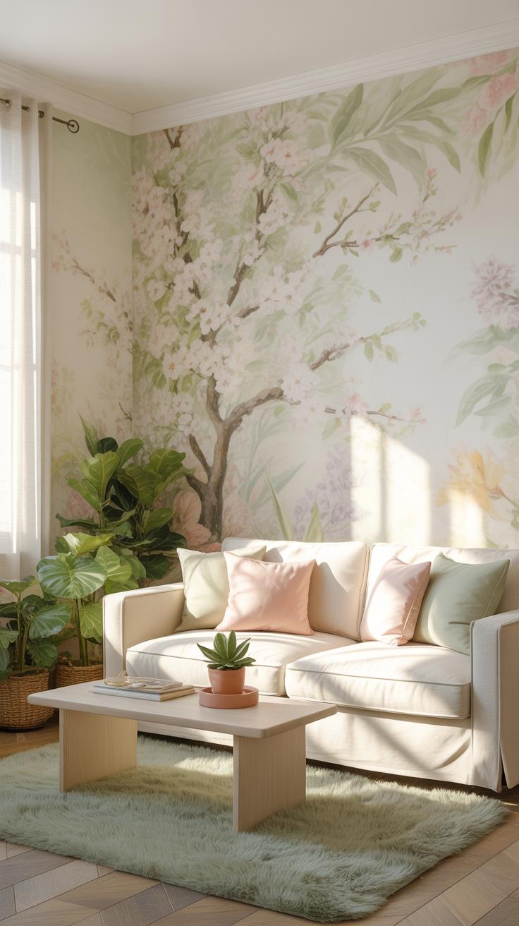
Bedrooms require patterns that promote rest. Use delicate trailing vines or small sprigs to create a calm environment. Avoid high contrast colors that stimulate the brain. Instead, choose tone on tone patterns. These designs provide texture without visual noise. Peel and stick vinyl options work well for accent walls. This allows for easy updates when the seasons change later.
Dining rooms benefit from bold floral statements. Use vibrant botanical prints to stimulate conversation and energy. Install the wallpaper above a chair rail or wainscoting to protect the material. This technique balances the pattern with solid wood elements. Experts recommend choosing washable surfaces for dining areas. Splashes or spills happen often in these spaces. Durable coated paper resists moisture and simplifies standard cleaning tasks.
Floral Wallpaper IPhone Styles Beautiful Lock And Home Screen Picks
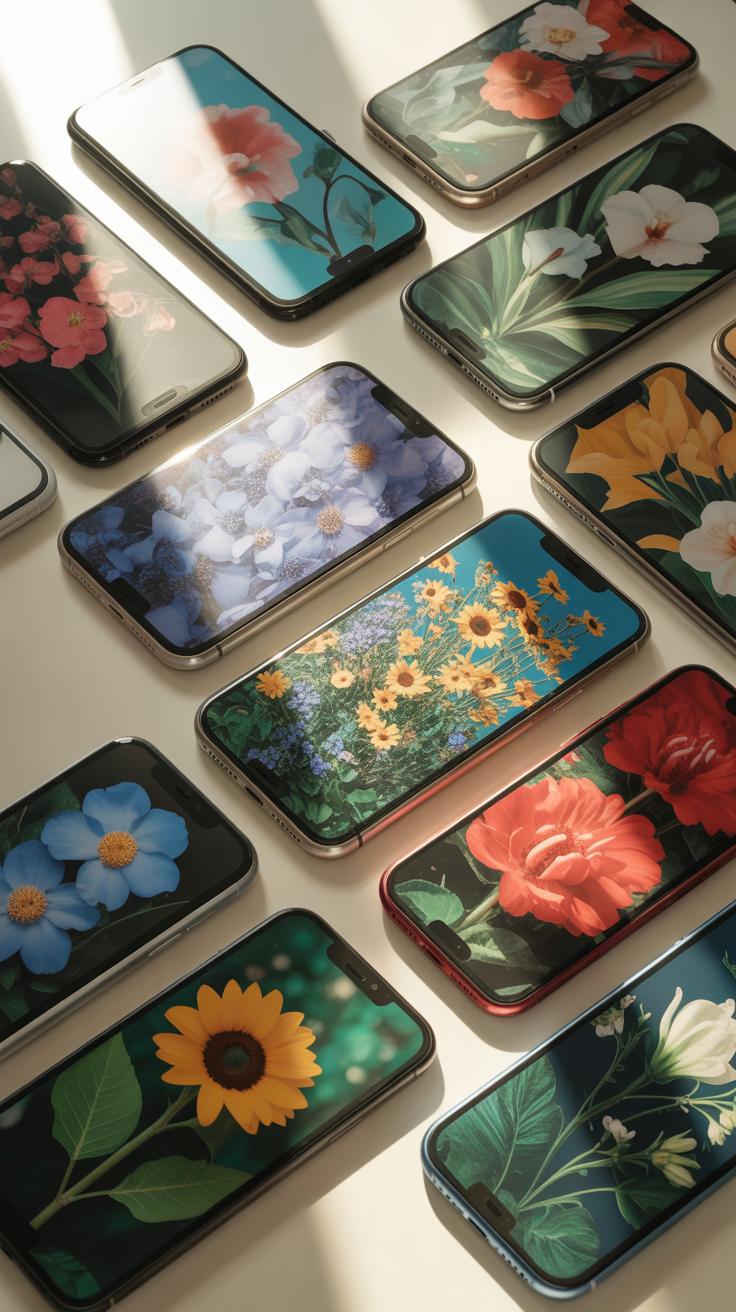
What Makes A Floral Wallpaper Work Beautifully On IPhone Screens
An iPhone screen requires specific visual balance to remain functional. High contrast between the floral pattern and the app icons prevents visual clutter. You must choose images with enough negative space at the top for the clock and date. Darker backgrounds are often better for OLED screens because they save battery life. Vivid colors ensure the retina display shows every sharp detail of the petals.
The lock screen and home screen serve different tactical roles. Use a bold, detailed floral image for the lock screen where the image is the main focus. Switch to a blurred or minimalist version of the same pattern for the home screen. This technique keeps the interface clean and easy to read. Proper scaling ensures that the camera lens or sensors do not cut off important design elements.
To plant a garden is to believe in tomorrow, and bringing those blooms into your home keeps that hope forever in sight.
— Audrey Hepburn
Top Floral IPhone Wallpaper Styles Trending Right Now
Vintage botanical illustrations are currently the most popular choice for mobile devices. These designs use accurate scientific drawings from the 18th and 19th centuries. They provide a sophisticated look without using too many bright colors. Many users prefer these because they look professional and timeless. The muted tones do not distract the eye when you are searching for a specific application on your phone.

Moody maximalism is another strong trend for modern smartphones. This style uses deep blacks or dark greens behind bright tropical flowers. The high contrast makes the screen pop and utilizes the depth of modern phone displays. Abstract floral art also works well for people who want a hint of nature without clutter. These styles use broad brushstrokes and simple shapes to suggest flowers instead of showing every single leaf.
Stunning Flower Background Wallpaper Ideas For Every Aesthetic
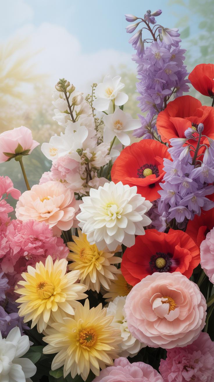
Photorealistic Vs. Illustrated Flower Backgrounds: Which Style Suits You
Photorealistic floral wallpapers use high-resolution macro photography to capture every detail. This style creates a strong sense of depth and biological accuracy. Designers use these backgrounds for accent walls in modern or minimalist rooms. Large-scale digital printing allows for crisp images that do not blur. Choose this style if you want your space to feel connected to the literal physical world.
Illustrated backgrounds rely on hand-drawn techniques or vector art. These patterns offer more control over color palettes and scale. You can match the wallpaper precisely to your existing furniture. Common styles include woodblock prints, watercolors, and pen-to-paper sketches. This option works best in historic homes or rooms requiring a specific artistic mood. It provides a creative interpretation rather than a direct copy of nature.
Popular Flower Species Featured In Wallpaper Art And Their Symbolic Meaning
Roses and peonies dominate the floral wallpaper industry. The rose historically represents love and classical beauty across Western cultures. Peonies symbolize prosperity and honor, especially in East Asian art traditions. These choices ground a room in tradition and luxury. They work well in bedrooms or formal dining areas. Use these species when you want to signal timeless sophistication and deep cultural roots.
Lotus flowers and lilies offer a different set of visual meanings. The lotus signifies rebirth and purity because it grows in muddy water. Lilies often represent renewal and transition in various design movements. Selecting these species adds a layer of quiet intent to your walls. They fit best in bathrooms or entryways where you want a fresh start. Strategic selection of species ensures your wallpaper communicates a specific message.
Cute Home Screen Wallpaper Ideas Featuring Floral Themes
Designing A Cohesive Floral Home Screen Layout Across Your Devices
Digital continuity requires matching visual assets across smartphones, tablets, and desktops. High-resolution files prevent pixelation on larger displays. Pro level designers use distinct variations of the same floral pattern to create professional unity. This strategy avoids exact duplication which looks amateur. Focus on color hex codes and motif scale to ensure your devices feel connected without appearing identical or repetitive.
Strategic placement dictates how you crop floral images for different aspect ratios. Mobile screens favor vertical compositions with central focal points. Desktop monitors require horizontal layouts with negative space on the left or right sides. Use the golden ratio to position primary blooms where they will not be obscured by system clocks or toolbars. This technical approach ensures the wallpaper serves the hardware functionality.
Tips For Choosing Cute Floral Home Screen Wallpapers That Don’T Clash With App Icons
Floral patterns often create visual noise that makes app labels unreadable. Strategic selection focuses on the depth of field and color saturation. Use images with a blurred background, known as the bokeh effect, to provide a soft canvas for your grid. Avoid high-contrast patterns with sharp edges. These elements compete with the rounded squares of modern interface icons and reduce your navigation speed.
- Muted Color Palettes: Select desaturated tones or pastel floral arrangements. Bright, neon petals often vibrate against the standard blue and green colors used in communication and finance app icons. Muted tones provide a stable backdrop that allows the foreground elements to remain the primary focus of your eyes.
- Strategic Negative Space: Choose wallpapers with floral clusters located at the edges or corners. Leaving the center of the image empty or minimally textured provides a clear area for your most-used applications. This layout prevents the flower petals from slicing through the middle of your important folders and widgets.
- Low Contrast Filters: Apply a slight matte or fade filter to high-resolution floral photography. Reducing the distance between the darkest and lightest pixels flattens the image. This technique creates a paper-like texture that supports legibility. Most OS interfaces function better when the background does not have extreme highlights or deep shadows.
- Geometric Floral Patterns: Use stylized or vector-based illustrations instead of realistic macro photography. Repeating geometric patterns offer a predictable grid that aligns with digital layouts. These designs provide a sense of order. They work effectively for users who maintain a large number of apps across multiple home screen pages and folders.
- Dark Mode Compatibility: Opt for floral designs with deep charcoal or navy backgrounds. These dark canvases make the vibrant colors of app icons pop. Darker wallpapers also reduce eye strain during nighttime use and save battery life on OLED screens. Ensure the floral elements have enough luminance to be visible without being distracting.
Organization is the primary goal of any home screen layout. Use custom widgets to bridge the gap between your floral background and your functional apps. Transparent widget backgrounds allow the wallpaper to show through while providing a dedicated space for text. Test your chosen image by swiping through pages to ensure the movement does not cause visual distortion or hide critical notification badges.
Cute Images For Wallpaper Whimsical Floral Art Worth Downloading
Where To Find High Quality Cute Floral Wallpaper Images For Free
Open-source image repositories provide the most reliable high-resolution files. Platforms like Unsplash and Pexels host professional photography and digital illustrations. These sites offer Creative Commons Zero licenses. This means you can use the art for personal phone or desktop backgrounds without cost. Always check the file resolution before downloading. Low-resolution images look pixelated on modern screens. Aim for 1920×1080 pixels minimum.
Institutional archives also offer free downloads of historical floral art. The Biodiversity Heritage Library and the Smithsonian Institution digitize antique botanical illustrations. These public domain files provide unique retro aesthetics. You can crop these images to fit vertical mobile screens. Look for files in JPEG or PNG formats for maximum compatibility. These sources ensure you get high-quality art while respecting intellectual property laws.
Watercolor Florals And Doodle Style Flowers That Bring A Playful Touch
Watercolor patterns create a soft visual impact that reduces eye strain. This style uses translucent layers to build color depth. Digital watercolor replicates traditional wet-on-dry techniques. Many current designs favor loose floral shapes rather than strict botanical accuracy. This approach works well for lock screens where icons sit over the image. The light color palettes maintain a clean look on your device.
Doodle-style florals focus on bold lines and simplified geometry. This trend draws heavily from mid-century modern design and Scandinavian folk art. The 1950s era popularized these stylized, flat graphics. These images use high contrast and bright colors to create energy. They offer a playful alternative to realistic photography. Precise linework ensures the pattern remains legible at small scales on mobile phone displays.
Fondos De Pantalla Para IPad Con DiseOs Florales Que Enamoran
Why IPad Screen Dimensions Call For A Different Floral Wallpaper Approach
iPad screens use a 4:3 aspect ratio. This differs significantly from the 16:9 ratio found on most smartphones and monitors. Floral patterns must account for this wider canvas. A vertical phone image will crop poorly on a tablet. You need high-resolution files that maintain detail when the device rotates. Standard mobile backgrounds lose their focal points during this transition.
Rotation creates a technical challenge for floral layouts. The iPad homescreen shifts from portrait to landscape mode instantly. Centralized floral motifs work best because they stay visible in both orientations. Avoid busy patterns that cluster only at the edges. Dead space in the center obscures the art when you place apps. Choose designs with balanced negative space to keep the interface functional.
Best Floral IPad Wallpaper Styles For Split View And Full Screen Display
Split-View multitasking divides the screen into two distinct sections. Large botanical illustrations or single-stem vintage prints survive this division well. Small, repeating ditsy prints often look cluttered when compressed into a narrow window. Use bold macro photography or clear watercolor shapes. These styles maintain their visual integrity even when half the screen is covered by a spreadsheet or browser window.
Full-screen display benefits from Art Nouveau or Victorian botanical sketches. These historical styles offer intricate detail that rewards the high pixel density of Retina displays. Professional designers choose muted tones to prevent icon fatigue. Bright neon flowers distract from productivity. Stick to earthy greens and soft petals. This approach creates a professional aesthetic that works for both creative and corporate environments.
Lush Green Floral Wallpaper Ideas For A Nature Inspired Look
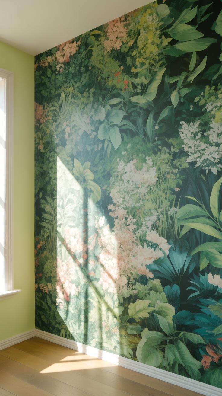
How Green Botanical Wallpaper Creates A Calming, Biophilic Atmosphere
Biophilic design uses green botanical patterns to reduce human stress levels. Scientific studies show that viewing foliage lowers blood pressure and improves focus. Green floral wallpaper mimics the natural environment indoors. This visual connection to nature satisfies a biological need for organic shapes. Large scale leaf prints maximize this effect. They break the visual monotony of flat, synthetic wall surfaces found in modern offices.
Strategic use of sage and moss tones provides a neutral backdrop that does not fatigue the eyes. These shades work well in bedrooms and workspaces where mental clarity is the priority. Fern and vine motifs offer rhythmic patterns that create a sense of order. Avoid high-contrast neon greens if the goal is relaxation. Stick to forest and olive pigments. These colors ground the room and provide a stable atmosphere.
Pairing Green Floral Wallpapers With Natural Materials And Earthy Tones
Match green floral patterns with raw wood, stone, and woven textiles to reinforce the organic aesthetic. Oak and walnut furniture provide a warm counterpoint to cool leaf prints. Jute rugs and linen curtains add tactile texture that complements the visual depth of the wallpaper. This combination creates a cohesive look rooted in mid-century modern and Scandinavian design principles. Avoid heavy plastics or high-gloss finishes that clash with nature-inspired motifs.
Use earthy tones like terracotta, ochre, and sand to balance the greenery. These colors prevent the room from feeling too cold or monochromatic. Brass or copper hardware adds a subtle metallic accent without overwhelming the foliage design. Keep the flooring neutral to let the walls serve as the focal point. Designers often use stone tiles or hardwood planks to anchor the space. This approach ensures the green wallpaper remains the central design element.
Blue Flower Wallpaper And Cute Summer Wallpapers For A Breezy Seasonal Vibe
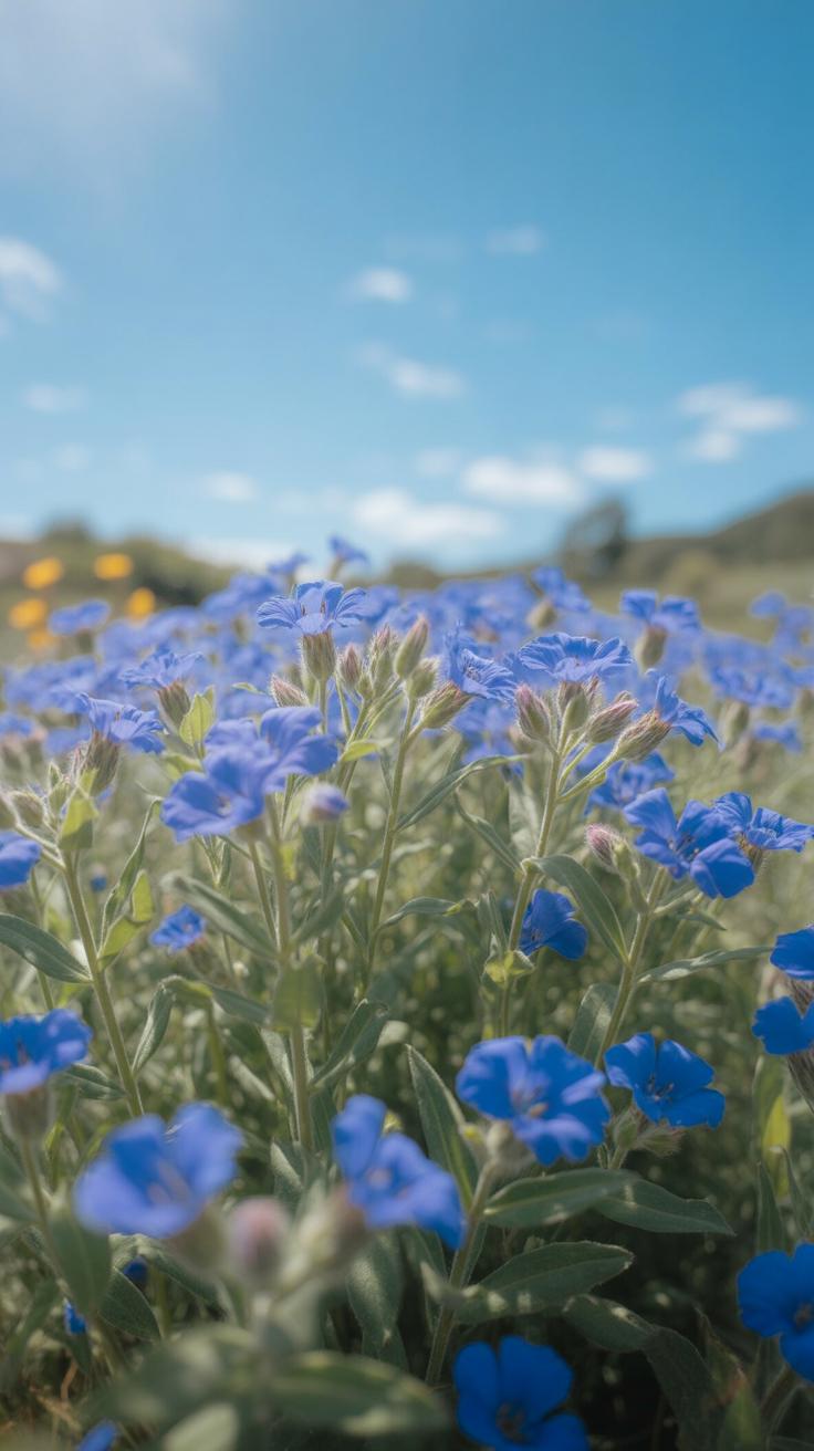
The Calming Psychology Behind Blue Floral Tones In Wallpaper Design
Blue floral patterns trigger specific psychological responses through color theory. Visual systems process shorter light wavelengths as calming signals. This reduces blood pressure and heart rate in occupants. Designing with blue lowers sensory overstimulation in high-traffic rooms. It creates a perceived drop in temperature. This makes it a tactical choice for south-facing rooms that receive intense afternoon sunlight. Architects use these tones to maximize mental clarity.
Historical design movements often utilized blue pigments for their durability and status. Indigo and ultramarine dyes provided stable colorfastness in early wallpaper production. These shades do not fade as quickly as red or yellow organic dyes. Modern printing uses synthetic pigments to replicate these classic effects. Choosing blue flower wallpaper ensures long-term visual consistency. It provides a neutral base that supports various wood finishes and metallic hardware accents.
Top Blue And Summer Floral Wallpaper Combinations To Try This Season
Summer floral designs prioritize high-contrast palettes and breathable spatial layouts. These patterns use negative space to prevent visual clutter in small areas. Designers often pair cornflower blue with crisp white backgrounds to mimic natural sky light. This combination increases the perceived square footage of a room. Use oversized botanical prints to create a focal point without requiring additional wall decor or expensive art pieces.
- Chinoiserie Patterns: These designs feature intricate birds and vines on pale blue backgrounds. They offer a formal look that works well in dining rooms. The style dates back to 17th-century European trade with Asia.
- Coastal Wildflowers: This style uses sea holly and beach pea motifs. It shifts away from tropical themes toward temperate shoreline flora. Use this for a rugged but clean aesthetic in bathrooms or mudrooms.
- Block Print Designs: Hand-carved woodblock styles provide a rustic feel. These patterns emphasize repetition and geometric symmetry. They work best in kitchens where traditional craftsmanship is the primary design theme and focus.
- Watercolor Pastels: Soft edges and blended pigments create a diffused visual effect. This technique hides wall imperfections and uneven surfaces. It is ideal for older homes where walls are not perfectly flat or smooth.
- Dainty Calico Prints: Small-scale floral repeats offer a vintage country vibe. These patterns provide high durability because small marks or stains blend into the busy design. Use these in nurseries or playrooms for practical longevity.
Select wallpaper materials based on the specific environmental conditions of your room. Non-woven substrates allow walls to breathe and prevent moisture buildup behind the paper. This is critical for summer-themed wallpapers used in humid climates. Vinyl-coated options provide better scrub resistance for high-touch areas. Always check the pattern repeat measurements before ordering rolls. This avoids mid-project shortages and ensures a seamless installation across the entire wall surface.
Frequently Asked Questions

How do I choose the right floral pattern for a small room?
Selecting the perfect design for a compact space depends on the mood you want to create. For a sense of openness, opt for small-scale patterns with plenty of negative space. However, one of the most popular floral wallpaper ideas for small bathrooms or entryways involves using oversized, dramatic blooms. These large prints create a bold focal point that distracts from the room’s limited square footage, adding unexpected depth and sophisticated character.
How can I pair floral wallpaper with my existing furniture?
To create a cohesive look, pull a secondary color from the wallpaper pattern and repeat it in your upholstery or decorative cushions. If your floral wallpaper ideas feature a busy, intricate design, balance the room with solid-colored furniture and clean lines to avoid visual clutter. Mixing textures, such as a velvet sofa against a smooth papered wall, adds professional designer flair while ensuring the floral prints remain the true star of your space.
Is there a budget-friendly way to use floral patterns without papering an entire room?
Absolutely! You can achieve a high-end look on a budget by creating a single accent wall or framing large panels of wallpaper as botanical art. Another affordable approach is applying paper to unexpected areas like the back of a bookshelf or inside a closet. These creative floral wallpaper ideas allow you to enjoy premium, luxury designer patterns without the high cost of purchasing multiple rolls for full-room coverage.