What Is A Monochrome Bouquet And Why It Works So Well
The Core Concept Behind Single Color Floral Arrangements
A monochrome bouquet uses flowers and foliage from a single color family. Designers select blooms that share one base hue but offer different values and saturations. This technique removes the distraction of competing colors. It forces the viewer to notice the structural details of each stem. Florists use this method to create a clean and intentional look for professional events.
This concept relies on the deliberate use of tints, tones, and shades. You group light pinks with deep magentas to build depth without breaking the color theme. This mirrors the principles of minimalist design movements from the twentieth century. By limiting the palette, you highlight the physical properties of the materials. The strategy works because it simplifies the visual field for the audience.
Why Visual Harmony Makes Monochrome Bouquets So Striking
Visual harmony occurs because the eye processes a single color more quickly than a multicolored mix. In a monochrome arrangement, the repetition of one hue creates a sense of order. This order allows the brain to focus on texture and shape. It prevents the cluttered feeling common in amateur floral work. Professional designers use this psychological shortcut to create immediate visual impact.
Texture becomes the primary tool for variety when color is constant. You mix soft petals with jagged leaves to provide contrast. This contrast keeps the arrangement from looking flat or boring. The absence of diverse colors emphasizes the unique silhouette of each flower. This tactical approach ensures the bouquet looks sophisticated and expensive. Consistency in color delivers a powerful and unified design statement.

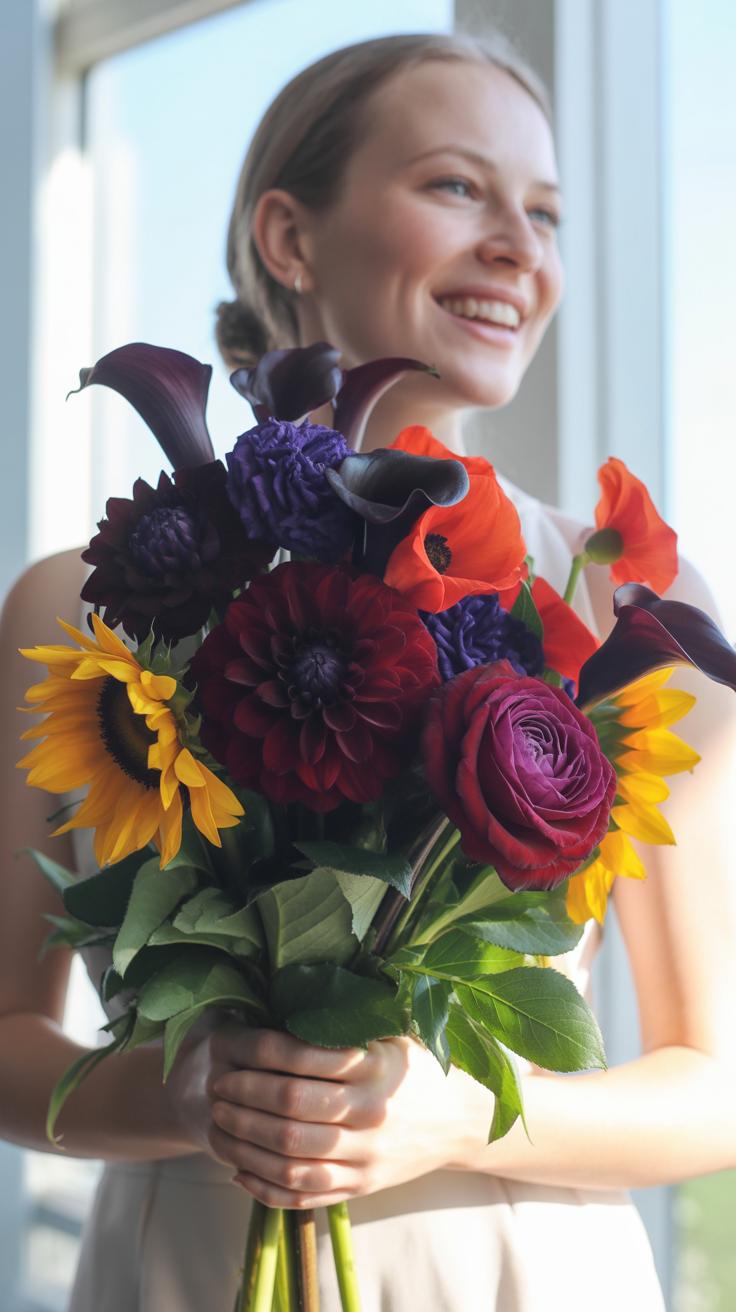
Unique Bouquet Ideas That Start With A Single Color Palette
How To Build Depth And Texture Using One Hue
Monochrome design fails when it lacks contrast. You must vary the physical shapes of your materials to create visual interest. Combine flat petals with ruffled edges or spiky fillers. This technique creates shadows within the arrangement. These shadows define the shape of each flower. Without varied textures, the bouquet looks like a flat mass of color. Depth requires light to hit surfaces differently.
Incorporate foliage that matches your primary hue to maintain the color theme while adding structural layering. Use matte finishes against glossy leaves to break up reflections. Greenery often provides the necessary architectural base for softer blooms. Select stems with different heights and thicknesses. This vertical variation prevents a stagnant look. Strategic placement of different textures ensures the eye moves through the entire arrangement effectively.
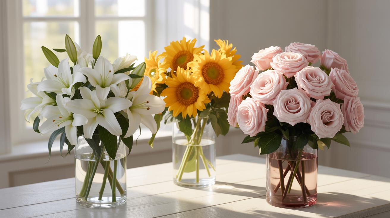
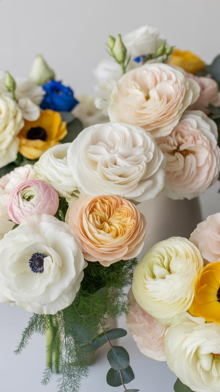
Flowers That Naturally Lend Themselves To Monochrome Styling
Consistent color palettes rely on flowers with high petal counts and strong color saturation. Select species that offer natural variations in shade within their own genus. This helps you bridge the gap between light and dark tones of one color. You need flowers that hold their pigment throughout the life of the bloom. Avoid varieties that fade quickly as they age or under direct light.
- Roses: These flowers offer a massive range of consistent colors and petal structures. They provide a dense focal point for any design. Modern hybrids ensure a steady supply of specific shades year-round. This makes them the primary choice for professional color-blocking techniques.
- Hydrangeas: Large clusters of small blooms create an immediate base of saturated color. They are ideal for filling space without adding too many different shapes. Their unique structure allows them to absorb light. This creates a deep, matte background for more delicate stems to shine.
- Carnations: These blooms are highly underrated for their durability and uniform color saturation. They feature ruffled edges that naturally create shadows and texture. You can group them tightly to mimic more expensive flowers. Their rigid stems make them excellent structural components for dense monochrome arrangements.
- Tulips: Sleek stems and smooth petals offer a clean look for modern designs. They provide a distinct silhouette that contrasts well with rounder flowers. Since they continue to grow after cutting, they add dynamic movement to the arrangement over time. Use them for minimalist styles.
- Ranunculus: These flowers have thin petals layered tightly together to create a heavy visual weight. They offer deep color pigments that do not wash out easily. Their curved stems allow for more organic shapes within a strict color theme. They bridge the gap between formal and wild aesthetics.

Focus on the physical properties of each stem to ensure structural integrity. Use heavy-headed flowers like hydrangeas as the foundation. Place smaller, more delicate stems like ranunculus at the top to create a tiered effect. Always strip the leaves below the water line to keep the water clear. This maintenance step ensures the color remains vibrant longer. Consistent hydration is critical for maintaining deep color saturation in a single-hue display.
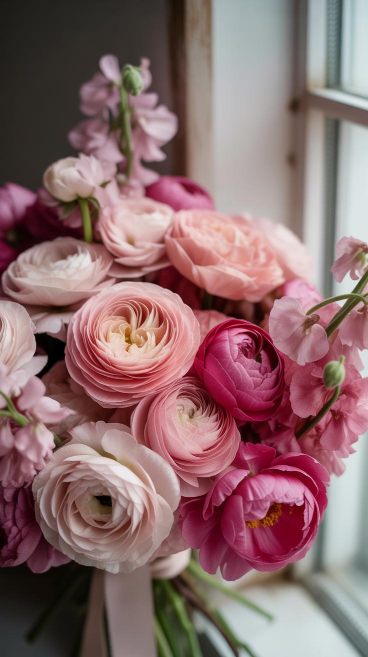
The Allure Of A Wine Red Bouquet Rich Tones Done Right
Best Flower Varieties For A Deep Red Monochrome Arrangement
Choose flowers with high pigment density to maintain a true wine profile. Black Magic roses provide a velvet texture and dark core. Burgundy dahlias offer geometric depth and structural support for the base. Use ranunculus to add tightly coiled petals that catch shadows. These species produce the saturated pigment necessary for a cohesive look. Avoid bright reds that shift the color temperature toward orange.
Incorporate scabiosa for its dark centers and wiry stems. This flower adds visual weight without bulk. Astrantia provides a star shaped detail that breaks up solid floral blocks. Use amaranthus to create vertical flow or drape. These choices ensure the monochrome palette remains interesting. Select varieties that naturally lean toward maroon or bordeaux. Consistency in hue prevents the arrangement from looking disorganized or messy.
Styling Tips To Make A Wine Red Bouquet Look Intentional And Polished

Focus on texture rather than color shifts to build dimension. Layer matte petals against waxy leaves to create contrast. This technique prevents the bouquet from looking like a flat red blob. Use different bloom sizes to guide the eye. Place larger flowers at the center of gravity. Surround them with smaller buds to add movement. A polished look requires a clear focal point and balance.
Select a container that complements the dark tones without competing. Classic metals like aged brass or pewter work best. These materials ground the heavy red tones. Use minimal greenery to keep the focus on the monochrome theme. Deep plum or chocolate foliage enhances the wine color better than bright green. Clean the stems thoroughly to keep the water clear. Clear water reflects professionalism and attention to detail.
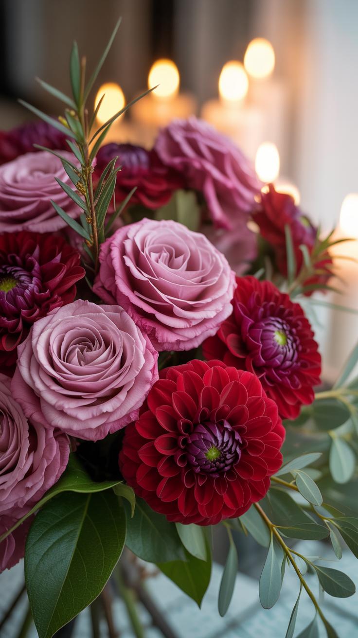
Embracing The Dark Bouquet Trend With Confidence
What Makes A Dark Toned Bouquet Dramatic Without Feeling Overdone
Texture drives success in dark monochrome arrangements. Deep pigments like burgundy and chocolate absorb light instead of reflecting it. This creates a flat look if you only use one flower type. Use different shapes to build depth. Mix velvety petals with shiny leaves or rough seed pods. This variety ensures the eye sees form and movement. Contrast within the dark palette prevents the bouquet from looking like a solid black hole.

Structure maintains the balance between drama and clutter. Keep the silhouette tight and intentional. Dark tones carry more visual weight than light colors. Use smaller filler elements to break up large blooms. This technique creates negative space within the dark mass. It allows individual flower shapes to stand out clearly. A focused color range keeps the design sophisticated. Precise placement ensures the dark tones feel curated rather than heavy.
Occasions Where A Dark Bouquet Makes The Biggest Statement
Modern winter weddings provide the best backdrop for dark monochrome designs. The stark contrast against white attire or pale indoor settings highlights the rich tones. Historical Dutch Still Life paintings often featured these moody palettes to signify luxury and depth. Using deep reds or purples in a formal setting communicates maturity and high design. These colors work well in spaces with stone, metal, or raw wood finishes.
Corporate events or gallery openings benefit from the authority of dark palettes. These colors suggest power and stability. Dark bouquets do not distract from the work on display but add a layer of refinement. Use them in evening settings where artificial lighting can create highlights on the foliage. The shadows cast by dark flowers add architectural interest to a room. Strategic placement near light sources maximizes the impact of the deep hues.
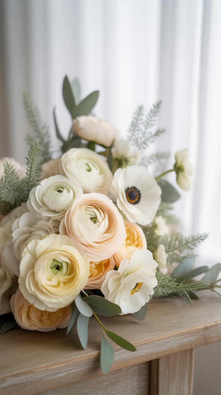
Luxury Flower Bouquets Elevating Monochrome With Premium Blooms
Which High End Flowers Work Best In A Single Tone Luxury Arrangement
Luxury monochrome designs rely on high petal counts and structural integrity. Garden roses like the O’Hara or Patience varieties offer deep layers that create natural shadows within a single hue. Peonies provide massive volume and soft textures that dominate the visual field. Orchids add a sleek and architectural element. These flowers command higher prices because they grow slowly and require specific climate controls.
Strategists select these blooms to ensure the arrangement looks dense and expensive. Calla lilies provide clean lines for modern settings. Hydrangeas act as a structural base to support heavier stems. Using variety in flower shapes prevented a flat look. You must mix round blooms with spire shapes or clusters. This creates visual depth without changing the color. It forces the eye to notice the quality of each stem.
Nature has a way of showing us that there is a quiet, soulful beauty in a single color. When you gather flowers of one hue, you create a memory of elegance that is both humble and profound.
— Martha Stewart
How Packaging And Presentation Enhance The Luxury Feel
Packaging defines the brand value of a luxury bouquet. High-weight specialty paper provides a crisp frame for the flowers. Professional designers use the Korean wrapping style to add volume and layers. This technique uses waterproof matte film and silk ribbons to create a flared base. The wrapping color must match the flowers exactly to maintain the monochrome theme. This creates a unified and intentional appearance.
Presentation also involves the choice of a premium vessel. Heavy crystal or hand-blown glass vases add physical weight and light refraction. Ceramic containers with matte glazes offer a contemporary feel. The container must have the correct proportions to support the flower weight. Proper hydration systems hidden inside the box or vase ensure the blooms stay fresh. Every detail communicates that the sender spent more on the final product.
Unique Bouquets That Break The Rules In All The Right Ways

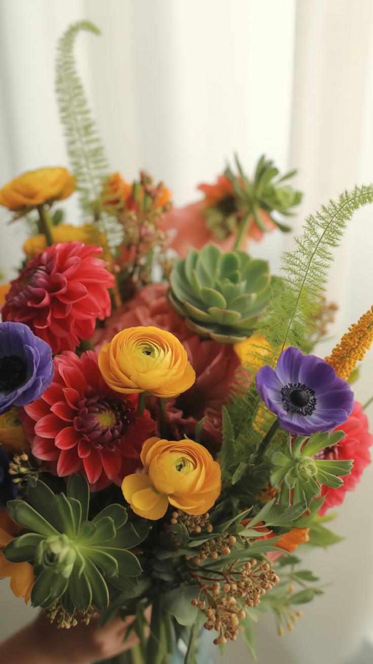
Unexpected Flower Pairings That Still Stay Within One Color Family
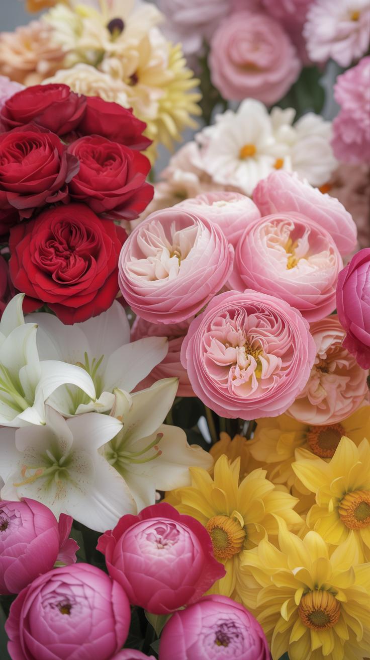
Monochrome design thrives on diverse anatomy rather than color variance. Combine flowers with deep architectural differences to create visual tension. Match the soft, heavy petals of a peony with the rigid, waxy spikes of ginger or anthurium. This approach relies on form alone to define the arrangement. Use species from different botanical families to ensure the textures do not blend into a single mass.
Contrast matte surfaces against glossy finishes within your chosen hue. Place velvet-textured celosia next to the smooth, reflective skin of a calla lily. This technique mimics the principles of the Brutalist movement by emphasizing raw material qualities. It forces the eye to recognize individual shapes through light play. Select flowers with varying heights to create a tiered structure. This builds depth in a single-color field.
How To Add Foliage And Fillers Without Breaking The Monochrome Theme
Greenery usually disrupts a monochromatic palette unless the palette is green. To maintain a strict color theme, select foliage that matches your primary flower color. For white bouquets, use silver-toned plants like dusty miller or lamb ear. These plants provide a neutral bridge that does not register as a second color. For dark themes, use copper-toned or near-black leaves like those found on certain cotinus species.
Apply the concept of tonal consistency to all filler materials. Use spray paint or floral tints on dried elements to match the exact shade of your fresh blooms. This keeps the visual weight uniform across the entire design. Dried seed pods and painted grasses offer structural support without adding unwanted hues. Select stems that share the same saturation levels. This ensures no single element stands out due to brightness or dullness.

Bride Bouquets 2026 Monochrome Styles Leading The Way Down The Aisle
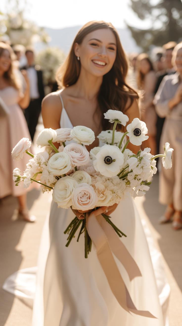
Trending Monochrome Bridal Bouquet Colors For 2026 Weddings
Market data indicates a shift toward saturated, singular hues for 2026 wedding seasons. Deep burgundy and midnight plum dominate fall and winter trends. Designers use these dark tones to create visual weight and sophistication. These colors move away from traditional soft palettes. They offer a bold contrast against white bridal gowns. High-fashion influences drive this demand for moody, single-color floral arrangements in high-end ceremonies.
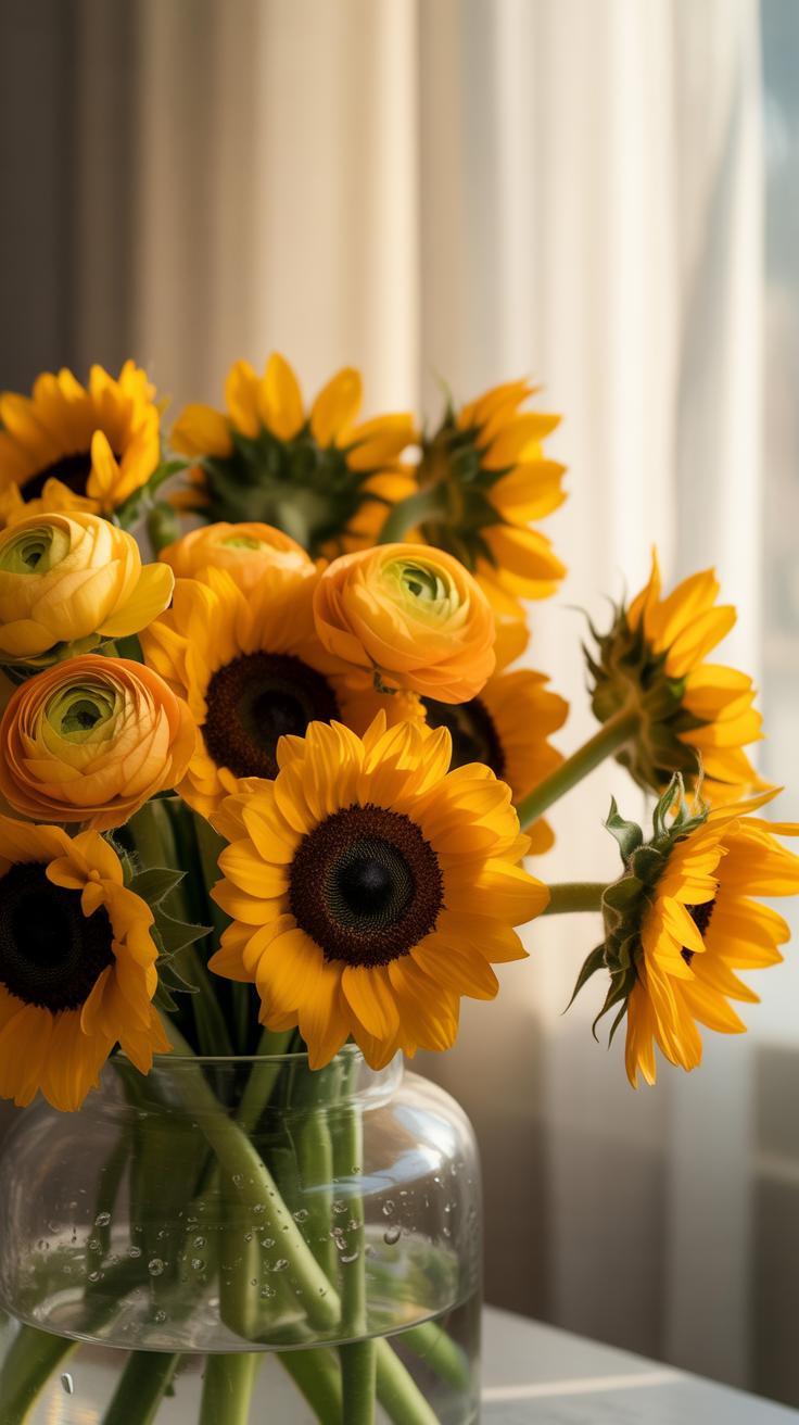
Spring and summer 2026 focus on butter yellow and apricot crush. These warm, monochromatic tones replace previous pastel trends. Florists select various species in the exact same shade to build depth. This technique relies on shape rather than color variation. Using one color highlights the natural form of each flower. It creates a clean, intentional look that fits modern minimalist wedding themes and luxury branding.
How To Match A Single Tone Bouquet To Your Wedding Aesthetic
A monochrome bouquet must align with the architectural lines of the wedding venue. Industrial spaces require structured, architectural blooms in one sharp tone. Garden settings benefit from softer textures within the same color family. Select blossoms that echo the fabric weight of the bridal gown. Heavy satins pair well with thick-petaled flowers. Light silks demand airy, delicate single-color stems to maintain a cohesive visual balance.
- Modern Minimalism: Focus on clean lines and stark contrasts. Use stark white Calla lilies or bleached foliage. This style emphasizes form over variety. It suits sleek gallery venues or urban loft spaces perfectly.
- Classic Elegance: Utilize traditional flowers like roses or peonies in a single cream shade. This creates a timeless look that avoids dated color trends. It provides a sophisticated anchor for formal ballroom ceremonies and traditional attire.
- Bohemian Naturalism: Choose earthy tones like terracotta or sienna. Incorporate dried elements with fresh blooms in the same hue. This adds organic texture without breaking the monochromatic rule. It fits outdoor desert or forest wedding environments.
- Avant-Garde High Fashion: Select bold, unexpected colors like cobalt blue or deep emerald. Use unusual flower shapes to create a sculptural piece. This approach works for experimental weddings. It turns the bouquet into a statement art piece.
- Vintage Romanticism: Apply muted tones like dusty rose or lavender. Select heirloom flower varieties to evoke historical eras. Ensure every stem stays within two degrees of the primary hue. This maintains the monochrome effect while adding subtle depth.
Lighting conditions significantly impact how a monochrome bouquet appears in photography. Bright sunlight flattens single-color arrangements. Use flowers with high-contrast textures like ruffles or velvet petals to create shadows. This ensures the bouquet does not look like a solid blob in photos. Strategic texture selection preserves the detail of the flowers. It allows the monochromatic theme to remain visible and professionally captured throughout the event.

Flower Therapy How Creating Monochrome Bouquets Supports Your Well Being
The Calming Effect Of Working With A Focused Color Palette
Choosing a single color removes the stress of complex color theory. Most florists struggle with clashing hues and visual clutter. A monochrome palette simplifies the decision process. You focus entirely on texture and form instead of worrying about color harmony. This restriction lowers cognitive load. It allows your brain to relax. Reducing choices makes the creative process more efficient and much less draining.
Color psychology proves that specific hues influence your nervous system. Blue and green tones lower heart rates. Yellow and orange hues can improve your mood. Working within one color family creates a cohesive visual environment. This consistency prevents overstimulation. Your eyes rest on the unified tones. This visual order translates to mental order. Professional designers use this strategy to maintain focus and produce high quality work without burnout.
Why Flower Arranging Has Become A Recognized Mindfulness Practice
Arranging flowers requires total presence and tactile engagement. You must handle delicate stems with care to avoid breakage. This physical task forces you to slow down your movements. Floristry involves sensory input from scents and textures. These elements root you in the present moment. Many therapists recommend manual tasks to reduce anxiety. Working with plants connects you to natural cycles and provides a break from digital screens.
Scientific studies show that handling soil and plants reduces cortisol levels. Physical contact with organic materials triggers a positive biological response. You learn to accept imperfections in nature. This practice builds patience and resilience. Following a specific design method provides a sense of control. Completing a bouquet offers a tangible reward for your effort. It serves as a functional form of meditation that produces a measurable physical result.
Dark Flowers That Deserve The Spotlight In Monochrome Designs
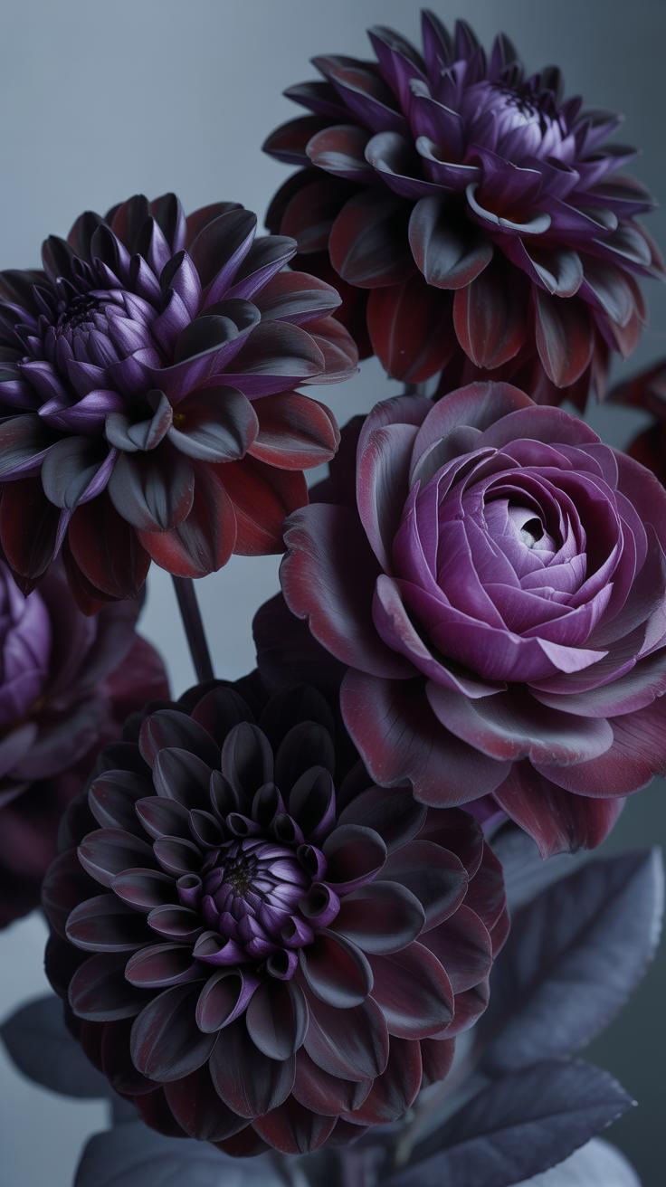
A Closer Look At Natures Most Dramatically Dark Blooms
Deep purple and maroon flowers often pass for black in monochrome arrangements. The Queen of Night tulip provides a rigid structure and smooth texture for spring designs. Black Baccara roses offer a velvet finish that absorbs light differently than standard red varieties. Chocolate cosmos introduce a brownish hue and a delicate scent. These species create visual depth without using multiple clashing colors.
Scabiosa and hellebores provide darker tones that work well in moody palettes. The Midnight Poppy is another reliable choice for high contrast. Modern floral designers use these blooms to anchor a bouquet. Darker petals typically have thicker cell walls than lighter ones. This anatomical trait gives them a matte appearance. Select these flowers to build a solid base for any dark monochromatic display.
How To Source And Care For Dark Flowers To Keep Them Looking Fresh
Sourcing dark flowers requires planning because high demand often limits local stock. Order these varieties at least two weeks before your deadline. Check for petal bruising upon arrival since dark pigments show damage easily. Store these blooms in a cool environment away from direct sunlight. Heat causes dark petals to wilt faster than light ones. Keep the water temperature low to maintain stem rigidity.
Standard hydration techniques apply but discipline is necessary. Use clean shears to cut stems at a forty five degree angle. Change the water every twenty four hours to prevent bacterial growth. Bacteria block the vascular system of the plant. This blockage leads to premature drooping in heavy headed flowers like dahlias. Monitor the humidity levels in the room. Dry air will crisp the edges of dark delicate petals quickly.
The Fancy Bouquet Formula Simple Steps To A Refined Monochrome Look
Key Design Principles That Give Any Monochrome Bouquet A High End Finish
High end monochrome design relies on texture and depth rather than color shifts. Professional florists use the Law of Threes to create balance. This means you must select three different flower types in the same hue. One should be a primary focal flower. The second acts as a secondary filler. The third provides a trailing or airy movement. This strategy prevents the arrangement from looking like a flat mass of color.
Depth comes from varying the height of each stem. You must avoid placing all heads on the same horizontal plane. Push some blooms deeper into the arrangement to create shadows. Pull others outward to catch the light. This technique mimics the natural growth patterns found in high end landscape design. It forces the eye to move through the bouquet. Strategic spacing makes a single color look expensive and deliberate.
Common Mistakes To Avoid When Assembling A Monochrome Arrangement
A major error in monochrome design is ignoring the greenery. If you use standard green leaves with a white or red palette, you break the monochrome effect. You must choose foliage that matches the tone of your petals. Some designers use painted or bleached leaves to maintain the single color scheme. Others remove all foliage entirely. This keeps the focus strictly on the textures of the primary floral stems.
Another mistake is failing to account for lighting conditions. Single color bouquets can look dull in low light. You need to mix matte petals with shiny or velvet textures to reflect light differently. For example, a satin finish rose paired with a fuzzy cockscomb creates visual contrast. Without varied finishes, your bouquet will look like a solid block on camera. Movement and light reflection turn a boring bundle into a professional piece.
Frequently Asked Questions

What exactly is a monochrome bouquet, and is it hard for beginners to make?
A monochrome bouquet is an arrangement featuring various flowers within a single color family. It is one of the most approachable monochrome bouquet ideas for beginners because you do not have to worry about clashing colors. By focusing on one hue, such as soft pink or clean white, you can easily create a sophisticated, cohesive look that instantly elevates any room without needing professional floral design skills.
How can I add depth and visual interest to a single-color floral arrangement?
To prevent your arrangement from looking flat, incorporate different textures and shades within your chosen color palette. Mix large, focal blooms like roses with delicate fillers like baby’s breath or laceflower. Utilizing various foliage and greenery also adds essential contrast. When exploring monochrome bouquet ideas, remember that playing with stem heights and flower shapes creates a dynamic, layered appearance that draws the eye and looks professionally styled.
Can I create a beautiful monochrome arrangement on a tight budget?
Absolutely! You do not need expensive exotic flowers to achieve a high-end look. Start by visiting your local grocery store and selecting affordable staples like carnations, mums, or tulips in the same color. By grouping these budget-friendly stems together, you create a lush, luxurious impact. Inexpensive greenery from your own backyard can also serve as the perfect structural base to fill out your design while keeping costs low.