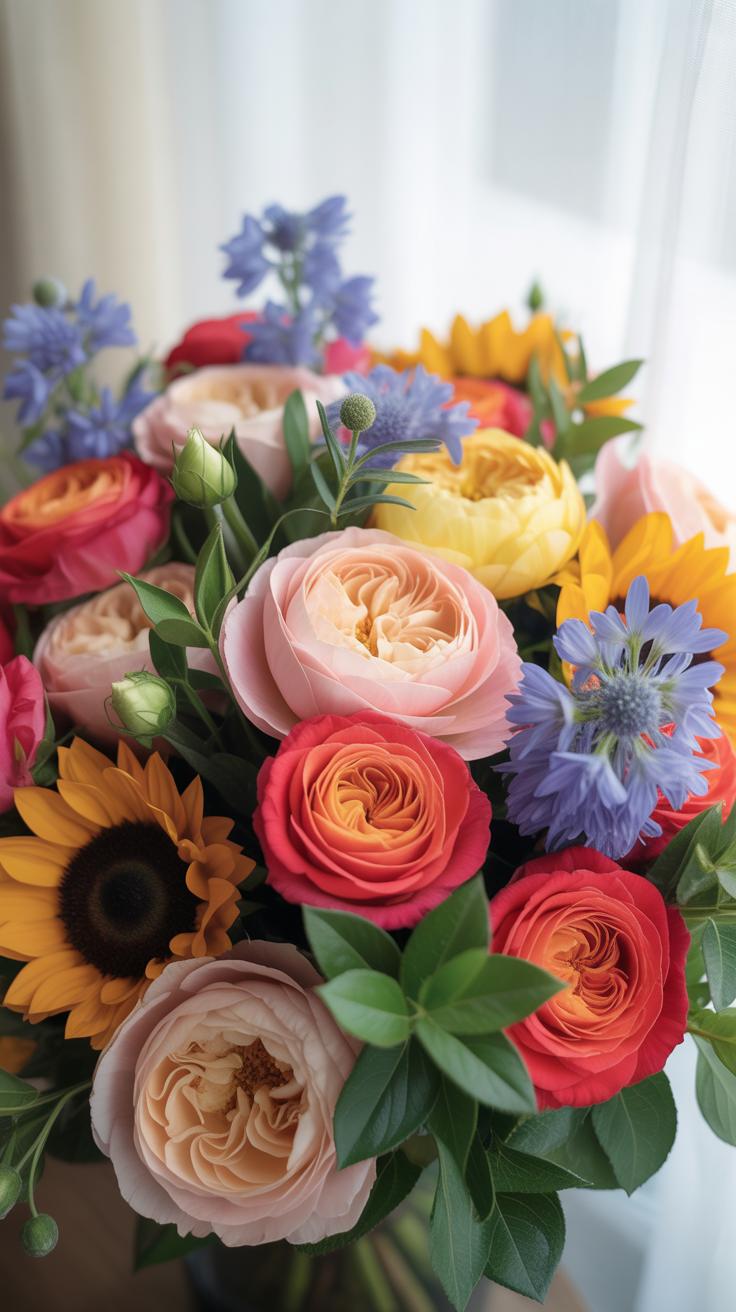
What Makes A Colorful Flower Bouquet Truly Bold And Eye Catching
The Role Of Color Saturation And Contrast In Bold Bouquet Design
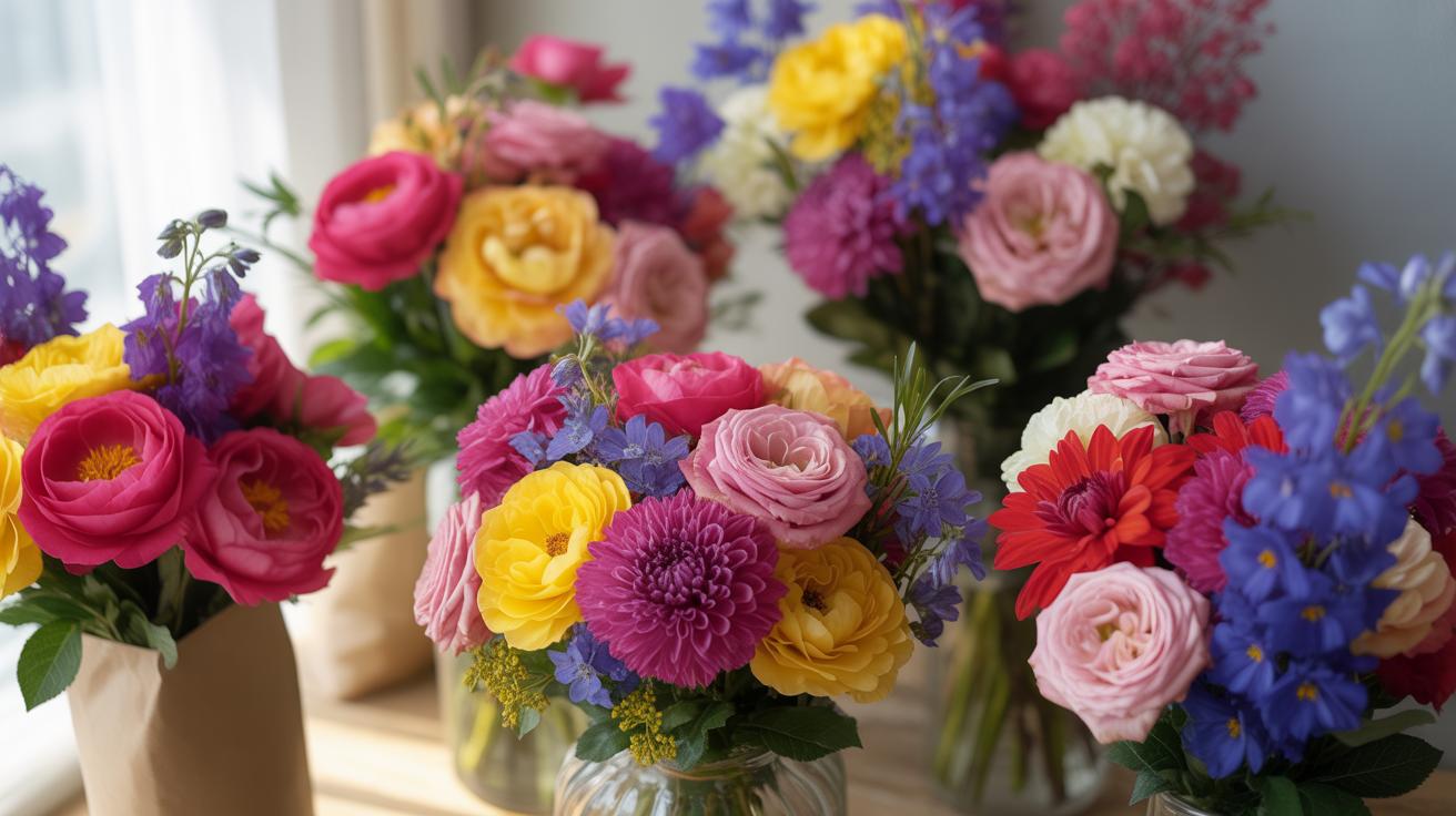
Bold bouquets rely on high saturation levels. Saturated pigments reflect more light and command immediate visual attention. Designers use the color wheel to create tension. Complementary colors sit opposite each other on the wheel. Examples include blue and orange or red and green. Pairing these creates a vibration effect. This technique forces the human eye to process two clashing signals at once.
Contrast also involves value and temperature. Dark maroon flowers make bright yellow petals look sharper. Mixing warm reds with cool purples creates a dynamic temperature shift. Professional florists avoid muddy tones. They select flowers with pure, clean hues. This ensures the bouquet does not look dull from a distance. High contrast is the fastest way to make a floral arrangement stand out in any room.
How Flower Size, Texture, And Form Amplify Bold Color Impact
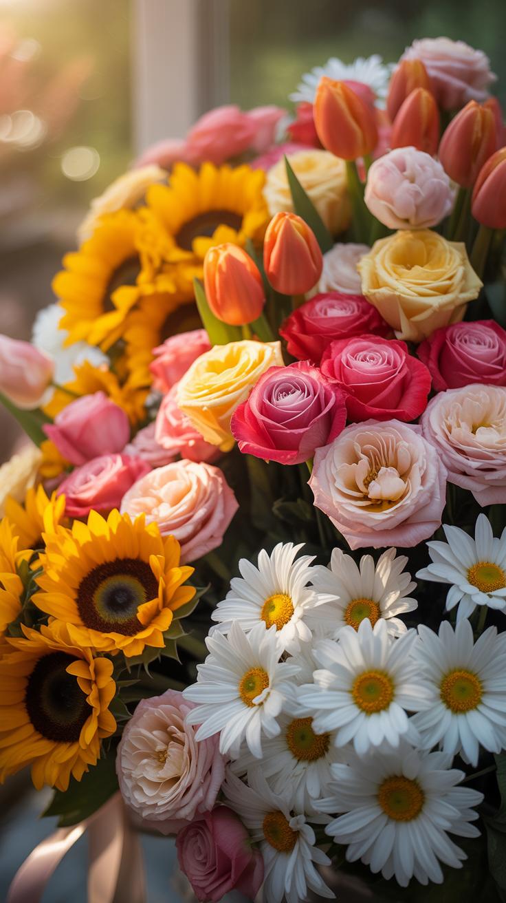
Color alone does not make a bouquet bold. Large scale blooms like dinnerplate dahlias or peonies provide a wide canvas for color. Their massive surface area maximizes the impact of the pigment. Small flowers like waxflowers often act as filler. They can dilute the visual power if overused. Successful bold designs prioritize focal flowers with significant girth. This ensures the color carries enough weight to be seen.
Texture and form change how color is perceived. Smooth petals reflect light evenly for a glossy look. Ruffled or velvety petals create shadows and depth. This physical structure makes the color appear richer. Sharp architectural shapes like protea or calla lilies add a structural edge. These distinct outlines frame the color. Using varied forms prevents the bouquet from looking like a flat mass. Structural variety reinforces the aggressive color palette.

The Science Behind Bright Flower Bouquets And Their Emotional Effect On People
How Color Psychology Shapes The Way We Respond To Vibrant Blooms
Color psychology dictates how humans process visual stimuli from bold floral arrangements. High-saturation hues like red and orange stimulate the sympathetic nervous system. These colors increase heart rates and blood pressure levels. This physiological response creates a sense of urgency and energy. Florists use these warm tones to grab immediate attention and direct focus within a large event space.
Cooler bold tones like deep indigo or violet trigger a different neurological path. These colors engage the parasympathetic nervous system to promote relaxation. Designers combine these with high-contrast yellows to create visual tension. This tension keeps the viewer engaged without causing fatigue. Understanding these biological triggers allows you to control the mood of a room through specific flower placements and color choices.
What Research Says About The Mood Lifting Power Of Bright Floral Colors
Behavioral research from Rutgers University confirms that flowers trigger immediate positive emotions. Participants in long term studies showed significantly higher scores on the Duchenne smile test when receiving bright bouquets. These results were consistent across all age groups. Bright colors specifically act as a catalyst for the release of dopamine in the brain. This chemical reward system improves memory and social behavior.
A study from Harvard University found that people feel more energetic when looking at bright flowers in the morning. This effect reduces cortisol levels and lowers anxiety. Vivid blossoms serve as a visual cue for nature and life. This connection helps people feel more resilient against daily stress. Tactically using bright colors in high traffic areas improves the overall productivity and morale of the people in that environment.

Top Flower Varieties To Include In A Bright Colorful Bouquet
Bold Tropical And Garden Flowers That Deliver Maximum Color Payoff
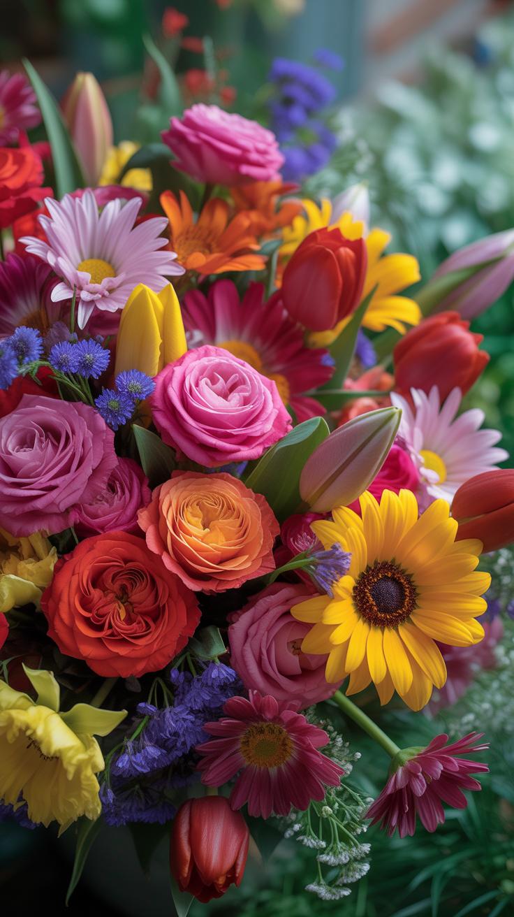
High-impact floral design requires species with high pigment density and structural integrity. Tropical varieties offer saturated tones that do not fade under harsh lighting. Garden standards like zinnias provide flat, broad surfaces that reflect more light than delicate petals. Selecting flowers with thick cell walls ensures the color remains vivid throughout the event. You must prioritize varieties known for their distinct color saturation levels.
- Bird of Paradise: This species provides a stark architectural shape with vibrant orange and deep blue contrast. It functions as a focal point because its unique geometry draws the eye immediately. The waxy texture ensures the colors remain consistent without wilting in high heat.
- Gloriosa Lily: These flowers feature wavy petals with bi-color patterns in crimson and lime yellow. They add movement to a bouquet while maintaining a high-contrast profile. The climbing nature of the plant makes the stem flexible for specific structural placements in modern floral arrangements.
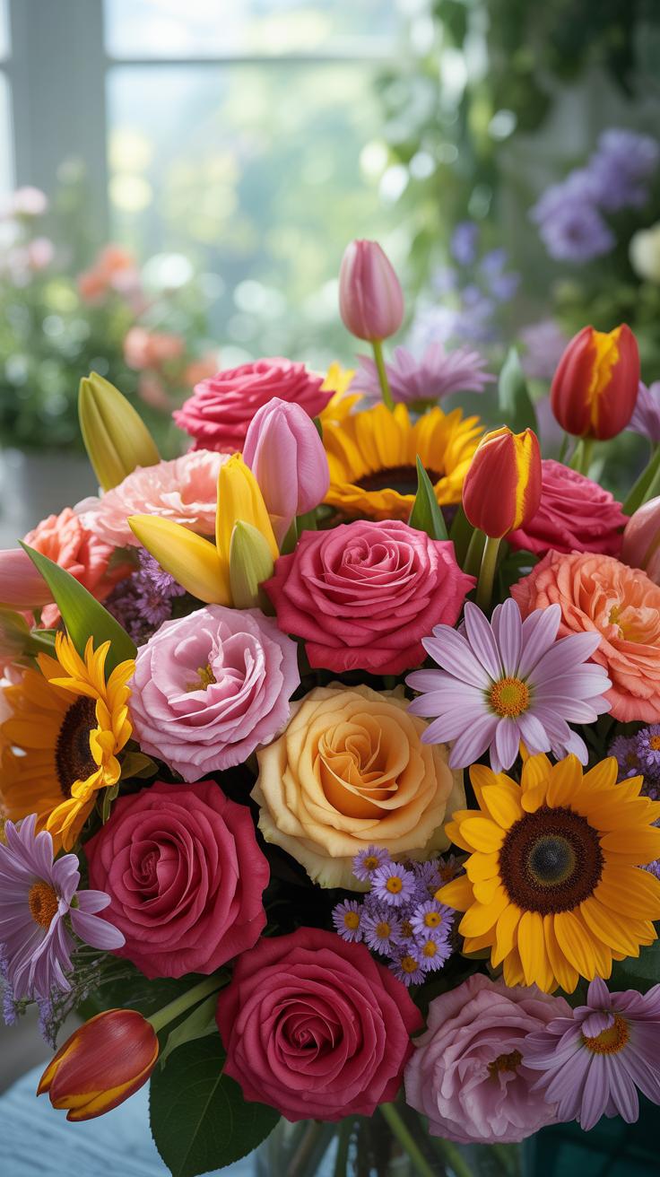
- Dahlias: Decorative and dinnerplate varieties offer the widest range of solid and variegated bold hues. Their dense petal layers create shadows that make deep purples and oranges appear more intense. They are the standard for high-volume color in late summer designs.
- Protea: King and Pink Mink varieties offer large-scale texture with muted but deep tones. Their bracts have a matte finish that contrasts against the shiny leaves of other tropicals. This variety provides bulk and durability for a heavy, color-forward bouquet structure.
- Anthirium: Known for a heart-shaped spathe, these flowers come in neon greens, deep reds, and bright pinks. The plastic-like surface reflects light differently than soft petals, adding a metallic sheen to the color palette. They last longer than almost any other cut flower.
Balance these bold choices by grouping similar colors to create a color blocking effect. This technique was popularized in mid-century modern design to emphasize form. Avoid mixing too many small, variegated species as they dilute the visual impact. Use large focal flowers to anchor the design and define the primary color story. This strategy ensures your bouquet looks intentional rather than cluttered.
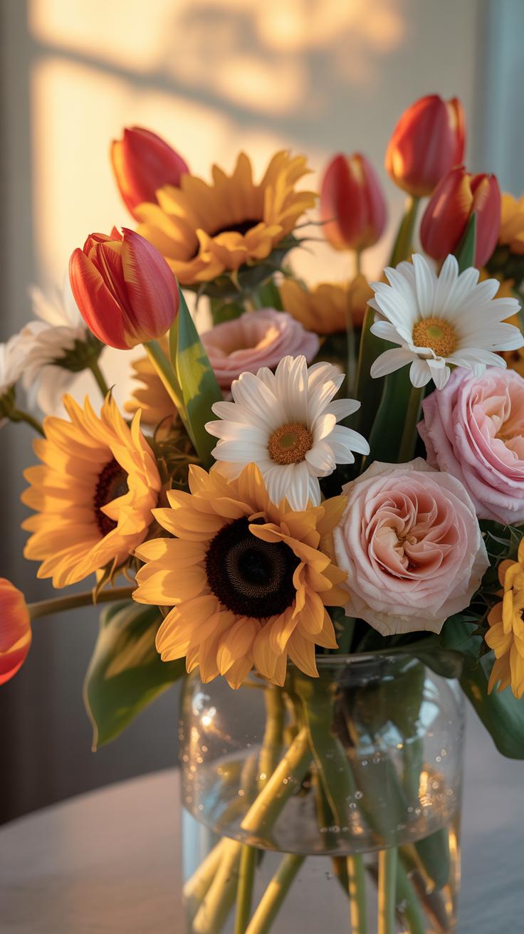
Seasonal Flower Picks That Keep Your Bold Bouquet Fresh And Relevant Year Round
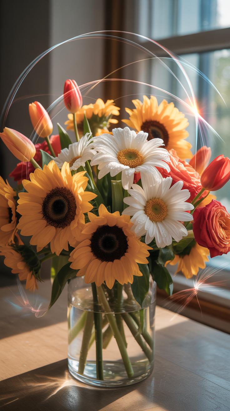
Timing your selection based on the peak bloom cycle ensures maximum petal size and color depth. In spring, focus on Dutch tulips and anemones for high-contrast centers. Summer allows for the use of sunflowers and celosia which offer intense yellow and magenta tones. Using flowers out of season results in duller colors and weaker stems. Strong stems are necessary to support the weight of heavy, colorful blooms.

Fall designs should incorporate marigolds and chrysanthemums for deep bronze and gold layers. Winter relies on amaryllis and ranunculus to provide punchy reds and oranges against dark greenery. This seasonal rotation prevents the bouquet from appearing stagnant or artificial. Expert designers match the color temperature to the natural light of the season. Following the natural growth cycle guarantees the freshest product with the most durable cellular structure.
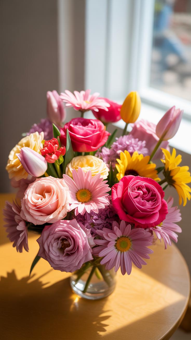
Color Combination Techniques For A Stunning Colorful Bouquet
Understanding The Color Wheel And How Florists Use It To Build Bold Pairings
The color wheel serves as the primary technical map for floral design. It organizes twelve basic hues into a circular format to show their relationships. Florists identify primary colors like red and yellow to anchor a design. They use secondary and tertiary colors to bridge gaps between intense shades. This tool helps you see which colors create high contrast and which blend together naturally.
Mastering the color wheel allows you to control visual weight and temperature in a bouquet. Warm colors like orange advance toward the eye and appear larger. Cool colors like blue recede and provide depth. You use these placements to guide the viewer through the arrangement. Precise color selection ensures the bouquet looks intentional rather than chaotic. Accurate wheel usage is the foundation of professional floral aesthetics.
Deeply felt colors are the heart’s way of remembering the vibrancy of a summer garden. Like a bold bouquet, a life lived in color captures the warmth of our most beautiful memories.
— Leo Buscaglia
Complementary, Analogous, And Triadic Color Schemes Explained For Bouquet Design
Complementary schemes use two colors directly across from each other on the wheel. Examples include blue with orange or red with green. These pairings provide the highest level of visual tension and energy. Florists use this technique to make specific blooms pop against their background. It creates a vibrant look that immediately grabs attention. You must balance the proportions so the colors do not clash harshly.

Analogous schemes use three colors sitting next to each other on the wheel. Think of red, red-orange, and orange together. This method creates a cohesive and harmonious appearance. Triadic schemes use three colors spaced equally apart, forming a triangle. This offers a balanced but high-contrast palette. Professional designers select these schemes based on the desired mood. These structures remove guesswork and guarantee a balanced final product.
Flower Therapy How A Bright Color Bouquet Can Support Mental Well Being
The Origins And Growing Recognition Of Flower Therapy In Wellness Practices
Flower therapy stems from ancient traditions where people used nature to treat emotional distress. Early civilizations in Egypt and Greece documented the use of plants for their restorative properties. Modern scientific research now validates these practices. Studies show that proximity to plants lowers cortisol levels and reduces physical markers of stress. This historical connection to nature remains a core principle in current holistic health models.
The wellness industry now categorizes floral interaction as a legitimate sensory intervention. Practitioners recognize that visual stimuli from plants trigger immediate chemical responses in the brain. This recognition led to the development of horticultural therapy as a clinical tool. Hospitals and rehabilitation centers integrate these bright floral elements to improve patient recovery rates. The practice focus on tangible results rather than abstract concepts to ensure measurable improvements in health.
Using Bold And Bright Floral Arrangements As A Daily Mood Boosting Ritual
Strategic placement of bold bouquets creates a focus point for daily mindfulness. High-contrast colors like saturated red and bright orange demand attention and interrupt negative thought loops. Set these arrangements in high-traffic areas like entryways or desks to maximize exposure. This placement ensures that you interact with the colors during peak stress times. Consistent visual contact reinforces the positive association between the viewer and the space.
Select specific color spectrums to achieve desired physiological outcomes. Warm tones like yellow and gold stimulate the production of serotonin which enhances alertness. Cool but saturated blues and purples promote focus and mental clarity during difficult tasks. High-intensity colors work better for energy than pastel shades in office environments. Use these bright arrangements as anchors for short breathing exercises to lower heart rates and increase productivity throughout the workday.
How To Design A Vibrant Floral Arrangement For Every Occasion
Bold Bouquet Ideas For Weddings Celebrations And Milestone Events
High-stakes events require maximum visual impact to anchor the venue. Use the principles of the Fauvist movement by prioritizing saturated color over realistic blending. Pair deep crimson roses with bright orange ranunculus to create immediate heat. This high-contrast approach ensures the flowers remain visible in professional photography against white bridal gowns or dark suit fabrics. Use massing techniques to group similar colors for a modern look.

Structure determines the success of a milestone arrangement. Incorporate architectural elements like blue delphinium or yellow forsythia to add height and authority to centerpieces. These lines direct the eye toward key event focal points like podiums or altars. Use secondary colors like violet and lime green to prevent the palette from looking flat. Heavy textures from protea or dahlias provide the physical weight necessary for large Scale installations.
Everyday Vibrant Floral Arrangements That Brighten Homes And Workspaces
Daily environments benefit from intentional color theory application. Place primary yellow sunflowers or red tulips in high-traffic zones like foyers to boost occupant alertness. Use the Dutch Still Life style by mixing various bold hues in a single vessel for a lush effect. Keep stems at different heights to allow airflow and light to pass through the arrangement. This prevents the bold colors from overwhelming small desk areas.
Functionality dictates the choice of blooms for the home. Select long-lasting varieties like carnations or zinnias in electric shades to extend the life of the display. Change the water daily to prevent bacterial growth which dulls vibrant petal pigments. Avoid overcrowding the vase to ensure each flower has space to breathe. Strategic placement near natural light sources enhances the saturation of the petals and improves the mood of the room.
Choosing The Right Bright Color Flower Bouquet For Gifting
Matching Bold Flower Colors To The Personality And Preferences Of The Recipient
Select bold colors based on the recipient’s daily energy and environment. Assertive personalities often prefer high-contrast pairings like orange and purple. These combinations suggest strength and confidence. Observe the recipient’s home decor or clothing choices to identify their favorite hues. Avoid guessing their preferences. Use saturated tones to match a vibrant lifestyle. Active individuals typically respond well to warm primary colors like red.

Consider the physical space where the bouquet will sit. High-saturation flowers command attention in minimalist rooms. A quiet person might find neon palettes overwhelming. Match the visual weight of the blooms to the recipient’s social style. Use monochromatic bold schemes for those who appreciate modern design. Mixed bright colors suit people with eclectic tastes. Always prioritize the recipient’s proven color history over generic trends to ensure the gift resonates.
Cultural Meanings Of Bold Flower Colors To Consider Before Gifting
Cultural context dictates the success of a bold bouquet. In many Asian cultures, red symbolizes luck and celebration. It is a standard choice for weddings and lunar festivals. However, white is often associated with mourning in these same regions. Never send white flowers to a celebration in a traditional East Asian household. Research the specific heritage of the recipient to avoid sending a message of grief by mistake.
In Latin American traditions, yellow flowers often represent death and are reserved for the Day of the Dead. Gifting bright yellow blooms in this context can be insensitive. Western markets view yellow as a symbol of friendship and joy. European history associates yellow with jealousy in some older floral dictionaries. Always verify local customs when selecting intense pigments. Strategic color selection prevents social errors and ensures your floral gift communicates the intended message accurately.
DIY Tips For Arranging A Bright Color Bouquet At Home Like A Professional
Essential Tools, Supplies, And Techniques Every Home Arranger Should Know

Professional floral design requires specific hardware to ensure structural integrity and flower longevity. You must prep every stem to maximize water intake and maintain vibrant hues. Use sharp bypass shears rather than standard kitchen scissors to avoid crushing the vascular system of the plant. Clean your vessels with bleach to eliminate bacteria that cause premature wilting. Proper preparation prevents the arrangement from collapsing under its own weight.
- Bypass Shears: High quality blades make clean cuts without pinching the stem. This keeps the water transport system open so bold blooms stay hydrated. Standard scissors tear the tissue and lead to rapid decay in high energy arrangements.
- Floral Tape: Use thin waterproof tape to create a grid across the mouth of the vase. This grid locks heavy headed flowers into specific positions. It allows you to maintain precise spacing between clashing or complementary colors without them shifting.
- Flower Food: Commercial packets contain carbohydrates, acidifiers, and biocides. These chemicals regulate pH levels and limit bacterial growth in the water. This is vital for maintaining the intensity of saturated pigments in bright petals over several days.
- Thorn Stripper: Metal or rubber strippers remove foliage and thorns below the water line quickly. Rotting leaves create ethylene gas which kills flowers early. Clean stems ensure that the focus remains entirely on the colorful blooms above the rim.
- Chicken Wire: Folded wire mesh provides better structural support than floral foam for heavy stems. It is a reusable tool that allows for more natural stem placement. Professionals use this to create the wide, airy shapes seen in modern high end designs.
Mastering the 45 degree cut is the most basic yet vital skill for any home arranger. This angle increases the surface area for water absorption and prevents the stem from sitting flat against the bottom of the container. Remove all foliage that falls below the water line to keep the environment sterile. These tactical steps provide the foundation for any high contrast color palette.
Step By Step Guidance On Layering Colors And Textures For A Polished Bold Look
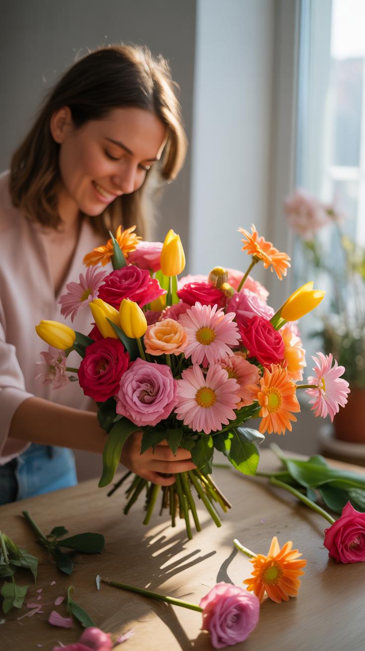
Start with a sturdy base of dark greenery to create a high contrast backdrop for your colors. This foliage acts as a frame and provides mechanical support for the primary stems. Place your largest, most vibrant focal flowers first in a triangular pattern to establish balance. Professional designers use this grouping method to guide the eye across the entire arrangement rather than focusing on one single spot.
Layer in secondary blooms that sit slightly higher or lower than your focal points. This variation in depth creates visual interest and prevents the bouquet from looking flat. Add tactile elements like berries or spiked celestial flowers to break up soft round shapes. Finalize the look by tucking in airy filler plants that bridge the gaps between intense color blocks. Proper layering ensures every bright hue has space to breathe.
What To Look For When Visiting A Flower Shop For Bold Color Bouquet Ideas
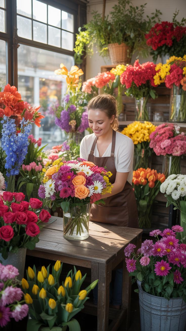
How To Communicate Your Bold Color Vision To A Professional Florist
Do not use vague descriptions like bright or pretty. Use specific color terminology to get the best results. Professional florists work with color theory daily. Mention specific shifts such as monochromatic, analogous, or complementary schemes. Provide physical or digital swatches of your target shades. This prevents misinterpreted descriptions. Bring photos of specific flowers that match your desired saturation levels to ensure the florist understands your goals.
Explain the intended lighting for the bouquet. Natural sunlight and artificial indoor lighting change how saturated colors appear to the eye. Request high contrast pairings if you want a bold look. Ask for primary colors like red, blue, and yellow for maximum impact. Demand deep jewel tones for a moody aesthetic. Specificity reduces errors. Always confirm if the florist can source specific varieties like Protea or Anemones before placing an order.
Questions To Ask At The Flower Shop To Ensure Freshness, Quality, And Color Longevity
Ask the florist for the arrival date of the current stock. Flowers lose color intensity as they age and respire. Inspect the petals for bruising or transparent edges. This indicates poor hydration or old age. Inquire about the source of the blooms. Locally grown flowers often retain color better because they spend less time in transit. Verify that the shop uses clean buckets and anti-microbial solutions to prevent stem clogging.
Request information on the specific vase life of bold varieties. Some high-pigment flowers like Dahlias have shorter lifespans than others. Ask about the storage temperature in their floral cooler. Drastic temperature changes cause many flowers to wilt and fade rapidly. Ensure the florist uses a hydrating treatment for woody stems. This maximizes water uptake. Knowing the technical care steps ensures your bold colors stay vibrant for more than three days.
How To Care For Bright Flower Bouquets So Bold Colors Last Longer
Water, Light, And Temperature Tips That Preserve Vibrant Flower Colors
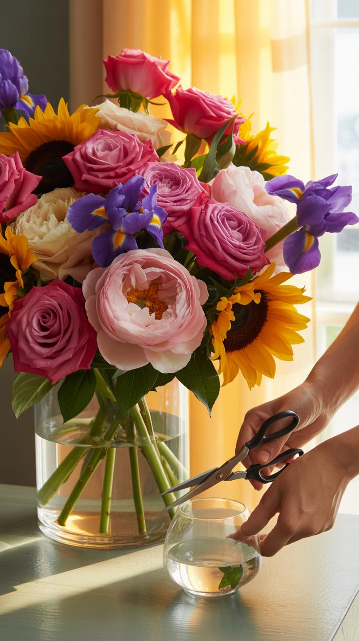
Vibrant pigments require immediate hydration to prevent oxidative stress. Use tepid water mixed with flower food containing sugar and a pH acidifier. Cut stems at a forty-five-degree angle every two days. This maximizes the surface area for water intake. Clean water prevents bacterial growth that plugs the stem capillaries. Change the water daily to ensure the liquid stays clear and free from decay.
Heat accelerates the metabolic rate of cut flowers and causes rapid fading. Keep arrangements in cool areas away from direct sunlight and drafts. Ultraviolet rays degrade the anthocyanin molecules that give flowers their deep reds and purples. Maintain a room temperature between sixty-five and seventy-two degrees Fahrenheit. Moving your bouquet into a refrigerator overnight mimics professional floral coolers. This simple step extends the life of bold hues significantly.
Common Mistakes That Cause Bold Bouquets To Fade Prematurely And How To Avoid Them
Foliage left below the water line creates a breeding ground for bacteria. Organic matter decomposes and releases ethylene gas which triggers the wilting process. This gas acts as a ripening hormone that kills bright blooms faster. Remove all submerged leaves immediately upon arrival. This keeps the water sterile and the stems open. Clean your vase with bleach before use to kill any lingering pathogens from previous arrangements.
Ethylene exposure also comes from proximity to ripening fruits and vegetables. Avoid placing flowers in kitchens near apples or bananas. These items emit high levels of gas that drain the color from petals within twenty-four hours. Mist your flowers carefully to maintain humidity without saturating the blossoms. Excessive moisture on petals can lead to gray mold or spotting. Focus on stem health and environmental stability to maintain the original saturation.
Frequently Asked Questions

What are the best flower types for creating a vibrant, high-contrast arrangement?
To achieve a high-impact look, focus on blooms with naturally saturated pigments. Consider using deep purple anemones, fiery orange ranunculus, or hot pink peonies. These varieties are perfect for bold color bouquet ideas because their petals hold intense hues that won’t fade against greenery. Mixing different textures, like velvety roses with spiky celosia, further enhances the visual drama and ensures your arrangement looks professionally designed and full of life.
How can I balance multiple bright colors without the bouquet looking messy?
The secret to organizing bold color bouquet ideas is using the color wheel to guide your selections. Try a monochromatic scheme with various shades of one bright hue, or an analogous palette using neighboring colors like red, orange, and yellow. To prevent a cluttered appearance, incorporate plenty of dark foliage or neutral “breaker” flowers. This provides a visual resting point, allowing the intense colors to pop without overwhelming the viewer’s eye.
Is it possible to create a bold, colorful bouquet on a limited budget?
Absolutely! You can achieve a high-end look by choosing affordable, sturdy flowers in vivid tones, such as carnations, zinnias, or gerbera daisies. These blooms are cost-effective and come in incredibly bright shades. Another tip is to supplement your arrangement with foraged greenery or dramatic dried elements. By focusing on a few “star” stems in saturated colors and filling the rest with inexpensive filler, you can create stunning arrangements without overspending.