
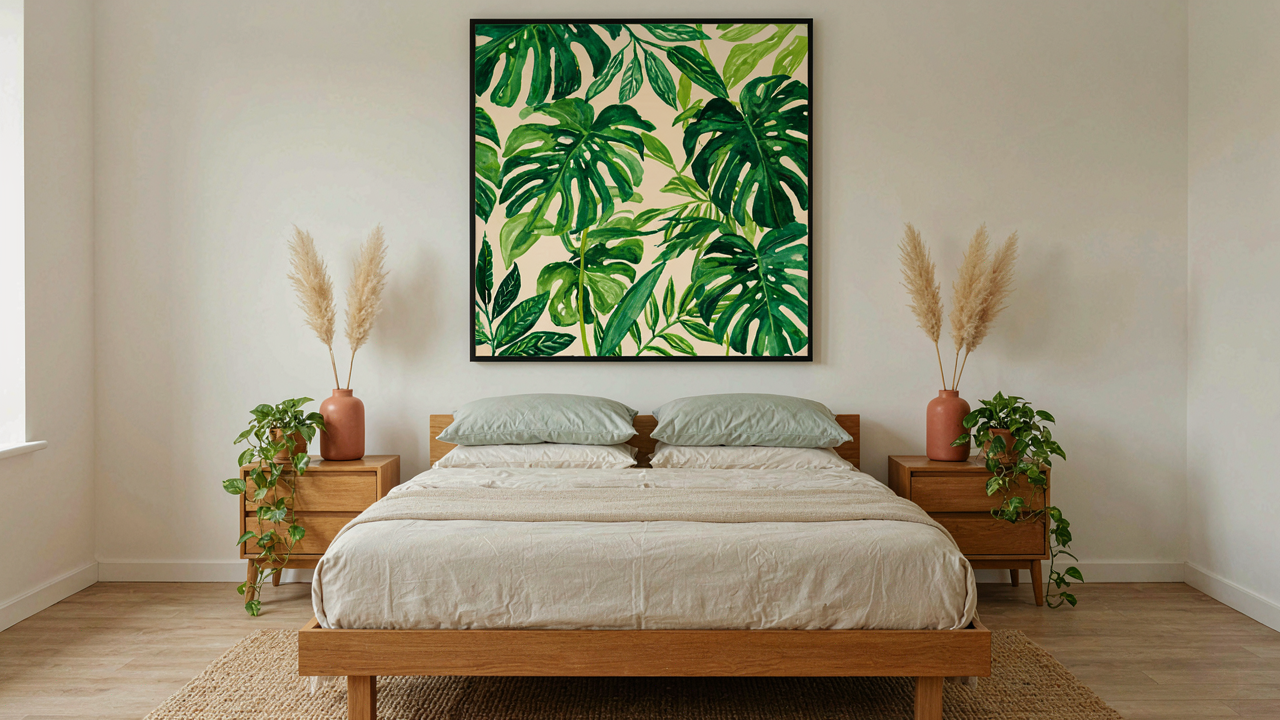
The Illusion Of Serenity: Why Generic Botanicals Fail
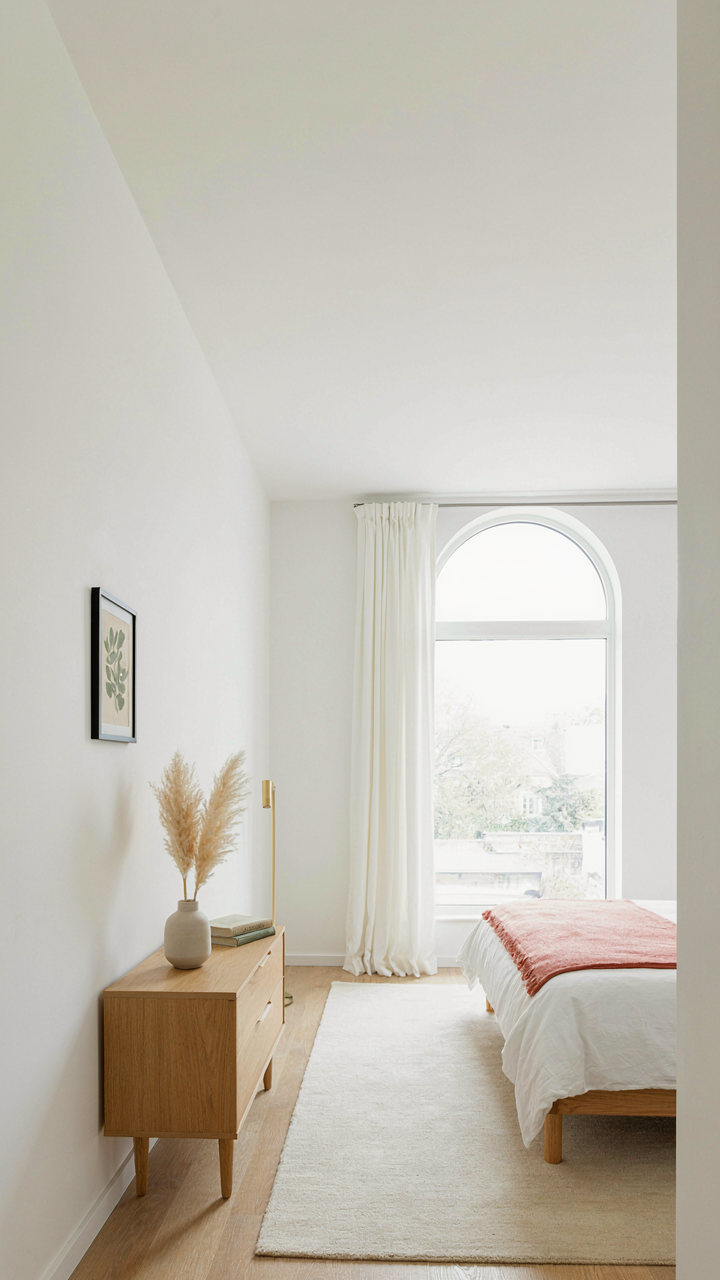
Scale And Placement Kill The Effect Before Design Even Starts
You want botanicals to work because you believe they’ll fix what’s broken about your bedroom. They won’t, because you’ll hang them wrong. The mechanism is simple: your eye needs contrast and hierarchy to process visual information. A single 16×20 print centered above a nightstand creates a dead zone, not a focal point. Your brain registers it as decoration you tolerated, not something you chose. Scale must match wall proportion. Placement must anchor the room’s visual weight, not float in the middle of nothing.
Most advice says “hang at eye level” and stops there. That’s incomplete. Eye level for standing isn’t eye level for lying in bed, where you’ll spend eight hours daily. A botanical print should occupy 25 to 40 percent of available wall space above furniture to register as intentional. Prints smaller than this read as afterthoughts. Larger than 40 percent and they flatten the room’s depth. The placement rule: anchor to an actual piece of furniture, not to empty wall. This creates a visual system instead of decoration scattered in space.
When Patterns Become Noise Instead Of Rest
Interior design borrowed from signal processing the concept of noise—visual information the brain flags as irrelevant clutter. Botanical prints degrade into noise when you layer too many competing patterns. A room with botanical bedding, botanical wall art, botanical throw pillows, and a botanical rug creates the opposite of the calm you wanted. Your nervous system works harder, not less hard, to filter what matters. The irony: people add more botanicals when the first batch doesn’t feel restful, accelerating the collapse into chaos.
The real problem isn’t quantity. It’s unintentional repetition of the same plant species or print style across multiple surfaces. When every piece shows ferns or monstera leaves in similar scales and colors, the eye stops differentiating and starts tuning out. Strategy: use one dominant botanical print as your anchor piece, then incorporate botanical elements through solid textures, wood, or a single secondary pattern in a different plant family entirely. This maintains the botanical aesthetic without triggering visual fatigue. Your bedroom becomes a space you want to inhabit, not a collection to apologize for.
Framed Botanical Prints: The Contextual Commandment
White Space Works Like Gravity
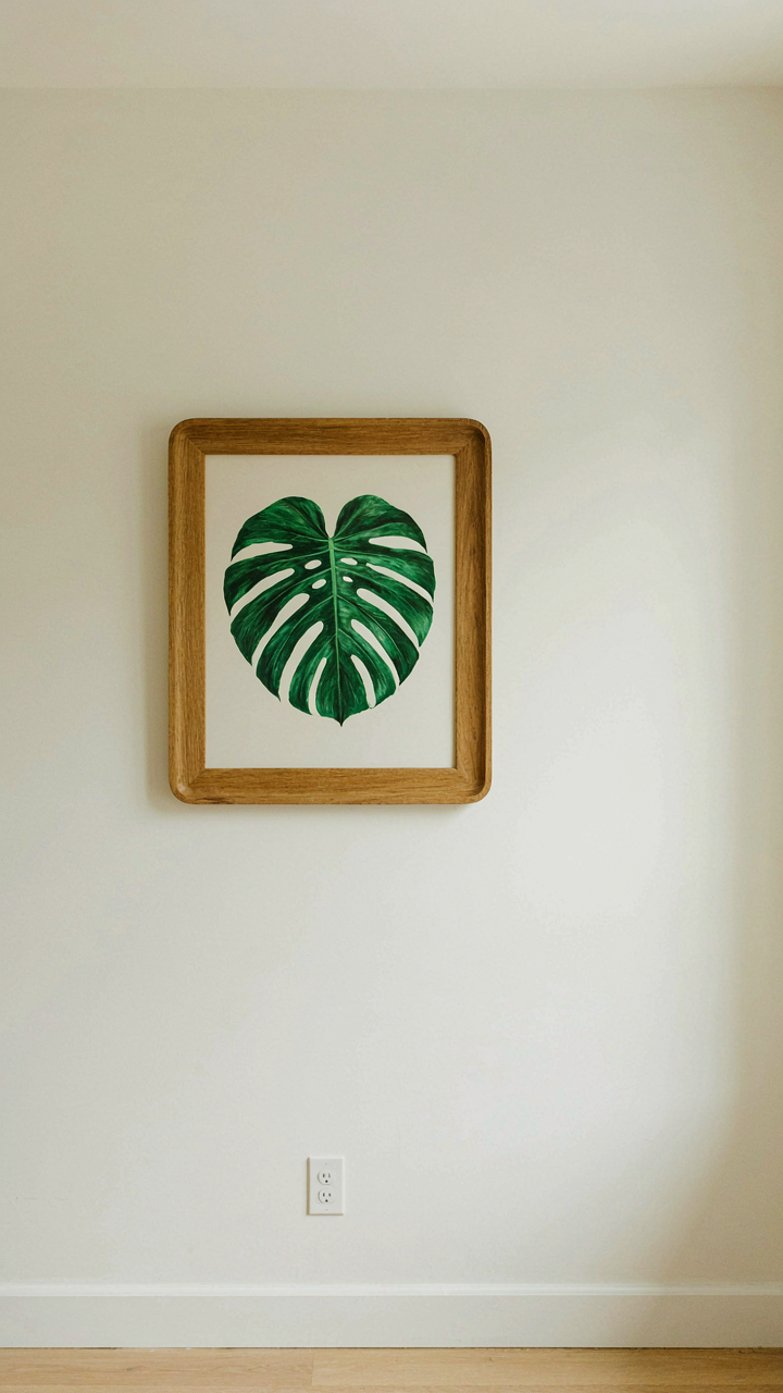
You want people to feel like your bedroom is intentional, not cluttered. That’s the real reason you care about this. Empty wall around a framed botanical print functions like gravity in visual design—it pulls attention toward the frame instead of scattering it. The principle is borrowed directly from physics: objects gain perceived mass when surrounded by void. A print surrounded by blank wall reads as important. A print drowning among other objects reads as decoration you couldn’t find a home for.
Most advice tells you to “layer prints” or “create a gallery wall.” That’s wrong for botanical prints in bedrooms. A single botanical print on a wall with substantial empty space establishes dominance. The frame becomes an anchor point for your eye. Place your print at eye level when standing, roughly 57 to 60 inches from floor to center. This is not negotiable if you want the print to function as intended.
Frame Choice Dictates Perceived Value
The frame material and finish do the heavy lifting on whether your botanical print reads as thoughtful or throwaway. Wood frames communicate warmth and tradition. Metal frames signal minimalism or contemporary taste. Glass matters too—regular glass flattens the print, while museum-quality glass reduces glare and protects pigment from UV damage, which extends the life of the print itself by decades. The frame is not a container. It’s the declaration of how much the print is worth your attention.
Thin frames work for botanical prints because the botanical subject already carries visual weight. Ornate frames compete with the print and shrink perceived quality. A natural wood frame in walnut or oak thickness of one to one and a half inches pairs with most botanical prints without fighting them. Metal frames should be brushed, not polished—polished metal reflects light and breaks the frame’s authority. Match your frame finish to existing bedroom hardware: door handles, light fixtures, or drawer pulls. Consistency builds coherence. Frame your print within four weeks of hanging it. Delay signals you haven’t committed to the decision.
The Biophilic Blueprint: Hardwiring Your Relaxing Bedroom
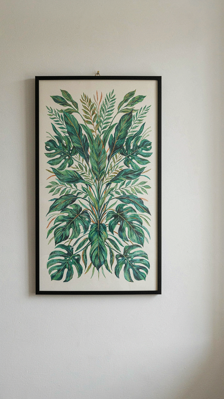
Your Brain Recognizes What Kept Your Ancestors Alive
You want botanical print bedroom decor because you’re wired to trust it. Evolutionary psychology maps directly onto interior design through a concept called biophilia, your innate pull toward living systems. Your nervous system doesn’t distinguish between a real forest and a credible representation of one. Botanical prints work because they trigger the same safety signals your ancestors needed to survive.
When your eye lands on foliage patterns, your brain registers resource availability, water proximity, and shelter. This isn’t mystical. Your amygdala and parasympathetic nervous system react to the visual data before conscious thought arrives. Bedroom relaxation isn’t about aesthetic preference. It’s a physiological response to environmental cues that signal safety. Botanical prints deliver those cues at scale without requiring an actual garden.
Pattern Recognition Beats Literal Representation
The common mistake is treating botanical prints as decoration instead of neurological input. You don’t need photorealism. You need the pattern language nature uses. Fractal repetition, organic asymmetry, and layered complexity are what your visual cortex processes as “natural.” A stylized botanical print works better than a photograph because it strips away noise and amplifies the pattern.
Look at traditional botanical illustrations from botanical gardens and scientific texts. They simplified reality into essential shapes and rhythms. Your brain locks onto these rhythms faster than it processes photographic detail. When selecting prints, prioritize recognizable leaf structures, repeating growth patterns, and depth variation. Place them where your eye naturally travels during rest or upon waking. The arrangement itself becomes a visual protocol your nervous system learns to associate with safety.
Tropical Bedrooms: The Intentional Immersion Method
Prints, Textures, And Light Work Together
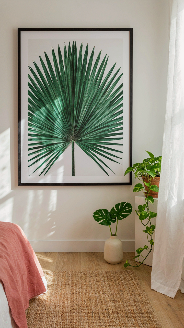
You want this to feel real because a flat room makes you feel like you’re failing at taste. Here’s the mechanism: tropical botanical prints work only when light hits them the way it hits actual leaves. Direct sunlight flattens prints. Filtered or diffused light creates depth by casting shadows across the texture of the paper itself.
Add linen or cotton elements with visible weave near the prints. Rattan, jute, or woven wall hangings absorb light differently than smooth surfaces. This layered texture strategy mirrors how actual tropical foliage breaks light into multiple planes. Position prints where morning or afternoon light grazes them at an angle, not head-on. The print becomes a surface, not a decoration.
Building A Space That Hits Multiple Senses
The common advice calls this “creating an atmosphere.” That’s lazy. You’re actually reverse-engineering the sensory input your nervous system gets in an actual tropical environment, then engineering it into a bedroom. Neurobiology recognizes that touch, smell, and sight integrate to create a cohesive spatial memory.
Vegetation matters. Real potted plants release volatile organic compounds that your brain recognizes before you consciously notice them. Pair a single botanical print with live trailing plants on the same wall. Add tactile elements: a sisal rug, raw wood furniture, linen bedding. These materials feel warm and porous like living things. The print becomes one data point in a coordinated input system, not the focal point trying to do all the work alone. Arrange these materials so you encounter them in sequence as you move through the room, building recognition layer by layer.
Curating Your Tranquil Bedroom: The Selective Abundance Principle
Restraint Beats Visual Noise
You want your bedroom to feel intentional because clutter signals you’ve lost control of your space. Here’s the mechanism: your brain processes visual information as cognitive load. Every botanical print competes for attention. Add too many and you’ve built an gallery, not a sanctuary. The goal is calm, which requires visual hierarchy.
One carefully placed fern print does more work than five scattered across walls. Restraint forces you to choose prints with genuine impact. Your eye lands somewhere specific. The room breathes. You’ve eliminated the background noise that prevents deep sleep. This is why hotel rooms feel restful, not cluttered. They understand subtraction.
The Dominant Focal Point
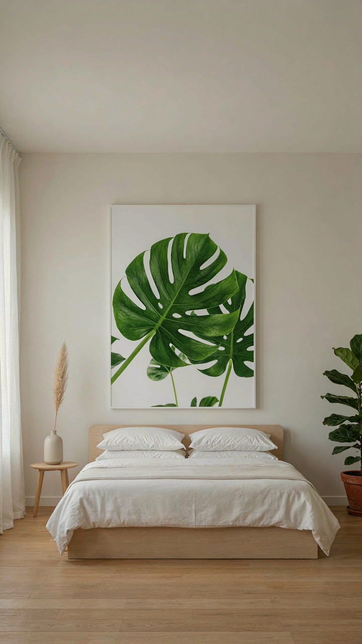
Statement pieces work because they solve the attention problem immediately. In retail design, this principle is called “hero merchandising”: one product gets 80 percent of the display space and draws foot traffic. Apply this to botanical print bedroom decor. One large-scale botanical print, positioned at eye level from your bed, becomes the room’s organizing principle. Everything else supports it.
The statement piece doesn’t require a frame or elaborate styling. A single 24×36 inch print of a monstera or palm frond on a neutral wall creates spatial definition without visual fatigue. Your eye settles there. The room organizes around that anchor. Other small prints or botanicals fade into supporting detail. This concentration of visual weight is what separates intention from decoration. Position your statement piece first, then build the remaining palette around it.
Bedroom Vintage: The Patina Protocol For Authenticity
Where To Find Real Botanical Prints
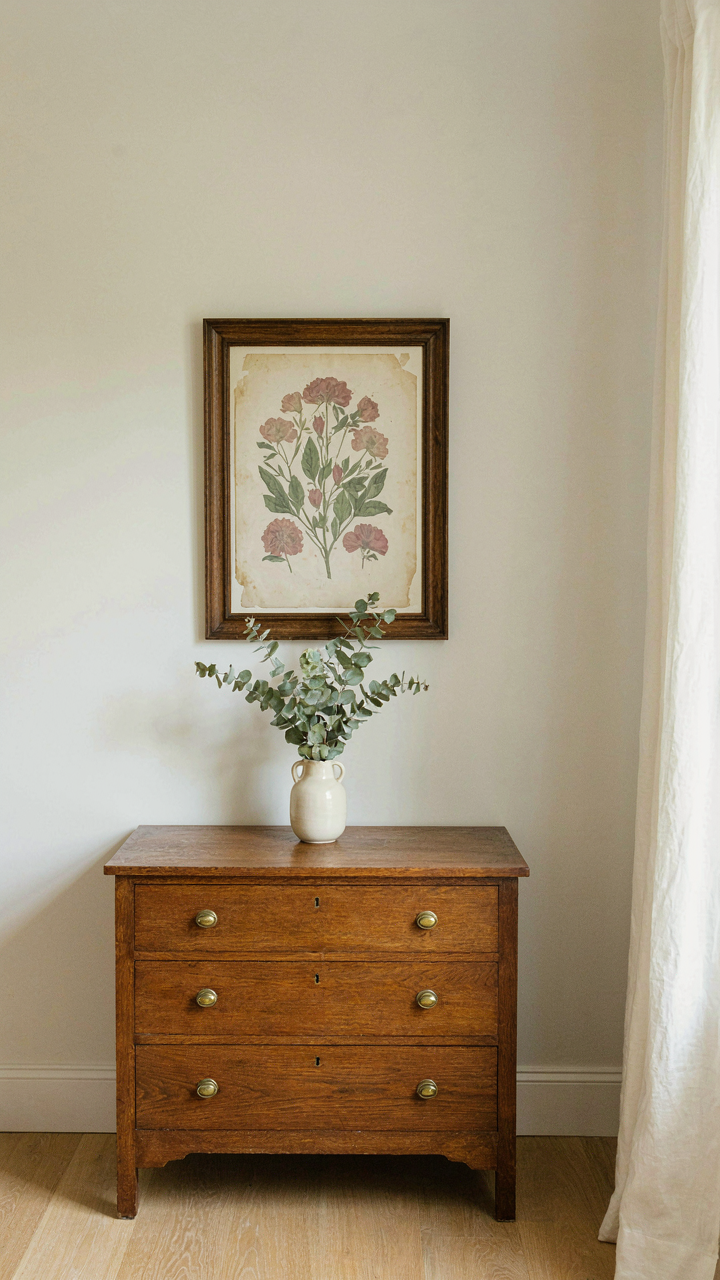
You want the credibility signal that comes from owning something legitimately old. Here’s the mechanism: authenticity in vintage design works like curation in biology. An ecosystem either contains genuine organisms or it doesn’t. A bedroom either contains real period botanical illustrations or convincing reproductions. Most people buy the latter and call it vintage. The difference matters because genuine aged prints carry visual weight that new prints mimicking age cannot replicate. Paper yellowing, foxing patterns, and ink fading follow no formula. They’re the residue of actual time.
Source prints from three reliable channels. First, estate sales and auction houses specializing in natural history materials. Second, dealers who specialize in 19th-century scientific illustration and can verify provenance. Third, reputable online platforms with return policies that allow paper inspection under proper light. Avoid marketplaces mixing authentic and reproduction stock without clear labeling. Verify the seller’s track record on botanical print authentication. A legitimate dealer can explain why paper shows specific aging marks and what printing technique produced the illustration. Don’t settle for vague descriptions like “vintage style” or “antique inspired.”
Pairing Prints With Period Furnishings
The real lesson from interior design history is constraint breeds coherence. Mixing a genuine 1920s botanical print with mass-produced modern furniture creates visual discord because the print signals a specific era and craftsmanship level the furniture doesn’t match. Your bedroom either commits to the period or it doesn’t. Half-measures read as confused, not eclectic.
Match prints to furniture from overlapping decades. If your prints are from the 1890s to 1920s Arts and Crafts movement, furnishings should reflect that same production window. Wood frames, hand-forged hardware, and upholstery in period-appropriate fabrics create alignment. Solid wood dressers with simple joinery, cast iron bed frames, and wool textiles signal the same era as your botanical material. Skip contemporary pieces that break the timeline. The room’s visual authority depends on everything referencing the same moment in design history.
Framed Botanicals: The Strategic Grouping System
Why Odd Numbers Work Better Than Pairs
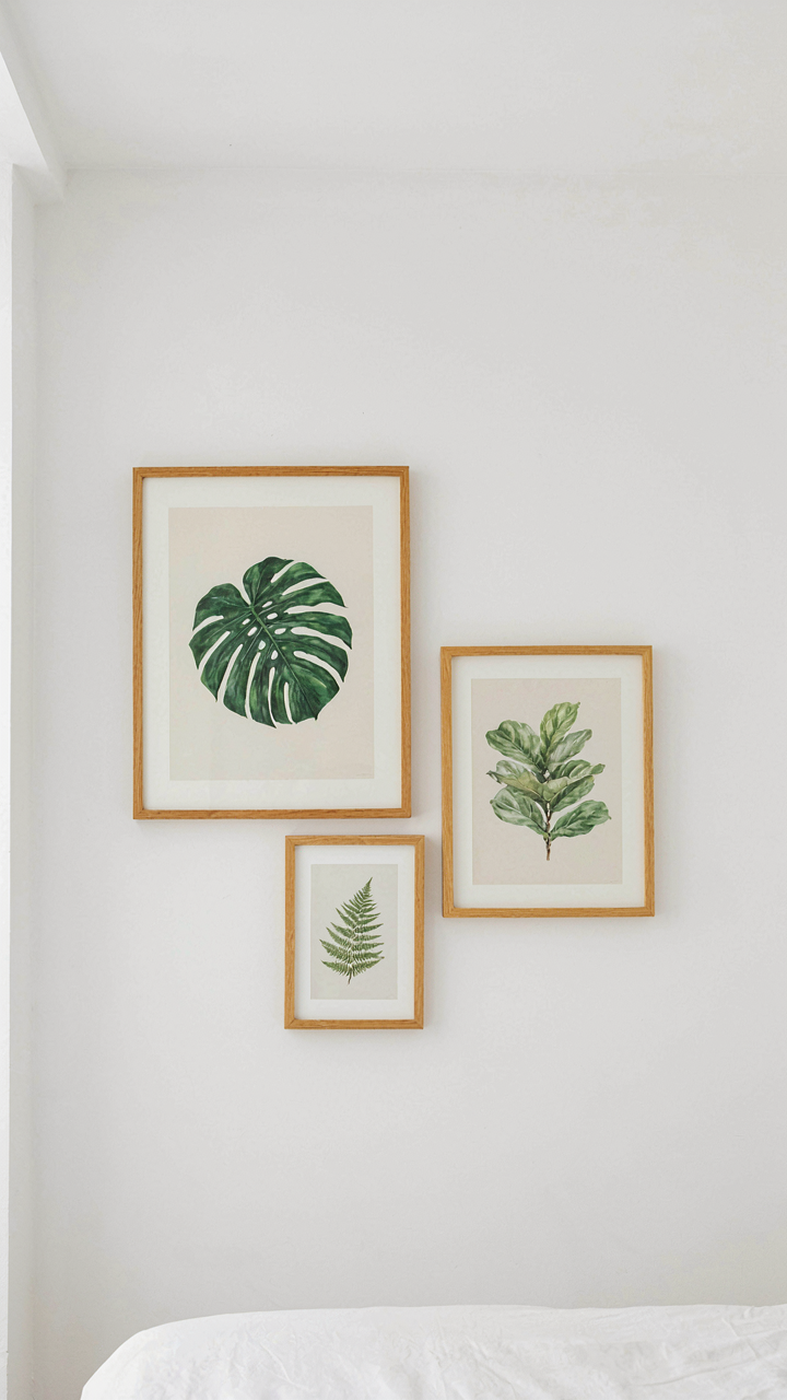
You want your wall to feel intentional, not like you’re filling space. That’s the real fear underneath asking about quantities. Borrowing from composition theory in visual art, odd numbers create asymmetrical balance, which your brain reads as deliberate arrangement rather than default matching. Even numbers feel like pairs. Pairs feel like compromise.
Three, five, or seven prints create visual tension that pulls the eye around the wall instead of settling it. The odd number interrupts pattern recognition, forcing active viewing. Start with three botanicals as your base. Five works if your wall runs horizontal and long. Seven only if you have the square footage to justify the density without cramping.
- Three prints: Works for walls under 8 feet wide. Creates a tight focal point. Easiest to balance visually without overthinking placement or frame sizes.
- Five prints: Ideal for bedroom walls 8 to 12 feet wide. Allows for varied frame sizes and creates rhythm without excess. Standard gallery wall density.
- Seven prints: Requires walls over 12 feet or multiple walls. Risk of visual noise increases. Only use if frames, mats, or spacing create clear breathing room between pieces.
- Single statement print: Works only if the frame is substantial and the botanical subject has architectural presence. Most bedrooms mistake this for empty wall.
- Nine prints: Rarely necessary. Creates museum density. Demands professional spacing and frame consistency or becomes visual clutter masquerading as curation.
Uneven groupings force your brain to work harder, which makes the arrangement feel curated rather than coincidental. This is why matching frame sets always feel sterile. Mismatched frames with odd quantities read as collected taste instead of catalog decorating.
Spacing That Actually Creates Cohesion
Gallery wall principles aren’t vague aesthetic suggestions. They’re rules about negative space distribution. Most people space prints too far apart, thinking distance creates elegance. It creates fragmentation. Your prints need to function as a single visual unit, not individual pieces standing alone.
The standard is 2 to 3 inches between frames. Tighter spacing at 1.5 inches reads as intentional grouping. Wider spacing at 4 inches or more breaks the visual hierarchy, making each print compete for attention independently. On bedroom walls, competition is a failure. You want one cohesive story, not five separate moments. The frames themselves must maintain visual weight balance. Mixing thin wood frames with thick gold frames without a connecting logic creates noise. Either commit to consistent frame style or use frame size variation as your linking principle. If your botanicals are all similar scale, vary the frames. If your prints vary in size, unify the frames.
Horizontal alignment matters more than mathematical perfection. Your prints should sit at eye level when you’re standing or sitting in bed. Adjust the group’s center point to 57 to 60 inches from the floor. This keeps the composition in your line of sight, not floating above your head or dropped too low. Test placement with kraft paper cutouts before drilling. Mark centers, check spacing, then commit. Adjustments after installation waste time and damage walls.
Resort Style Refined: Engineering Your Bedroom Retreat
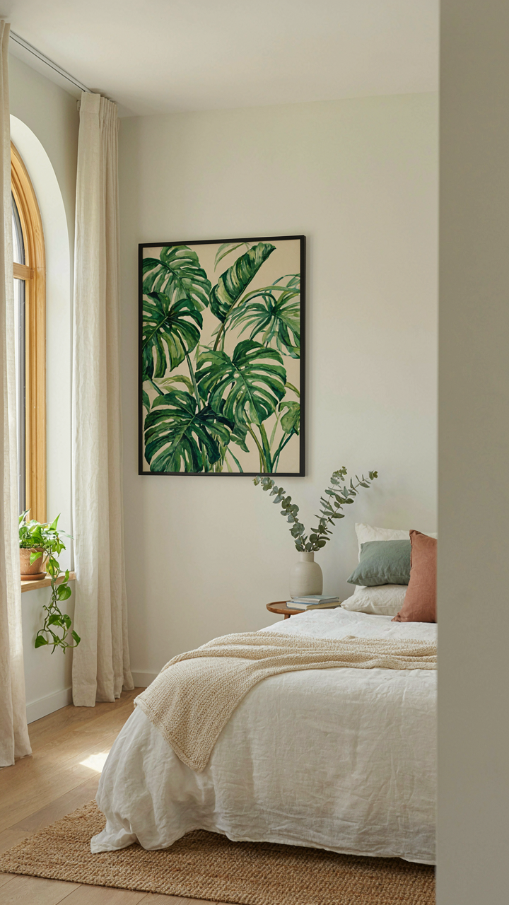
Form Follows Function First
You want your bedroom to feel like a luxury resort because you think that experience is unattainable at home. It’s not. The mechanism is simple: resort spaces work because they solve problems before they become visible. Botanical print bedroom decor follows the same logic as architectural planning. You don’t hang prints randomly and hope for cohesion. You reverse-engineer the retreat feeling by identifying what actually breaks comfort, then use botanical prints strategically to solve it.
Most advice says “choose prints you love.” That’s incomplete. Resort bedrooms use botanical prints as environmental controls, not decoration. They regulate visual noise by anchoring the eye to organized, repeating patterns. They soften harsh lines from windows and furniture. They create depth without clutter. A single large-scale botanical print placed above the bed doesn’t decorate the space; it gives the brain a focal point to rest on, which is what makes a room feel calm. The print does the work before you even notice it’s working.
Proportion Dictates Everything
Scale in design borrows from proportion in mathematics: the ratio between elements determines whether a space feels balanced or chaotic. A botanical print that’s too small relative to your wall space creates visual hunger, forcing your eye to search for meaning. Too large and it dominates, removing the retreat quality. The strategic move is this: measure your wall vertically and horizontally, then size your botanical print to occupy no less than one-third and no more than two-thirds of the wall surface behind your bed. This ratio works because it respects the architectural space without demanding attention.
Placement compounds proportion. Centering a botanical print creates stability but can feel static in smaller bedrooms. Hanging it slightly off-center with intentional negative space on one side introduces visual flow without restlessness. For rooms with multiple walls, use botanical prints in descending scale: the largest above the bed, progressively smaller prints on adjacent walls. This progression guides the eye naturally through the room and prevents any single element from reading as an afterthought. Measure twice before hanging anything.
The Tropical Theme Bedroom Deconstructed: Beyond Surface Level Aesthetics
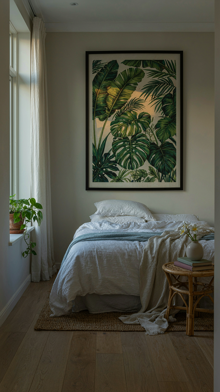
How Light Shapes Your Nervous System
You want this room to feel like an escape because you’re not actually escaping anywhere. The mechanism is simple: tropical environments trigger a physiological shift in your brain because they signal safety and resource abundance. Light wavelength and intensity control that signal more than any print ever will.
Tropical regions sit near the equator where light hits at a steep angle and carries more blue spectrum during midday hours. Botanical prints alone don’t recreate this. You need to engineer the light itself. Install warm-toned bulbs (2700K or lower) during evening hours to mimic sunset, then shift to cooler, diffused light during morning to match tropical dawn. Layer in a dimmer switch. The prints amplify what the light establishes, not the reverse.
The Sensory Stack That Actually Works
Most advice stops at “add plants and prints to the room.” That’s incomplete. Tropical immersion requires parallel sensory channels running simultaneously to override your brain’s recognition that you’re still in your bedroom.
- White noise or rainfall audio: Tropical environments have constant ambient sound. Rain loops or waterfall recordings at 40-50 decibels mask outside noise and anchor your nervous system into the environment narrative.
- Humidity calibration: Tropical air carries 70-80 percent humidity. A small humidifier in the room shifts air quality. Your skin feels different, which your brain registers before your eyes do.
- Vetiver or cedarwood scent diffusion: These botanicals mirror actual tropical plant chemistry. Scent travels directly to your limbic system faster than visual input. A subtle diffuser near your bed works better than heavy room spray.
- Texture through linens and surfaces: Cotton or linen bedding mimics the weight and breathability of tropical sleeping conditions. Matte botanical prints on canvas absorb light like real foliage rather than reflect it like glossy paper.
- Temperature zone management: Keep the room 1-2 degrees cooler than your normal comfort range. Tropical air feels cool against skin. Your body interprets this shift as context confirmation before conscious thought kicks in.
When all five channels align, your brain stops evaluating the room as a collection of aesthetic choices and processes it as an environment. The botanical prints become texture in that environment rather than decoration on a wall. Execute this stacking deliberately, not as decoration afterthought.
Your Bedroom Isn’t A Gallery; It’s An Ecosystem. Stop Decorating And Start Cultivating
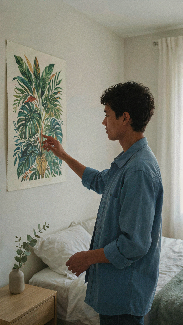
Most people treat botanical print bedroom decor like interior design theater. They buy prints, hang them, then expect magic. Wrong move. The real shift happens when you stop asking “what looks good” and start asking “what feels alive.” Your bedroom becomes a functioning system the moment you choose prints that actually reflect your energy, layer textures that breathe, and arrange everything so it reinforces your best self. Today, pick one botanical print that genuinely moves you, not one that matches your walls. Everything else clicks into place from there. A bedroom designed from the inside out always beats one decorated from Pinterest.