
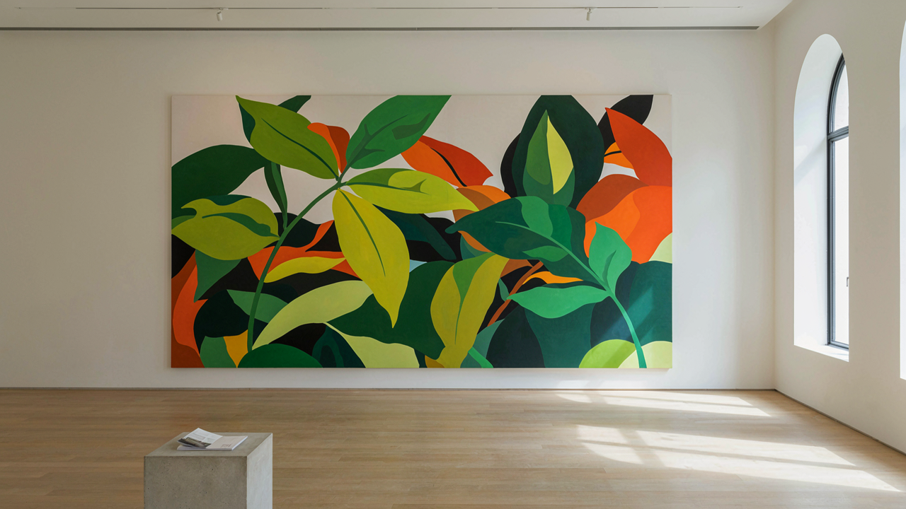
The Scale Fallacy: Why Bigger Isn’t Always Better (Unless You Know How)
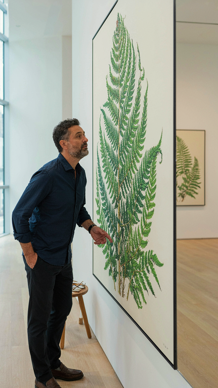
When Grand Size Fails
You want large scale botanical art because you think it guarantees presence. It doesn’t. Scale operates under the same principle as signal amplification in physics: you can only amplify what’s already there. A weak composition scaled to ten feet becomes a weak composition at ten feet. The mistake is treating size as a substitute for structure.
Most artists assume larger canvas equals larger impact. Reality is harsher. A mural-sized painting with poor focal hierarchy, muddy value relationships, or unclear plant anatomy reads as confusion at distance, not authority. The viewer’s eye has nowhere to lock. Botanical accuracy demands proximity. Push the scale without solving these problems first and you waste material, time, and wall space.
What Happens To Detail When Size Changes
Detail doesn’t amplify linearly with scale. A vein structure visible at arm’s length on a 24-inch canvas becomes invisible from across a room on an 8-foot version, unless you intentionally enlarge and emphasize it. Many botanists and traditional illustrators miss this shift. They assume accurate representation means painting what a microscope shows, at any size. It means choosing which details matter at the viewing distance you’ve selected.
The mechanism is straightforward: optical resolution decreases as viewing distance increases. A stamen that occupies 2mm on paper and 12 inches on canvas isn’t automatically clearer. The human eye discriminates differently. You must identify which botanical features drive recognition at distance, then enlarge those selectively while simplifying secondary detail. This is not cheating the accuracy. This is respecting how vision actually works.
Beyond Representation: Abstract Botanical Art As Raw Emotion
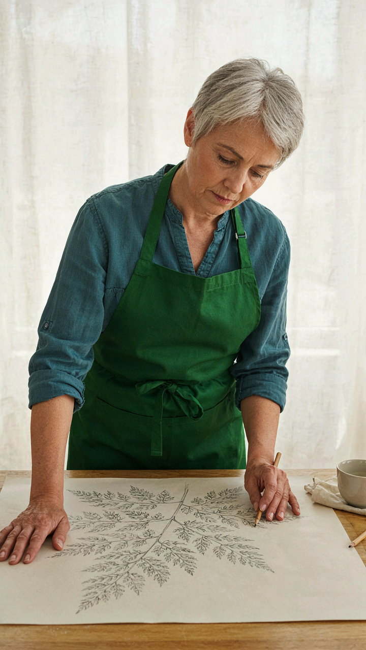
When Precision Becomes The Enemy
You want abstract botanical work to feel serious, not like decoration. The mechanism is simple: most artists confuse abstraction with vagueness. They think removing detail gives them permission to abandon structure. That’s backwards. Abstract botanical art demands more discipline than representation because you’re working without the safety net of recognizable form. The plant becomes raw data you extract, compress, and reassemble to trigger a specific emotional response rather than visual recognition.
Essence extraction means identifying which two or three characteristics actually carry the plant’s identity. A cactus spine’s aggressive angle. A fern’s recursive branching. A lotus pad’s peripheral thickness. You strip everything else. The viewer doesn’t need botanical accuracy. They need the compressed truth that makes them feel the plant’s behavior before they see what it is. This is why Georgia O’Keeffe’s magnified flowers worked. She didn’t paint flowers. She painted the mechanical logic of growth itself, enlarged until it became alien.
Fragmentation Reveals The Bone Structure
Deconstruction in art history refers to the technique of breaking down a form into components that expose its underlying logic rather than obscure it. Apply this to large scale botanical work: fragmentation stops being random and becomes a method for showing how plants actually organize themselves. A deconstructed leaf isn’t scattered randomly across the canvas. It’s split along the vein structure, each segment positioned to expose the hierarchical branching pattern that engineering built in.
The real advantage of fragmentation is that it forces you to understand the botanical form at a systems level before you ever touch the material. You map the plant’s geometry, identify which parts repeat, which parts support, which parts are redundant. Then you break it apart in ways that only make sense if you understand that system. This creates the uncanny feeling in the viewer’s brain. They recognize the logic before they recognize the plant. Install your fragmented elements so the negative space between pieces follows the original growth vectors, not random placement.
The Nature On Canvas Protocol: Cultivating Organic Chaos
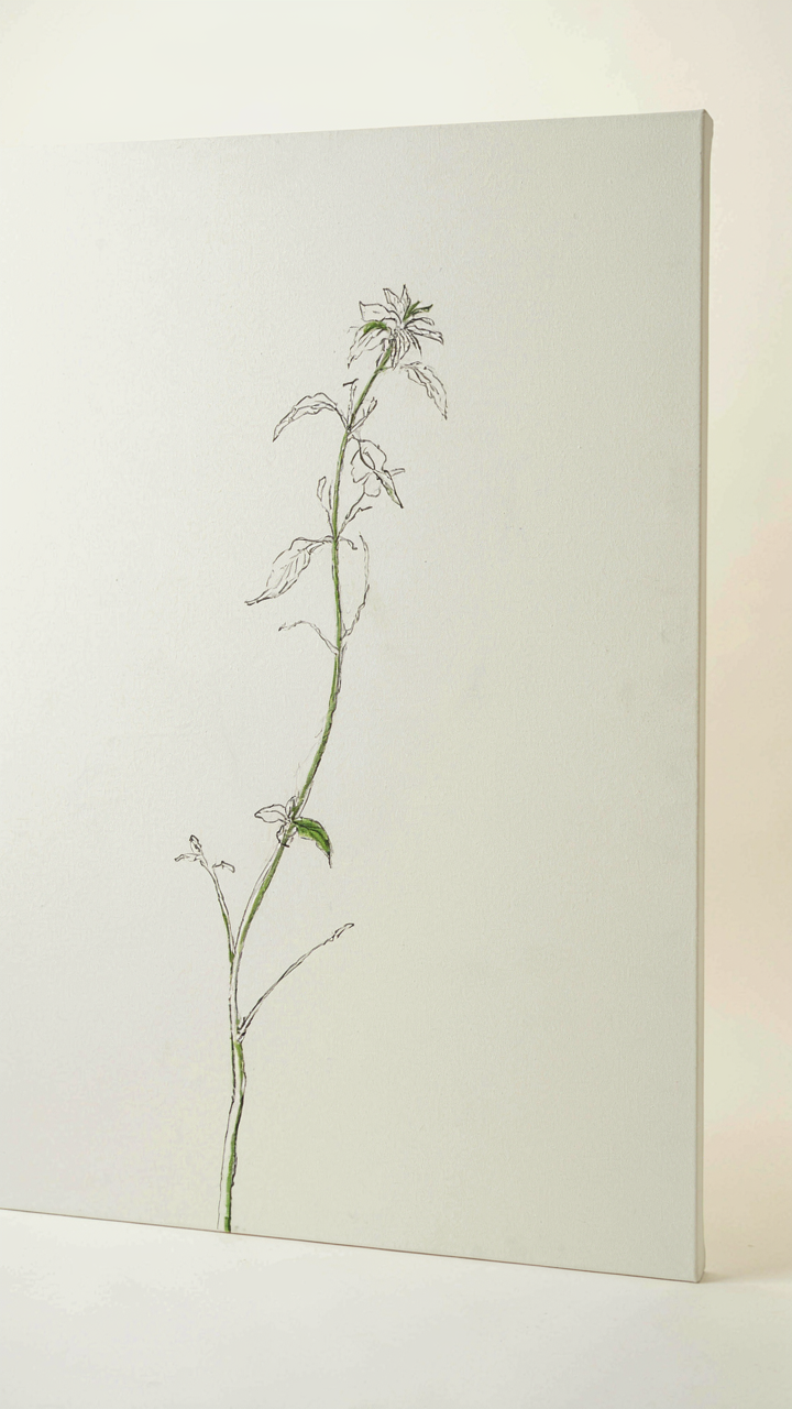
Growth Before Composition
You want your botanical work to look effortless because effortless reads as mastery. The mechanism is simple: stop treating plants as objects to arrange and start treating them as systems that expand outward from a source. Biology calls this apical dominance. The central stem grows first. Lateral branches emerge in sequence. Smaller branches fill gaps. Large scale botanical art fails when artists impose symmetry from the start. They sketch a grid. They place leaves like furniture. The result looks controlled but dead because it fights how plants actually build themselves.
The shift is tactical: begin with a single growth vector, then layer subsequent growth patterns around it. Start your large canvas with a dominant stem or trunk positioned off-center. Mark where primary branches emerge. Layer secondary growth. Let tertiary elements fill remaining space. This isn’t loose or random. It’s observation applied as structure. The viewer’s eye follows the same path a plant’s energy would take, which creates the illusion of natural inevitability even though you engineered every stroke.
Intention Masked As Accident
The common advice says randomness equals authenticity. That’s incomplete thinking. True randomness produces visual noise. Plants aren’t random. They’re constrained by growth rules, light direction, gravitational pressure, and resource availability. Controlled randomness means you decide which rules apply, then break them strategically. A leaf doesn’t land exactly where the angle suggests it should. A stem doesn’t split at perfect intervals. But these variations follow patterns, not whims. Randomness without logic reads as mistakes. Logic without variation reads as artificial.
The protocol: establish your botanical structure using growth hierarchy, then introduce variation at specific decision points. Where a branch divides, let it split at slightly different angles on adjacent drawings. Vary leaf density so some areas feel crowded while others breathe. Let background foliage overlap awkwardly rather than stack neatly. The outcome looks discovered rather than designed because you’re working with constraint-based variation, not pure invention.
The Unconventional Palate: Modern Botanical Art With Unexpected Hues
When Color Theory Becomes A Liability
You want permission to break the rules without looking amateur. Here’s the mechanism: color theory teaches harmony because it’s teachable. But harmony isn’t the goal of large scale botanical art. Emotional disruption is. The Renaissance masters understood this. Caravaggio didn’t use color to soothe. He used it to control where your eye moved and how long it stayed. Modern botanical painters who add unexpected hues aren’t being contrarian for status. They’re stealing a tactic from a field that understands visual hierarchy: advertising. Advertising uses color dissonance the same way botanical artists should—to create a focal point that dominates the composition through violation, not agreement.
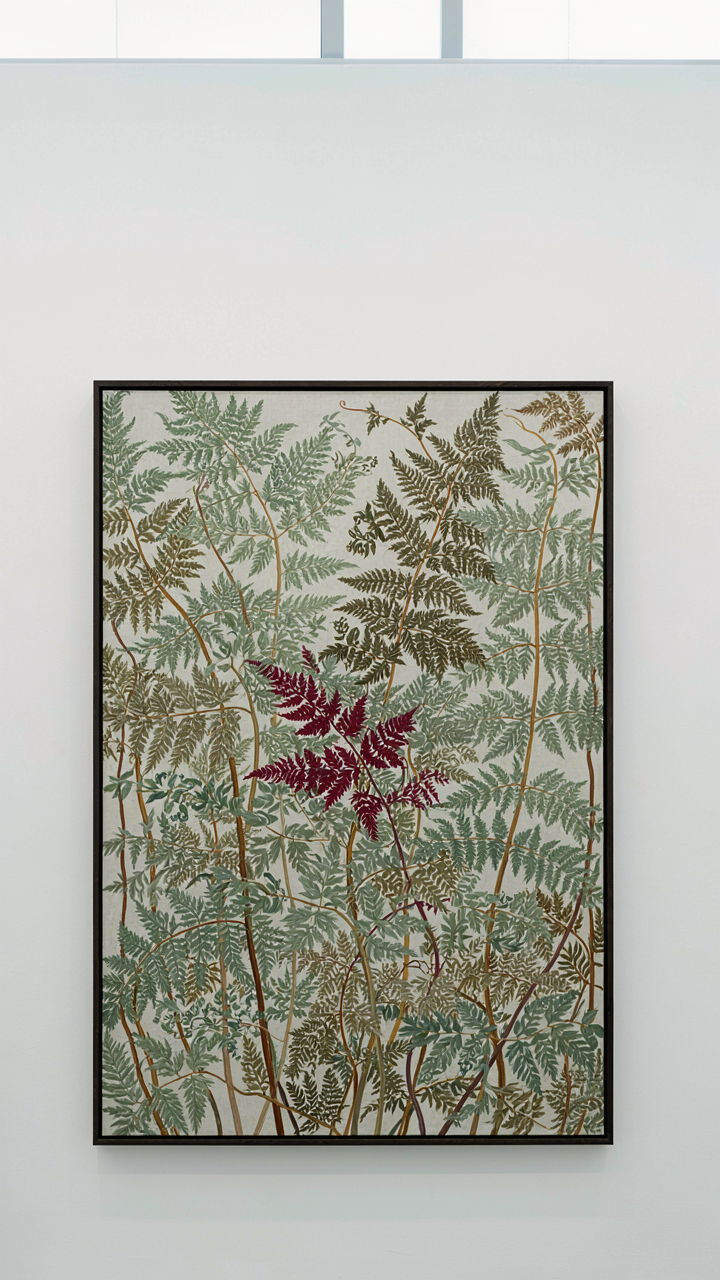
The practical move is simple: identify your dominant color story, then introduce one hue that shouldn’t exist in that botanical context. A painting of ferns rendered mostly in greens and earth tones gains immediate power when you add a single stroke of deep magenta or sulfur yellow in a leaf shadow or stem highlight. The unexpected color triggers cognitive processing. The viewer’s brain catches the error and locks onto it. This isn’t decoration. It’s a mechanism for manufacturing attention and memory.
Restraint As A Multiplier Of Intensity
Painters waste their intensity by spreading it across the full spectrum. A limited palette doesn’t mean boring. It means every pigment you choose earns its weight. Take a large scale botanical work and restrict yourself to three base colors plus white and black. That constraint forces you to mix variations that create visual depth through repetition and relationship, not through adding more colors to the canvas. The intensity multiplies because your eye has fewer choices. It moves through the composition faster. Every shape registers harder.
Test this on your next piece: choose one warm color, one cool color, and one neutral. Render the entire botanical subject through those constraints. What happens is counterintuitive. The work doesn’t feel limited. It feels focused. The viewer perceives more detail, not less, because their visual processing isn’t fragmented across competing hues. The mechanism is neurological, not aesthetic. Limited palettes maximize intensity through restraint because the brain detects pattern more efficiently when the input is filtered.
Contemporary Botanical Artists: Stealing Their Secrets, Not Their Style
What The Stroke Reveals
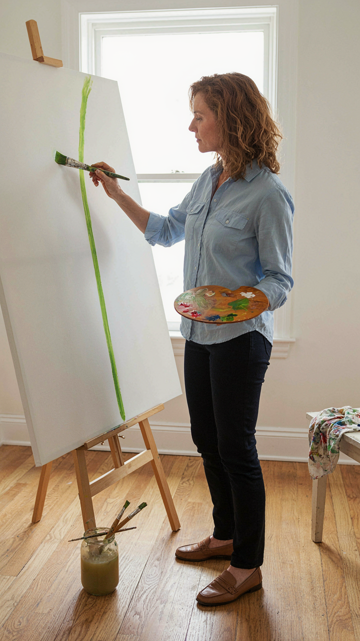
You want to study them because you think copying their subject matter will make your work legitimate. It won’t. The real mechanism is in how they handle the tool, not what they’re painting. Stroke economy—borrowed from painting and drawing discipline—means every mark serves compositional weight, not descriptive duty. Artists like Made Wijaya and contemporary installation practitioners don’t render every leaf vein. They choose which structural elements carry the viewer’s eye and which disappear into negative space. Study the decision-making, not the botanical accuracy.
The difference between amateur and professional large-scale botanical work lives in constraint. Professionals eliminate marks. They know that a single confident line stating a stem’s curve matters more than five hesitant ones depicting texture. Watch how established artists handle the transition from detail to abstraction as scale increases. They’re not adding complexity. They’re subtracting it strategically. Document the moments where they stop rendering and start suggesting.
The Disruption Pattern In Their Method
Most advice says “find your style by studying masters.” That’s backwards and wastes months. Their disruption didn’t come from perfecting convention. It came from breaking a specific rule that everyone else followed. Karl Blossfeldt’s macro photography disrupted botanical representation by removing color entirely, forcing shape and structure into prominence. Contemporary artists disrupt by choosing materials that contradict “proper” botanical media—industrial fabrics, synthetic pigments, digital projection on living plants. Identify which botanical norm each artist broke first. That break point is where their actual innovation started.
The mechanism is permission architecture. They gave themselves permission to fail at one thing traditional botanical art demands, which freed them to excel at something nobody expected. Extract that permission structure and apply it to your own constraints. If you work at scale, give yourself permission to sacrifice fine detail. If you use unconventional materials, give yourself permission to abandon color accuracy. The disruption isn’t about being different for status. It’s about removing a weight that was never necessary.
The Tropical Art Paradox: When Lush Becomes Lame
Vibrant Without The Saccharine
You want tropical work because you think it proves you’re cultured. The real problem: saturation killed tropical imagery years ago. Every hotel lobby and corporate office ran the same playbook—neon birds, oversaturated greens, maximum visual noise. The mechanism is simple: contrast dies when everyone uses identical color ranges. Your eye stops processing it.
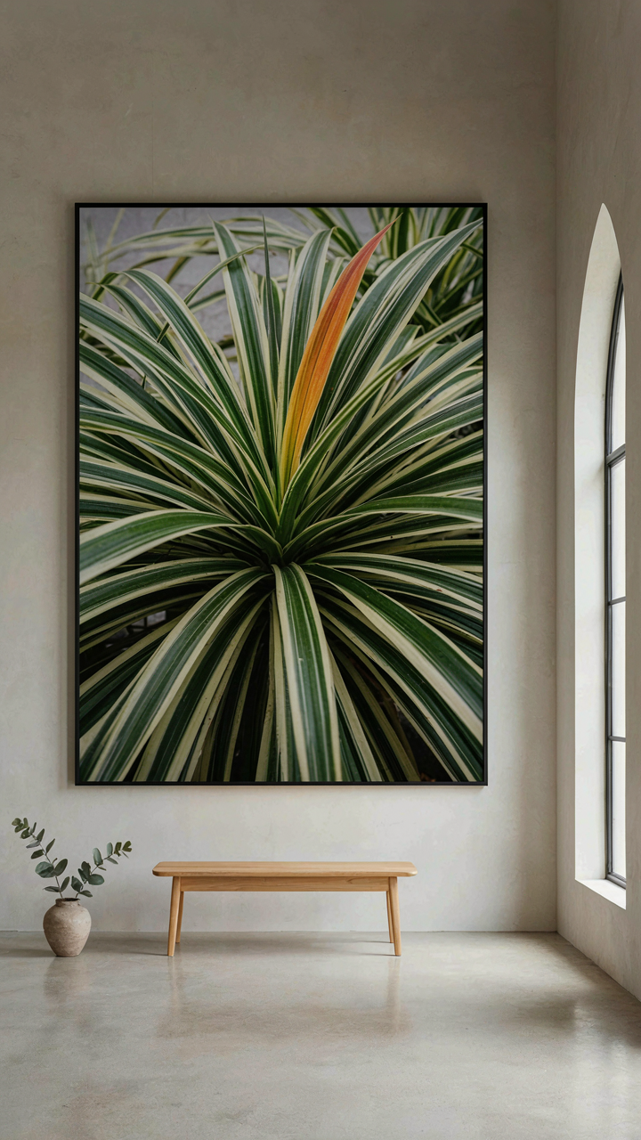
The fix requires constraint, not expansion. Pull your palette down to three dominant hues instead of seven. Use one high-chroma accent color—a single papaya orange or deep magenta—and let it sit against muted earth tones and near-whites. Work with actual pigment theory, not feeling. The moment you stop treating tropical work as “celebration of abundance” and start treating it as compositional discipline, the work gains weight. Saturation isn’t a virtue.
Exotic Made Edgy
Exotic fails when artists mistake unfamiliar for interesting. Borrowing from visual semiotics, the sign (what you see) and the signified (what it means) collapse when the subject matter does all the work. A rare orchid species doesn’t create meaning. The formal structure does. Most tropical botanical art relies entirely on subject novelty and abandons the compositional rigor that makes large-scale work function.
Flip the strategy: take ordinary plants—spider plants, pothos, philodendrons—and scale them to wall-size with the precision you’d reserve for precious specimens. The tension between common subject and monumental treatment becomes the actual content. Use symmetry breaking, negative space discipline, and tonal gradation to generate visual interest without depending on exotic reference. This move transforms the work from decoration into statement. Your scale and treatment matter more than what you paint.
Big Wall Picture: Architectural Integration, Not Just Decoration
The Wall Doesn’t Care About Your Art
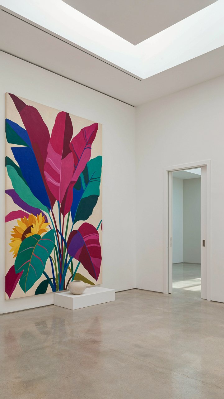
You want this piece to matter—to stop people, to make them feel something. That’s the real hidden fear: that a big botanical work will just hang there, ignored, a expensive decoration that nobody remembers. The mechanism that prevents this is simple: the wall is not a neutral backdrop. It’s part of the composition. Architecture has a term called “spatial syntax”—the way a space organizes movement and attention through its physical layout. Large scale botanical art operates the same way. The piece either amplifies or fights the room’s existing geometry, sight lines, and traffic patterns. Most people treat the wall as empty space to fill. That’s why most large botanical work fails to land.
The surrounding space determines what the art communicates before anyone looks at the details. A 10-foot botanical canvas placed opposite a doorway becomes the first thing a visitor processes. One placed on a side wall becomes something people discover, not something that confronts them. Wall color, ceiling height, proximity to windows, and furniture arrangement all shift how the piece registers. You’re not hanging art on a wall. You’re placing a visual element in an environment that already has rules. Measure the sight line distance. Walk the room’s natural path. Position the piece where the architecture has already trained the eye to look.
Establishing Visual Hierarchy Through Scale And Placement
When everything is big, nothing dominates. Scale without strategic positioning just creates noise. Think about museum display practice: curators don’t size every work the same and expect impact. They use proportion and placement to create a visual hierarchy that controls how long a viewer’s attention stays, and where it travels. A large botanical piece needs to compete with architectural elements for attention—not by overwhelming the room, but by claiming a specific spatial authority that matches its size. A 12-foot canvas on a 20-foot wall with competing artwork loses. The same piece as the sole focal point in a 20-foot space becomes unavoidable.
The room’s dominant surface should match or complement the art’s scale. If a wall is broken by windows, shelving, or architectural details, those elements fracture attention before the botanical work even registers. A wall must have enough uninterrupted surface area to let the piece breathe and establish dominance. This is why corner placement often fails—the room’s geometry fights against centralization. Position botanical art perpendicular to the main entry. Ensure at least 8 to 10 feet of clear sightline before any competing visual element interrupts it. Test this with a simple walk-through: where does your eye naturally rest, and for how long?
The Physics Of Presence: Engineering Visual Weight In Plant Painting
Where Elements Attract And Repel
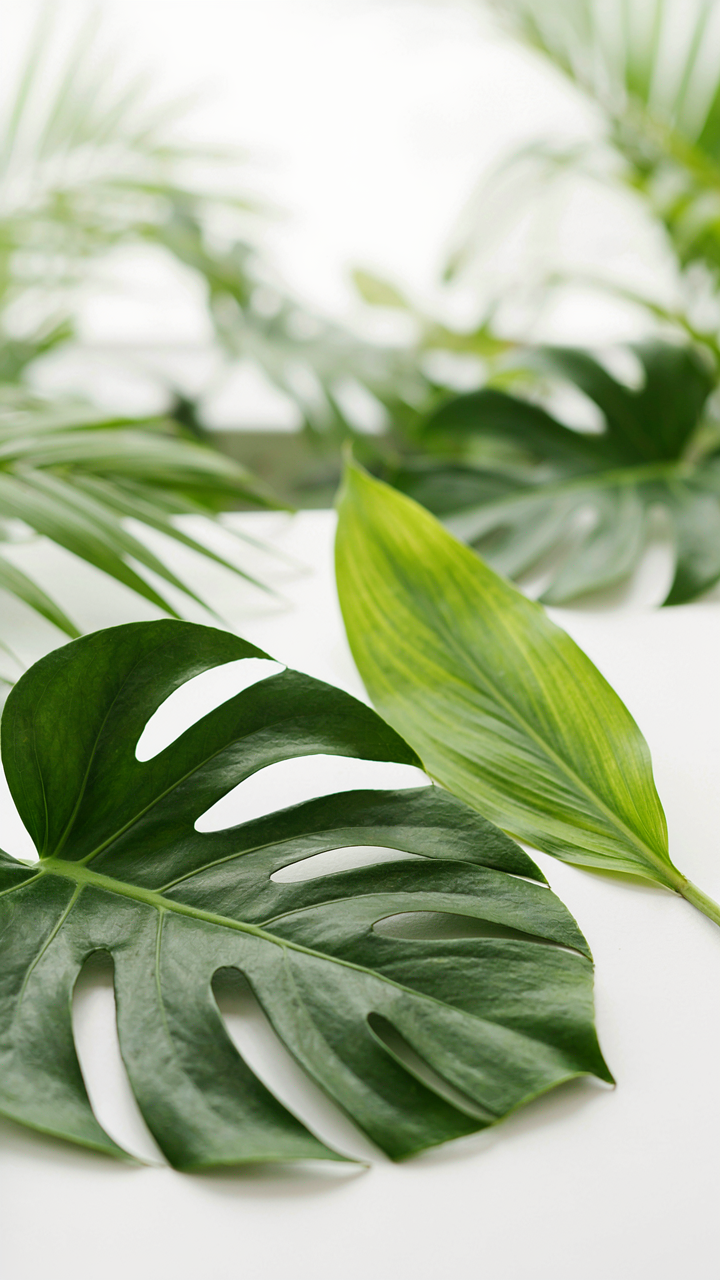
You want your botanical painting to hold attention without screaming for it. That’s the real problem—you need presence without desperation. Borrow the physics term “gravitational pull,” and you’re mapping it directly onto composition: certain plant elements draw the viewer’s eye based on their mass, color density, and position on the canvas, not their actual size.
Large leaves positioned in the lower third of a composition anchor the entire piece because weight distribution follows spatial logic. A single dark leaf holds more visual gravity than ten pale stems. The eye moves toward concentrated mass first, then radiates outward. This isn’t aesthetic preference—it’s how human perception processes information hierarchically. Your job is placing mass strategically so the viewer lands where you intend, then travels through your painting on a path you’ve engineered.
Depth Becomes Distance Becomes Believability
The common advice about atmospheric perspective in botanical art is incomplete. Yes, lighter tones recede and darker tones advance, but the real mechanism is about how the brain calculates spatial relationships through overlap, size variation, and edge quality. Soft edges signal distance; hard edges signal presence. A fern frond overlapping a magnolia leaf tells your brain one sits forward of the other without any color shift needed.
Scale compression works here too. Large-scale botanical art succeeds when you vary leaf sizes within a single plant species to create depth rather than botanical accuracy. Paint a foreground leaf at 40 percent larger than its background counterparts, and the viewer feels distance immediately. The eye cannot process two identical shapes at different sizes without inferring they occupy different spatial planes. Test this by placing two identical leaf shapes on a canvas—one 8 inches, one 3 inches, with no color difference. The smaller one recedes every time.
Large Painting Ideas: From Concept To Colossus (Without The Crisis)

Scaling Sketches: Methods For Maintaining Integrity
You want to believe a bigger sketch automatically becomes a bigger painting without losing what made it work. It doesn’t. Scaling is engineering, not magic. The real mechanism is proportion preservation—you’re not enlarging; you’re translating a ratio system across surfaces. Architects call this the “module.” One unit in your sketch must map to one consistent unit on the final surface. Break this mapping, and your composition fractures regardless of skill.
Start with a grid system or proportional dividers. These aren’t crutches for amateurs; they’re the structural integrity check that separates controlled expansion from distortion. Your sketch’s width-to-height ratio, the distance between focal points, the negative space ratios—all must hold their relationship at scale.
- Grid Transfer: Divide your original sketch into equal squares, then draw proportionally larger squares on the prepared surface. Transfer content square by square to maintain all spatial relationships without drift.
- Proportional Dividers: Mechanical tools that lock the ratio between sketch and final work. Set them once, use them throughout. Eliminates guesswork on distances and proportions.
- Projection Mapping: Use a projector to cast the sketch image onto your surface at desired size. Trace the outline lightly. Faster than grid work for complex organic forms like foliage clusters.
- Modular Measurement: Establish one base unit (say, 2 inches equals 1 inch of your sketch). Measure every element from your sketch using this ratio before placing it on the large surface.
- Tracing and Transfer Paper: Enlarge your sketch on a photocopier to working scale, lay transfer paper beneath it, trace the contours, then transfer to prepared surface. Works best for detailed botanical line work.
The common mistake is treating your sketch as decoration instead of architecture. Your sketch is the blueprint. Every botanical element—leaf placement, stem angles, cluster density—lives at a specific coordinate. Lose that discipline during scaling and you’ll repaint the same section repeatedly, chasing proportions that won’t reconcile.
Material Mastery: Choosing Mediums For Monumental Work
Large scale flips your material constraints. What works on an 8×10 canvas creates practical nightmares at 6 feet. A fast-drying acrylic that gives you thirty minutes on small work becomes liability on a wall-sized piece. You need mediums that give you working time proportional to surface area, not mediums that match your portfolio or what you bought last month.
Oil paint is the structural choice for monumental botanical work. Its slow dry time means you can blend a ten-foot stem passage without dried edges sabotaging your transitions. You control the pace. Acrylic demands speed or you’ll paint over partially set layers that catch your brushwork. Watercolor at large scale becomes a water management problem instead of a painting problem. You’re fighting gravity and evaporation across a surface too big to angle properly. Tempera and gouache lack the depth and luminosity that reward the viewing distance large work demands.
Surface preparation becomes non-negotiable with scale. A textured canvas that reads fine at arm’s length becomes a visual static at twelve feet. Use fine-tooth or smooth surfaces for large work. Primed hardboard or canvas mounted to support structures stays stable across climate changes that smaller works tolerate. Cotton canvas stretches and contracts; the larger the format, the more this movement compounds. Size your stretcher bars to support tension across the expanded distance. Botanical forms need clean edges and clear detail; your surface must reward that precision.
Brush selection shifts too. The same size brush that works for a small work creates visible brushstrokes at large scale where you want them invisible. You need both larger brushes for background passages and smaller, stiffer brushes for botanical detail work. Natural hair holds more liquid for blending; synthetic holds shape for precise stem work and vein definition. Layer both brush types into your approach. Your material stack at large scale includes mediums for transparency, mediums for flow, mediums for impasto work. Buy three types instead of one and prepare them before you start.
Contemporary Botanical Illustration: Precision For A Purpose
Plant Structure Shapes Credibility
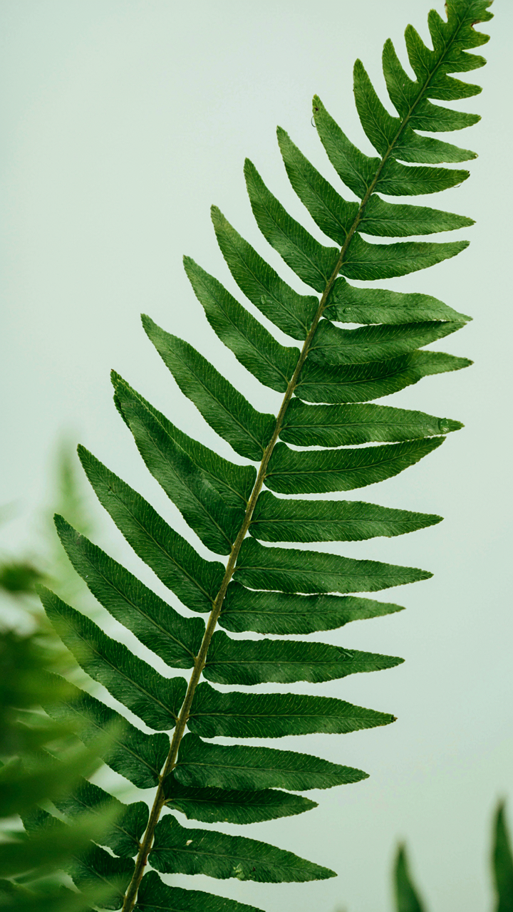
You want this work to look authoritative because authority moves viewers—and authority dies the moment a stem bends wrong or a leaf vein goes sideways. The mechanism here is borrowed from anatomy itself: a plant’s structure is its load-bearing system, and in large scale work, every deviation reads as incompetence. Study how stems thicken toward the base, how petioles attach at specific angles, how secondary veins branch hierarchically from the midrib. These aren’t decorative details. They’re the difference between illustration and fact.
Large scale magnifies mistakes. A vein misplaced on a 12-inch leaf reads as careless. The same error on a 4-inch leaf disappears into “artistic interpretation.” Before you render anything, spend time on dissection or high-resolution photography of the actual specimen. Map the vascular system. Understand growth patterns. Monocots have parallel venation; dicots have reticulated patterns. Ferns have different architecture entirely. This isn’t optional research—it’s the foundation that separates work that holds attention from work people dismiss.
Detail As Visual Syntax
The common advice says “include fine details to add interest.” That’s backwards. Details aren’t decoration—they’re language. They’re how you make a viewer’s eye move and how you control what they read first. In botany, a single unusual feature—a trichome cluster, a distinctive stipule, an uncommon sepal arrangement—becomes the visual anchor that makes the whole composition legible.
On large format, choose three to five structural details that actually distinguish your subject. Render those with obsessive precision. Leave everything else cleaner, simpler. This creates contrast and hierarchy. The human brain reads high-detail areas as important. Your job is to direct that instinct toward what matters taxonomically. When a viewer remembers one specific feature from your work, you’ve succeeded—they’ve absorbed information, not just seen an image. Build your composition so that featured detail sits where the eye naturally lands first, then let secondary elements support that read.
Your Biggest Obstacle Isn’t Technique; It’s Your Fear Of The Blank, Colossal Canvas
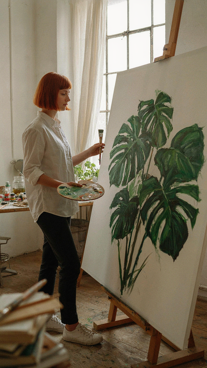
Most artists never attempt large scale botanical work because they mistake scale for complexity. You don’t need perfection at ten feet tall. You need permission to start messy. The real work isn’t mastering composition or color theory. It’s abandoning the delusion that you need to be “ready.” Sketch one plant life-size today. Just one. Watch how your brain rewires the moment you stop theorizing and let your hand move. You don’t rise to the level of your ambitions. You rise to the level of your smallest action.