
The Illusion Of Abundance: Why Generic Botanical Line Drawings Fail
When Mass Production Kills Distinction
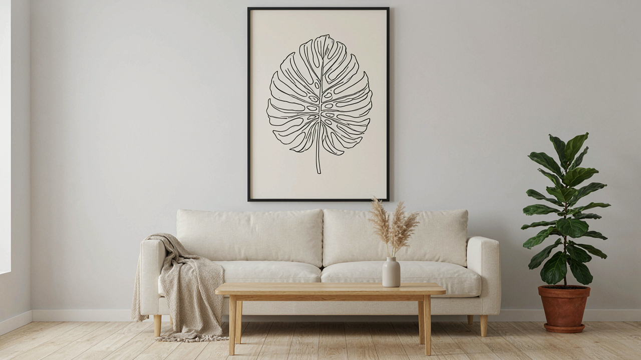
You want botanical line art that makes people stop and ask where you got it. That fear—that your choice will look like everyone else’s—is real because it’s already happening. The mechanism is simple: when a design exists in unlimited digital copies, scarcity collapses. Ten thousand Instagram accounts post the same monstera leaf template. The human brain registers abundance as worthlessness. A thing you can have instantly has already lost its signal value before you hung it.
Commoditized botanical designs fail because they’re optimized for reach, not impact. Stock sites and mass-market creators chase volume. They produce variations on the same five plant families—monstera, eucalyptus, palm fronds, ferns, succulents—rendered in identical stroke weights and proportions. The template dominates the execution. Your guests don’t see a thoughtful choice. They see a decision you made in five minutes from a grid of 500 identical options. Distinction requires friction. You must either commission original work or learn to identify the rare generic designs that actually contain edge.
Originality As The Only Pricing Mechanism
Economics teaches us that scarcity drives value. Apply that directly to botanical line art: a design that only exists in one or two physical spaces commands attention that a digital file duplicated across a million feeds cannot. Original line work—whether hand-drawn for a specific event or commissioned from an artist with a recognizable style—creates a bottleneck. There is no second copy. The moment someone else tries to replicate it, the effort required to reproduce hand-made line variation becomes the barrier that protects the original’s status.
The real move is this: buy from artists with a distinctive hand, not from platforms. A designer whose botanical work carries visible signature marks—irregular line weights, specific mark-making habits, characteristic spacing—creates work that cannot be copied without becoming obviously derivative. When you display that piece at an event, you’re not showing taste in curation. You’re showing you paid for exclusivity. Ensure your botanical line art comes from someone whose name you can actually state when asked where you got it.
Deconstructing The Occasion: Beyond Surface Level Themes
What Your Event Actually Needs
You’re buying botanical line art because you want the event to feel intentional, not because you understand what emotion you’re trying to land. That gap between desire and clarity is where most decor choices die. The real mechanism is this: every occasion has an emotional spine—the core feeling that makes people remember or forget the event. Your botanical line art either amplifies that spine or works against it.
Botanical line art succeeds because it operates on restraint. A single minimalist line drawing of a Monstera creates cognitive space for conversation. A cluttered floral arrangement steals attention. The difference isn’t taste. It’s neurology. Sparse, elegant visuals lower cognitive load. Your guests process the room faster and feel calmer. That calmness becomes the memory, not the decoration itself.
Translating Feeling Into Visual Language
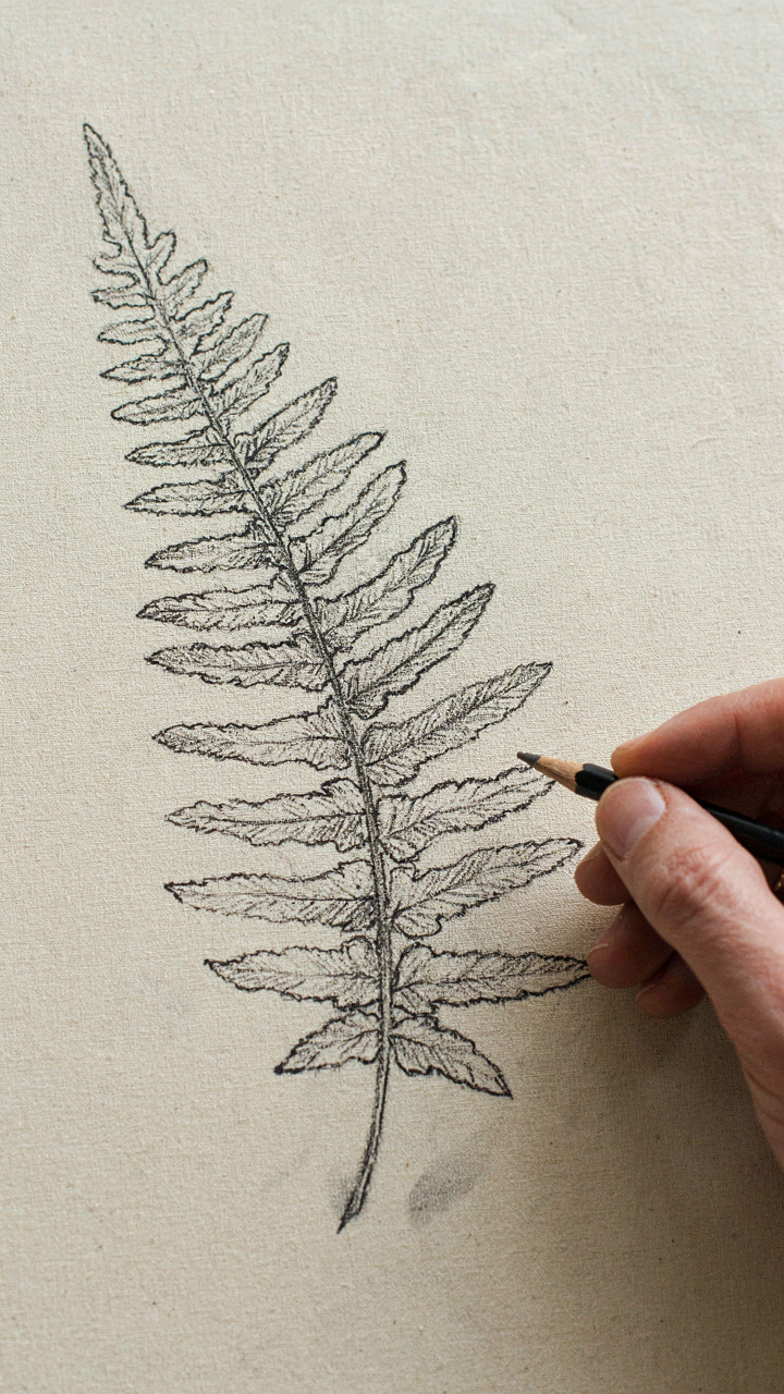
The mistake people make is thinking “botanical” means floppy florals and garden vibes. Wrong. Botanical line art speaks in the language of precision and time. A line drawing of a fern frond takes weeks to develop as a technique because the artist must understand the exact geometry of growth patterns. That rigor translates into a visual signal: this event has structure. This event was thought through.
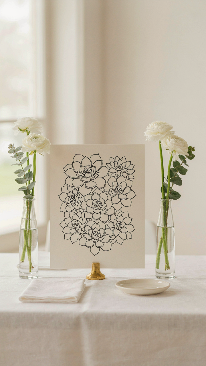
Match the botanical form to the emotional outcome you want. Geometric succulents signal control and modernity, used in corporate events or minimalist weddings. Flowing vine illustrations suggest growth and organic connection, deployed at product launches or intimate gatherings. Anatomically detailed seed pods communicate rarity and science, fitting for educational events. The plant species itself becomes your visual contract with the guest. Choose the botanical form first. The color palette and medium follow from that choice, not the other way around.
The ‘Less Is More’ Protocol: Crafting Impactful Botanical Line Art
Minimalist Compositions Amplify Focus
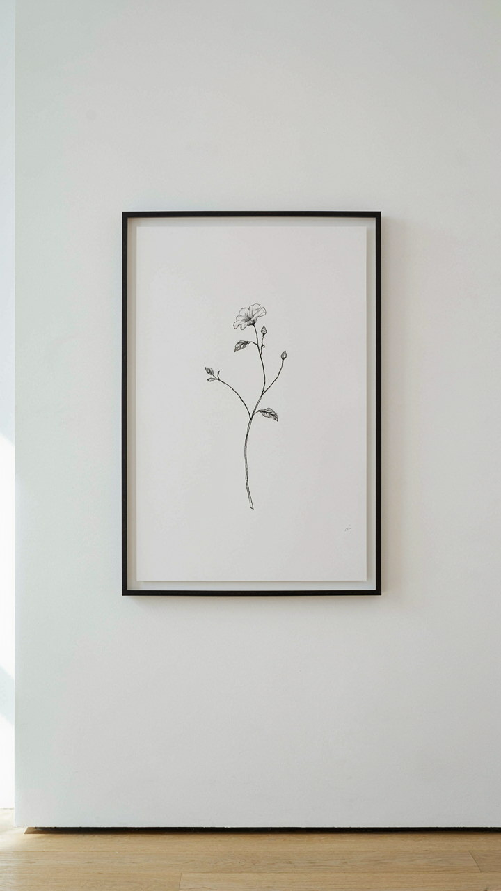
You want people to notice your work without feeling like you’re trying too hard. That’s the real mechanic here. Most botanical line art fails because it’s crowded. Too many stems, too many leaves, too much density. The eye has nowhere to land. Minimalism in botanical art works because it forces you to eliminate everything except the structural truth of the plant. Single stems. Intentional branching. One flower. The viewer’s attention has no escape route.
This isn’t about being sparse for aesthetic reasons. It’s about information hierarchy. When you show three stems instead of thirty, each line becomes readable. The negative space around each botanical element becomes part of the composition, not wasted area. For special occasions, a single statement piece beats a chaotic arrangement every time. The constraint creates clarity. That clarity is what makes the piece land.
Strategic Negative Space Utilization
Negative space isn’t absence. It’s presence through omission. Graphic design borrowed this principle from figure-ground relationships in visual perception, and botanical line art deploys it the same way: the white paper around your lines becomes as active as the lines themselves. When you leave space intentional and deliberate, it signals control. It signals intentionality. A crowded design signals panic. An airy design signals authority.
The technical move: decide what percentage of your composition will be empty before you draw. Forty percent white space minimum for statement pieces. Sixty percent for intimate settings. This forces you to draw only what matters. Each botanical element earns its place because it has to carry weight in less real estate. The result reads as refined rather than rushed. Use this ratio when planning layouts for table settings, wall installations, or printed materials.
The Feedback Loop System: Iterating Towards A Unique Poster
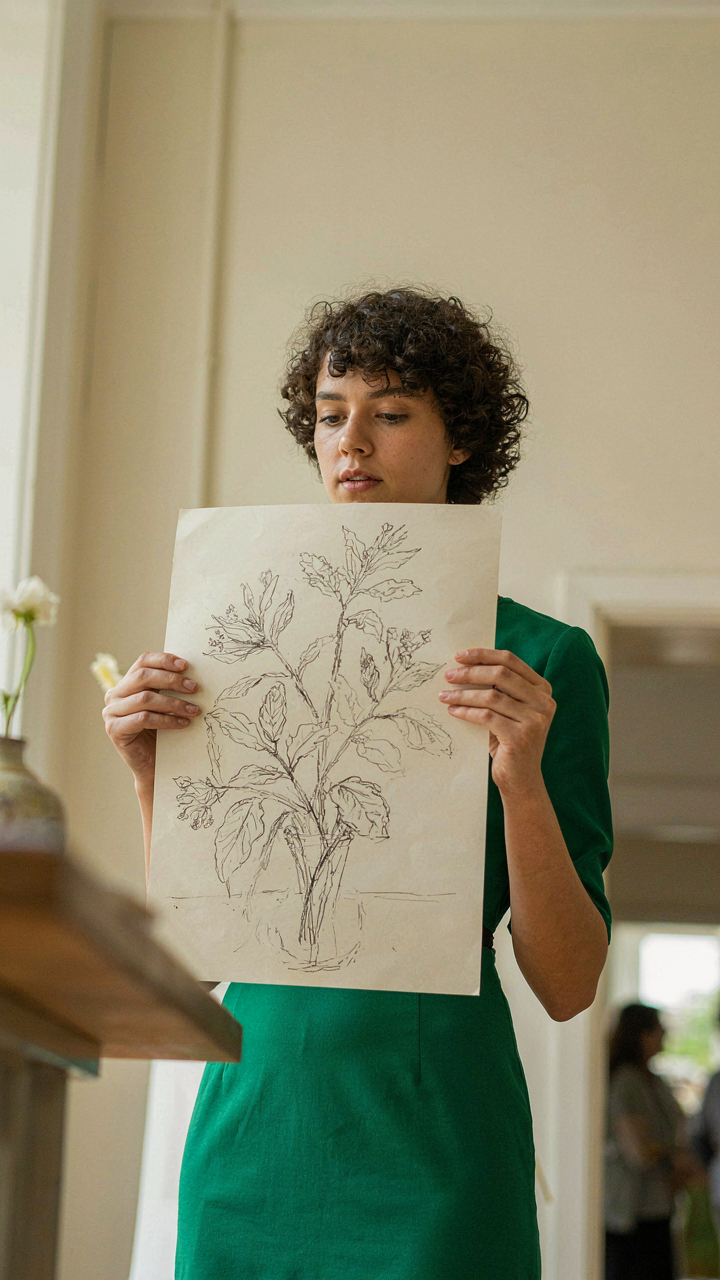
Rapid Testing Beats Perfect Planning
You want to avoid showing up with something that misses the mark because you didn’t know until the last moment. Cybernetics calls this feedback: the mechanism where output becomes input, and the system corrects itself in real time. Botanical line art decor works the same way. You sketch a stem arrangement, hold it against your venue lighting, see what the actual eye catches versus what you imagined, then adjust the line weight or leaf density accordingly.
Most designers wait until the poster is printed to learn what works. That’s backwards. Create a rough version at actual size—pencil on kraft paper or digital mockup at display dimensions—and place it in the space where it will hang. This single action reveals contrast problems, scale issues, and whether the negative space reads as intentional or accidental. Move it. Rotate it. Check it from ten feet away and three feet away. Each view teaches you something your desk never could.
Design Responds To Its Walls
The context around a poster determines whether botanical line art reads as sophisticated or cluttered. A minimalist white gallery wall demands different line density than a textured wallpapered room. A poster designed for soft, diffused afternoon light will look flat under harsh fluorescent. You can’t predict this from samples or mood boards. You have to see the actual variable in the actual location.
Print or display your draft version on-site for at least 24 hours before finalizing. This catches the glare angles, how shadows fall across the lines, whether existing decor competes for attention, and if the line work holds clarity when viewed at actual viewing distances. Then make one specific adjustment: increase or decrease line weight by one pen size, shift the botanical composition left by half an inch, or adjust the negative space proportion. Repeat the test. Document what changed and why. This becomes your decision record for future work.
Mastering The Medium: Beyond The Basic Botanical Line Drawing
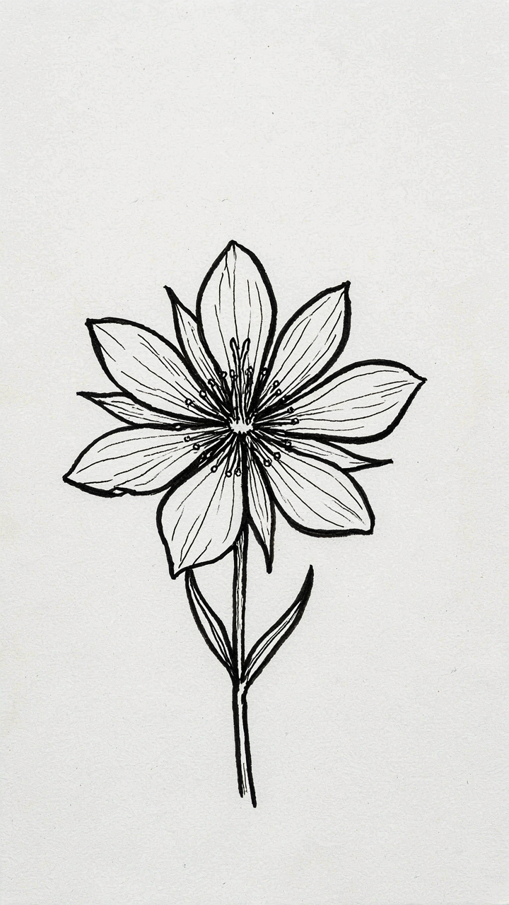
When Line Weight Becomes Your Real Tool
You want this to look professional because you’re tired of flat, forgettable decor that reads as lazy. The mechanism is simple: line weight controls visual hierarchy. Borrow from typography and typography borrows from drafting—thick lines advance, thin lines recede. In botanical line art, this isn’t decoration. It’s directional control. A thick stem grounds the composition. Thin vein work becomes texture. The viewer’s eye follows what you made bold.
- Stem and Branch Lines: Use 2-4mm weight for main structural elements. Thicker marks create visual anchors that hold the composition and prevent scattered energy across the piece.
- Vein and Detail Work: Drop to 0.5-1mm for internal leaf structure. This contrast creates depth without adding color or literal space between elements.
- Contour Variations: Alternate line weight around a single leaf outline instead of uniform strokes. Start thick at the base, taper thin toward the tip to mimic natural growth patterns.
- Cross-Hatching for Texture: Use parallel or intersecting thin lines in 0.3-0.75mm weight to suggest shadow and organic variation without filling solid areas.
- Ink Density Over Line Width: Layer medium-weight lines instead of making one line thicker. This maintains control and prevents bleeding on paper while building perceived weight through repetition.
The practical step: test your pen weights on scrap paper before committing to the final piece. Map where each weight goes before you draw. Inconsistent line weights read as accident, not intention.
Pulling From Non Ornamental Plant Sources
Everyone fixates on ferns and monstera leaves because they’re Instagram-safe. That’s the wrong starting point. The real leverage comes from pulling from botanical specimens that don’t naturally read as “decor”—seed pods, root systems, cross-sections of bulbs, thorns, tendrils. Scientific botanical illustration from the 18th and 19th centuries used these for identification, not aesthetics. That constraint forced precision and revealed structure that decorative illustration ignores.
The mechanism is contrast. A room full of conventional leaf silhouettes becomes visual noise. One unexpected element—a dissected flower head, a tangled root mass, a thistle’s spiky architecture—breaks the pattern and forces attention. Start by studying botanical cross-sections in medical or scientific texts. The internal structure of a fruit or stem holds more visual interest than another outline of a leaf because it contains information, not just shape. Your design becomes a statement about what you chose to include, not what convention demands you show.
Integration, Not Juxtaposition: Embedding Botanical Wall Decor
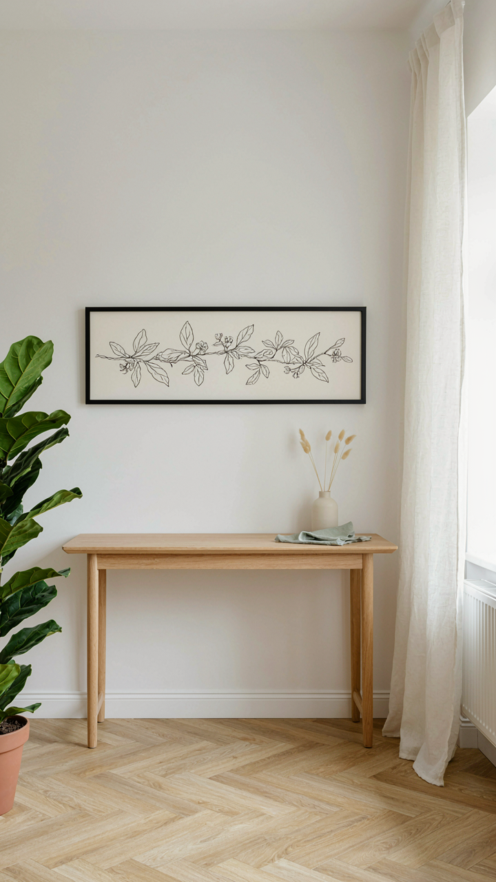
The Room Becomes The Frame
You want botanical line art to look intentional, not like you hung something because you needed to fill dead space. That’s the real fear here. The mechanism is simple: botanical line art only works when it responds to the room’s existing geometry and function, not when it demands the room reorganize itself around it. Think of it like figure-ground relationship from gestalt design. In botanical line art, the plant lines are the figure, but they must echo the spatial logic already present. A vertical line drawing placed on a wall that’s already divided by trim molding reinforces that vertical structure. Placed randomly, it creates visual conflict.
The integration starts before the art hangs. Map your wall’s load-bearing lines: door frames, windows, architectural edges, furniture placement. Botanical line art works when its composition aligns with these existing vectors. A long horizontal botanical piece above a console table extends the table’s line weight upward. A tall, narrow drawing fits a vertical wall section between windows. This isn’t decoration layered on top of a room. It’s decoration that becomes part of the room’s visual grammar. The wrong approach places art where space exists. The right approach places art where the room’s structure invites it.
Ambient Light Changes The Entire Game
Lighting isn’t decorative. It’s structural. A graphite or ink-based botanical line drawing appears flat and lifeless under poor overhead fluorescent light, but the same piece gains dimension and presence under directional light that creates shadow and texture on the paper surface. This is about material behavior, not aesthetics. Angle matters more than brightness. A 45-degree light source from above and to the side reveals the paper tooth and line weight variation that flat overhead light erases completely.
Spatial dynamics follow light. A botanical line art piece positioned in a room’s darkest corner reads as a black blob on beige, regardless of quality. The same piece in a well-lit zone with ambient light from multiple angles becomes legible and integrated. Before hanging, spend 24 hours observing how natural and artificial light moves across your wall throughout the day. If a wall gets direct morning light that fades to shadow by evening, place the piece where it receives consistent mid-day illumination. This is not about pretty. It’s about the drawing remaining visually present and functional for the entire duration of the event or gathering. Install botanical line art pieces where light hits them consistently, or relocate the light source to guarantee visibility.
The Signature Aesthetic: Elevating To Modern Poster Status
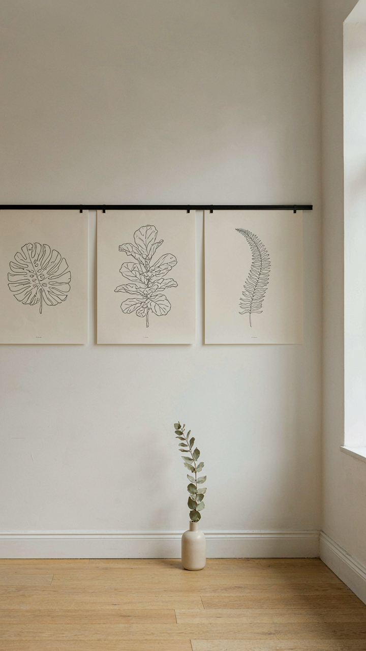
Build A Visual Language That Sticks
You want people to recognize your work instantly. That’s the real driver here. Most creators chase aesthetics month to month, hoping recognition lands by accident. It doesn’t. The mechanism is simple: constraint breeds recognition. When you limit your line weight, repeat specific botanical forms, and stick to a narrow color palette across projects, your work becomes identifiable. Botanical line art that works as modern poster material does this ruthlessly. You’re not trying to be versatile. You’re trying to be unmistakable.
Start by auditing what you’ve already created. Pull three pieces you’re proud of. Identify the repeated choices: line thickness, how you render stems, whether your leaves taper or round at the edges, your background treatment. These aren’t accidents. They’re the skeleton of your language. Double down on them. Consistency compounds faster than novelty ever will. Within six months of repeating these choices, people stop asking what your style is and start asking for your style.
Disregard The Trend Cycle
Trend-chasing kills distinctiveness. Everyone copying botanical minimalism from the same Instagram source means everyone’s work collapses into the same visual category. You become interchangeable. The real move is to understand what made minimalism work structurally, then apply that principle differently. Minimalism works because it removes visual noise. But that doesn’t mean your line art needs to look like everyone else’s minimal line art.
Study design movements that influenced botanical representation: the Arts and Crafts movement prioritized handmade clarity over ornament, and mid-century modernism flattened forms into graphic shapes. Learn those principles, then apply them to what you see in the plants around you, not what you see in design feeds. When you build from principles instead of copying aesthetics, your work automatically diverges. The pieces you make for special occasions—wedding invitations, event posters, corporate installations—will read as considered rather than fashionable. Make something that doesn’t need the current year to make sense.
Scaling Impact: From Boho Botanical Line Art To Grand Statements
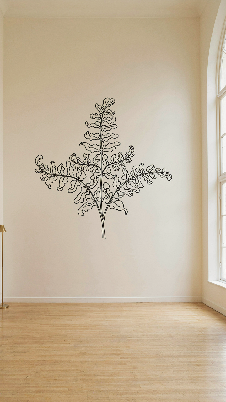
Less Line, More Wall
You want people to feel like your event space transformed, not decorated. That’s the real driver here. The mechanism is constraint: minimalism at scale works because every line you remove forces the remaining lines to carry weight. Botanical line art scales differently than representational work. A single stem with five leaves on a ten-by-eight-foot wall doesn’t look sparse—it looks intentional. The negative space becomes the actual design.
Most people default to filling walls because they’re afraid of emptiness. Wrong move. Large installations demand radical reduction. Start by selecting one botanical form—a single fern unfurling, branches of eucalyptus, or geometric succulents. Render it in one color, one line weight. Let the wall breathe. The constraint forces your eye to trace the form completely, which creates engagement that cluttered work never achieves.
Position Defines Perception
The rule from architecture applies here: focal point placement determines how a viewer reads the entire room. Botanical line art in scale needs to anchor one visual zone, not scatter across surfaces. High placement—seven to nine feet up—makes pieces command attention without competing with furniture or people. Low placement—below eye level—works only if it frames a functional zone like a table or bar. This isn’t about aesthetics. It’s about visual hierarchy.
Most installations fail because they treat large walls as blank canvases to fill. Treat them as frames. A single oversized botanical line drawing positioned at the center point of an accent wall stops the eye. Everything else in that section of the room becomes secondary. For multi-wall applications in event spaces, place botanical pieces on opposing walls at staggered heights to create movement without chaos. Measure sight lines from entry points before finalizing placement.
The Real Obstacle Isn’t A Lack Of Ideas, But A Fear Of Truly Owning Your Aesthetic Vision
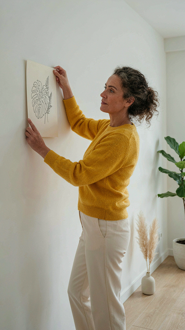
Most people collect botanical line art because they like how it looks. You collect it because you’re afraid to commit. You want permission to make your space yours, but that permission doesn’t exist outside you. Stop waiting for the perfect piece. Buy one sketch today, hang it on your wall, and live with it for a week. Your taste gets sharper through action, not contemplation. Own your aesthetic or watch someone else own the room.