
The Illusion Of Effortless Wildflower Bouquets: What You’re Missing

Nature’s Chaos Versus Contrived Order
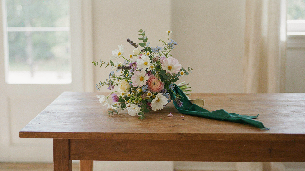
You want the bouquet to look like you didn’t try, which means you’re actually afraid of appearing try-hard. Here’s the mechanism: wildflower bouquets work because they combine real botanical randomness with deliberate ribbon placement. The ribbon becomes the control variable. Without it, you have a handful of stems. With it, you have composition. The untrained eye sees only the flowers. The trained eye sees the ribbon doing all the work underneath.
Most people treat wildflower bouquets as “just throw flowers together.” Wrong. Wildflowers have natural variation in stem length, bloom density, and color distribution. Ribbon styles function like editorial decisions in graphic design, they frame and contain what would otherwise read as accident. The ribbon’s width, texture, and wrapping technique determine whether the arrangement looks intentional or neglected. This distinction matters because it changes how viewers process the entire piece.
Controlled Imperfection In Ribbon Application
The common advice says “let it look loose and natural.” That’s incomplete. Real controlled imperfection requires three deliberate choices: ribbon placement relative to the stems, tension applied during wrapping, and the finishing knot position. Each one signals intention. Too tight and you lose the wildflower effect. Too loose and the bouquet collapses into the viewer’s hand. The ribbon must create tension without announcing itself.
Successful wildflower bouquets require you to establish the stem bundle first, then wrap the ribbon in a way that supports the specific flowers you’ve selected. Silk ribbons compress differently than satin. Wider ribbons hide stem irregularities. Narrow ribbons expose them. If you want the wildflower aesthetic to land, choose ribbon width based on your stem thickness, not based on what looks pretty in isolation. Wrap at forty-five degrees to the bundle, overlap slightly on return, and secure the knot at the back where it disappears into the flowers.
Why “Matching” Your Ribbon Bouquet Is A Recipe For Mediocrity
Color Theory Mistakes When Harmony Dulls Natural Flower Bouquet
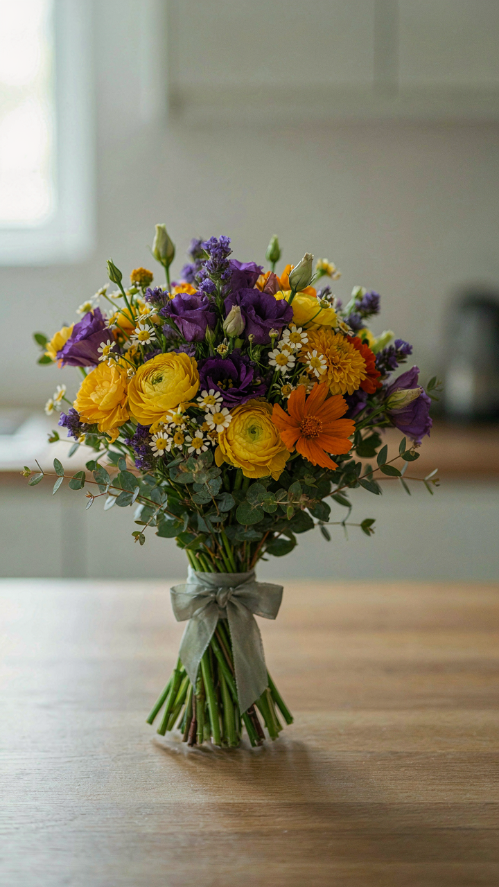
You want the ribbon to disappear into the arrangement so nobody questions your taste. That’s the real fear here. But that’s exactly the mechanism that kills visual interest. Color theory teaches us about complementary contrast, not sameness. A wildflower bouquet already contains competing hues—yellows, purples, whites, oranges. A ribbon that “matches” one flower tone creates visual noise instead of structure because it fights for the same frequency as the blooms themselves.
The common advice says pick a ribbon shade that echoes your dominant flower. Wrong. The ribbon’s job is not to blend. A neutral tone (natural linen, soft gray, warm white) or a true contrast (deep charcoal against pastels, muted sage against warm tones) actually focuses the eye and makes the arrangement read as intentional. Grab a ribbon that sits outside the flower color range entirely, not within it. This one move separates styled from accidental.
Texture Clashes The Unseen Friction In Wild Flower Bouquet
Mechanics apply here too: friction. Wildflower stems carry rough, organic texture—uneven surfaces, visible striations, natural variation. A glossy satin ribbon creates friction against that aesthetic language. Your eye registers the conflict without naming it, which reads as sloppy. A matte linen or organic cotton ribbon mirrors the tactile reality of the stems. The textures speak the same dialect instead of interrupting each other.
Most people ignore texture entirely because it seems invisible until you see it fail. Wildflowers demand honest materials—raw silk, burlap, twine, linen tape—anything that acknowledges weathered plant matter instead of contradicting it. Handle the actual ribbon before buying. Run it against the stem ends. If it feels like it belongs to a different object category, it will look that way in the arrangement. Choose fabric weight that sits flush against the stems without buckling or sliding. The binding holds visual weight only when material density matches the bundle it wraps.
The Counterpoint Principle: Amplifying Wildflower Beauty With Ribbon
Ribbon As Visual Anchor
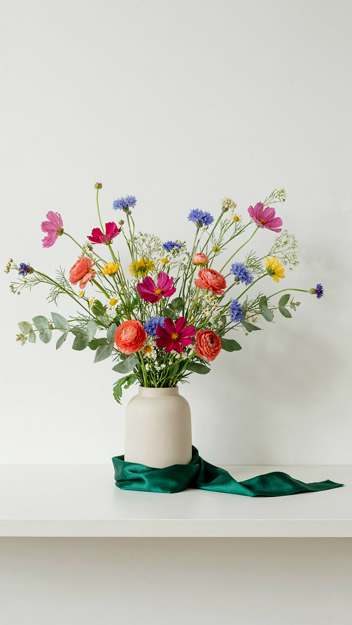
You want the bouquet to look intentional, not like someone grabbed flowers and tied them with whatever was lying around. The real mechanism is simple: ribbon functions as a frame, not competition. It establishes a visual boundary that tells the eye where the arrangement ends and the room begins. Without it, wildflowers blur into the background. With it, they become a deliberate object.
The frame works because wildflowers naturally resist order. Their stems cross at odd angles, colors scatter, heights vary. This is their strength. Ribbon doesn’t fight this chaos—it contains it. A structured edge around unstructured stems creates coherence without flattening the bouquet’s character. The ribbon becomes the pause between the flowers and everything else in your space.
Tension Through Deliberate Mismatch
Design uses contrast from visual conflict to signal intention. Think of it in terms borrowed from graphic design: positive and negative space. Your ribbon is negative space that makes the wildflowers positive space. The mismatch is the point. Ribbon creates visual tension through deliberate mismatch, not harmony. Mismatched ribbon to wildflower works harder than matching ribbon.
A silk ribbon in deep jewel tones wrapped around pale wildflowers forces the eye to register both. A linen ribbon in natural tan does the same through texture contrast, not color. The tension stops the viewer from treating the bouquet as wallpaper. Pick ribbon that contradicts your flowers in one dimension: color, texture, or weight. Never try to blend. Opposition is what makes the arrangement read as a choice you made.
The “Scarcity Signal” Method For Wildflower Wedding Ribbon

Minimal Ribbon, Maximum Impact
You want people to think your wildflower bouquet cost more than it did. That’s the real reason you’re reading this. The mechanism works through economics: scarcity signals value. When ribbon is absent or restrained on a bouquet, the viewer’s brain fills the gap. Restraint reads as intentional. Intention reads as expensive. A single thin silk ribbon wrapped once around the stem stem sends a different message than layered, wrapped, and bowed excess.
Most advice tells you to “let the flowers speak.” That’s incomplete. The real play is negative space. Strip away the decorative noise and the focal point—those wildflowers—becomes the only thing worth looking at. Your eye doesn’t compete with ten ribbon textures. It lands on what matters. That’s control. That’s the mechanism working.
The Understated Elegance Mechanism
Luxury brands figured this out decades ago. Their packaging uses single-color ribbon, minimal embellishment, and structural restraint. The psychology is direct: complexity suggests mass production. Simplicity suggests curation. When someone sees a wildflower bouquet with a single grosgrain ribbon in a neutral tone, they assume it came from a high-end florist, not a grocery store. The ribbon choice becomes invisible proof of taste.
The action is specific: choose one ribbon type, one color family, one wrap method. Don’t mix. Don’t layer. Don’t experiment on the bouquet itself. This signals decisiveness. Decisiveness signals expertise. Your wildflower bouquet becomes an artifact of control, not accident.
Textural Tectonics: When Ribbon Meets Untamed Wildflower Wedding
Ribbon As The Anchor Point
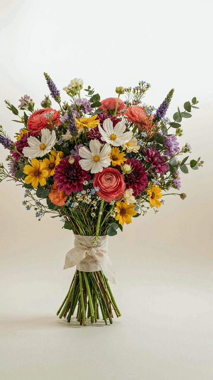
You want this section because you’re worried a wildflower bouquet will look chaotic without something to justify the mess. The real mechanism is borrowed from geology: ribbon functions as the stable tectonic plate around which unstable forces organize themselves. In bouquet design, the ribbon doesn’t decorate the flowers. It establishes visual boundary and structural reference. The flowers move, shift, and sprawl. The ribbon stays fixed. This asymmetry is what makes the composition readable instead of accidental.
Ribbon choice determines how much visual weight the bouquet can carry. A thin silk ribbon suggests delicacy and demands restraint in stem count and color range. A wide linen ribbon absorbs chaos and allows denser, more varied wildflower combinations without collapsing into visual noise. The ribbon’s texture, width, and wrap method aren’t afterthoughts. They’re the load-bearing walls of the entire arrangement. Without deliberate ribbon selection, wildflower bouquets default to looking like weeds someone grabbed from a field.
Layering Tension Between Wild And Controlled
Everyone says wildflower bouquets celebrate natural randomness. That’s incomplete. Natural randomness plus total visual collapse are the same thing without structural opposition. The real work happens in the gap between flower composition and ribbon treatment. Wildflowers create vertical, horizontal, and diagonal vectors that pull in competing directions. Ribbon counteracts this by establishing a single focal plane and color anchor.
Bouquet depth requires flowers to occupy multiple layers: outer perimeter flowers spread wide, middle-distance flowers create secondary silhouette, core flowers establish depth. Each layer fights for visual dominance. Ribbon wraps at the binding point where all layers converge, creating compression and hierarchy. When ribbon sits too loose, the bouquet reads as unfinished. When it sits too tight, it strangles the wildflower aesthetic. The protocol is this: wrap ribbon at the exact point where stems naturally transition from individual to bundle, then secure it so the wrapping material neither slides nor compresses the stems further.
Beyond Silk: Unconventional Materials For Wildflower Bouquets

Raw Linen And Jute: Earthy Anchors
You want people to notice your taste without announcing it. That’s the real reason unconventional ribbon materials matter. Using linen and jute works because they operate on contrast—they ground wildflowers visually instead of competing with them. The coarser weave absorbs light differently than silk, which makes the flowers themselves the focal point. This is basic figure-ground separation from visual design.
- Natural fiber weight: Linen and jute provide structural support for heavier wildflower stems without requiring synthetic stiffeners or wrapping techniques.
- Color retention: These materials hold natural dyes and earthy tones without fading as quickly as cheaper alternatives when exposed to indoor light.
- Texture compatibility: The rough surface matches wildflowers’ organic aesthetic rather than fighting against it like polished ribbons do.
- Cost efficiency: Raw materials cost significantly less than silk while projecting intentionality rather than budget constraint.
- Durability in humidity: Linen and jute resist moisture damage better than synthetic blends, keeping bouquets structurally sound in humid rooms.
The mechanism is straightforward: textured materials distribute visual weight. When you wrap a wildflower bouquet in linen, you’re not adding decoration—you’re creating a visual boundary that lets the flowers breathe. Jute works the same way but reads slightly more casual. Wrap the binding twice around the stem cluster, knot at the back where it won’t show, then trim excess material at a 45-degree angle to prevent fraying.
Velvet And Leather: Unexpected Luxury In Ribbon Bouquet
The common advice says wildflower arrangements must stay casual or they lose their charm. That’s incomplete thinking. Velvet and leather actually elevate wildflowers by introducing scarcity—luxury materials signal intentionality, and when paired with unstructured flowers, they create cognitive friction that makes people look twice. The juxtaposition is the entire mechanism.
- Velvet hand-feel: High pile velvet adds tactile luxury without visual heaviness, making the bouquet feel like a deliberate gift rather than a casual arrangement.
- Leather aging properties: Real leather develops patina over weeks and months, creating evolving visual interest as the bouquet dries or fades.
- Narrow ribbon widths: Velvet and leather work best at 1.5 to 2 inches wide—thicker materials overwhelm delicate wildflower stems if oversized.
- Moisture resistance: Both materials repel water better than cotton ribbons, protecting the hand-tie area from stem seepage and rot.
- Neutral color palettes: Deep jewel tones and earth tones in velvet and leather complement wildflower color variation without competing for attention.
Layer velvet or leather ribbon directly against the stem cluster, then secure it with a simple knot or small copper wire wrapped underneath. The material needs direct contact with the stems to work visually—spacing it away with foam or filler defeats the purpose. Use this approach when you want the bouquet to read as intentional design rather than gathered flowers.
The “Inertia Loop” Of Ribbon Placement For Wildflower Bouquets

Where The Eye Lands First
You want the ribbon to look intentional because you’re worried it looks like an afterthought. Here’s the mechanism: ribbon placement in wildflower bouquets operates on the same principle as visual hierarchy in graphic design—the eye follows contrast and interruption before it follows anything else. A ribbon wrapped low on the stem handle creates a visual anchor point. It stops the viewer’s eye from drifting upward into the chaotic mass of blooms. The placement works because it contradicts the natural upward movement of the stems themselves.
Most florists wrap ribbons too high, right where the flower heads begin. This fails because it competes with the blooms instead of supporting them. Low placement, roughly two to three inches above where stems are cut, creates separation. The ribbon becomes a frame, not a competitor. This distinction changes how a bouquet reads in a room—it shifts from “scattered plants” to “composed object.” Position the ribbon where the hand would naturally grip the bouquet, not where the flowers are fullest.
Moving Weight Through The Stems
Bow theory in textiles teaches us that fabric flow follows the path of least resistance—tension applied at one point distributes stress across the whole structure. Apply this to wildflower bouquets: a ribbon wrapped with slight tension at the stem base redirects visual weight downward and outward. This creates the illusion that the entire bouquet has more stability and intention. The tighter the wrap, the more the ribbon “holds” the viewer’s attention at that focal point instead of letting their eye scatter across individual stems.
Loose ribbons fail because they add visual chaos to an already complex arrangement. Tight wraps, by contrast, impose order. The mechanism is simple: your eye reads tautness as control. Wrap the ribbon around the stem bundle two to three times with even tension. Each wrap should sit parallel to the one below it. This parallel stacking creates visual rhythm that guides the eye down the bouquet, then naturally toward the room itself. The ribbon becomes the transition object between the flowers and the home.
Ignoring Wedding Colors: Why Your Bouquet Doesn’t Need To Match
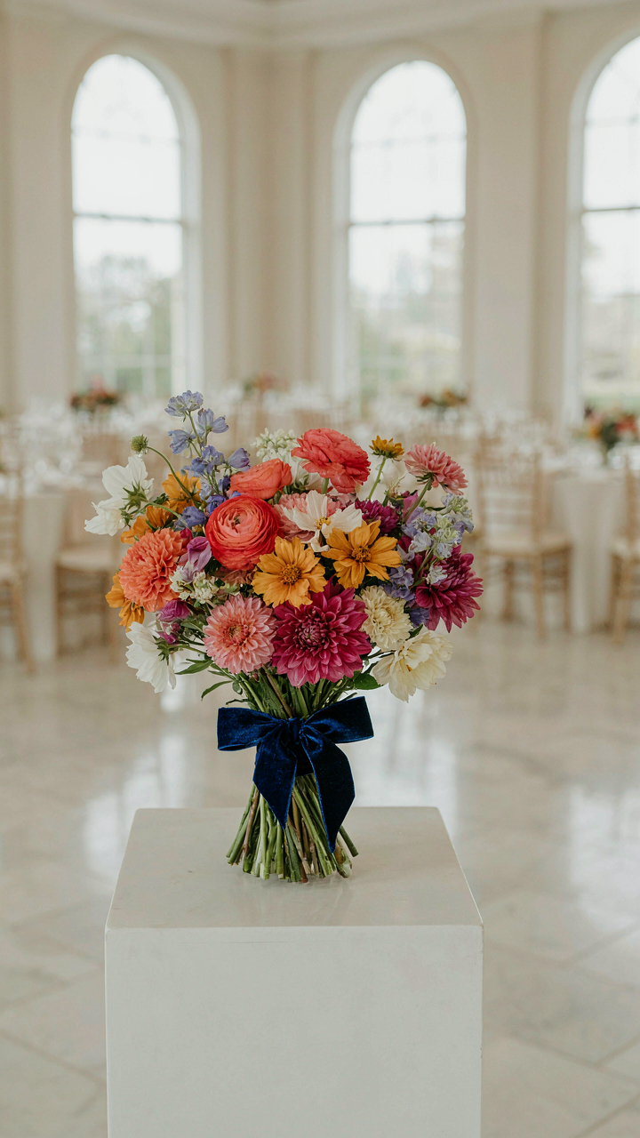
The Tyranny Of Themes Breaking Free From Wedding Colors
You’re anxious that mismatched ribbons signal poor planning. Here’s the mechanism: wedding color coordination became an industry standard because it’s easy to sell and easy to execute, not because it’s visually superior. Design history shows that constraint-based systems actually limit impact. When you force a wildflower bouquet into a predetermined palette, you’re optimizing for safety instead of presence. The ribbon becomes an afterthought that blends rather than anchors.
Wildflower arrangements inherently resist uniformity. Their stems vary in thickness and height. Their blooms cluster unpredictably. A ribbon that echoes the wedding palette gets swallowed by this natural chaos. The real play is selecting ribbon that creates contrast or depth against the flowers themselves, not against bridesmaid dresses or linens. This is a material decision, not a decorative one.
Bouquet As Statement Independence In Wedding Flowers
A bouquet with intentional ribbon contrast becomes a focal point instead of a supporting player. Most wedding advice treats flowers as background to the overall theme. That’s backwards. The bouquet sits in photographs, in the bride’s hands, in every memory of the day. Its ribbon should earn that real estate through visibility and purpose, not through obedience to a color scheme.
Independence here means choosing ribbon based on how it photographs and reads from distance, not how it coordinates on a mood board. Consider the flowers’ actual color range, the lighting conditions, and the contrast you want. Then pick ribbon that makes those elements sharper. This transforms the bouquet from an accessory into a design decision. The ribbon becomes active, not passive.
The Longevity Fallacy: Prioritizing Aesthetics Over Durability
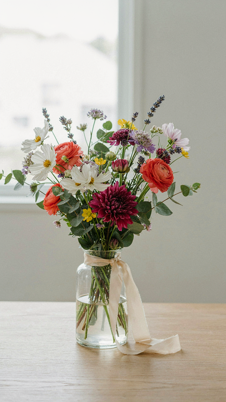
Temporary Beauty: Embracing The Ephemeral
You want the bouquet to look perfect forever because admitting flowers die feels like failure. The mechanism is simple: wildflower bouquets are biological systems, and applying durability metrics to living material is a category error. Ribbons don’t change this fact. Silk, satin, linen, or cotton ribbon wrapping extends visual impact for days, not months. The bouquet itself deteriorates on a predictable timeline regardless of ribbon choice. Accept this first, then choose ribbons that optimize the actual window you have.
The practical move is matching ribbon material to the bouquet’s intended lifespan. Delicate ribbons like silk organza work for events spanning hours or a single day. Cotton and linen ribbons hold their appearance through a week indoors with basic water maintenance. Synthetic ribbons resist wilting longer but create visual discord as the flowers fade around them. The contradiction between permanent ribbon and decaying flowers reads as neglect, not intentional design. Pick ribbon durability that tracks with your flowers’ actual decay rate.
Securing The Delicate: Practicalities For Natural Flower Bouquet
Wrapping wildflowers tightly destroys them. Most florists wrap too aggressively, crushing delicate stems and petals under tension. The binding point matters more than ribbon material. Use a loose figure-eight wrap around the stem bundle, crossing the ribbon once or twice rather than spiraling it down the full length. This distributes pressure evenly and prevents circulation cutoff that accelerates wilting. Secure with a single knot at the base, not multiple wraps that compound damage.
Water reaches wrapped stems slower than exposed ones, creating a secondary failure point. Cut a quarter-inch slit in the wrapping at the base where stems enter water. This single protocol step lets moisture penetrate the binding without requiring you to unwrap the bouquet. Replace water every two days and trim stem ends by half-inch increments. These actions matter infinitely more than ribbon choice. Ribbon is the last variable in the equation, not the first.
The Untamed Edge: How Imperfection Defines True Wildflower Bouquet Ribbon Styles
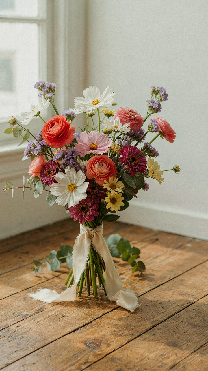
Wabi Sabi And The Frayed Edge
You want permission to stop overthinking your ribbon choice. That’s the real motive here. Wabi-sabi, the Japanese design philosophy, treats imperfection as the primary aesthetic value. It doesn’t celebrate flaws reluctantly. It centers them. Wildflower bouquet ribbons embody this directly. A raw silk ribbon with uneven edges, a linen band with visible weave variation, a hand-dyed cotton strip with color fade—these aren’t mistakes you tolerate. They’re the entire point.
The mechanism is simple: uniformity signals mass production and control. Irregularity signals authenticity and intention. When you choose a ribbon with visible texture, fraying, or natural color variation, you’re making a statement about what you value. Your bouquet stops looking like a product and starts looking like a choice. This shift changes how people perceive the entire arrangement. Wrapping wildflower stems in a perfectly flat, machine-cut ribbon creates cognitive dissonance. The flowers are wild. The ribbon should be too.
Let Go Of The Aesthetic Grip
Most advice says to “balance” wild flowers with formal ribbon. That’s backwards. The real tension comes from pretending order was never your problem. The wildflower bouquet philosophy demands you abandon control in the tying itself. Use ribbon without measuring it first. Wrap it asymmetrically. Let the ends fall at different lengths. Tie a knot you’d normally redo. The bouquet tells you when it’s done, not your blueprint.
When you release the need for symmetry, the ribbon becomes a tool of integration, not correction. A softly twisted jute ribbon wrapped loose around the stems, with trailing ends that curve naturally down the sides, feels congruent with wildflower chaos. The ribbon becomes part of the story, not a frame around it. Photograph your arrangement before you fuss with the bow. What you see in that first moment is usually the one worth keeping.
The Real Obstacle Isn’t Finding The Perfect Ribbon; It’s Your Inability To Embrace The Inherent Imperfection Of Nature

You don’t need another ribbon style recommendation. You need permission to stop chasing “perfect.” Wildflowers live because they reject symmetry. The moment you accept that asymmetrical, slightly worn silk or linen ribbon complements their chaos better than pristine satin, your entire aesthetic shifts. Buy one ribbon today that actually matches nothing in your home. Pair it with wildflowers. Notice how it works. Imperfection isn’t a compromise; it’s the entire point.