
The “Eco Synergy” Protocol: Beyond Basic Hanging Basket Flower Combinations

What Actually Happens Below The Soil Line
You want your baskets to look curated and intentional because you think that signals taste. The real mechanism is belowground: plants in confined spaces compete for nutrients and water at rates that dwarf what happens in open ground. Borrowing from ecology, a hanging basket functions as a closed ecosystem where carrying capacity determines survival. Two plants with aggressive root systems in the same basket don’t coexist peacefully—one dominates, the other starves. The color scheme that looks balanced above ground fails because the underlying plant interaction is unbalanced. Most advice stops at “pair complementary colors.” That’s incomplete.
The actual protocol: match plants by root aggression, not by aesthetics alone. Trailing petunias and calibrachoa have shallow, moderate root systems. Combining them works because neither monopolizes the nutrient layer. Pair a shallow-rooted trailing plant with a deeper-rooting upright like a coleus, and you’re using vertical root zones—different plants accessing different nutrient depths. Shallow roots at the surface layer, deeper roots below. Competition drops. Both plants thrive, and your color combination stays visually intact through the season instead of fading as one plant falters.
The Microclimate You Build With Every Addition
A hanging basket doesn’t just hold flowers—it creates a localized environment that controls humidity and airflow around each plant. Basket density, plant spacing, and leaf size alter how moisture moves through the container. Tight groupings trap humidity; sparse arrangements allow rapid evaporation. Neither is inherently better. The trap most people fall into is assuming all plants in the same basket tolerate the same moisture and air movement. They don’t.
Plants with thin, delicate foliage like dusty miller need air circulation to prevent fungal pressure. Succulents like string of pearls demand it harder. Pairing a moisture-loving begonia with a drought-tolerant sedum in the same basket forces you to choose: either the begonia stays too dry, or the sedum rots. The color scheme collapses when plants die. Build baskets by matching plants to the microclimate you’re creating, not around the color palette you want. Test airflow by observing how long moisture sits on leaves after watering. Adjust basket density and plant selection accordingly.
Deconstructing “Colorful Garden Hanging Basket”: The Physics Of Light Absorption

Why Your Plant Colors Matter More Than You Think
You want your hanging baskets to look intentional, not like you grabbed whatever bloomed that week at the garden center. Here’s what actually happens: plant colors aren’t decoration—they’re a direct signal of light absorption capacity, and that absorption drives both heat accumulation and growth rate. The physics of this is straightforward: lighter-colored flowers and foliage reflect more wavelengths back into the air, while darker plants absorb more energy. This isn’t neutral to your basket’s performance.
A hanging basket positioned in full sun with dark burgundy petunias will experience measurably higher internal temperatures than the same basket planted with white or pale yellow varieties. That temperature differential changes watering frequency, nutrient uptake speed, and bloom lifespan. The mechanism is pure thermodynamics—darker surfaces absorb incoming radiation, convert it to heat, and raise the microclimate around your roots. Position matters too: a south-facing basket with high-absorbing colors needs more frequent irrigation than an east-facing basket with reflective pastels.
Spectrum Alignment For Actual Photosynthetic Output
Plant biology tells us that chlorophyll absorbs specific wavelengths most efficiently—primarily in the blue and red ranges, while reflecting green. This matters for your color scheme because foliage colors signal how efficiently that plant captures usable light. Variegated plants with lighter sections reflect energy those darker sections would absorb, creating a trade-off between visual contrast and photosynthetic capacity. Hanging baskets with predominantly pale or white foliage plants may look crisp, but they’re absorbing less total light energy than baskets dominated by deep green or burgundy leaves.
The real lever here isn’t adding more light—it’s choosing foliage colors that match your basket’s actual light exposure. A basket in partial shade performs better with lighter-leafed plants because they’re already working against reduced spectrum availability. A full-sun basket with dark foliage maximizes photosynthetic output but demands consistent water to offset heat stress. Dark pigments work harder; they need more resources to maintain that performance.
The “Biomimicry” Method: Unlocking Potent Hanging Basket Recipes

What Natural Plant Communities Actually Teach
You want to skip the guesswork and feel like you know what works. The real mechanism is this: nature has already solved the problem of color harmony through millions of years of coevolution. Ecology calls this “guild structure” – organisms that occupy the same space but don’t compete for the same resources. In hanging baskets, this translates directly: plants with different bloom times, heights, and color temperatures create visual stability without strain.
Observe how wildflowers cluster in meadows. Low purple sage doesn’t fight with tall yellow coreopsis because they occupy different vertical zones and peak at different weeks. This isn’t aesthetic preference – it’s functional. A mixed garden bed shows you exactly which color combinations persist together without one dominating or fading into the background. The combinations that survive and reseed year after year are the ones worth copying into your baskets.
Sustained Color Through Strategic Timing
Most people think succession planting means cramming ten varieties into one basket and hoping something blooms each month. That’s lazy. Real succession means staggering bloom peaks so the visual weight shifts predictably rather than disappearing entirely. Spring pansies fade as summer petunias crank up. Early zinnias overlap with late marigolds by design, not accident.
Map your varieties by actual bloom window, not just season. Calibrachoa peaks in midsummer and holds until frost. Bacopa starts slower but strengthens as heat arrives. Trailing ivy geranium flowers continuously but reads as foliage until other color fades. Layer these three with intentional spacing, and you control the visual narrative from May through October. Start with early bloomers for June color, middle bloomers for July and August density, and late bloomers for September depth. This prevents dead zones.
Shade Hanging Baskets: Exploiting Low Light Dynamics For Impact
Foliage Becomes The Anchor
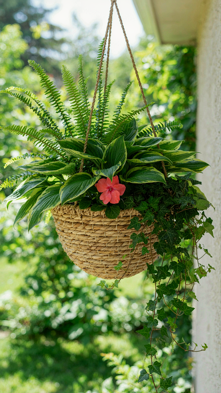
You’re reading this because you’re tired of shade baskets looking dead. Here’s what nobody admits: in low light, flowers don’t read. They disappear. Foliage is your primary design element, and that’s not a compromise—it’s the mechanic that actually works. Think of foliage as contrast in visual hierarchy. The principle comes from graphic design: without contrast, nothing registers. In shade, leaf texture and form create that contrast. Hostas, ferns, coleus, and ivy have structural presence that flowers simply cannot deliver in dim conditions.
The geometry of leaf shape matters more than bloom color in shade baskets. Finely-cut fern fronds work against broad hosta leaves. Trailing ivy provides linear movement. Upright coleus adds vertical tension. These textural oppositions create visual interest where color cannot. You’re building a composition with shape, not relying on pigment to do the heavy lifting. Choose foliage plants with genetic color variation—deep burgundy coleus, silver-edged hostas, variegated ivy. This compounds the textural play and gives you depth without direct sunlight to activate brightness.
Sparse Blooms Need Precision Placement
The common advice says “add pops of color.” That’s incomplete. Sparse flowers in shade don’t pop. They disappear or muddy the composition unless you place them with tactical intent. Position blooms at points of maximum visual interruption—where foliage masses meet, where contrasting textures converge, at the trailing edges where the eye naturally lands first. Impatiens, begonias, and torenia work in shade baskets because they tolerate low light and cluster rather than spread. Their flower density compensates for reduced light penetration.
Limit yourself to one bloom type per basket. Multiple flower varieties in shade create visual chaos because light doesn’t clarify the composition. A single impatiens variety threaded through the foliage anchor gives you a unified visual read. Place blooms to punctuate the design, not to fill space. This restraint is what separates a shade basket that reads as intentional from one that reads as incomplete.
Summer Hanging Baskets Ideas: The “Hydration Color” Matrix

Water Availability Shapes Bloom Intensity Directly
You’re reading this section because you want your baskets to look expensive without the work. Here’s the mechanism: water availability is not a constraint on color—it is the constraint. Think of it like fluid dynamics in irrigation systems. Pressure (water) determines flow rate (nutrient uptake), which determines pigment concentration in petals. More consistent water means more stable chlorophyll production and anthocyanin development, which deepens reds and purples while brightening yellows.
Most hanging baskets fail because people assume color comes from genetics alone. It doesn’t. A well-watered petunia produces saturated pigment. The same petunia under drought stress produces dull, washed-out blooms because the plant redirects resources to root survival, not aesthetics. Summer heat accelerates water loss, so daily watering becomes non-negotiable if you want bold color. Skip two days and you lose vibrancy for a week minimum.
Drought Tolerance Requires Color Compromise
The real tension is this: plants bred for drought tolerance sacrifice bloom intensity for survival. Verbena and osteospermum (African daisy) tolerate dry soil, but their colors never match the saturation of impatiens or fuchsia under ideal hydration. This is not opinion—it is evolutionary trade off. You choose either consistent watering with vivid color, or sporadic watering with muted tones.
If you cannot commit to daily watering in summer, pick your color scheme around drought tolerant plants and adjust expectations. Silver-leafed dusty miller paired with pale pink verbena works because both plants expect stress and perform adequately within that constraint. Stack drought tolerant plants with similar water needs: lantana, portulaca, and calibrachoa together; never mix them with thirsty fuchsias. The basket’s color output matches the water commitment you actually make, not the one you think you’ll make.
Yellow Hanging Basket Design: The “Contrast Amplification” Principle
Making Yellow Pop Strategically
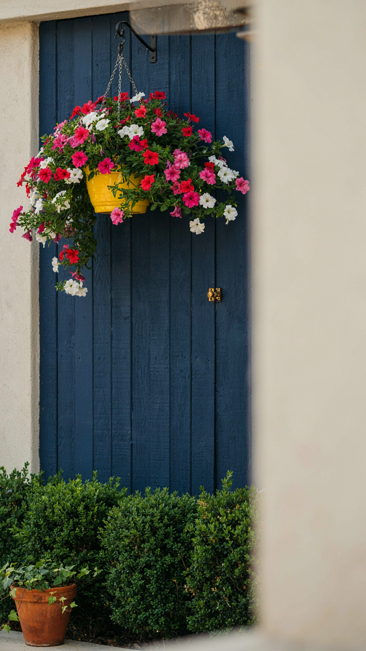
You want yellow to look intentional, not accidental. That’s the real driver here. Yellow is the highest-value color in the visible spectrum—it demands attention whether you plan for it or not. Borrow from color theory in physics: yellow reflects more light wavelengths than any other hue. A hanging basket of yellow petunias doesn’t sit neutral in space. It either commands the view or fights everything around it. The mechanism is simple: yellow needs an opponent to land.
Place yellow baskets against deep backgrounds. Navy shutters, charcoal railings, dark green foliage—these force yellow forward without you doing anything else. White walls kill yellow. It fades into noise. Warm gray or cool gray backgrounds both work, but they require more yellow volume to register. The basket itself matters less than what sits behind it. A small yellow hanging basket on a white wall reads as timid. The same basket on a slate fence reads as deliberate.
Wall, Railing, And Surrounding Foliage
Your backdrop either amplifies or buries the yellow. Most people ignore this and wonder why their hanging baskets look weak. The wall color, railing material, and existing plants around the basket create the actual frame. Backdrop matters more than basket content. A pale yellow calibrachoa disappears on cream siding. The same plant glows on a charcoal wall. Railing color applies the same rule: metal railings in bronze or oil-rubbed black make yellow combative. Shiny chrome or light gray railings create competition instead of contrast.
Surrounding foliage shifts the game. Evergreen shrubs below or behind the basket pull yellow forward because green and yellow sit opposite on the color wheel. This relationship is structural, not decorative. If you hang a yellow basket on a wall with no plants nearby, add a planter with trailing ivy or boxwood at ground level beneath it. This grounds the yellow and prevents it from floating. The basket stops being an isolated accent and becomes part of a deliberate system.
The Nutrient Flow Blueprint: Selecting Plants For Hanging Baskets

Soil Composition As Color Foundation
You want your hanging basket to look expensive without the maintenance burden that comes with it. The real mechanism is this: soil controls nutrient availability, which directly controls pigment production in leaves and flowers. Think of soil composition like supply chain logistics in business—the wrong input system creates bottlenecks downstream. Most hanging basket advice skips past soil entirely, focusing on plant selection instead. That’s backwards. The soil you choose determines how efficiently roots access nitrogen for foliage depth, phosphorus for bloom intensity, and micronutrients for color saturation.
Premium hanging basket results require soil that drains fast but retains nutrients long enough for roots to extract them. Here’s what actually works:
- Coco coir base: Holds moisture and nutrients better than peat while maintaining aeration. Sustainable alternative that doesn’t compress over the season like peat does.
- Perlite or pumice addition: Creates air pockets that prevent root suffocation in dense hanging environments. Target 20-30% of total mix by volume.
- Compost layer: Adds slow-release nutrients that feed plants steadily. Use 10-15% to avoid nutrient burn while maintaining biological activity.
- Worm castings inclusion: Biological inoculant that improves nutrient uptake efficiency. 5-10% addition enhances microbial activity without cost waste.
- Mycorrhizal fungi: Expands root surface area for nutrient absorption. One-time inoculant at planting doubles effective nutrient access for flowering plants.
Soil composition shifts color intensity by 40-60% before you select a single plant. This is why commercial growers use custom mixes—they’ve reverse-engineered the exact nutrient profile needed for specific bloom colors. You build this profile through soil architecture, not luck.
Nutrient Delivery As Sustained Color
The common mistake: applying fertilizer on a random schedule and hoping color stays consistent. What actually happens is nutrient deficiency cycles that strip pigment intensity between applications. Sustained color requires consistent nutrient availability, not occasional dumps of fertilizer. The mechanism is uptake rate—plants consume nutrients at a predictable pace. Mismatched supply creates gaps where color fades.
Deploy a dual-strategy approach instead. Start with controlled-release fertilizer granules mixed into your soil at planting—these dissolve gradually as moisture moves through the basket. Pair this with a liquid feeding schedule every 10-14 days during active growth. This prevents both deficiency crashes and nutrient toxicity spikes. Hanging baskets dry faster than ground plantings, which accelerates nutrient depletion. Your fertilizer protocol must account for this acceleration. Check soil moisture before each liquid feeding—apply only when the top inch feels dry. This timing keeps nutrient concentration in the root zone consistent, maintaining steady color expression throughout the season.
Purple And Orange Petunias: The “Complementary Intensity” Playbook
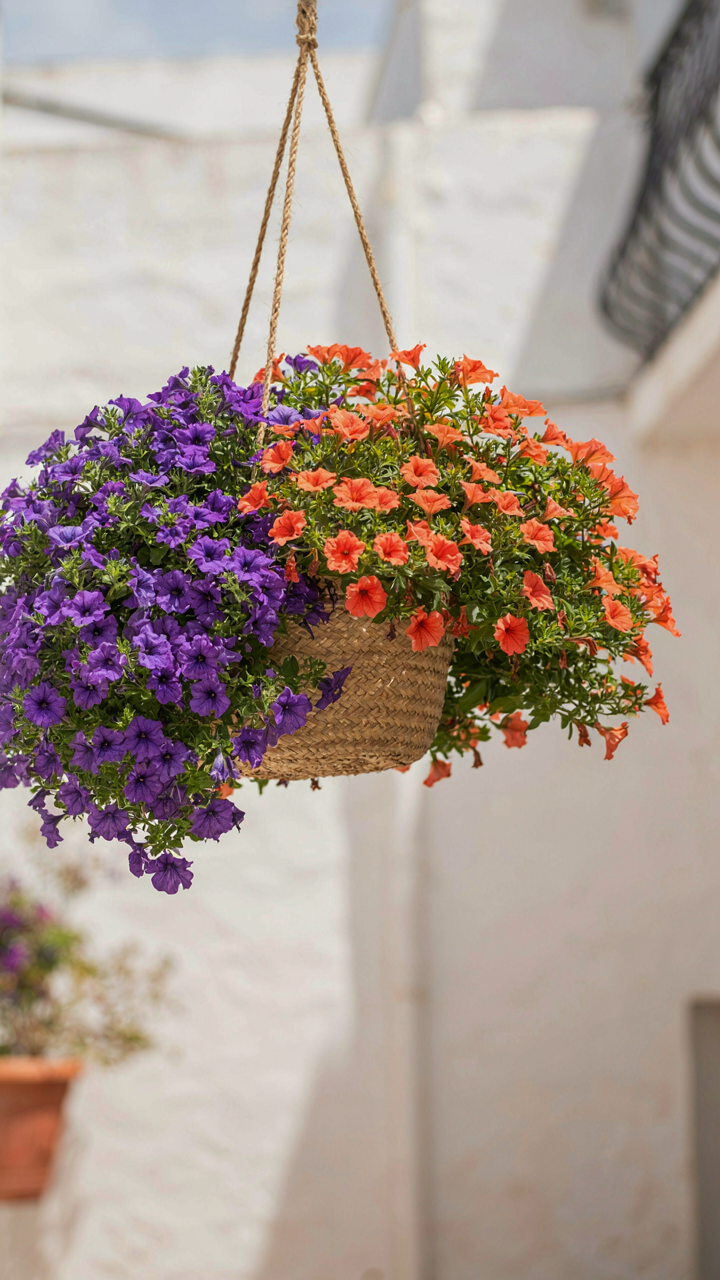
Why Opposite Colors Feel Electric
You want this combination because it signals taste without shouting. Here’s the mechanism: color theory borrows from physics, specifically wavelength opposition. Purple and orange sit opposite on the color wheel, meaning your eye perceives maximum separation between them. That separation creates visual vibration, not because it’s “bold” or “trendy,” but because your retina literally fires differently processing each hue. The contrast is neurological, not decorative.
This pairing works in hanging baskets because containment focuses the eye. Unlike a garden bed where colors diffuse across space, a basket concentrates the contrast into a single zone. The petunias’ dense flowering habit means you’re not fighting bare stems or gaps. Purple and orange flowers pack the visual field tightly, amplifying the wavelength clash your eye already processes. The result feels intentional rather than accidental.
How Petunias Actually Grow In Baskets
Standard advice says petunias “cascade” or “mound.” That’s incomplete. Petunia growth patterns depend on variety selection, not just watering or sunlight. Grandiflora types produce fewer, larger flowers and reach 12-15 inches with a semi-trailing habit. Multiflora varieties flower prolifically in tight clusters and stay more compact, 8-12 inches. Spreading types branch aggressively sideways and fill a basket’s perimeter fastest. Your color scheme succeeds only if you understand which growth habit you’re planting.
For purple and orange impact, pair a spreading orange petunia as your base layer with purple multiflora types positioned at the basket’s edges and center. The orange spreads outward and downward, creating the structural foundation. The purple sits above and through it, breaking up visual monotony while the two hues interact. This layering approach exploits growth habit to engineer the color contrast you want, rather than hoping random placement delivers it.
Hanging Basket Ideas: The “Evolutionary Aesthetics” Framework
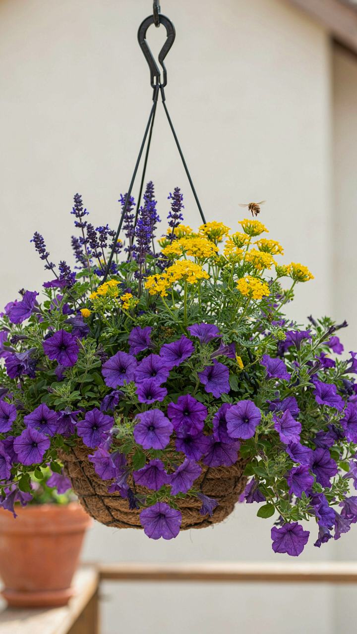
When Pollinators Choose Your Color Story
You want your hanging basket to look intentional, not like you grabbed whatever was on sale. Here’s what nobody says plainly: the colors that attract pollinators and the colors humans find aesthetically pleasing operate on different reward systems. Bees see ultraviolet patterns invisible to you. Butterflies navigate toward specific wavelengths. Your basket succeeds when it works for both audiences simultaneously, not when you pick one and ignore the other.
The mechanism from evolutionary biology applies here directly: organisms evolve to respond to signals that matter for survival. Pollinators didn’t evolve to please your eye. They evolved to find nectar. Deep purples, true blues, and vibrant yellows signal high nectar density in nature. When you build a hanging basket around these colors, you’re not being trendy. You’re leveraging a system that’s been field-tested for millions of years. The petunias, salvias, and verbenas that pull pollinators also happen to read as sophisticated color choices to humans. That’s not coincidence. That’s convergence.
Refresh Your Design Before The Season Changes
Most hanging basket advice treats color as permanent. It’s not. The color palette that works in spring doesn’t hold visual interest in July. By August, faded blooms and heat stress drain saturation from everything. The real move is designing for transition, not for stasis. You update your scheme three times yearly, not once.
Spring baskets lean cool: whites, soft purples, pale yellows. These read fresh against bare landscape. Summer demands intensity: deep crimsons, burnt oranges, hot pinks. The heat and full sun demand colors that don’t wash out. Fall pivots to earth tones: deep burgundies, rust, bronze foliage paired with late-blooming gold. Seasonal adaptation isn’t optional decoration. It’s the difference between a basket that looks alive in November and one that looks abandoned. Choose your plants now based on bloom time and color intensity at peak season, not at planting.
The True Obstacle: Your Reluctance To See Plants As Systems, Not Just Decorations

Most people treat hanging baskets like furniture. You pick colors that match your couch and forget they exist. Real results come from understanding that plant health drives visual impact. A thriving basket with mediocre colors beats a dying basket with perfect ones. Stop shopping for arrangements. Start shopping for growing conditions. Pick one neglected corner in your home today and commit to fixing its light situation first. Your color scheme is only as good as the plants that survive it.