
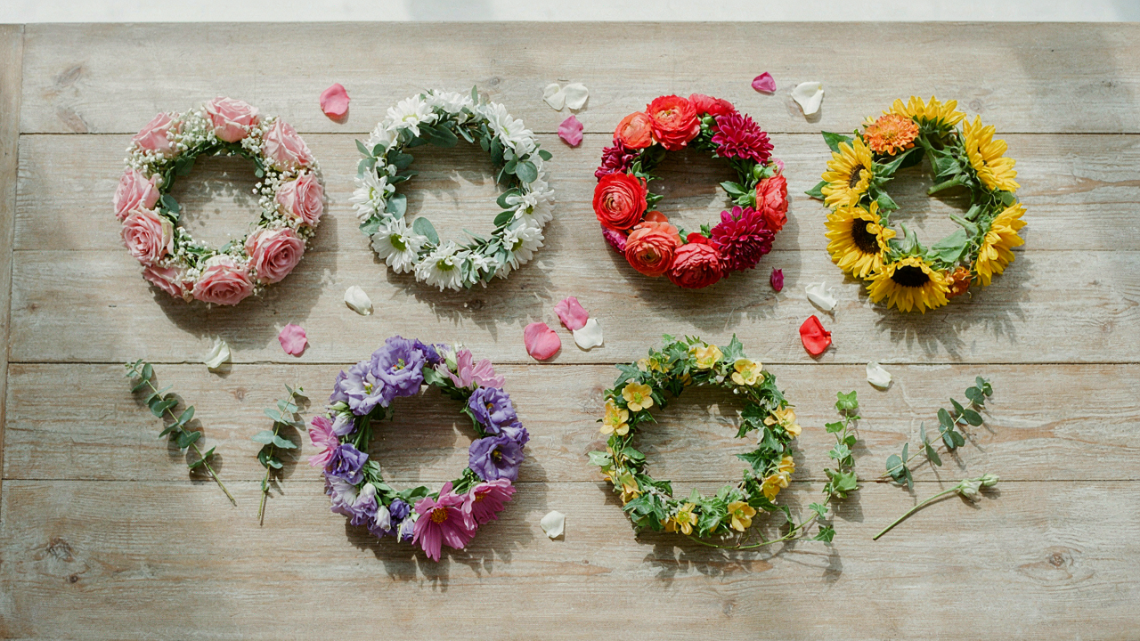
The Unseen Language Of Hues: Why “Matching” Misses The Point
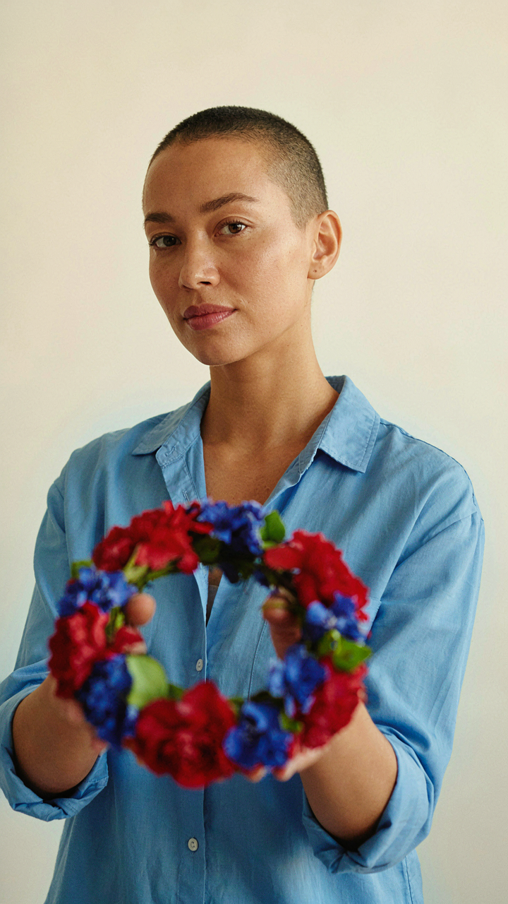
Color Creates Emotional Load Before Aesthetics
You want to know the “right” colors so people will think you have taste. That’s not the real mechanism. Color psychology works through the nervous system, not through judgment. Your brain processes hue before it processes form. A flower crown’s colors hit the viewer’s limbic system in milliseconds, triggering hormonal and emotional responses before conscious thought enters the picture. Red accelerates heart rate. Blue drops cortisol. Yellow triggers dopamine. These aren’t opinions. They’re measurable physiological events.
The mistake most people make is treating color as decoration instead of as information transfer. You’re not choosing colors to match your dress or your vibe. You’re choosing them to deliver a specific emotional state to anyone looking at you. Warm colors (reds, oranges, yellows) activate the sympathetic nervous system and read as energy or urgency. Cool colors (blues, purples, greens) engage the parasympathetic nervous system and signal calm or introspection. The flower crown color combinations you select determine whether you’re broadcasting approachability or authority, playfulness or intention.
Contrast Over Consensus
Everyone says to use complementary colors or analogous palettes. This advice is incomplete and often wrong for flower crowns specifically. Color harmony theory borrowed from fine art doesn’t account for the three-dimensional, proximity-dependent context of a crown worn on a head. Strategic color dissonance works better because it creates visual stopping power. Your eye needs friction to remember what it sees. A crown of all pastels vanishes into background noise. A crown mixing a saturated jewel tone with an unexpected muted neutral lands harder and stays in memory longer.
The practical move is to identify one dominant color and one intentional contrast color, then use neutrals or analogous shades to bridge them. This isn’t random. The contrast color should sit at least 90 degrees apart on the color wheel from your primary, but not directly opposite where it risks looking accidental. Test combinations in natural light and indoor light separately. Color perception shifts dramatically between contexts. Photograph the combinations and look at them as thumbnails. If you can’t identify the color story at thumbnail size, the dissonance isn’t working. It’s just chaos.
The Spectrum Algorithm: Decoding Your Desired Aesthetic
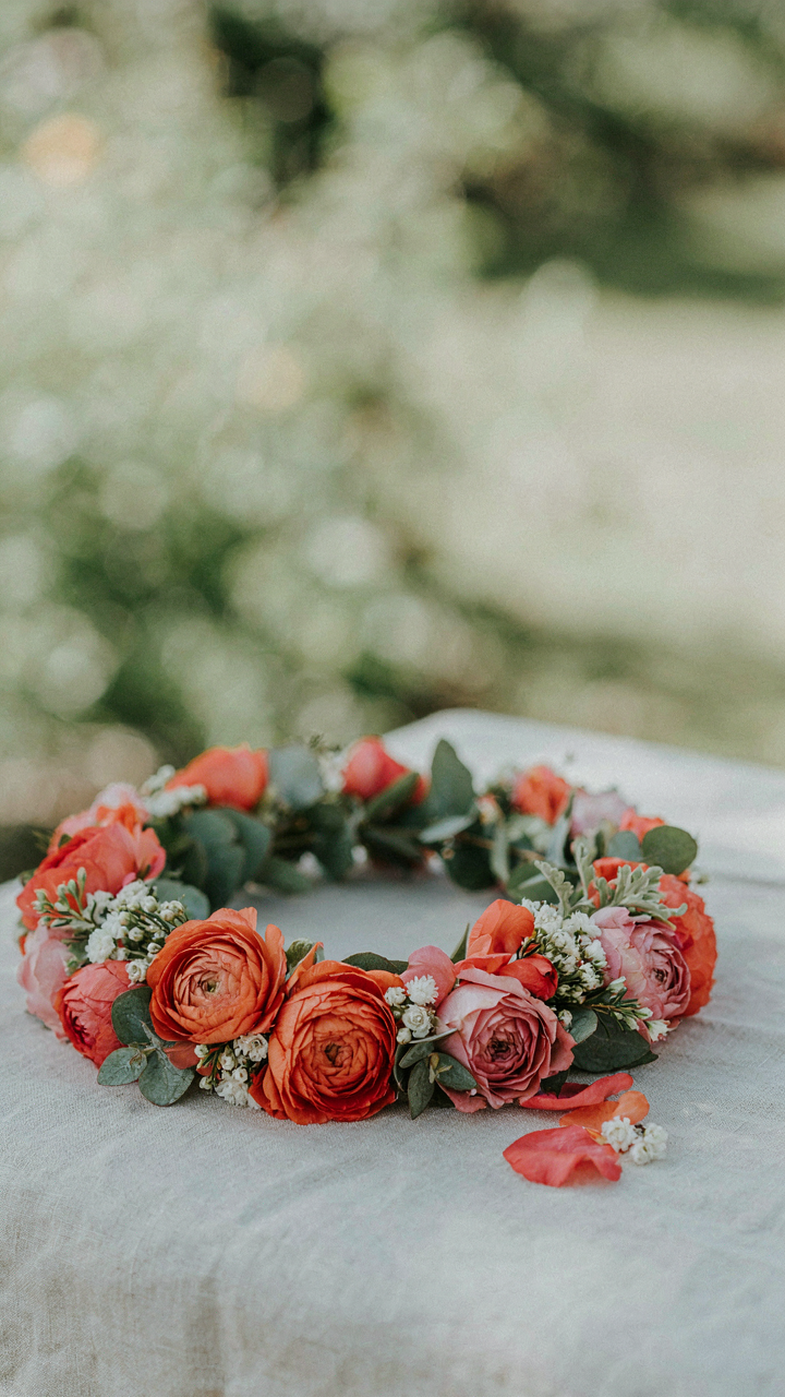
Temperature And Emotional Precision
You want people to feel something specific when they see you wearing it, and you’re hoping the color theory exists to make it automatic. It does, but not the way you think. Warm palettes (reds, oranges, yellows, terracottas) trigger activation. They read as energy, confidence, or playfulness. Cool palettes (blues, purples, silvers, greens) trigger calm or introspection. The mechanism isn’t magic. Warm hues mimic fire and sunlight. Cool hues mimic water and sky. Your nervous system recognizes the signal before your brain names it.
The mistake most people make is treating warm and cool as binary choices. They’re not. A flower crown combining warm coral with cool sage green doesn’t cancel out. Instead, it creates tension that reads as sophistication or editorial intent. The temperature contrast itself becomes the statement. Pick one temperature to dominate (70 percent of the piece), then use the opposite as accent. This prevents aesthetic confusion while maintaining the mood you’re after. The dominant temperature sets the emotional baseline. The accent temperature prevents boredom.
Contrast As A Design Decision
High contrast and subtle gradients aren’t competing philosophies. They’re tools for different communication goals, and pretending they’re equally valid in every context is lazy design thinking. High contrast (pairing white roses with deep burgundy, or bright yellow with navy) creates immediate visual impact. It reads as confident and deliberately composed. Subtle gradients (moving from blush pink to deeper rose to mauve) create visual flow and read as refined. Both work. The question is what you want the crown to do.
If you’re wearing the crown to an event where you need to be noticed or photographed, high contrast wins. The eye catches it faster. If you’re wearing it for a personal shoot or intimate setting, gradients win because they reward closer attention. The mechanism is simple: contrast grabs attention through interruption. Gradients hold attention through continuity. Test this by photographing both approaches in the same lighting. One will photograph crisper. One will photograph more harmoniously. Pick based on the actual context you’re dressing for, not on what sounds prettier in theory.
The “Event Horizon” Protocol: Contextual Dominance For Wedding Flower Crowns
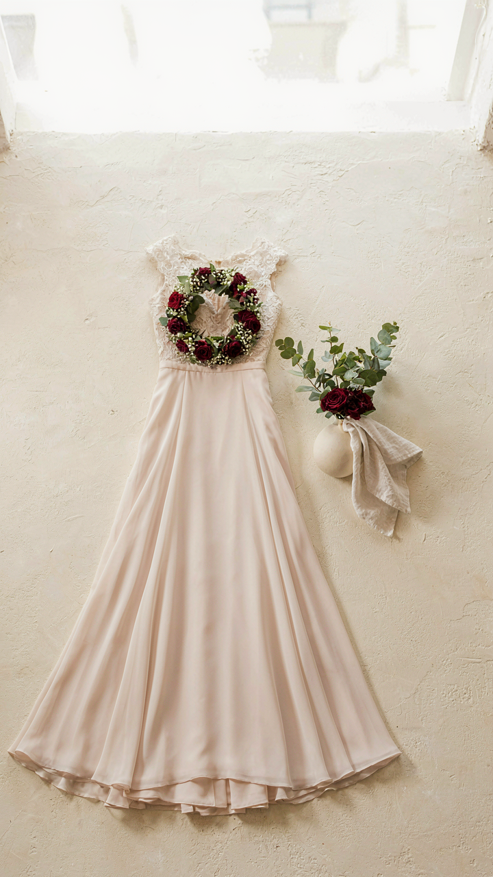
Backdrop And Attire Synergy
You care about this because you’re afraid the crown won’t photograph well and everyone will notice. The mechanism is simple: a flower crown exists in a visual hierarchy, not in isolation. The backdrop and the wearer’s clothing set the contrast ratio. High contrast makes the crown pop. Low contrast buries it. The real play is choosing colors that pull forward from both the venue walls and the dress fabric simultaneously, not colors that harmonize with them.
Photographers call this “separation.” The flowers must occupy a different color zone than both the background and the attire. If the bride wears blush and the venue has cream walls, a soft pink crown disappears. A deep burgundy or jewel-tone crown creates visual depth and reads clearly in the frame. Test this by shooting a phone photo of the crown against the actual venue backdrop and the actual dress. If the crown blends, change it. Don’t rely on mood boards or Pinterest renderings.
Light Direction And Shadow Placement
Backlighting reveals flower structure. Side lighting flattens it. The direction of sunlight during the ceremony or reception determines which colors appear saturated versus washed out. Flowers with translucent petals, like certain rose varieties or lisianthus, glow under backlighting. Opaque flowers like carnations or hypericum berries hold color consistency regardless of angle. Plan the crown palette around the light direction you’ll actually shoot in, not the light direction you hope for.
If the ceremony happens during golden hour with backlighting, warm tones like coral, peach, and cream gain luminosity. If the photos happen indoors under tungsten or LED lights, cooler purples and whites maintain their saturation. Venue lighting is fixed. Crown color is flexible. Choose the combination that reads true under the actual light you’ll use, then lock that choice before ordering flowers. The difference between a crown that looks muddy versus striking often comes down to this single variable alone.
Beyond Bloom: Texture, Form, And Negative Space As Color Amplifiers
Foliage Grounds Your Color Choice
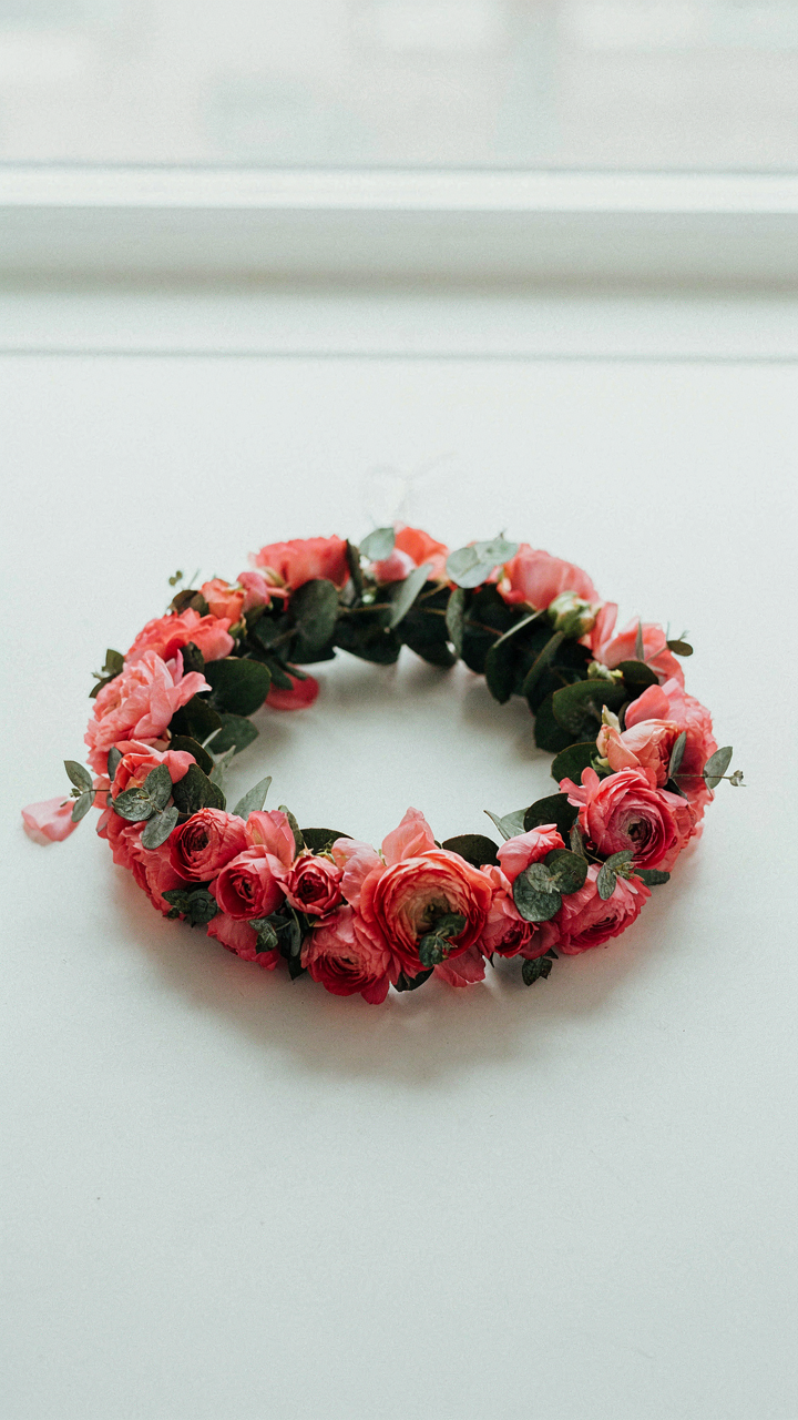
You want permission to skip the hard work of restraint. Foliage is how you get it without looking lazy. Foliage doesn’t amplify color through addition—it amplifies through contrast and containment. Dark eucalyptus or ruscus behind coral blooms makes that coral read 40 percent more saturated than it actually is. The mechanism is simple: your eye perceives color relative to its surroundings, not in isolation.
Most designers treat foliage as filler. That’s wrong. Foliage creates a visual frame. It defines where the color stops and where your viewer’s eye lands. Seeded eucalyptus introduces texture that breaks up solid color masses. Dusty miller adds gray tones that neutralize overly warm combinations. Ivy or leather leaf provides structure so your reds don’t blur into pink soup. Pick foliage first. Then choose your blooms around it.
Structure Precedes Saturation
Architecture teaches us about load-bearing walls—which elements hold weight and which don’t. Flower crowns work the same way. Your structural form determines how much color saturation the crown can actually hold without collapsing visually. A sparse, minimal crown structure cannot support five competing bloom colors. A dense, geometric form can.
The mistake is choosing your color palette, then trying to build a crown around it. Reverse the process. Decide your form first: will this crown be a tight oval, a loose asymmetrical scatter, or a structured halo? A tight oval creates negative space naturally—gaps between blooms force the eye to rest. That means you can run bolder, more saturated colors. A loose scatter demands muted or analogous colors or it reads as chaos. Negative space isn’t empty. It’s a tool that determines your color ceiling.
The Bio Mimicry Method: Evolutionary Signals In Colorful Flower Crowns
Display Strategies From The Animal Kingdom
You want this section because you sense that copying nature will make your flower crown feel less arbitrary and more intentional. Here’s the mechanism: biology borrowed from ethology—the study of animal behavior—shows that display operates on signal clarity, not accident. Animals use color saturation, contrast ratios, and spatial placement to communicate status or fertility. Flower crowns function identically. High-saturation colors positioned at the crown’s peak mimic the head plumage displays peacocks and birds of paradise use to signal dominance. The viewer’s eye processes these arrangements faster than random combinations because the brain has been wired over millennia to read them.
Color crowns that borrow from animal display don’t feel “designed.” They feel inevitable. Parrots pair primary colors with dark bases. Monarch butterflies stack orange against black. Hummingbirds flash iridescent reds and purples in precise sequences. Study these patterns not as inspiration but as proof of concept. When you stack high-chroma blooms like celosia or amaranthus against darker foliage, you’re not being creative—you’re being legible. The mechanism is visual hierarchy through biological precedent, and it works because human perception hasn’t evolved past the signals that kept our ancestors alive.
Remapping Threat And Attraction Signals
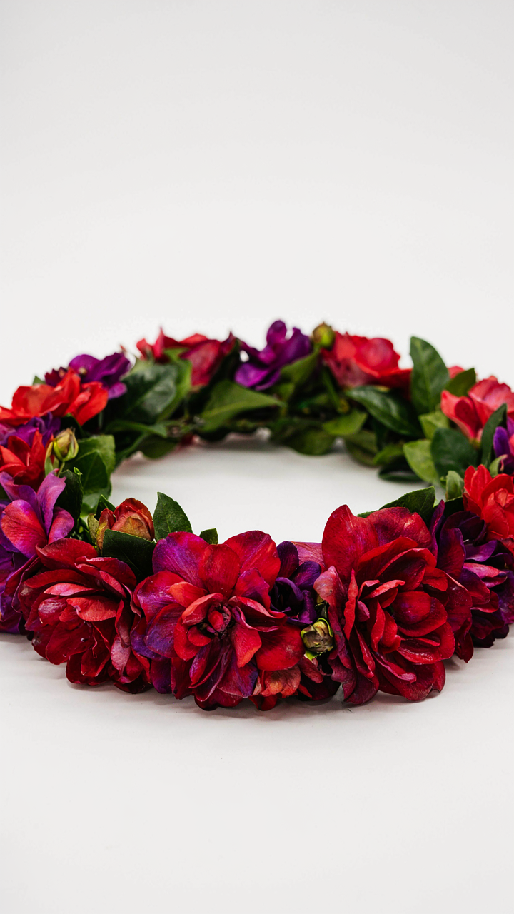
The common advice says bright colors attract and dark colors recede. Incomplete. Evolutionary biology teaches that color signals work through context pairing, not isolation. Warning signals—the reds and yellows of poison frogs—pair saturation with pattern. Attraction signals—the iridescence of bower bird displays—pair shimmer with structural color. Your flower crown operates the same way. A crown of solid red dahlias reads as noise. Red dahlias ringed with deep burgundy foliage and white space reads as intentional threat or status claim. The mechanism is signal-to-noise ratio, not color alone.
Remap this: treat warm saturated colors as biological “warnings” that demand contrast, and cool or muted tones as biological “attractions” that draw focus through subtlety rather than alarm. Deep crimson roses work when anchored by charcoal eucalyptus or black-leafed plants. Pale pink peonies work when isolated against green. Don’t pair similar saturation levels—that’s visual flatness masquerading as harmony. Build your crown by deciding whether each bloom broadcasts dominance or invitation, then structure the surrounding colors to amplify that signal. This is how you stop making crowns that look pretty and start making ones that work.
Autumn’s Manifesto: Fall Flower Crown Wedding & Seasonal Authority
What Seasonal Shifts Actually Demand
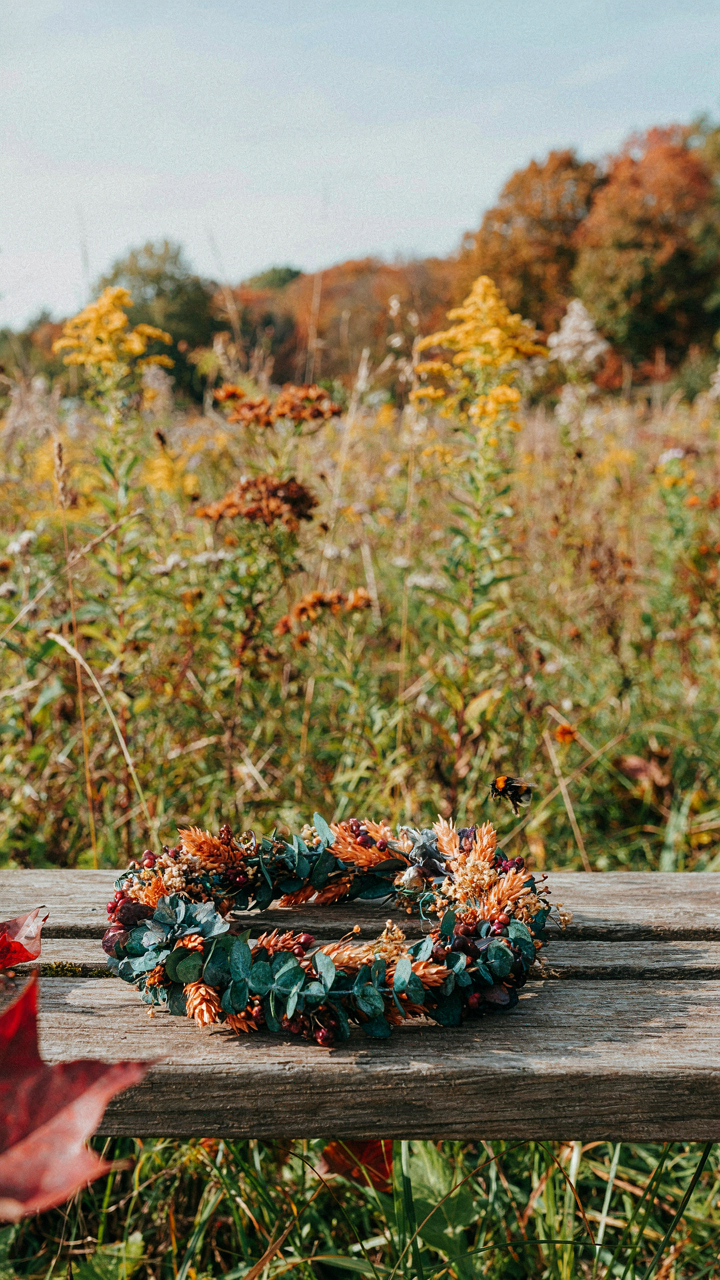
You want to look like you understand fall, not like you grabbed whatever was on sale in September. The mechanism is simple: seasonal color combinations work because they mirror what’s already dominant in the environment. Your brain registers a flower crown that matches the trees around it as intentional, not accidental. This is applied color theory from landscape design. Designers call it “color harmony through context.” In flower crowns, context is everything. Pick colors that echo what’s already dying or transforming in late September through November, and you stop looking like you’re fighting the season.
Autumn strips back to earth tones because plants themselves stop producing vibrant pigments. Chlorophyll breaks down. Carotenoids and anthocyanins take over. These aren’t random colors. They’re the actual chemical end-state of vegetation. A flower crown that uses deep burgundy, burnt sienna, mustard gold, and deep green doesn’t just look good with fall backgrounds. It looks inevitable. The palette works because it’s not competing with anything in your environment. It’s completing it.
- Deep Burgundy and Blush: Combines the wine tones of dying leaves with skin-tone neutrality. Works with both warm and cool complexions without conflict.
- Mustard Gold with Sage Green: Pulls directly from late-season plant chemistry. Sage mimics faded foliage while mustard reads as concentrated pollen or lichen tones.
- Rust Orange and Deep Plum: Creates visual tension that feels earned, not forced. Rust appears in oxidized materials and dying flower heads naturally.
- Cream and Terracotta with Dark Chocolate: The lightest option for fall. Cream prevents the palette from becoming oppressive while terracotta grounds it in soil tone.
- Charcoal and Copper with Burnt Orange: High contrast option that reads as sophisticated. Copper mimics late-season lichen and weathered metal in autumn landscapes.
Execution matters more than theory here. Source flowers that actually exist in those color ranges during fall months. Ranunculus comes in burgundy and rust. Dahlias hold deep plum tones. Hypericum berries deliver the mustard and rust without fading. Don’t force pastels into an autumn crown. The palette only works if the flowers retain their color through the event and photographs accurately under natural light. Test your combinations in the actual venue lighting before committing.
When The Obvious Palette Becomes A Liability
Everyone assumes fall means orange, brown, and red. This is incomplete. The assumption comes from thinking about fall as a single mood instead of three distinct seasonal phases. Early fall still holds green. Mid-fall introduces the transition. Late fall moves to grays and blacks as foliage dies completely. A crown stuck in the orange-brown-red trinity looks generic because it ignores timing.
The real move is specificity within the season. Pair deep teal with gold instead of orange with brown. Use charcoal with copper instead of red with orange. Add unexpected cool tones like dusty blue or slate gray to ground warm colors and create contrast that reads as intentional design, not seasonal decoration. A single unexpected color in an otherwise traditional palette signals authority. That one cool tone proves you chose every element, not just assembled what tradition suggested.
The Coiffure Mariage Equation: Integrating Floral Headbands With Hair

Your Hair Is The Anchor, Not The Canvas
You want people to think your flower crown looks intentional rather than like you grabbed flowers and hoped for the best. Here’s what actually matters: your hair color and texture determine the crown’s visual weight before you pick a single bloom. Think of hair as the base layer in a design system—it’s the constraint that either amplifies or neutralizes your color choices.
Dark hair demands different floral saturation than blonde or red. A deep brunette absorbs light, so pastels vanish into it; you need flowers with genuine pigment density or white accents to register. Red hair creates its own color temperature conflict—oranges and warm pinks compete for attention rather than complement. Texture shifts the equation too. Fine, thin hair makes heavy blooms look unbalanced; thick waves can anchor larger, denser arrangements without looking top-heavy. The mechanism is straightforward: your hair’s visual mass and chromatic value predetermine which flower colors will actually land.
Proportion Rules That Actually Work
Skip the vague “balance it with your face shape” nonsense. That’s decoration advice, not design principle. Real balance comes from the ratio between crown density and available hair surface area. Thin, delicate stems can load onto voluminous hair without tilting forward; sparse updos need fewer, larger blooms positioned to spread weight across the crown.
The crown’s footprint must match your hair’s structural capacity. A half-up style anchors less surface area than a full updo, so it handles fewer flowers before the crown shifts or slides. Proportional fit isn’t aesthetic—it’s mechanical. Measure your intended crown width against the width of your gathered or styled hair, then scale floral density to that ratio. This prevents the crown from appearing as an afterthought or from dominating your head entirely.
The Anti Trend Playbook: Crafting Timeless Flower Crown Ideas
What Actually Lasts Vs What Disappears
You want this thing to matter after the event ends. Most people confuse “trendy” with “good,” then wonder why their flower crown photos age like spoiled milk. The mechanism is simple: trends move fast because they’re built on novelty, not structure. Timeless combinations follow color theory and botanical compatibility, not Instagram cycles. A crown lives or dies based on contrast ratios and seasonal availability, not whether influencers are still talking about it.
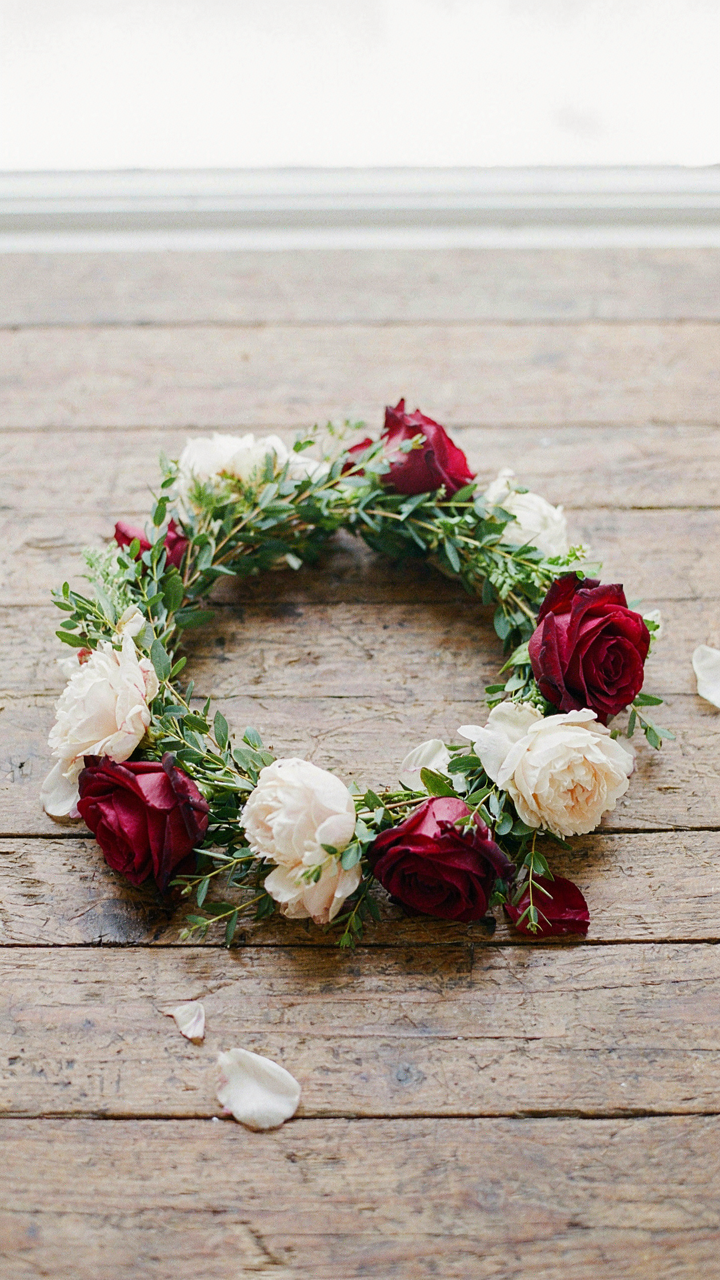
Color psychology has a baseline that doesn’t shift. Deep jewel tones against soft neutrals work the same way they did fifty years ago because human perception hasn’t changed. The real enduring move is matching flower crown colors to principles that outlast social feeds: complementary color schemes, analogous harmonies, and contrast levels that photograph consistently across different lighting. When you build on those mechanics instead of chasing what’s hot now, the crown transcends the moment.
Building A Signature That Sticks
Your personal brand isn’t a feeling you project. It’s a repeatable system people recognize. In marketing, this is called a positioning anchor. In flower crowns, it’s a signature color combination you own and refine, not abandon when something new drops. The difference between memorable and forgettable is constraint, not freedom. You need a locked-in palette that people associate with you specifically, then iterate within that frame.
Signature combinations work because they build recognition through repetition and consistency. If you always lead with burgundy and cream, occasionally adding seasonal accents like sage or gold, people know what to expect before they see the crown. They remember you for it. This is how you stop being interchangeable with every other crown maker out there. Choose your foundational pairing now, test it across three seasons, then commit to it as your mark. Everything else is variation.
Stop Chasing Trends, Start Shaping Reality: The End Of Accidental Elegance

Most people pick flower crown colors by accident, copying what they saw online last week. You’re different. You understand that color combinations aren’t decorative choices, they’re psychological statements. Your move today: grab three flowers you own or can access, arrange them by intention instead of aesthetics, and notice what story emerges. The people who matter don’t follow trends. They create them.