Deconstructing The “Natural” Fallacy: Beyond Obvious Color Pallets
What “Natural” Actually Means Here
You want permission to stop overthinking and just pick colors that feel safe. The real mechanism: “natural” in botanical print design doesn’t mean colors found in nature. It means colors that don’t trigger the viewer’s pattern-recognition alarm. Your brain flags clashing hues as artificial or cheap. Muted greens and dusty roses feel “natural” because they reduce cognitive friction, not because they’re botanically accurate.
Historical botanical illustration from the 18th and 19th centuries used pigments sourced from earth, plants, and minerals. Those constraints created a narrow palette that viewers now associate with authenticity. Designers copied that limitation even after synthetic pigments became available. The association stuck. “Natural” palettes sell because they signal heritage and restraint, not because they’re derived from actual botanical specimens.
How Light Rewrites Your Color Choices
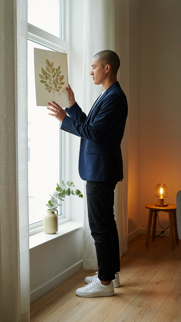
Botanical prints under window light perform differently than under fluorescent bulbs, which is basic physics applied to print design. A dusty sage green that reads sophisticated in soft morning light becomes murky under harsh overhead fixtures. The wavelength shift changes the hue’s perceived saturation and depth. Most beginners test colors in one lighting condition, then watch them fail in the client’s actual space.
This is why botanical print color palettes for interiors require testing under the specific light source where the print will hang. A palette that works in your design software under cool white monitors will shift toward yellow-green under warm incandescent bulbs. The mechanism is simple: light doesn’t reveal color, it creates it. Before locking a palette, view samples under the three light sources the print will encounter: morning natural light, afternoon natural light, and the room’s primary artificial lighting.
The Photosynthesis Protocol: How Plants Dictate Botanical Print Color Palettes
Saturation Follows Energy Flow
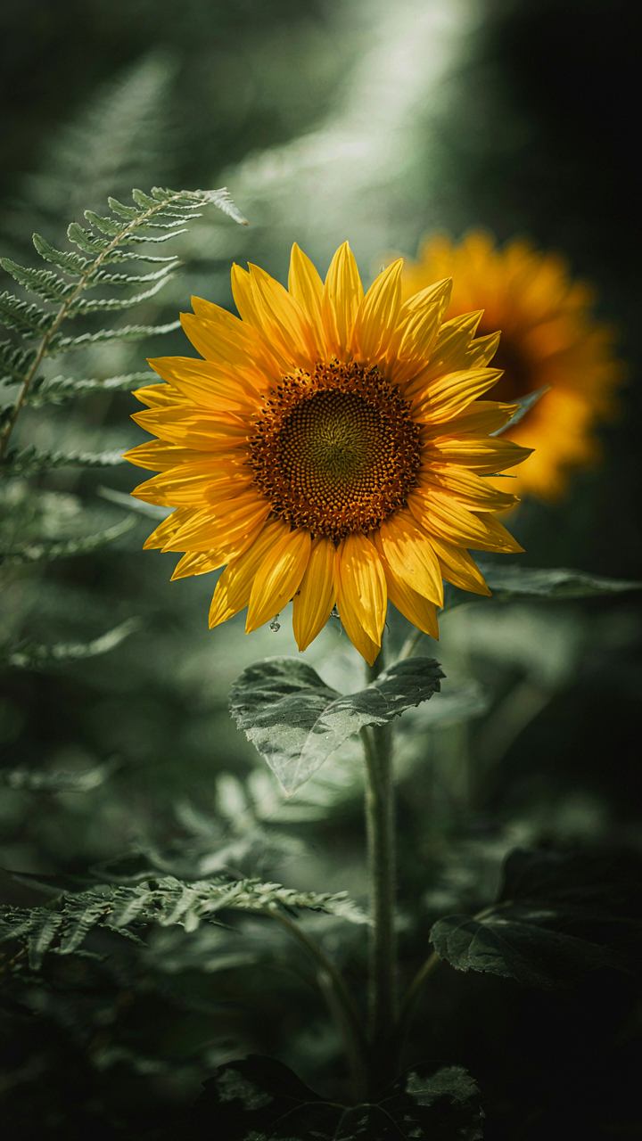
You want to know the shortcut to picking colors that look “right” without overthinking it. Here’s what’s actually happening: saturation in botanical prints tracks the plant’s energy conversion rate, and this is borrowed directly from photosynthesis biology. High-light environments produce highly saturated pigments because the plant generates more energy to defend and display them. Low-light understory plants desaturate their pigments to absorb more wavelengths. When you pull a color palette from a sun-facing flower versus a shade plant, you’re not choosing randomly—you’re choosing based on the metabolic logic the plant encoded into its tissues.
The mistake most people make is treating saturation as optional decoration. It’s not. A botanical print that uses full saturation on shaded ferns or desaturated tones on sunflowers signals visual confusion immediately. Your viewer’s brain registers the mismatch before they know why something feels off. Start by identifying whether your source plant grows in high-light or low-light conditions. This single decision determines your saturation ceiling. Don’t push beyond what the plant’s actual photosynthetic strategy would support.
Growth Cycles Shift Hue And Value
Seasonal progression changes how plants present color, and this shift is non-negotiable in botanical illustration. Spring growth favors chlorophyll-dominant greens and pale yellows because new tissue allocates resources to photosynthetic machinery before pigment production peaks. Summer maturation builds carotenoids and anthocyanins, deepening oranges, reds, and purples. Autumn triggers pigment breakdown, reversing the palette toward browns and ochres. Winter dormancy strips most chromatic content entirely.
The common advice is to “capture the plant at its best.” That’s backwards. Capture it at the growth stage you intend to represent, then lock your palette to that phase. A spring flowering bulb palette will contradict a midsummer bloom palette from the same plant. Document which cycle you’re working from and hold that boundary. This prevents the visual static that happens when your palette contradicts the plant’s biological timeline. Pick your season first. Derive your colors second.
Beyond The Bloom: The “Foliage First” Method For Vintage Garden Color Palette
Start With Greens And Browns
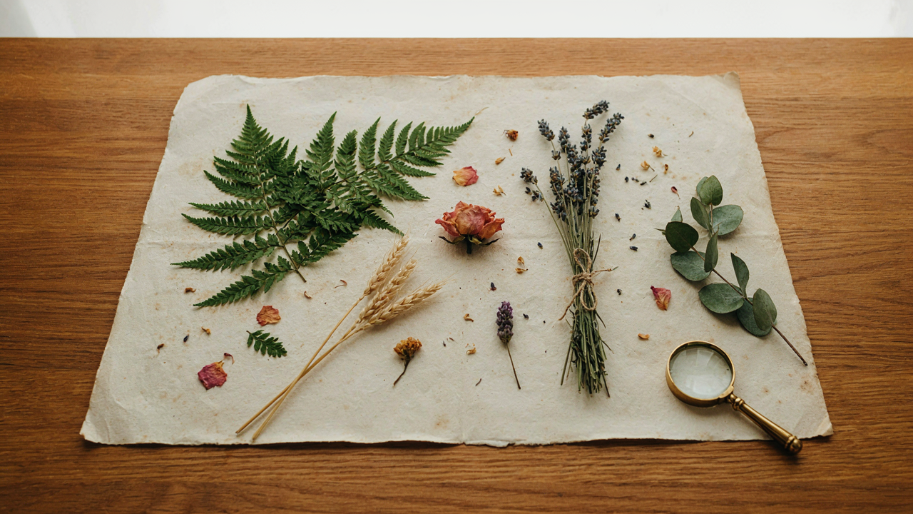
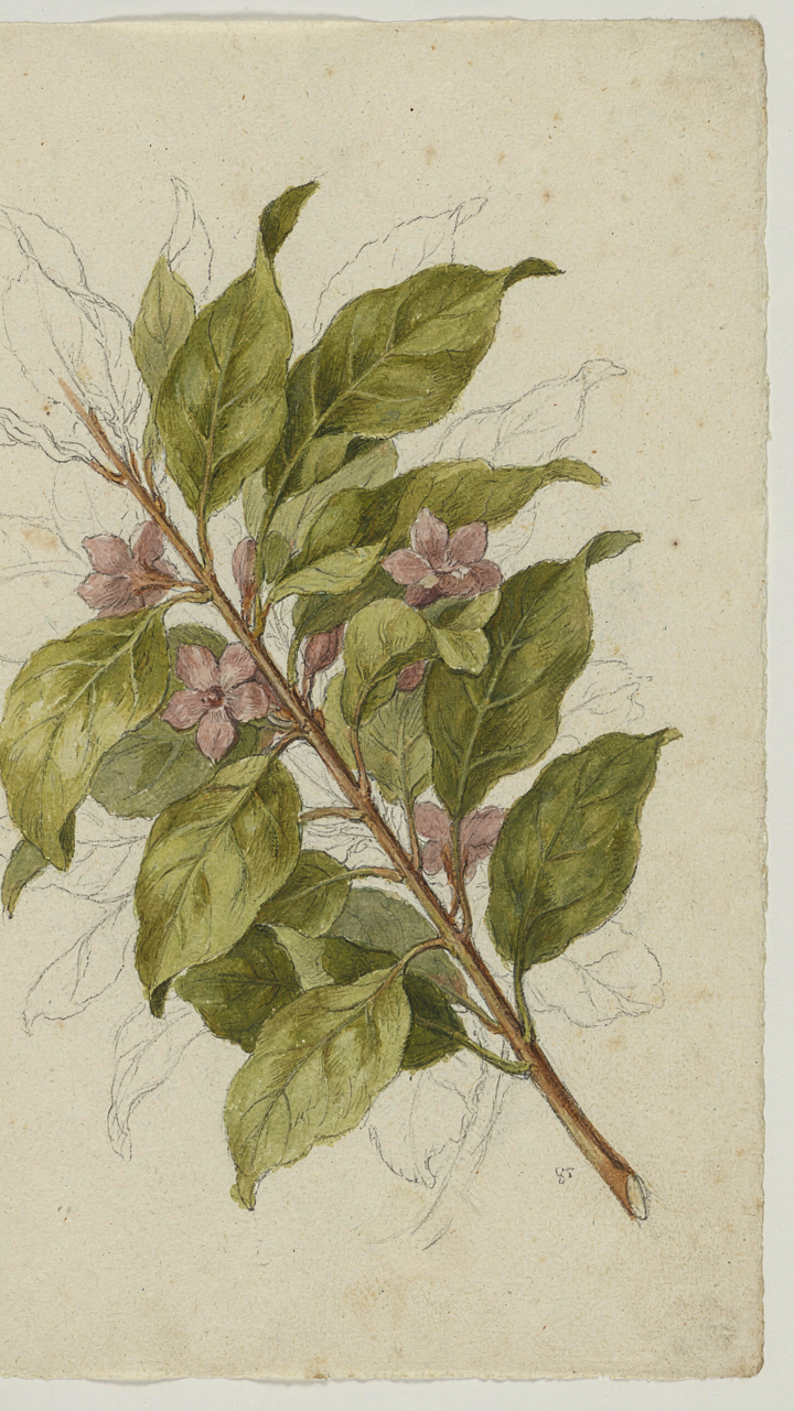
You want permission to skip the flower obsession without feeling like you’re designing something boring. Here’s the mechanism: vintage botanical prints didn’t lead with color. They led with structure. The foliage is the anchor. Greens and browns form the visual weight that makes everything else land. Without this foundation, you’re just placing random colors on white space.
Botanical illustration traditions from the 18th and 19th centuries treated leaves and stems as the primary visual subject. Flowers were accents. This inverted hierarchy is why those prints still work. Start by choosing your green family: olive, sage, forest, or muted grey-green. Pick one brown that reads as earth or aged paper. These two colors comprise 60 to 70 percent of your palette. Everything after this is refinement, not foundation.
Layer Secondary Colors Over Structure
Design operates on hierarchy like music operates on rhythm. Your primary foliage is the baseline. Secondary hues are the melody. Most beginners reverse this and wonder why their palettes feel chaotic. The real move is restraint through placement. After your greens and browns lock in, add no more than two or three secondary colors—and only where a botanical element demands it.
Vintage garden palettes typically introduced secondary hues through flower tones, seed pods, or insects. Dusty rose, muted gold, or slate blue worked because they occupied small visual real estate. The foliage around them did the heavy lifting. Build your palette by assigning each secondary color to a specific botanical element, then stop. Use a neutral cream or off-white for negative space. This forces intentional constraint and makes the palette feel curated instead of collected.
The Subtlety Of Decay: Unearthing Vintage Botanical Color Palette Secrets

When Paper Yellows, Design Improves
You want vintage botanical palettes because they signal taste without effort. Here’s the mechanism: aging isn’t random deterioration. It’s predictable chemical change. Paper yellows through oxidation. Inks fade through light exposure and chemical breakdown. These shifts aren’t flaws to correct. They’re the actual color story. A deep forest green from 1850 didn’t start forest green. It started brighter. What we see now is the desaturated, warmth-shifted result of 170 years of controlled degradation.
Extract this by understanding the direction of shift, not fighting it. Yellowing paper adds warmth. Fading inks lose saturation uniformly. A botanical print’s original red might have been bright vermillion. Now it’s rust. Your palette should borrow from the faded version, not the theoretical original. Pull colors directly from high-resolution scans of vintage prints. These colors already account for age. You’re not guessing at faded tones. You’re sampling the proven result.
Desaturation As Deliberate Constraint
Most designers avoid muted tones because they fear looking dull. That’s backwards. Desaturated colors demand precision. You can’t hide behind saturation. When a color has less intensity, every relationship becomes visible. Vintage botanical prints prove this. A muted sage paired with pale cream works because there’s nowhere for mistakes to hide. The contrast comes from value and undertone, not brightness.
Start by reducing saturation 20 to 40 percent below standard RGB values. If you’re sampling from a vintage print, check the HSL values. The saturation percentage will be lower than contemporary botanical designs. Maintain this constraint across your entire palette. Don’t mix highly saturated and desaturated colors expecting harmony. The palette works because everything follows the same aging logic.
Light’s Tyranny: How Illumination Dictates Your Color Design Inspiration
Natural Light Transforms Everything You See
You want to believe your color choices are timeless. They’re not. Light physics governs how humans perceive wavelengths, and botanical print palettes live entirely within this constraint. The spectrum shifts across time of day and geography. Morning light carries blue wavelengths. Afternoon light turns warm and yellow. A color that reads as muted sage in north-facing studio light becomes electric under south-facing windows. This isn’t poetic. This is measurable.
Victorian botanists understood this instinctively when they placed color studies near windows during specific hours. They weren’t being precious. They were observing their work under consistent conditions to verify what the print would actually look like in a viewer’s home. Your botanical palette must survive under the light conditions where it will live. If you design under artificial studio lighting and the client views it under natural daylight, the entire composition collapses. Test every palette under the light source it will occupy.
Shadows And Highlights Reshape The Palette
Most designers treat shadows and highlights as passive background elements. Wrong. They function as active palette members that shift perceived saturation and value across your entire botanical composition. A dark shadow edge behind a leaf doesn’t just create depth. It actively desaturates the leaf’s color next to it through simultaneous contrast. The brain compares colors against their adjacent neighbors, not in isolation. This means your mid-tone greens and pinks perform completely differently depending on what surrounds them in the value range.
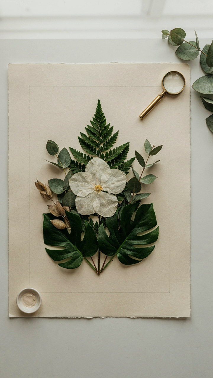
Strategic highlight placement on flower petals acts as a visual anchor that trains the eye where to rest within the print. The lighter you make a highlight, the more the surrounding colors appear saturated by comparison. This is why pressed flower studies often placed white or cream-colored elements deliberately within compositions. They weren’t adding detail. They were using light and shadow as control levers for the entire palette’s perceived intensity. Map your values first, place your highlights intentionally, then verify the palette holds cohesion under changing light angles throughout a single day.
The “Terra Firma” Anchor: Grounding Your Vintage Floral Color Palette

When Your Brights Need A Foundation
You want permission to use color without looking chaotic. Here’s the mechanism: earthy tones function as visual anchors in botanical prints the same way a foundation stabilizes architecture. They don’t compete. They hold the structure. Browns, ochres, taupes, and muted greens create the plane on which brighter florals land without noise. This isn’t decoration theory. It’s contrast management.
Vintage botanical prints from the 18th and 19th centuries built this system intentionally. Illustrators used paper stock and ink pigments that favored warm earth undertones. The prints didn’t need busy backgrounds because the ground itself was the stage. Your modern palette works the same way. Start with one earthy tone covering 40 to 60 percent of your design surface. Everything else becomes legible because it has somewhere to rest.
Quiet Bases That Make Blooms Pop
The common advice says “use neutrals.” Wrong instruction. Neutrals are often too sterile. What you actually need are muted, warm-leaning tones that absorb visual weight without vanishing. Tan, warm gray, soft khaki, and dusty olive accomplish what beige cannot: they honor the botanical subject while staying subordinate to it.
This mechanism comes from figure-ground psychology. Your eye reads the lighter, warmer tone as recessive space. Brighter or cooler botanical elements advance forward. Place a saturated red peony against a pale tan and the flower dominates. Place it against pure white and you get visual tension instead of hierarchy. The base tone must have enough substance to push the foreground forward. Test your chosen neutral against your brightest botanical color. If the neutral disappears, it’s too close in value. If the bright loses impact, the base is too similar in temperature. Adjust until the bright botanical reads first.
The Observer Effect In Botanical Hues: A Quantum Physics Approach To Colour Palates
How You See Changes What You See
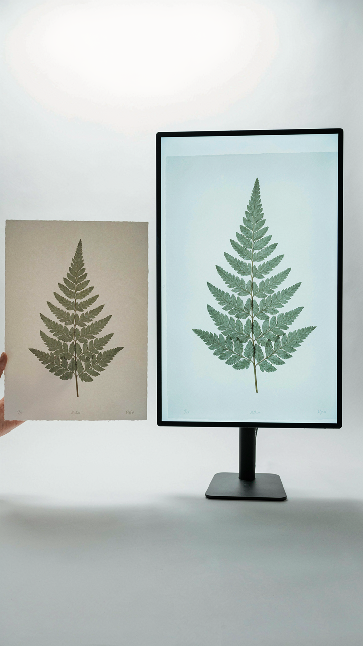
You want this section because you’re hoping someone will finally explain why your botanical palette looks different on screen than in print, and you want to sound smart about it. Here’s the mechanism: quantum physics has an “observer effect” where measurement changes the observed state. In botanical color work, your eye functions as the observer. The palette doesn’t exist in isolation. Light source, surface material, and your viewing angle physically alter which wavelengths reach your retina. A sage green under north-facing window light reads completely different under warm LED bulbs. You aren’t imagining inconsistency. You’re experiencing the measurable reality of observation itself shaping outcome.
The practical implication is this: stop treating color as fixed. Botanical prints from the 18th and 19th centuries shifted appearance based on pigment type, paper quality, and room conditions. Modern digital palettes face the same problem multiplied. Your monitor calibration, ambient room light, and even the time of day you’re viewing affect color perception. To build palettes that actually work, you must test them in the actual environment where they’ll be used. Not the theoretical environment. The real one. This eliminates the gap between intention and result.
- Pigment Type Matters: Natural pigments in historical botanical prints absorbed and reflected light differently than synthetic dyes. Lead-based yellows looked greener under candlelight than daylight, shifting the entire palette relationship.
- Paper Surface Alters Reflection: Matte paper diffuses light across wavelengths differently than glossy surfaces. A botanical print on hot-pressed paper reads warmer than the same print on cold-pressed, even with identical inks.
- Light Source Creates Dominant Wavelength Shifts: Incandescent bulbs emit more red and infrared. Fluorescent bulbs shift blues upward. Your palette composition must account for which light type will dominate the viewing space.
- Screen Calibration Skews Digital Preview: Uncalibrated monitors display botanical greens as too blue or too yellow. This creates false feedback during the design phase, locking in mistakes before printing.
- Metamerism: The Mismatch Problem: Two colors can look identical under one light source but completely different under another. Botanical palettes built without metamerism testing fail when context shifts.
The design move is concrete: establish your viewing conditions first. Specify the light source, paper stock, and display environment before finalizing color values. Measure twice, design once.
When Context Rewrites The Relationship
Stop reading botanical color guides that list “complementary pairs” without mentioning context. Those pairs only work under specific light and viewing conditions. The relationship between colors is not inherent to the colors themselves. It emerges from the environment observing them. In quantum terms, the field matters more than the particles. A mauve and sage pairing reads sophisticated in soft gallery lighting but muddy under harsh office fluorescents. The palette didn’t change. The observer’s field did.
Historical botanical illustrators understood this intuitively. They painted under natural northern light and expected viewers to see work under the same conditions. When museums moved those pieces under different lighting, the color relationships shifted visibly. Modern designers skip this step entirely, building palettes on screens and wondering why they fail in print. Your palette’s success depends entirely on matching the observer’s environment to the design environment. Specify RGB values for screen display, CMYK values for print, and the exact light temperature for both. This isn’t extra work. This is the actual work.
Olive Color Combinations: The Unsung Hero’s Spectrum In Color Palette Design
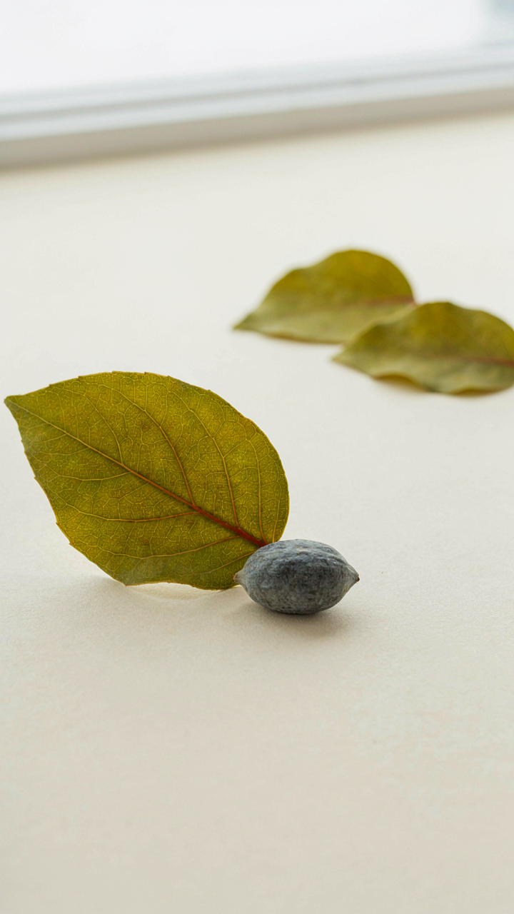
Why Olive Works Across Every Botanical Print Style
You want olive because it solves the problem nobody admits: most botanical prints fail because they clash with actual interior spaces. Olive is the mechanism that bridges that gap. It sits at the intersection of natural and muted—enough saturation to read as intentional, low enough to play well with wood, stone, and existing furniture. Olive comes from the fruit itself, a desaturated yellow-green born from how light hits chlorophyll in a mature state. This is why it lands differently than pure green. It carries age, stability, and depth without the aggressiveness that stops people from actually using botanical prints on their walls.
Olive anchors compositions across scale and context. In historical botanical illustration, particularly the naturalist tradition of the 18th and 19th centuries, muted earth-toned greens appeared constantly because artists worked with pigments derived from actual plants and minerals—ochre mixed with verdigris produced exactly this tone. Modern designers inherit this credibility accidentally. You place olive as your dominant green in a botanical print palette and suddenly the whole composition reads as grounded, not precious. It works in minimalist rooms. It works in maximalist rooms. It works when you have one print and when you have twelve.
- Backgrounds and Negative Space: Olive recedes visually, making foreground botanical elements pop without requiring high-contrast reds or blacks. This creates depth economically.
- Mid-Tone Anchor: Use olive to bridge between light neutrals and darker accent colors in your palette. It prevents compositions from feeling flat or disjointed.
- Seasonal Flexibility: Olive reads as spring growth, summer foliage, and autumn transition depending on surrounding colors. One tone, multiple visual contexts.
- Print Aging Appeal: Olive suggests age and collectibility without actually being worn. This matters for pieces that will hang permanently, not rotate.
- Fabric and Material Match: Botanical prints on linen or cotton naturally highlight olive undertones in the fibers themselves, creating visual continuity with the substrate.
The mechanism is simple: olive doesn’t demand attention from your room’s existing color story. It asks permission politely. This is why beginners succeed with it. You’re not fighting against beige walls or gray furniture. You’re extending them into botanical territory.
Olive Against Warm And Cool Counterpoints
Everyone says “pair olive with cream and you’re done.” Incomplete advice. The real work happens when you map olive against color temperature deliberately. Cream plus olive reads safe, not thoughtful. Cream plus olive plus a warm accent creates actual tension that holds the eye.
Temperature is the borrowed framework from color science, and in botanical palettes it functions like balance in physics—each warm element requires a corresponding cool element or your composition tips into monotony. Pair olive with warm terracotta or rust, and you’ve activated the natural earth palette that appears in seed pods and weathered stems. The warm tone doesn’t fight the olive; it releases it. Add a cool grey or slate blue into that same palette and you’ve created a three-point system. The olive no longer feels like background—it becomes a bridge. This is the mechanism most tutorials skip: they show you combinations that work, not why they work or what happens when you manipulate the temperature balance.
The contrasting move is technical. Take olive and place it directly beside warm cream or pale yellow, then add burnt orange or deep rust somewhere in the composition—typically in smaller concentrated areas like flower centers or leaf shadows. The olive suddenly gains dimensionality. Shift to cool blue-greys or dusky purples and olive becomes the warm element by comparison, even though it isn’t objectively warm. You’re not choosing colors based on feeling. You’re choosing them based on what role you need filled in the temperature spectrum, then verifying the result reads cohesive when you step back from the canvas or screen.
The “Cultivated Chaos” System: Embracing Imperfection In Your Botanical Prints
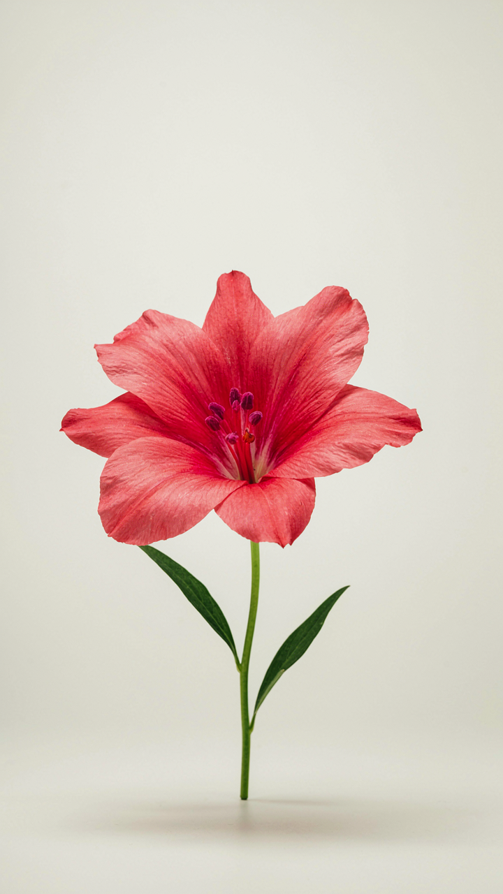
Where Randomness Becomes Structure
You want permission to stop overthinking. That’s the real ask here. In ecology, the term “edge effect” describes how maximum diversity occurs where two systems meet, not in uniform zones. Apply this to botanical prints: the color tension that emerges between intentional harmony and unplanned adjacency creates visual velocity that pure coordination kills. Most advice tells you to match hues scientifically. That’s backwards. The moment you introduce one color that shouldn’t technically work, your palette gains oxygen.
Botanical illustration history proves this. Victorian-era naturalists didn’t filter pigments through color theory first. They worked from specimens in front of them, captured the anomalies, and those prints outlasted the “correct” ones by decades because the eye found something to grip. You’re not randomizing for effect. You’re building a protocol where one note sits slightly outside the harmony range, forcing the viewer’s brain to work, which registers as authenticity. That work is what makes the palette stick.
Deliberate Dissonance Without Chaos
Allowing subtle discord doesn’t mean throwing mud at the wall. You pick two primary colors that work together, then add one secondary that sits at a minor interval from those two, creating tension rather than unity. Think of a sage green paired with burnt sienna and dusty mauve. Sage and sienna harmonize through earth tones. Mauve introduces cool undertones that make both previous colors sharper. The discord is calibrated, not accidental.
The mechanism: contrast improves retention. Your brain flags inconsistency faster than consistency. In botanical prints, this means the viewer holds the image longer, which translates to perceived depth and complexity. When you introduce that third color consciously, you’re anchoring the entire palette to reality rather than theory. Start with your two core colors from any botanical reference. Scan the specimen for one accent pigment that feels slightly off. That’s your third color. Use it in 10 to 15 percent of the composition. Integrate it into leaf veins, shadow areas, or flower stamen. This isn’t decoration. It’s compression. You’ve made sophistication feel effortless by building discomfort into the system itself.
The Real Obstacle Isn’t Finding Palettes; It’s Your Resistance To Seeing Systems Instead Of Just Surfaces
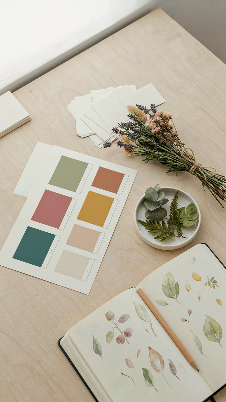
Most people treat botanical color palettes like decoration when they’re actually communication tools. You don’t need permission to use sage green with rust and cream. You need to stop pretending the palette picks itself. Open any botanical image you actually like right now. Extract five colors. Name them. Use them everywhere for one week. That’s the system. Boring is repeatable, and repeatable is powerful.