
The Illusion Of Simple: Why Most Botanical Guides Fail You

What Observation Actually Requires
You want permission to skip the hard part. Most botanical guides hand you shortcuts because you’re willing to pay for them, and they’re willing to sell comfort instead of competence. The mechanism is simple: generic advice feels actionable because it avoids the bottleneck that actually matters—your eye.
Botanical art demands what neuroscience calls “perceptual learning,” the same threshold athletes and surgeons hit. You don’t learn to draw a leaf by following proportional rules. You learn by studying real specimens until your visual cortex registers the specific vein angles, the curl at the margin, the asymmetry nobody mentions. This takes weeks of direct observation before your hand catches up.
Depth Makes The Work Disappear
The common advice is wrong: “start simple to build confidence.” Confidence comes from understanding, not from completing easier versions of the wrong problem. Historical botanical illustrators from the Renaissance through the Victorian era didn’t graduate from simple to complex. They started with deep botanical knowledge, then translated that directly into mark-making.
When you understand vascular structure, you stop guessing at how a leaf sits on a stem. When you know why certain margins curl or flatten based on the species, your drawing gains authority. Spend four weeks observing one plant species across its growth cycle before touching paper. The apparent complexity vanishes because you’re no longer inventing details—you’re recording what you already know.
Deconstruct, Don’t Decorate: The Scientific Illustration Botanical Imperative

Forms First, Flourishes Later
You want permission to skip the boring structural stuff and jump straight to making it look impressive. That’s not how this works. Scientific illustration borrows from biology the concept of taxonomy—the systematic classification of life. In botanical art, taxonomy is your skeleton. You organize plant anatomy into its component parts before line, shading, or composition enters the frame.
The mechanism is simple: plants are built from repeating units. Leaves emerge from nodes. Petals follow numerical patterns. Stems taper predictably. When you map these relationships first, your hand stops lying. Most botanical artists fail because they copy surface appearance without understanding the structural rules underneath. You need the blueprint before the rendering.
The Measurement Mandate Over Mood
Accuracy isn’t a constraint that kills creativity. It’s the only constraint that matters in scientific botanical illustration, and treating it as optional is how you produce work that looks right but registers as false to anyone who knows plants. The tradition runs back centuries through botanical illustration for taxonomic documentation, where a single misplaced vein could prevent species identification.
This means: proportions matter more than emotion. Measure the seed pod diameter against the leaf width. Count the stamens. Observe whether the leaf margin is serrated, entire, or lobed. Record these facts on paper before you render. The moment you prioritize a dramatic angle or flattering light over accurate structure, you’ve stopped doing botanical illustration and started doing decoration with plants in it. Document first. Design second.
The Anatomical Mandate: Botanical Drawings As Dissection
What’s Actually Inside
You want botanical drawings to look credible because credibility converts. Here’s the mechanism: most artists skip the internal architecture entirely. They draw the surface and call it done. Botanical illustration demands the opposite. You must understand xylem pathways, vein structure, seed coat composition, and root hair distribution. Not to show off. To draw what’s real. Pierre-Joseph Redouté didn’t just paint rose petals—he mapped the spiral phyllotaxis underneath. That accuracy is what made his work last three centuries.
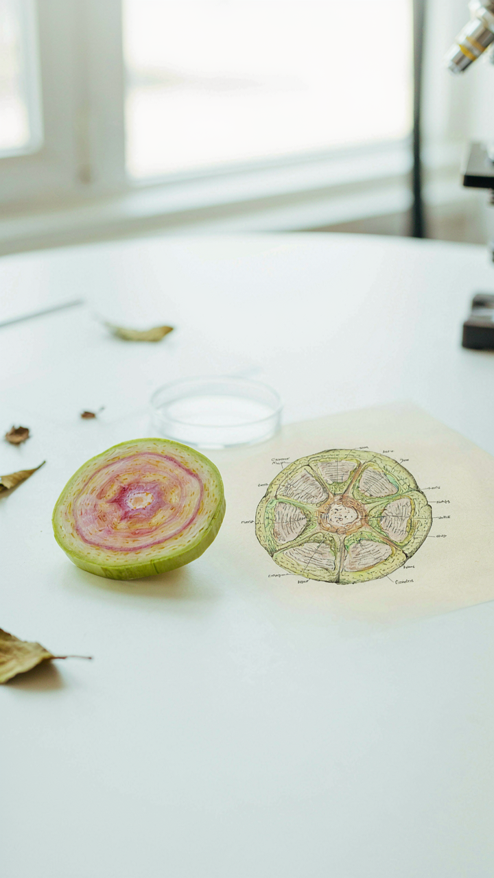
The anatomical approach borrows from dissection, the surgeon’s field. Where a surgeon maps tissue layers to understand function, a botanical illustrator maps cellular organization to understand form. This isn’t metaphorical. You’re performing visual dissection on paper. Study cross-sections of stems. Observe how vascular bundles arrange themselves. Look at leaf epidermis under magnification. The more you see beneath the surface, the more convincing your surface rendering becomes. Your hand stops guessing and starts transcribing.
Form Follows The Mechanism It Serves
Every structure on a plant exists because it solves a problem. Thorns protect. Stomata breathe. Root hairs absorb. The moment you understand why a structure exists, you stop drawing it as decoration and start drawing it as engineered object. This shift in perception changes everything. A thorn isn’t a sharp line—it’s a modified leaf designed to deter predators and conserve water. Draw it that way and it gains weight.
The practical step is direct: before you sketch any plant part, name its function. What does this root system do? It anchors and absorbs. Now draw those two purposes into the form itself. Does the stem need to support weight? Make the vascular bundles visible. Does the leaf need to maximize light capture? Show the petiole angle and blade orientation as solutions, not accidents. This forces accuracy into every mark. You’re no longer illustrating a plant. You’re illustrating a design problem that evolution solved.
Precision Protocol: Mastering Scientific Botanical Illustration
Tools That Separate Observation From Guessing
You want this section because you’re afraid generic sketching won’t look credible. Here’s what matters: scientific botanical illustration operates on the same principle as engineering—measurement precedes execution. The difference between amateur botanical art and scientific work isn’t talent. It’s constraint. You need tools that force accuracy instead of letting your hand wander into interpretation.
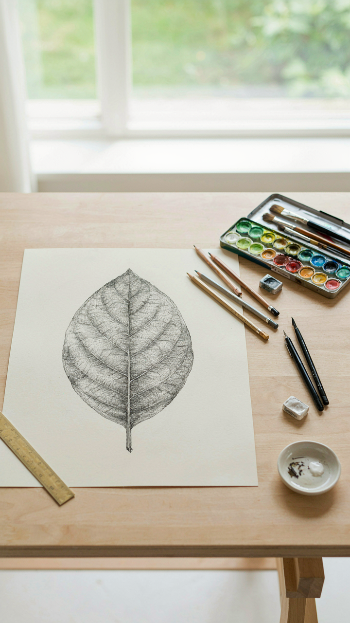
- Hard pencils (H, 2H, 4H): These grades leave minimal graphite, letting you layer detail without muddying the paper. Start with 4H for construction lines that won’t smudge into your final work.
- Mechanical pencils (0.5mm or 0.3mm): Consistent line weight and point sharpness eliminate the variable of hand pressure. Essential for repeating the same line thickness across multiple specimen studies.
- Fine-tipped ink pens (0.1mm to 0.5mm): Used after pencil work is refined, these pens create the permanent outlines that define botanical structures. Archival quality prevents yellowing over decades.
- Cold-pressed watercolor paper (140-300 gsm): The tooth of cold-pressed paper grabs pigment and allows layering without buckling. Hot-pressed paper is too smooth for controlled washes in scientific contexts.
- Blending stumps and kneaded erasers: These tools refine transitions and recover highlights without destroying paper fiber. They let you correct mistakes surgically instead of starting over.
Paper quality determines whether your layers build or blur together. Cold-pressed 100% cotton rag paper holds multiple glazes without warping—this matters when you’re layering translucent washes to show cellular structure or leaf transparency. Cheaper paper disintegrates under this process. The eraser isn’t decorative either. A kneaded eraser lifts graphite selectively, letting you recover whites for reflected light on seed pods or the underside of petals without creating harsh edges.
When Lines Tell The Whole Story
Most botanical guides say shading creates dimension. That’s backwards thinking that wastes your effort. The line itself carries all the information in scientific botanical illustration. Shading exists only to clarify what the line cannot state alone—surface texture, translucency, or internal structure.
Your line work must follow the actual direction of growth or cell structure. A stem line shouldn’t curve arbitrarily; it follows the phyllotactic spiral or the mechanical stress points where the plant naturally bends. Leaf veins don’t scatter randomly; they branch in patterns determined by vascular biology. When you control these lines with reference to actual specimens, your drawing becomes a data visualization. When you guess, it becomes decoration. Limit shading to cross-hatching or stippling that reinforces directional information already established by your line work, and stop before your specimen looks soft or impressionistic.
Learn Watercolor Beyond “Pretty”: Pigment As Botanical Data
Color Signals Plant Structure, Not Decoration
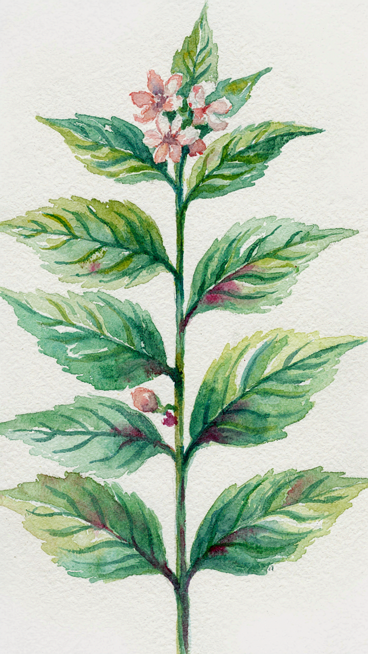
You want watercolor to look effortless and natural because that feels like mastery. The mechanism is this: pigment isn’t decoration. It’s classification. Botanists use color to document species, stage of maturity, and tissue type. Your watercolor works the same way. A leaf’s underside differs in pigment density from its upper surface. Veins concentrate chlorophyll differently than surrounding tissue. When you render these distinctions accurately, the painting reads as credible data, not sentiment.
Most botanical artists treat color as optional mood. Wrong. Each hue choice either confirms or contradicts what the plant actually is. Cadmium yellow signals youth and new growth in many species. Alizarin crimson in sepals distinguishes flowering stage from vegetative. The viewer doesn’t consciously register this, but their brain does. Accuracy in color builds authority. You’re not painting what flowers feel like. You’re painting what they are.
Layering Builds Optical Density, Not Just Depth
Transparency in watercolor works like geological stratification in botany: each layer reveals structure beneath while adding information above. Build color in thin washes, letting each dry before adding the next. This isn’t technique for its own sake. Thin glazes over thin glazes create gradients that read as the actual cell structure of petals, not flat painted surfaces. A petal isn’t one uniform color. It has density variation from edge to center, intensity shifts toward the base, shadow areas where tissue overlaps itself.
Start with the lightest local color—the dominant hue of the petal or leaf. Let it dry completely. Then add mid-tone layers where shadows fall or where color intensifies. Finally, place your darkest accents in veins, margins, or recessed areas. This sequence mirrors how light actually moves through translucent plant tissue. The layered washes create the illusion of depth because they’re optically accurate, not because you’ve followed a composition rule. Control your pigment load: thinner glazes mean more control over gradation and fewer mud situations from over-mixing on the paper.
The Biomechanics Of Botany Illustration: An Engineering Perspective
How Plants Actually Stay Upright
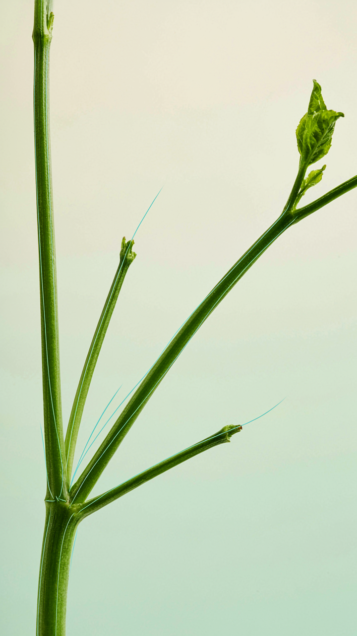
You want to draw botanicals that look authoritative instead of limp, and that means understanding load distribution before you touch paper. Engineering uses the principle of structural load paths to explain how forces move through systems, and botanical illustration uses the exact same principle to determine where stems thicken, where branches angle, and where weight concentrates. Plants don’t reinforce randomly. They respond to gravity and wind stress by building material where stress peaks.
Study a plant’s branching angles and stem diameters and you’ll see the architecture underneath. Smaller branches angle upward at steeper degrees because they carry less load. Main stems stay thicker and angle more gradually because they bear the cumulative weight of everything above. When you draw a plant without this logic, the eye catches it immediately as wrong, even if the viewer can’t name why. Accurate botanical illustration requires you to trace the structural reasoning, not just the outline.
Where Tension And Compression Actually Show
Everyone teaches you to shade stems by adding darkness on one side and light on the other. That’s incomplete. What they miss is that stems show compression on the lower side where weight presses down and tension on the upper side where the plant resists that downward force. The curvature of a stem, especially in drooping botanical studies or upright formal styles, reveals which forces win at each point along its length.
The vein structure in leaves follows the same logic. Veins concentrate where stress runs highest. Primary veins run from the attachment point outward because that’s where bending stress peaks. Secondary veins branch perpendicular to spread that load laterally. When you render veins, place them where structural function demands them, not where they look decorative. This single shift transforms your work from illustration to documentation.
Beyond Aesthetics: Plant Illustration For The Discerning Eye
What Makes A Species Recognizable
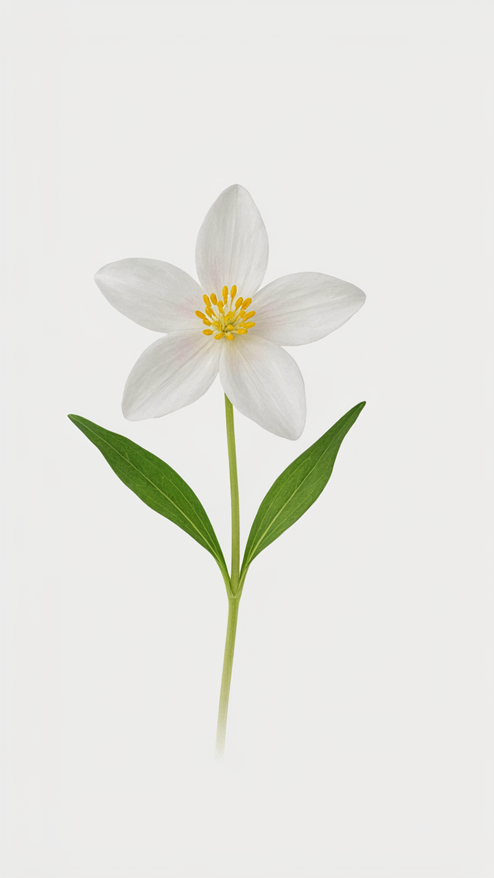
You want this section to validate that you have refined taste. Here’s the mechanism: species differentiation in botanical art isn’t about beauty or mood. It’s about visual taxonomy. Botanists use illustration to communicate identity, not feeling. The difference between two plant species often hinges on a single structural detail: leaf arrangement, sepal count, stamen placement, or vein pattern. Miss that detail and your drawing becomes decorative rather than documentary. The viewer—whether botanist or collector—recognizes competence only when you’ve captured the distinguishing features that separate one species from another.
Early botanical illustration traditions, particularly from the 16th through 18th centuries, prioritized accuracy over style for this exact reason. Artists like Pierre-Joseph Redouté and Maria Sibylla Merian succeeded because they understood that a single misplaced leaf margin would render their work useless to the scientific community. Your job is to identify which structural elements define the species you’re drawing, then render those elements with precision. Everything else becomes secondary. Start by studying the specimen’s botanical key characteristics before touching pen to paper.
Reduction Over Decoration
The common advice says to simplify. That’s incomplete. You must subtract strategically, not blindly. Start by identifying the essential characteristics that distinguish your species from its nearest relatives, then build outward only as far as those characteristics require. Each mark you add should serve identification, not impression.
Graphite rendering, watercolor wash, and pen line all succeed or fail based on the same principle: amplification through omission. When you remove distracting elements—background texture, ambient shadow, decorative flourish—the core structures become louder. Your viewer’s eye moves exactly where you direct it. The mechanism is neurological. The brain processes negative space faster than it processes decoration, so stripped-down work reads as authoritative while busy work reads as amateur. Stop adding details and start asking which details earn their place.
Botanical Studies: The Relentless Pursuit Of Veracity
See What Others Miss
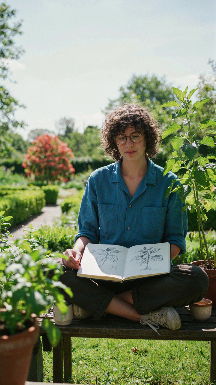
You want to believe careful observation will somehow elevate your work above the noise. The real mechanism is simpler: most artists don’t look long enough to notice what’s actually there. Botanical studies demand the naturalist’s habit—sustained, deliberate attention to living specimens. This isn’t aesthetic practice. It’s data collection. You’re training your eye to register variation, proportion, and structural logic that casual viewing skips entirely.
The difference between generic plant drawing and botanical study is time spent in front of the subject. Naturalists in the 18th and 19th centuries didn’t invent observation—they ritualized it. You sit with a plant for hours, not minutes. You rotate it. You examine the undersides of leaves, the branching angles, the vein patterns. You note where the stem thickens and why. This accumulated attention becomes visible in the work before you ever touch paper.
Witness Transformation, Not Snapshots
The mistake people make is treating botanical art as a static rendering problem. It’s not. Growth happens in real time, and your job is to document the mechanism. A leaf doesn’t emerge fully formed. A flower unfolds in a sequence. Seed pods develop through stages. If you draw the plant once and call it finished, you’ve missed the entire story that makes botanical work credible.
Work in series. Choose a specimen and return to it every few days over weeks or months. Sketch the same angle repeatedly as it changes. Note when new growth emerges, how leaf size scales, which parts thin or thicken. This approach requires a simple protocol: same light, same angle, dated entries. The documentation itself becomes the artwork’s foundation. This is how botanical illustrators built their authority—not through isolated perfect renderings, but through methodical, time-stamped observation that proved their work was grounded in reality, not invention.
Scientific Drawings Of Plants: The Uncompromising Standard
When Precision Stops Being Optional
You want to know if your work matters. That’s the real question underneath this section. Scientific plant drawings exist because casual observation fails. Botany borrowed the engineering principle of tolerances from manufacturing: acceptable deviation from a standard. In botanical art, your tolerance is zero. Every detail either documents reality or it lies. The historical record proves this. Botanists, taxonomists, and field researchers depend on drawings for identification. A misplaced leaf vein could mean the difference between two species. That dependency created the standard.
Botanical illustration became scientific documentation starting in the Renaissance, accelerated through the 18th and 19th centuries when plant collecting exploded globally. Artists worked directly with specimens, often under magnification. They recorded what they saw, not what they thought should be there. Museums and herbals still hold these drawings as reference material. They work because the artist followed the specimen, not their imagination. That’s the mechanism: constraint creates credibility.
Turning Observation Into Contribution
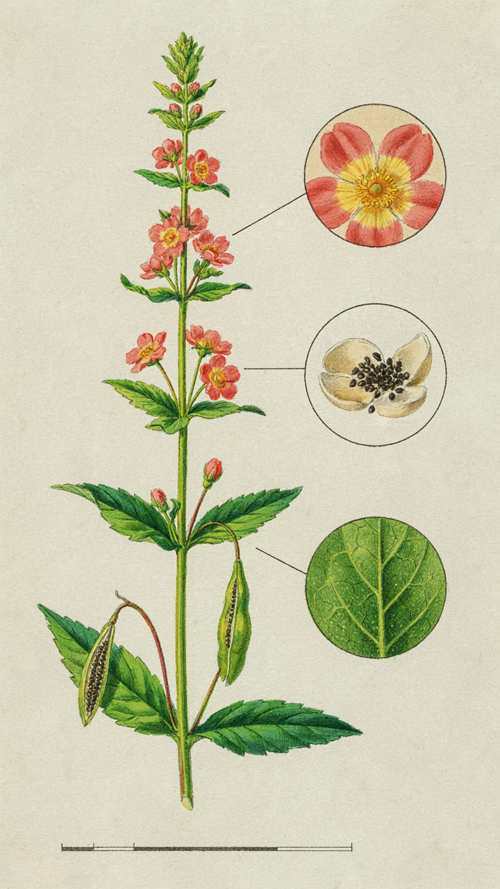
The common advice says “draw what you see.” That’s incomplete. You need to draw what you see in a way that lets someone else verify it. This is the difference between art and documentation. Scientific drawings use specific materials and techniques because they communicate precisely. You use hard pencils for line weight consistency. You include scale references so measurements transfer across centuries. You label anatomical features so identification stays possible.
Start by committing to one plant specimen, not multiple attempts at the same species. Document the whole plant, then move to detail views of flowers, seeds, and leaf undersides. Include a scale bar in your drawing so future viewers understand magnification. Photograph your reference specimen at high resolution before you start. Record the species name, collection date, and location. This transforms a drawing into evidence. That’s the only standard that matters.
Your Struggle Isn’t With Technique; It’s With Confronting Your Own Observational Laziness
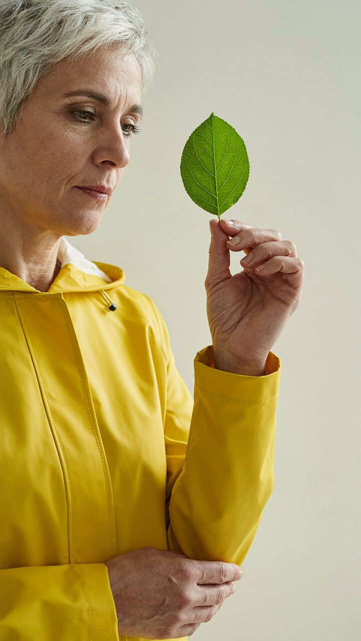
You don’t need another style guide. You need permission to stop looking at plants through screens and actually look at them. Pick one leaf today. Draw it badly. The botanical art styles that move people aren’t beautiful because they follow rules. They’re beautiful because someone bothered to see what was actually there instead of what they assumed was there. Your hand will follow your eyes, not the other way around.