
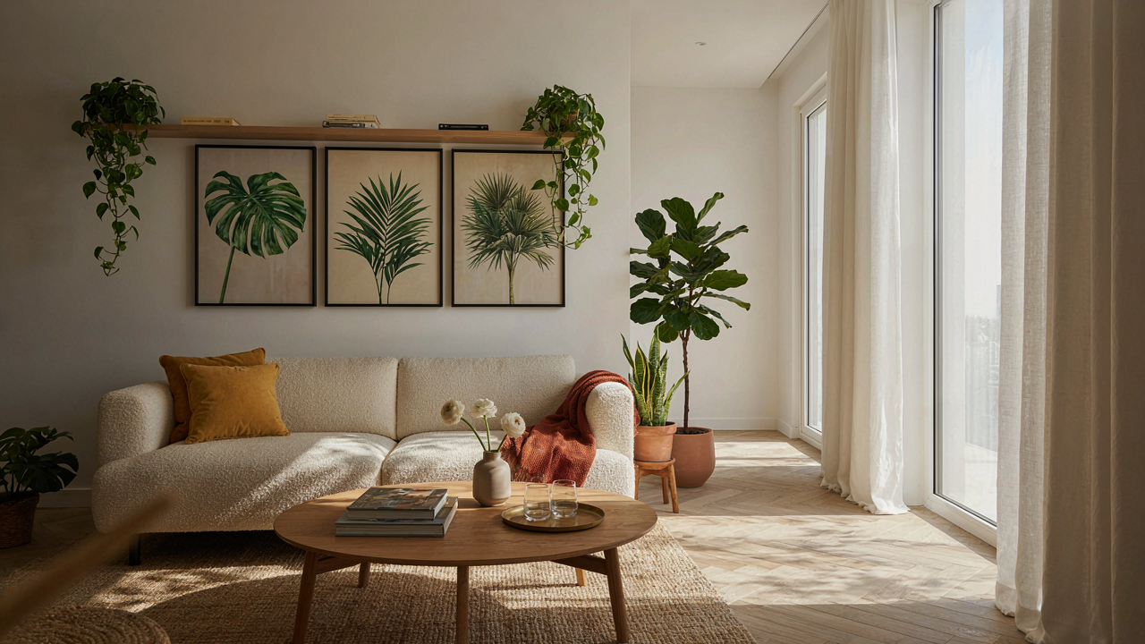
The Illusion Of “Stylish Home” & Generic Botanical Wall Art
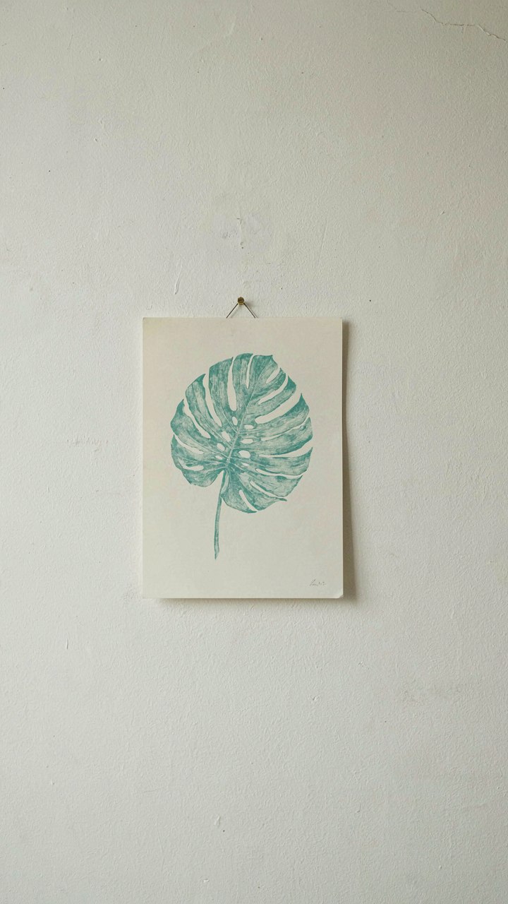
Why Mass Produced Prints Betray Your Aesthetic
You want people to think your taste is intentional, not inherited from a warehouse. The mechanism is simple: mass-produced botanical prints signal nothing about you because they signal the same thing about everyone. The printer manufactures ten thousand identical copies. Your wall gets the same image as the waiting room at a dental clinic. Repetition erases distinctiveness. When a print exists in high volume, it stops communicating taste and starts communicating compliance.
The real problem is material degradation and sourcing opacity. Most mass-produced botanical prints use thin paper, inks that fade within three to five years, and zero information about where the botanical reference came from. You’re buying a commodity, not a work with provenance. The frame costs more than the print itself, which should tell you something. If you can’t name the botanist, illustrator, or historical period the image comes from, you’ve bought decoration, not art.
The Visual Clichés Nobody Names Plainly
Generic botanical art advice tells you to “choose what speaks to you” and “go with your gut.” That’s incomplete. The real issue is that certain botanical compositions became visual clichés because they reproduce easily and require no taste to recognize. Oversized leaves, ferns in perfect symmetry, pressed ferns flattened against white backgrounds, watercolor florals in muted pastels—these images proliferated because stock art libraries automated the cliché. You see them everywhere because algorithms optimized for “calming nature aesthetic,” not originality.
The way out isn’t harder searching. It’s understanding that historical botanical illustration served a taxonomic function. Those prints were documentation, not decoration. When you source actual herbals or botanical drawings from specific time periods—Victorian field studies, Renaissance plant manuscripts, 19th century seed catalogs—you stop buying aesthetic consensus and start buying actual visual information. The image carries weight because it was made for a reason beyond filling wall space. Ask yourself: what was this print made to prove or record? If the answer is nothing, the wall doesn’t need it.
Deconstructing The “Botanical Wall Art Set” Myth
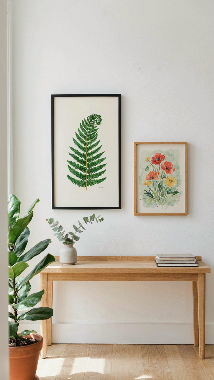
The Matching Trap Costs You Coherence
You want the problem solved fast, so you buy the set. Three matching prints, same frame, same mat. Done. But matching prints don’t create visual interest, they create visual noise that cancels itself out. Borrowing from graphic design, botanical sets suffer from what designers call “figure-ground collapse”—when everything competes equally, nothing stands out. Your eye has nowhere to land. Sets are packaged that way because they’re easier to manufacture and sell, not because they solve your space better.
The real mechanism: botanical sets assume your wall is blank and neutral. It’s not. Your wall has light, existing furniture, architectural character, and sight lines that already exist. A set ignores all of that. Strategic dissonance means choosing prints that conflict slightly in color intensity, scale, or composition—making each one sharper by contrast. One large fern print with clinical precision paired against a softer, smaller wildflower study creates tension that actual visual interest depends on. Match is the enemy of depth.
Bold Single Pieces Win In Real Rooms
Common advice tells you sets look more intentional. That’s backward. One oversized botanical print placed with purpose reads as a deliberate creative choice. Two or three smaller sets read as filling space. The difference isn’t subtle—it changes how people perceive your entire room. A statement piece anchors a wall. Sets fragment it. Scale matters more than quantity, and commitment matters more than coverage.
If you must use multiple prints, treat them as individual decisions, not a package. Choose each based on your room’s light, furniture placement, and actual negative space, not on whether they came together. The protocol: identify your strongest natural focal point on a wall, size the print to command that space without overwhelming it, then add a second piece only if it genuinely improves balance. Resist filling every gap. Empty wall space around a bold botanical print is composition, not wasted real estate.
The “Olive Tree Art Design” Principle: Intentionality Over Trend
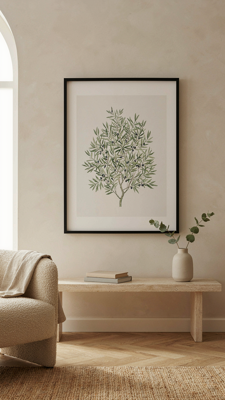
Timeless Motifs Over Botanical Fads
You’re worried that your botanical print choice will look dated in three years. Here’s the mechanism: most people chase whatever plant imagery dominates Instagram that season, then panic when the algorithm moves on. Timeless botanical prints work because they’re rooted in design history, not social feeds. Olive trees, ferns, and eucalyptus appear across centuries of art movements because their forms solve visual problems. They balance density with negative space. They read clearly from across a room. They don’t demand attention through novelty.
The distinction between trend and timeless comes down to adoption speed. Trendy botanical prints spike fast then crater. Timeless ones move slow, accumulate steadily, and hold value across decades. When you choose a motif that appeared in arts and crafts movement work, mid-century modernism, and contemporary design without looking forced in any of them, you’re buying longevity, not fashion. Pick plants with structural clarity and historical precedent, not whatever hashtag is peaking this quarter.
Symbolic Botanical Choices As Silent Communication
Botanical prints don’t just decorate walls, they broadcast intent. Psychology calls this nonverbal signaling, and your print choice either reinforces your stated values or contradicts them. A room claiming minimalism but featuring fussy, ornate florals sends mixed signals. A workspace displaying thorny or aggressive plants contradicts claims of calm focus. The print itself becomes a statement about consistency. The symbol embedded in your botanical choice shapes how others perceive your space’s purpose and your attention to detail.
Choose botanical imagery with clear historical meaning. Laurel represents achievement and wisdom. Olive symbolizes peace and resilience. Ferns connote growth and renewal without aggression. Succulents read as practical efficiency. Your print choice becomes part of your visual argument about who you are. The mechanism is simple: people decode symbols whether you intend it or not, so decide your botanical symbol deliberately instead of defaulting to whatever’s available. Your print announces your values before you open your mouth.
Simple Art For Living Room: The Art Of Visual Understatement
Minimalism Removes The Noise First
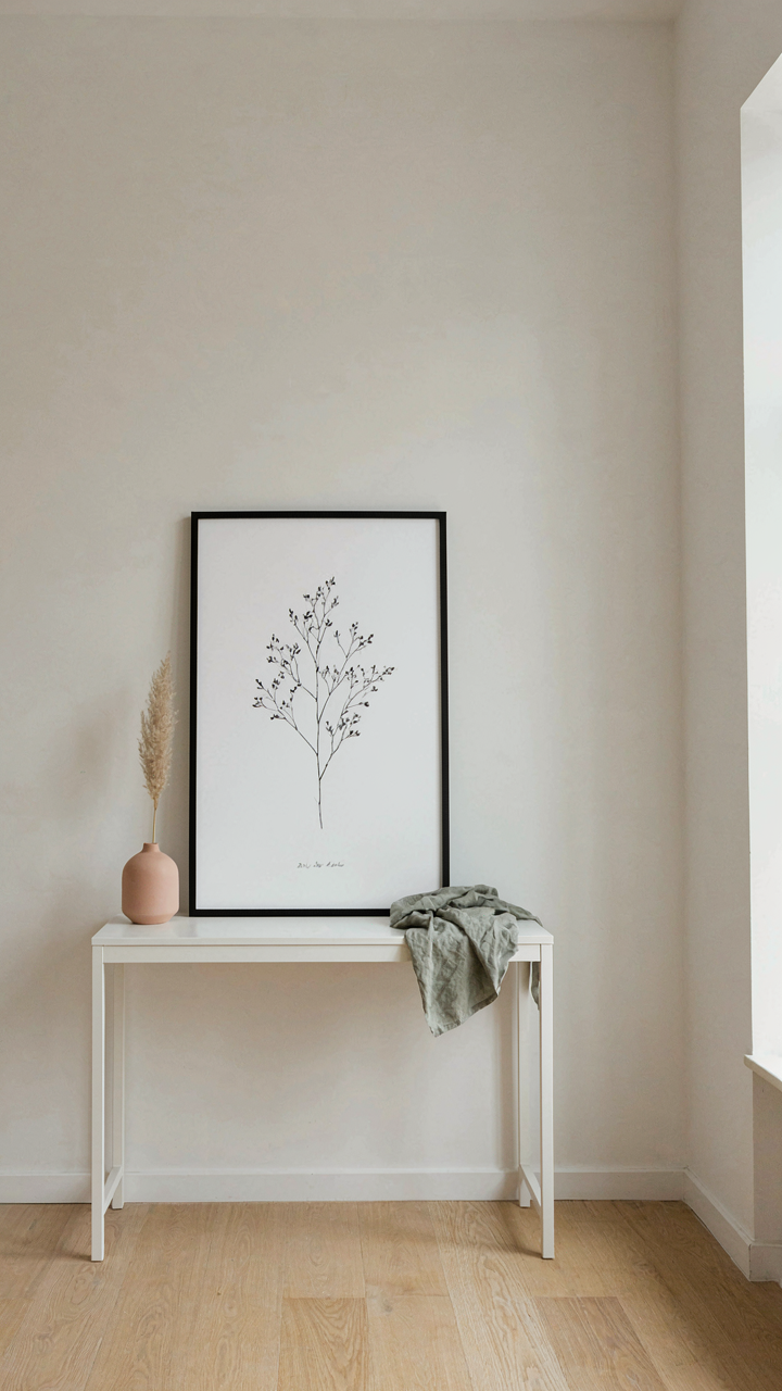
You want people to notice your taste without noticing you’re trying. That’s the real game here. Botanical wall art prints work in minimalist spaces because they operate on subtraction, not addition. The mechanism is constraint: fewer elements force each element to carry more weight. A single stem or leaf on white paper demands attention precisely because nothing else competes for it. This is the opposite of gallery walls and maximalist collages that hide mediocrity behind volume.
The prints that dominate minimalist living rooms share a structural rule: they isolate subjects. One botanical specimen. Clean background. No decorative border or text. Gallery-wrapped canvas or framed prints in natural wood or metal eliminate visual friction. The frame itself becomes architecture, not decoration. This restraint isn’t poverty of design—it’s precision. Install one substantial print above a console or floating shelf where it anchors the entire wall without demanding a collection around it. Scale matters here: a 24×36 inch print operates differently than a 16×20. Bigger commands the room through presence, not proliferation.
The Power Of Empty Space
Negative space in design functions like silence in music—it’s the architectural principle that shapes perception. Too many designers fear blank walls because they mistake emptiness for failure. Botanical prints leverage this directly. When you surround a print with substantial wall space, the brain processes that emptiness as intentionality. The print doesn’t float; it anchors. The wall becomes part of the composition, not just a backdrop.
Placement mechanics matter more than frame choice here. A botanical print positioned at eye level with at least two feet of unbroken wall on each side creates visual authority. The standard recommendation to center everything is lazy. Instead, place the print in the upper third of wall height and leave the lower two-thirds open—this mirrors the negative space principle used in editorial design and advertising. The empty wall beneath the print functions as visual breathing room that prevents the living room from feeling crowded. Start by marking placement with painter’s tape before hanging.
Beyond Canvas: The Olive Tree Acrylic Painting Advantage
What Your Wall Actually Feels
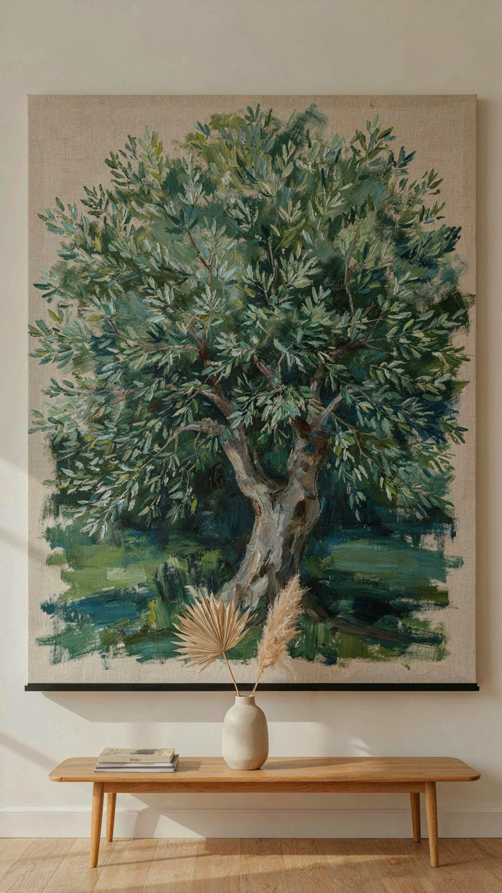
You want people to notice your taste without you explaining it. That’s the real play here. Material choice in botanical wall art isn’t aesthetic posturing—it’s physics. Acrylic paint on canvas creates surface texture that reflects light differently than print-on-paper. The brushstrokes hold shadow. The paint sits proud of the wall. This tactile presence registers in the viewer’s peripheral awareness before they consciously process the image itself. They feel the craft before they see the subject.
Olive tree acrylics deliver this specifically because of subject matter alignment with material choice. Organic forms demand dimensional rendering. Canvas accepts layering that reproduces the gnarled texture of bark or the complexity of foliage in ways flat prints cannot replicate. The medium becomes inseparable from the message. When someone stands three feet from an acrylic olive tree and sees actual paint depth, the work occupies space instead of just hanging on it. That distinction changes how the room feels.
Durability Meets Visual Depth
Most advice about botanical prints focuses on color fastness and fade resistance. That’s incomplete. Acrylic paintings outlast inkjet prints not just because pigment chemistry is more stable, but because the paint layer itself creates a protective seal over time. The binder in acrylic (polymer emulsion) cures and hardens into a protective film. Print inks sit on top of paper fibers with nothing between them and air. Acrylic gains strength through aging. Prints lose it.
The depth advantage compounds this longevity. A three-dimensional paint surface scatters ambient light across multiple angles. This means the botanical detail remains visible even under inconsistent lighting conditions throughout the day. An olive tree acrylic maintains visual clarity in morning light, afternoon glare, and evening shadow that would flatten a print into illegibility. Mount an acrylic olive painting where it catches side light and the brushwork becomes the dominant visual element. Print the same image on canvas and it disappears. Protection and presence are the same mechanic here—build the work with material that refuses to go flat.
Print Sets Wall Art: The “Portfolio Diversification” Model
Risk Versus Reward In Visual Spacing
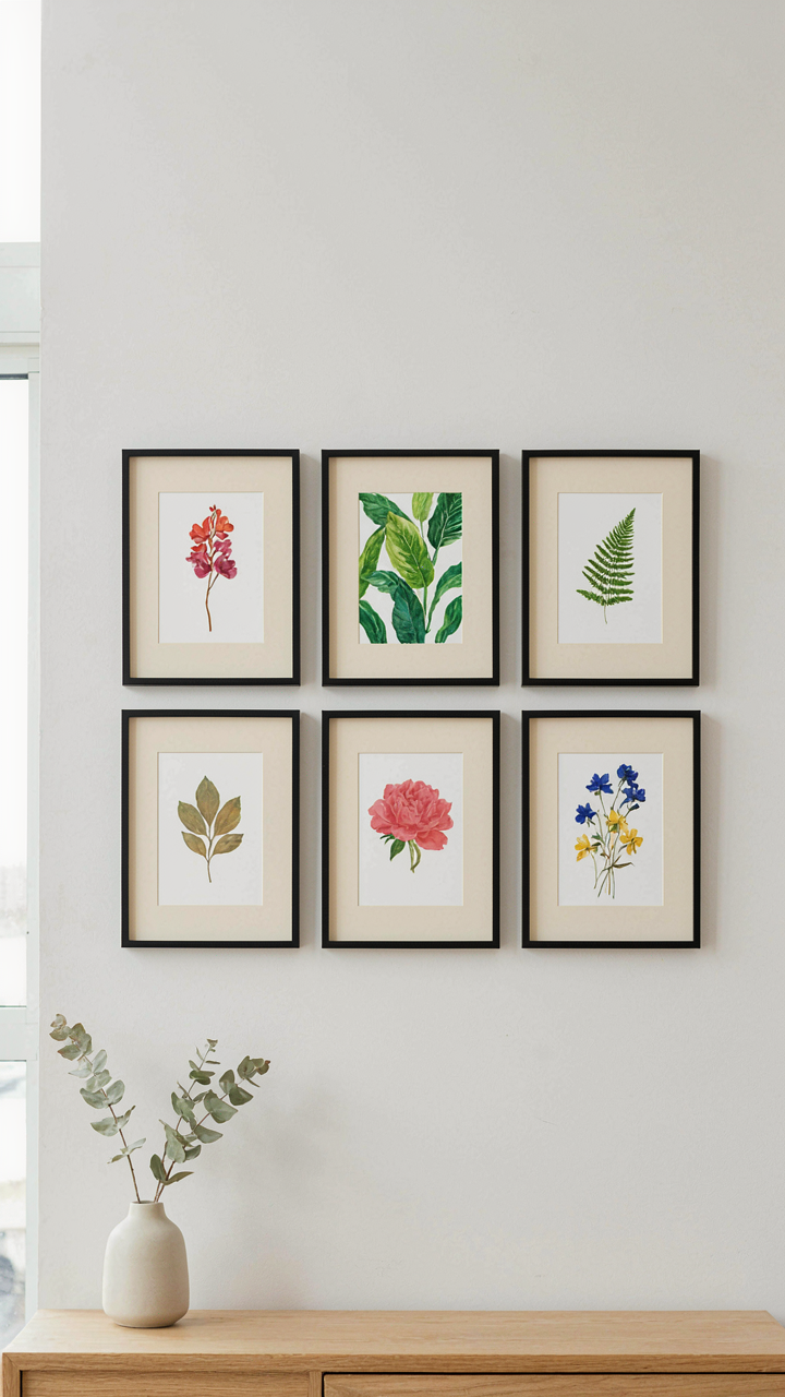
You want to hang multiple botanical prints without the room feeling chaotic. That’s the real question here. Economics teaches portfolio theory: risk decreases when you spread capital across uncorrelated assets. Botanical print sets work the same way. Each print in a curated set occupies different visual real estate and targets different focal points. A single large print commands attention. A coordinated set distributes it. The mechanism is this: varied botanical subjects (ferns, succulents, flowering stems, foliage studies) prevent visual monotony while maintaining cohesion through consistent framing, matting, or color palette. You’re not diluting impact. You’re multiplying it across the wall strategically.
The common mistake is buying random prints and calling it a collection. That creates visual noise. A true set operates as an integrated system where each print strengthens the others through intentional spacing and repetition. Frame size, color treatment, and botanical subject matter must follow a pattern. This isn’t decoration. It’s spatial strategy. When you hang a four-print set with uniform matting but varied botanical imagery, each print does work independently while the arrangement anchors the entire wall composition and controls where your eye lands and how long it stays.
Aesthetic Compounding Over Time
Print sets build value differently than single large statements. Think of aesthetic compounding like financial compounding, where initial arrangements generate returns that themselves generate more returns. A botanical set establishes visual rhythm on your wall. Over months, you perceive it not as four separate pieces but as one cohesive intervention. Your brain stops processing each print individually and starts reading the pattern. This changes how the room feels.
The mechanism compounds further when you add complementary elements. A set of framed botanical prints creates a visual anchor that makes other design choices easier and more purposeful. A new plant in the corner suddenly relates to the prints. Your furniture arrangement now dialogues with the gallery wall. You’re not just hanging art. You’re creating a reference system that makes future decisions cheaper and faster. This is why botanical print sets often trigger additional design choices in a home, when single prints rarely do. The initial set becomes the foundation that justifies and guides everything that comes after.
Green Pictures For Wall Collage: Curating Visual Ecosystems
What Your Botanical Mix Actually Signals
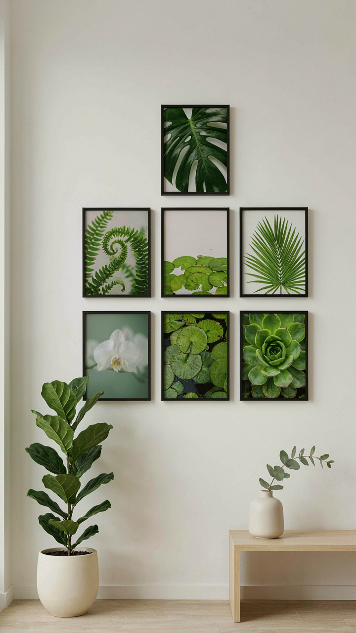
You want this to look effortless. That’s the real fear underneath. Most people think botanical wall art collages fail because they lack cohesion, but that’s backwards. They fail because the creator tried too hard to force unity. Think in terms of ecology, not interior design. In nature, diversity doesn’t create chaos—constraint does. You need one limiting factor that makes everything else feel intentional. That factor is either color palette, print scale, or frame material. Pick one and lock it down.
The mechanism is simple: constraint forces selection, and selection creates the appearance of curation. When you remove the constraint, you get visual noise that reads as indecision. Your eye doesn’t see eight different botanical prints. It sees eight different design choices competing for attention. Viewers register that immediately, and the whole wall feels amateur. The prints themselves don’t matter as much as the invisible rule governing them.
- Monochromatic Green Palette: Use prints ranging from sage to forest green. Same color family eliminates visual competition and creates depth through tonal variation alone.
- Frame Consistency: Match all frames in wood tone, metal finish, or painted color. The frame becomes the unifying element, not the botanical content inside.
- Scale Hierarchy: Mix sizes deliberately—one large anchor print, medium supporting pieces, small accent prints. This mimics natural growth patterns and feels intentional.
- Botanical Family Grouping: Use prints from the same plant category—ferns, succulents, orchids—across different presentations and styles. Similarity in subject creates cohesion despite visual variety.
- Negative Space Rhythm: Space prints at consistent intervals, leaving equal white wall between them. Repetition in spacing overrides differences in content.
When you build a collage with one constraint locked in, viewers see an intentional system instead of random decoration. The botanical elements become secondary to the organizational principle you’ve established. That’s what separates a collage from wall clutter.
Structure Over Apparent Spontaneity
Everyone says collages should look organic and unplanned. That advice is incomplete and creates the opposite effect. Unplanned collages look chaotic. Professional collages follow an invisible grid, even when prints overlap or vary in size. The grid is the skeleton no one sees—it’s what makes the organic appearance possible.
Start by imagining the wall divided into thirds vertically and horizontally, creating nine zones. Your prints should reference this underlying structure through their placement, not fight it. An off-center arrangement still lands on intersection points or clear alignments. You’re not creating randomness. You’re creating the appearance of randomness within strict parameters. The prints that seem to float freely are actually anchored to compositional rules.
The difference between a gallery wall and a Pinterest disaster is this: one follows grid principles, the other ignores them. Measure before you install. Mark positions lightly with painter’s tape. Use a level. The spontaneous look happens after you’ve removed all guesswork from placement. That’s how you move from “I put prints on a wall” to “I designed a collage.”
Tree Posters: Gravitas & Grounding Through Form
When Scale Defines The Room
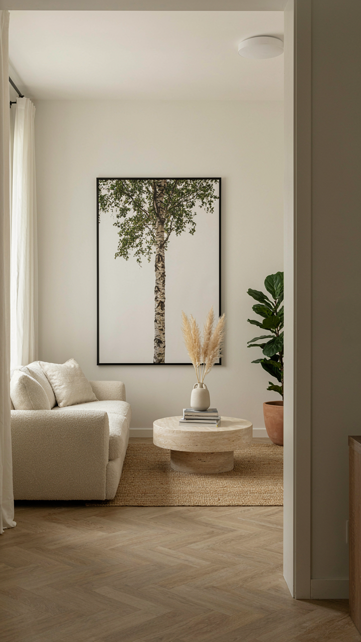
You want people to feel something shift when they enter. That’s the real reason you’re thinking about tree posters. Trees work because they operate on the principle of visual weight—a concept borrowed from architecture and physics where mass creates perceived stability. A large tree poster doesn’t just hang on your wall; it anchors the entire room’s spatial hierarchy.
The mistake most people make is treating tree posters as decoration. They’re not. A properly scaled tree poster functions as the room’s gravitational center. When you hang a floor-to-ceiling birch or oak print, you’re not adding art to the space; you’re reorganizing how people navigate it. The room now has a spine. Everything else orbits around it.
Commanding Attention By Refusing To Blend
Tree posters that work don’t whisper. They interrupt. The difference between a forgettable print and one that stops conversation is contrast and placement—not just subject matter. A monochromatic tree against a colored wall disappears. A detailed, high-contrast tree print positioned at eye level the moment someone enters forces engagement.
The mechanism is simple: your brain processes distinct forms before ambient details. A tree poster with visible trunk structure, branch articulation, and tonal range demands processing. You can’t glance past it. Position it opposite your entry point or above the primary seating area, and you’ve created what designers call a “visual anchor”—the first thing the eye settles on before scanning the rest of the room. This isn’t subjective taste. It’s how visual hierarchy actually works.
Poster For Bedroom Wall Art: The Unspoken Psychology Of Sanctuary
The Difference Between Restful And Boring
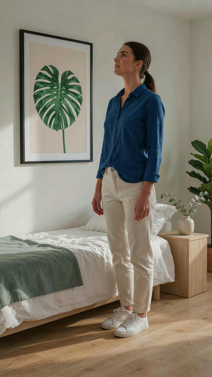
You want your bedroom to feel like a retreat, not a storage closet with a bed. The real tension is that most people confuse emptiness with calm. Psychology calls this the difference between negative space and deprivation. Botanical wall art prints operate on the same principle: they fill space without creating visual noise. A single well-placed botanical print establishes a focal point your eye returns to without demanding constant engagement.
The mechanism works because your brain categorizes visual input as either threat or resource. A blank wall signals incompleteness. A cluttered wall signals chaos. A thoughtfully placed botanical print signals intentionality. Your nervous system settles differently when it recognizes that a space was designed rather than abandoned. Repose isn’t the absence of stimulation. It’s the presence of order that your nervous system recognizes and trusts.
When The Art Actually Fits Your Life
Personal resonance determines whether a print becomes wallpaper or a reflection of who you are. Most advice says pick what you like aesthetically. That’s incomplete. What matters is whether the botanical subject carries meaning tied to your actual experience or values. A print of eucalyptus hits different if you’ve sat under eucalyptus trees. A rare fern print registers if you collect plants. The print anchors your bedroom to something true about you.
This is tactical, not sentimental. Art that connects to your inner world doesn’t require psychological effort to justify. Your eye moves to it naturally. You wake and see it without resentment. Over months and years, this consistency shapes how you experience the room. Choose a botanical print that reflects either your environment, your hobby, or a place that has meaning to you. Avoid generic selections based purely on color coordination.
The True Obstacle Isn’t Finding Good Art; It’s Your Unwillingness To Define What Good Actually Means For You

Most people buy botanical wall art prints because they saw them somewhere else. You’re not doing that. Stop scrolling through collections and start asking yourself what you actually feel when you see a specific plant, color, or composition. That feeling is your filter. Right now, open your phone and save three prints that make you stop. Don’t overthink it. Your gut knows what belongs on your wall before your brain does.