
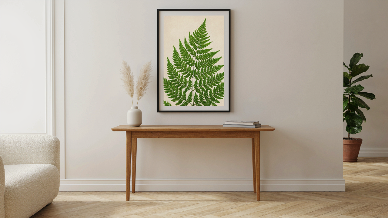
The Illusion Of “Easy”: Why Generic Botanical Illustration Decor Fails
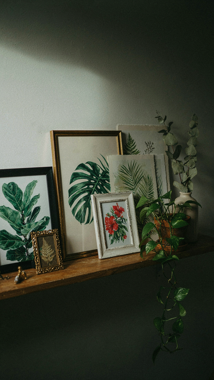
Decoration Without Intention Is Clutter
You want botanical illustration decor to feel effortless because you’re afraid picking the wrong piece will expose that you have no taste. Here’s the mechanism: intention is the constraint that turns decoration into design. Without it, you’re just buying objects that happen to have plants on them.
Most people treat botanical illustration decor like they’re filling empty wall space. They grab whatever matches their couch color or fits the frame size they already own. This is the output of zero filtering. Intention means deciding first why this specific plant, this specific style, this specific placement serves your space. The illustration either solves a problem or it doesn’t.
Avoiding Common Beginner Traps
The common advice tells you to “start small” and “match your aesthetic.” That’s incomplete. The real trap is confusing trend compatibility with intentional curation. You can match your aesthetic and still end up with five forgettable pieces instead of one that changes how the room functions.
The beginner mistake isn’t buying too much. It’s buying without understanding the difference between botanical illustration styles. Victorian-era scientific prints serve a different purpose than mid-century modernist botanical work or contemporary minimalist plant drawings. Each carries different visual weight and demands different placement logic. Pick your style first by understanding what each one does to a space, not by scrolling Instagram until something feels right. Then buy one piece that proves the concept works before adding more.
Beyond Replication: The “Authenticity Algorithm” For Botanical Decor
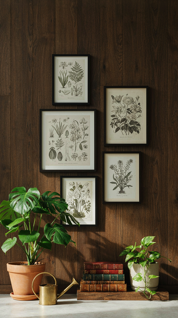
Where Victorian Botanicals Actually Come From
You want the look without the research. That’s the real problem here—authenticity feels like work, so you’ll grab whatever botanical print matches your couch instead. But here’s the mechanism: Victorian botanical illustration wasn’t decoration first. It was scientific documentation. The plants were accurate because accuracy served taxonomy, not aesthetics. That distinction matters for your space because it means copying the visual style without understanding the source defeats the entire purpose of using it.
The original botanical illustrations came from two places: field naturalists and the printing presses of Europe between the 1700s and 1900s. Artists like Pierre-Joseph Redouté worked from live specimens, not imagination. Museums, universities, and wealthy collectors commissioned these works as reference materials. When you source genuine Victorian botanicals—not reproductions of reproductions—you’re buying access to that original rigor. Auction sites, museum collections, and botanical libraries digitize these pieces. Start there, not with mass-produced prints labeled “vintage aesthetic.”
Translating Period Design Into Living Space
The mistake everyone makes is treating antique botanical work as a finished aesthetic object. It’s not. Victorian botanicals functioned as part of a knowledge system, not as decor that stood alone. Translating that into modern interiors requires you to recreate the logic, not just the image.
A Victorian botanist’s study had botanical prints arranged by taxonomy, framed consistently, integrated with actual specimens and research materials. Your modern equivalent doesn’t need a study—it needs intentional placement that mirrors that original function. Group related botanical families together. Frame them with consistent matting and wood tones. Layer them with actual plants or botanical reference books nearby. This creates visual coherence rooted in how botanicals originally operated, not arbitrary arrangement. The mechanism is simple: recreate the context, and the aesthetics follow.
The Archeology Of Aesthetics: Unearthing Vintage Botanical Illustrations

Where To Find Forgotten Botanical Drawings
You want vintage because it signals taste without effort. Here’s the mechanism: scarcity creates perceived value, and old botanical prints tap into that directly. Museums and botanical gardens digitized their archives decades ago. These collections sit online free or cheap. Estate sales and used book dealers stock original prints regularly. Auction sites like eBay rotate inventory constantly. The work isn’t finding them—it’s knowing which sources filter for quality automatically.
The real play is understanding what made a botanical illustration valuable in its own time. 19th century scientific accuracy mattered. Publishers hired skilled draftsmen to render plants for herbals and botanical texts. That precision translates to modern decor because the visual information is dense without being cluttered. A well-executed historical print reads as intentional, not nostalgic. Source from libraries, natural history museums, or botanical societies with public collections. Check publication dates and artist credits before committing budget.
Editing Your Selection, Not Filling Wall Space
Common advice says hang more pieces to fill gaps. Wrong. A concentrated collection beats scattered coverage every time. This follows basic design economy: constraint forces hierarchy. Pick five pieces that share one binding element—color palette, artist era, plant family, or frame style. Constraint isn’t limitation here; it’s the mechanism that makes the wall read as deliberate rather than accumulated. Two strong pieces beat seven mediocre ones because your brain recognizes intentionality.
The second layer is rotation. Most people hang decor once and ignore it. Buy double what you display. Store half in acid-free sleeves. Swap seasonally or every six months. This keeps the space from feeling static and gives you data on what actually works in your space under different light. Print quality matters more than quantity. A single museum-grade reproduction outperforms five drugstore frames. Invest in paper weight, ink type, and framing materials. That decision compound over time.
Ginkgo Plant And Beyond: The Power Of Singular Focus
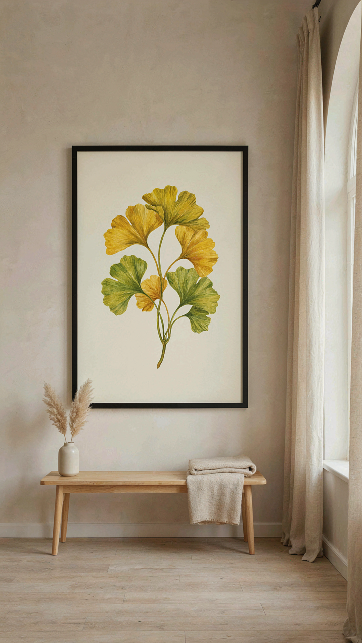
Why One Plant Works Better Than Many
You want permission to do less and call it design. That’s the real reason this matters. The mechanism is constraint. In visual hierarchy, constraint forces the eye to process information in a specific order, which is borrowed directly from information design. A single botanical form commands attention because it removes competition for your focus. When you place a ginkgo illustration alone on a wall, the viewer has nowhere else to look. Multiple plants scatter that attention and dilute the impact of each one. This is why galleries hang singular pieces in prominent spaces, not clusters of equal-sized work.
The practical application: choose one botanical specimen per room or wall section. A large ginkgo print on a neutral wall operates differently than five small botanical studies scattered across the same space. The singular piece builds tension through simplicity. It makes the room feel intentional, not decorated. Start by identifying the room’s primary wall, then select a plant form with distinct silhouette that matches your space’s scale. A fern works differently than a sunflower. The shape of the plant becomes the shape of the room’s visual story.
Forms That Stop The Eye
Different botanical structures create different effects on the wall. Ginkgo leaves radiate outward from a single point, creating centrifugal movement that pulls the eye inward first. Ferns layer in repetitive patterns that feel rhythmic and calm. Succulents read as geometric and architectural. The form you choose does the work before scale or color enters the equation. Illustration technique compounds this. A detailed line drawing of a ginkgo emphasizes the plant’s mathematical symmetry. A silhouette version transforms it into pure shape. The form determines what the piece communicates about your space.
Select a plant form that solves a specific problem in your room. If your wall is narrow, choose a vertically oriented plant like a palm frond or iris stem. If your wall is wide, horizontal plants like a sprawling fern or succulent cluster distribute the visual weight correctly. The plant form and the wall proportion must align, or the piece feels wrong regardless of quality. This is mechanics, not taste. Take a photograph of your wall, then overlay different botanical shapes mentally before you order or create anything. The right form fits before it hangs.
Botanical Silhouettes: Mastering Negative Space For Drama
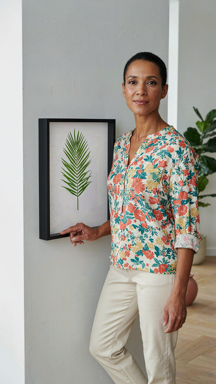
What Silence Does That Detail Cannot
You want this technique because it makes you look like you understand design when you’re actually just starting. Here’s what’s really happening: negative space is borrowed from figure-ground perception in visual psychology. The brain doesn’t see objects in isolation. It sees relationships between what exists and what doesn’t. A botanical silhouette forces this relationship into sharp focus by removing the distraction of internal detail and making the outline the entire message.
Most people think silhouettes are simpler because they have less information. That’s backward. Silhouettes demand a perfect outline because nothing else carries the weight. The shape must read instantly from across a room. You’re not decorating with a plant anymore. You’re decorating with the ghost of one, and that ghost has to be unmistakable.
The Edge Is Everything
Silhouettes work because they isolate the one thing most people ignore when hanging botanical art: the perimeter. In design systems, the boundary defines the system. Your silhouette’s edge determines whether viewers recognize it as a fern, a palm, or a leafless stick. A blurred edge kills the effect. A precise edge creates authority. Use a single, dark color against a light background or reverse it. The contrast ratio makes recognition instant.
Source your silhouettes from actual botanical specimens, not stylized interpretations. Historical silhouettes from the 19th century used pressed plants as templates. This produced outlines that were botanically accurate even though viewers saw only black shapes. Your frame size and wall placement matter more here than anywhere else in botanical decor because you’re relying purely on shape recognition. Mount silhouettes at eye level where the edge detail reads without straining.
The Sage Green Botanical Prints System: Calibrated Color Psychology
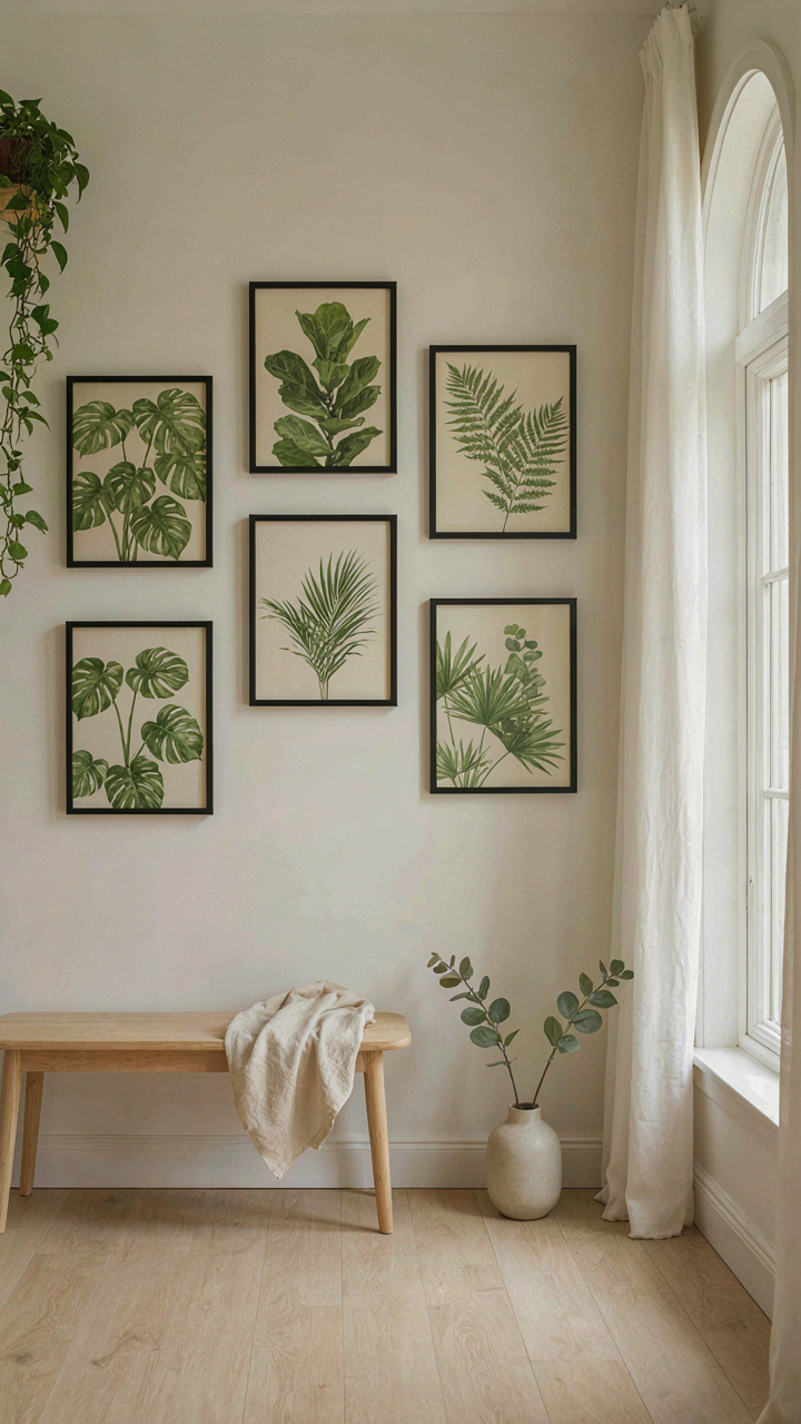
How Color Temperature Controls Room Energy
You want sage green prints because they signal taste and restraint. You’re buying status wrapped in calm. But the real mechanism is simpler: color temperature is the lever that controls whether a room feels active or passive, and botanical illustrations operate exactly like a thermostat.
Sage green sits in a narrow band between warm and cool, which makes it strategically neutral. It doesn’t trigger alertness like yellows or blues do. The pigment reflects light in a way that reads as stable rather than stimulating. This is borrowed from color science in physics: wavelengths in the 500-550 nanometer range activate fewer neural pathways associated with arousal. When you hang a botanical print in sage green on your wall, you’re literally damping the room’s energy signature.
Mood Matching Through Deliberate Palette Restriction
Most advice tells you to “choose colors that match your aesthetic.” That’s lazy and backwards. You choose colors based on the psychological work you need that room to do, then find botanical prints that deliver it.
Sage green works for bedrooms and reading spaces because it suppresses cortisol response without feeling depressing. Muted grays paired with sage push the effect further into calm. If you need focus instead of calm, introduce prints with warmer greens (closer to olive) or add earth tones like terracotta in the background. The botanical subject matter doesn’t matter as much as the pigment. Select your print’s dominant color first based on the emotional state you’re engineering, then verify the botanical subject fits your decor theme. That’s the protocol.
Green Leaf Texture Protocol: Sensory Depth In Botanical Decor
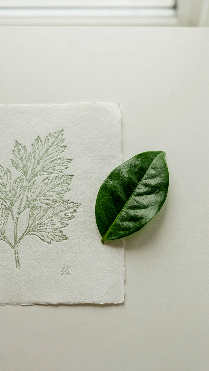
Touch Before Sight
You want people to feel something when they look at your wall. That’s the real play here, not some vague notion of “depth.” Tactile texture in botanical decor works like contrast in visual design: it forces the eye to move and the brain to process. You’re borrowing a principle from material science called haptic feedback. When viewers encounter raised leaf veins or embossed botanical prints, their brains predict touch even without contact, creating neurological engagement that flat images never trigger.
Most advice about botanical texture stops at “add dimension.” Wrong. The mechanism is specificity. A fine-art reproduction of a nineteenth-century botanical study, done on cotton rag paper with subtle embossing around the leaf edges, reads as intentional and rare. A mass-printed generic leaf on glossy cardstock reads as filler. Your goal is building tactile hierarchy through materials that signal craft, not cost. Choose paper weight over surface sheen. Choose embossing technique over paint texture. The difference lies in how the material reveals intention.
Layering Creates Contrast, Not Clutter
Botanical illustration has existed since the Renaissance, when artists needed precision for scientific documentation. That discipline matters now. Layering textures doesn’t mean stacking random objects in front of prints. It means placing elements at different distances from the wall to create genuine visual separation. A framed botanical illustration hung flush against the wall, with a small sculptural succulent or textured botanical study mounted three inches forward on a shelf below, creates focal depth that a single flat piece cannot.
Texture layering works in botanical decor when you control material contrast deliberately. Matte finish illustration next to a glossy leaf specimen. Smooth frame adjacent to a woven plant hanger. Paper next to metal. The contrast activates the eye’s tracking pattern and makes the entire installation register as designed rather than placed. Stop adding items. Start controlling which surfaces catch light differently. Mount your primary illustration at eye level, position secondary textured elements at angles that intercept side light, and leave breathing room between pieces.
The Anti Generic Gallery: Curating Authentic Botanical Decor
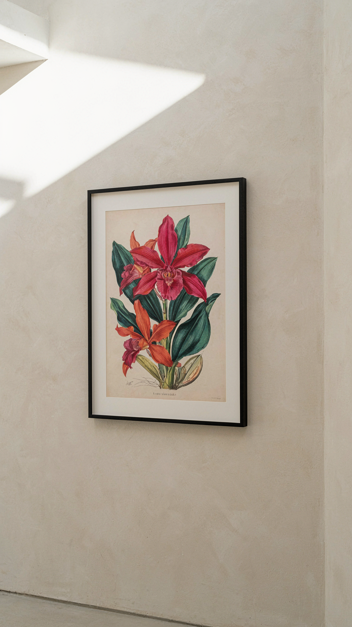
The 80/20 Rule Of Wall Space
You want permission to buy less and feel smarter about it. Here’s the mechanism: economics calls this the Pareto Principle, and it applies directly to botanical illustration decor. Eighty percent of the visual impact in a room comes from twenty percent of the pieces you hang. Most people load walls with filler, then wonder why nothing feels cohesive. The trick is identifying which botanical prints carry disproportionate weight and building around those anchors instead of spreading attention thin across mediocre work.
Start by auditing what you already own or are considering. Which pieces stop you when you walk past? Which ones do visitors actually ask about? These aren’t the pretty ones necessarily. They’re the ones with distinctive composition, unusual subject matter, or technical execution that reads as intentional. The rest are noise. Remove them from your mental inventory right now. You don’t need them.
Discard The Decorative, Keep The Demanding
Most botanical decor advice tells you to match colors and create harmony. This is incomplete thinking. What actually matters is selecting pieces that demand attention through specificity, not through prettiness. A botanically accurate Audubon-style study of a single plant species creates more visual authority than six generic florals in matching frames. The rare print teaches your eye something. The generic one just fills wall space.
This is where curation separates itself from decorating. You’re not aiming for a matched set. You’re building a collection that reveals your actual engagement with the subject. Choose one or two exceptional prints and give them prime placement. Let them breathe. Treat everything else as supporting material, and be willing to leave walls bare rather than compromise. Empty wall beats weak art every time.
Beyond Frames: Integrating Botanical Art Into Living Spaces
The Environment As Your Frame
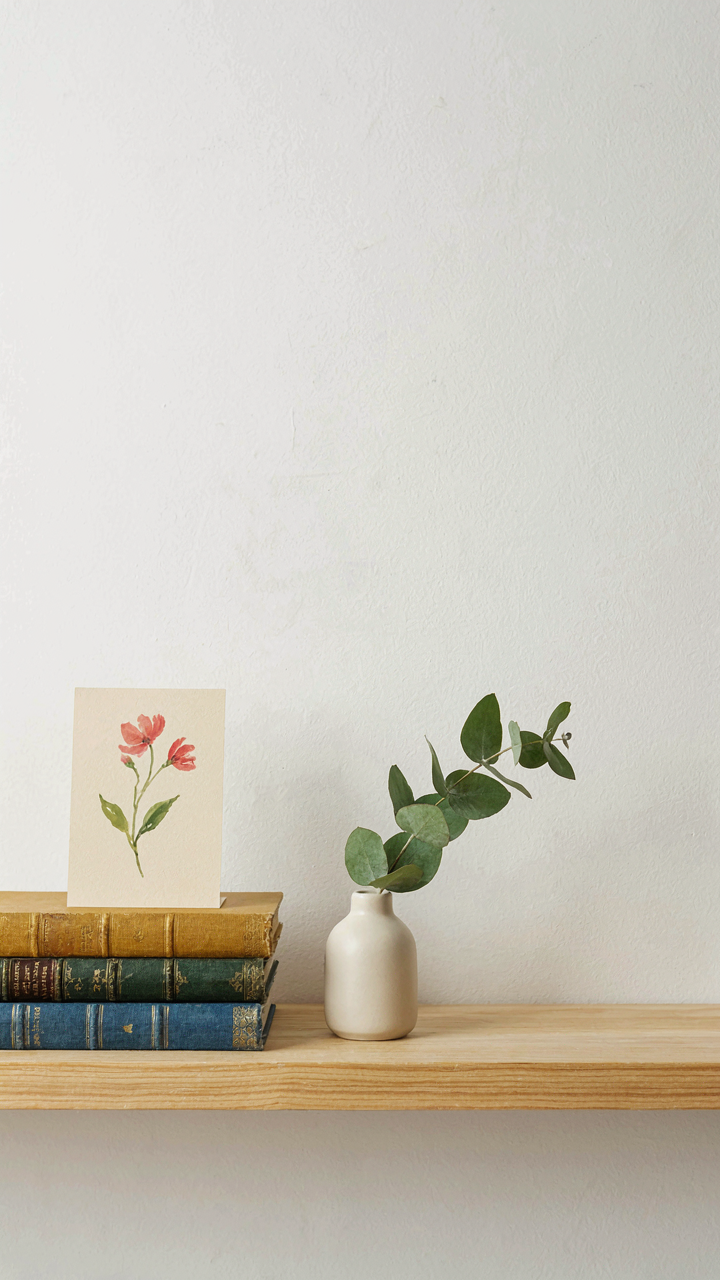
You want people to notice the art, not the room. That’s the real problem nobody states. The mechanism is spatial hierarchy: botanical illustrations only land when they compete with nothing else for visual weight. A framed piece on a blank wall screams “I hung something.” The same piece anchoring a shelf, layered with objects of varying scale and material, becomes part of the environment instead of interrupting it.
Stop treating botanical art like a solo performer on stage. Pair illustrations with objects that share their visual language—ceramic vessels, wooden boxes, dried plant material in glass. The illustration stops being decoration and starts being evidence of a coherent point of view. Scale matters. A small delicate botanical watercolor drowns against a massive wall. That same piece on a narrow shelf, paired with a small vessel or book, claims its space without apology.
Spatial Layering For Depth And Presence
Building immersive botanical experiences means controlling how the eye moves through space and time. You don’t flood a room with botanical imagery. You create stations where botanical art functions as the anchor for a small, intentional ecosystem.
- Shelf arrangements: Position illustrations at varying heights with objects in front, allowing depth. The botanical print becomes background structure, not the main event.
- Wall clusters: Group 3-5 pieces of different sizes and mediums on one wall zone. Negative space between frames matters as much as the frames themselves.
- Botanical objects as anchors: Place actual dried specimens, seed pods, or pressed plants near corresponding illustrations. The real object validates the representation.
- Transition zones: Position botanical art in hallways, entries, and stairwells where people slow down naturally. These spaces demand less visual competition than living areas.
- Lighting as integration: Place illustrations where natural light hits them at specific times. Changing light reveals details and prevents the art from feeling static.
The real work happens when you stop thinking about hanging art and start thinking about creating pockets of attention. Each botanical arrangement should feel discovered, not announced. Mount pieces at eye level when seated, not standing. The person who finds the illustration while sitting with coffee experiences it differently than someone scanning a wall at full height.
The Collector’s Manifesto: Investing In Antique Botanical Prints With Purpose
What Actually Separates Real From Fake
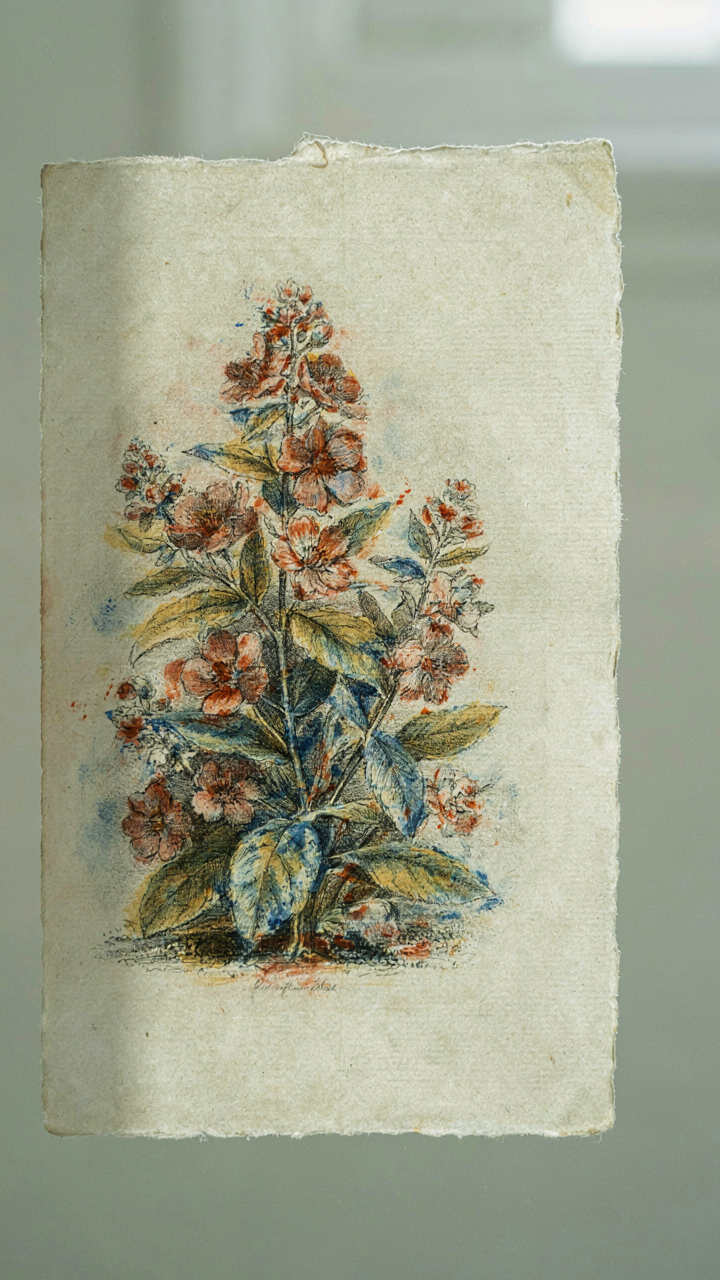
You want to believe you’re building something valuable, not just hanging expensive decoration that loses money. Here’s the mechanism: antique botanical prints hold value because they combine scarcity, historical documentation, and production cost. A hand-colored lithograph from the 1800s required skilled labor and expensive materials. Reproductions flood the market now, so the gap between genuine and fake determines whether you own an asset or an expense.
Examine the paper first. Antique prints use rag paper or laid paper with visible chain lines when you hold it to light. Modern reproductions sit on smooth wood pulp that yellows predictably. Check the printing technique by looking at the back. Hand-colored lithographs show pigment seeping through slightly. Check publication information: legitimate prints include the artist, lithographer, date, and printer’s mark. If that information is missing or vague, the piece likely never existed as an original edition.
Building Without Collecting Blindly
Most advice tells you to follow your taste. That’s incomplete. Economics teaches portfolio diversification—apply it here. Don’t buy five prints of the same plant family or artist. You’ll own redundancy instead of range.
Start by establishing which botanical illustrators matter historically. Pierre Joseph Redouté dominated rose documentation in the early 1800s. John James Audubon changed bird illustration through anatomical precision. Maria Sibylla Merian pioneered metamorphosis illustration across insects and plants. Buy one original print from a established illustrator if budget allows. If not, acquire a quality facsimile from a museum or scholarly publisher, then upgrade to originals as capital builds. Track your purchases in a spreadsheet noting artist, species, date, edition size, and price paid. This becomes your personal provenance record and investment benchmark.
Your Fear Isn’t Bad Art; It’s Irrelevant Art. The True Obstacle Is Ignoring Your Unique Vision
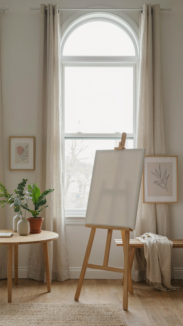
Most people kill their botanical illustration decor before it starts by chasing what works for everyone else. The shift you need isn’t technique or confidence. It’s permission to make something that only you would make. Stop waiting for your style to materialize. Take one plant you actually care about today and sketch it badly on a piece of paper. Hang it anyway. Your vision is only irrelevant if you never let it exist.