

The Illusion Of The Perfect Wedding Color Palette
Why Conventional Color Matching Fails Wildflowers
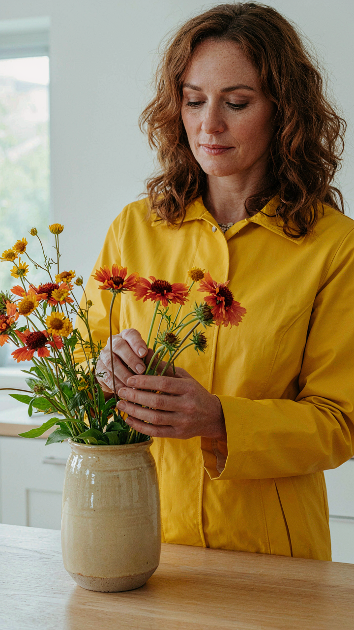
You want a guarantee that your wildflower arrangement will photograph well and look intentional, not like you grabbed whatever bloomed first. Here’s the problem: color theory rules—the ones designers teach about complementary pairs and saturation harmonies—assume controlled materials. Wildflowers reject that assumption. Each stem carries genetic variation in pigment. A batch of Indian Blanket flowers this season won’t match last season’s shade. Pantone swatches don’t account for the living variance baked into natural growth. That’s the mechanism killing the conventional approach: you’re treating biology like it’s a paint chip.
The real damage happens when you force wildflower selections to fit a predetermined palette. You end up rejecting viable blooms because they’re half a tone off spec. This creates artificial constraints that strip the arrangement of textural interest and movement. Wildflowers work precisely because they don’t coordinate—they coexist. The moment you impose graphic design rules onto living material, you’ve already lost. Your job isn’t to match colors. It’s to recognize which natural variations strengthen the overall presence of the piece.
Embracing Natural Discord For Genuine Style
Graphic designers call this principle “controlled chaos,” borrowed from chaos theory in mathematics—the idea that within apparent randomness exists an underlying order. Wildflower arrangements operate the same way. A purple Coneflower next to a coral Blanket Flower creates visual tension that feels alive, not confused, because both colors anchor to earth tones in their undertones. The discord reads as intention because it mirrors how wildflowers actually grow in nature. Monoculture arrangements always look staged. Mixed-palette arrangements look collected.
The protocol is simple: stop pre-selecting colors and start identifying color families instead. Warm families, cool families, neutral families. Within each family, natural variation becomes an asset, not a defect. A bouquet pulling from warm family wildflowers—Gaillardia, Coreopsis, Helenium—will cohere even if individual flowers deviate slightly in hue. You layer in a single cool accent stem to create focal contrast, then let the rest breathe. This approach works because it surrenders to wildflower biology rather than fighting it.
Deconstructing The Wildflower Wedding Theme Myth
Beyond Rustic Redefining Wildflower Aesthetics
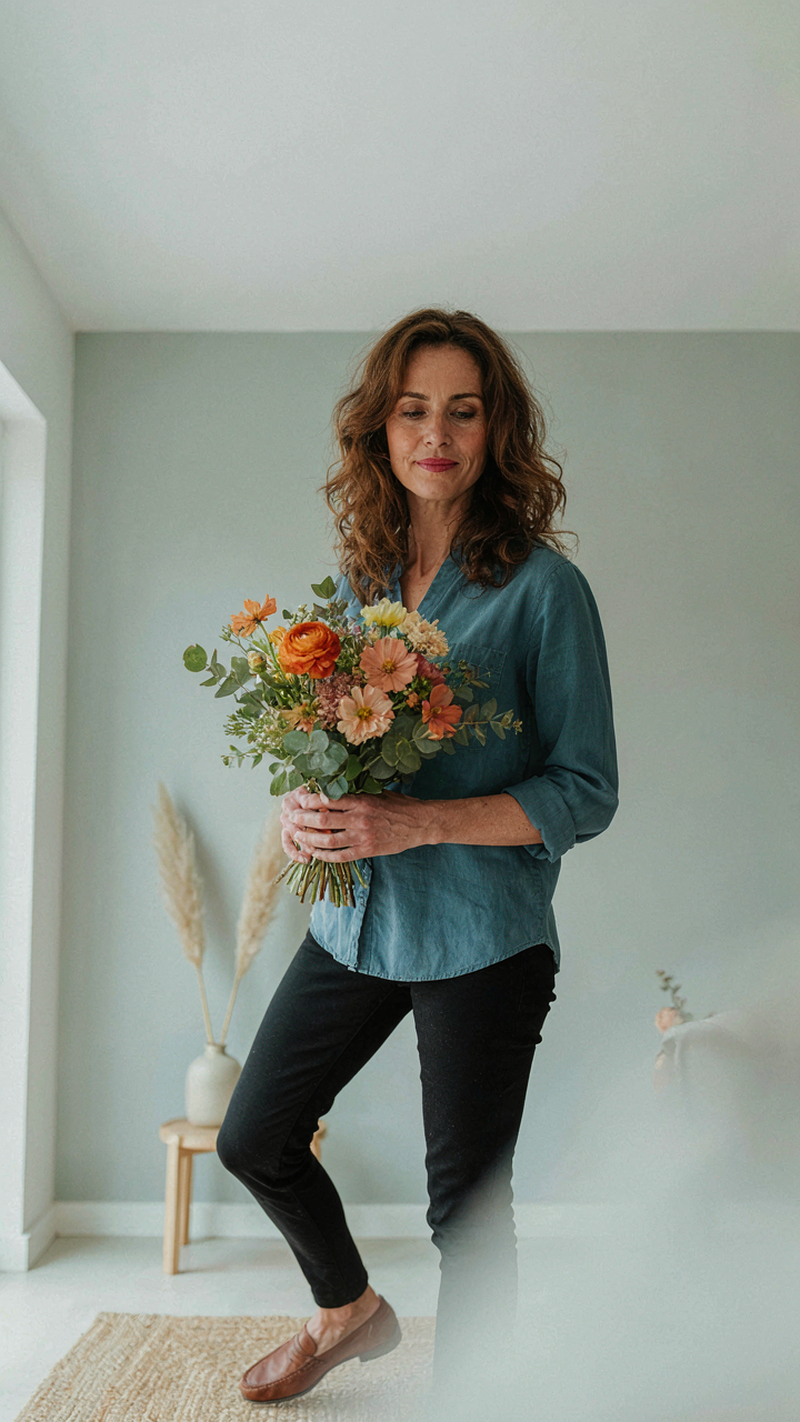
You want permission to use wildflowers without looking poor. That’s the real question underneath. The mechanism is simple: wildflowers became a status symbol the moment Instagram made “intentional imperfection” marketable. Borrowing from ecology, wildflower palettes work like ecological succession—early-stage blooms create visual chaos, but the real design skill lies in recognizing which color combinations have structural stability and which collapse under scrutiny. Most people assume wildflowers mean throwing random stems together. Wrong. Wildflower bouquets that land in styled homes follow deliberate color clustering, not accidental mixing.
The distinction matters because aesthetic credibility lives in the details. A wildflower bouquet with purpose uses color relationships that mirror natural growth patterns: complementary tones from plants that actually bloom together in specific regions, not flowers purchased from four different continents and shoved into one vase. Deep purples with pale yellows work because they emerge from the same soil conditions. Rust-red with cream works because those plants occupy the same ecological niche. The execution requires knowing which wildflower species produce which pigments, then building palettes around biological fact rather than trend.
Authenticity Over Forced Themes
Forcing a wildflower narrative into your home because a design blog said it’s “in” creates visual friction. Your space signals inauthenticity the moment guests sense you’re performing a role instead of making a choice. The real mechanism operates through consistency: if your home’s color story doesn’t align with wildflower palettes, no bouquet fixes that. Your walls, furniture, and existing art must support the palette you’re introducing, or the flowers become decoration fighting against the space rather than completing it.
Authenticity means asking what wildflower colors actually complement your home’s existing structure. If you live in a minimalist space with grays and whites, a vibrant multicolor wildflower arrangement creates visual conflict. If your home runs warm with terracottas and deep greens, wildflower palettes with rust, sage, and soft orange integrate seamlessly. Start by photographing your primary living space in natural light, identify your dominant three colors, then source wildflower arrangements that echo those tones rather than contradict them.
The Ecosystem Palette Protocol For Spring Wedding Colors
Nature Designs Systems, Not Collections
You want your wildflower bouquet to look intentional instead of accidental because status lives in restraint. Here’s the mechanism: ecology is the study of relationships between organisms and their environment. In wildflower bouquet color palettes, this translates directly to dominance and support. One color must occupy the visual territory like a keystone species. The rest follow a strict hierarchy rather than compete equally.
Most people throw colors together assuming variety equals beauty. That’s backwards. Nature never builds cohesion through randomness. It builds it through a single organizing principle: one dominant plant establishes the ecosystem’s character, secondary plants reinforce it, and accent plants fill gaps without challenging the structure. Your palette needs the same architecture.
Applying Ecological Hierarchy To Color Selection
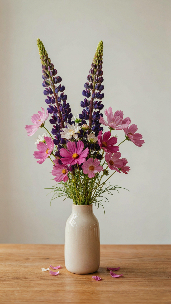
Dominant colors in spring wildflower bouquets serve as the ecological foundation. Lupine purples, Indian paintbrush reds, and buttercup yellows perform this role because they occupy maximum visual space when massed. Secondary colors support without competing. Pale prairie crocuses, soft cosmos, or cream-colored Queen Anne’s lace provide contrast while reinforcing the dominant hue’s presence. Accent colors appear sparingly and only where they emphasize the palette’s core tension.
The protocol works like this: select one dominant wildflower species by color, limit secondary colors to two maximum, restrict accents to one. This isn’t a creative constraint. It’s how vegetation actually stabilizes itself. Skip this hierarchy and your bouquet reads as confused, not eclectic. The viewer’s eye never settles because no color earned the authority to lead.
Unpacking Spring Wedding Color Palette Fails
When Pastels Become Visual Noise
You want your bouquet to photograph well and feel expensive. That’s the real driver here. But the consensus move—loading spring arrangements with blush, cream, and sage—actually does the opposite. It creates visual mud. In design, we call this low contrast. A bouquet with no tonal separation reads as one flat, forgettable mass instead of a composed arrangement. Wildflower bouquets suffer most from this trap because their natural variety demands structure, not suppression.
The mechanism is simple: your eye needs stopping points. Pastels remove them. When every element sits in the same brightness range, nothing commands attention. A spring wildflower bouquet full of pale pink cosmos, light purple statice, and cream yarrow becomes visually exhausting to look at, not restful. The eye searches for an anchor and finds none. You need at least one element that breaks the pastel plane—a deeper tone, a contrasting hue, or genuine white space between stems.
High Contrast Cuts Through The Aesthetic Clutter
Spring doesn’t require softness. It requires clarity. Bold pairings—deep burgundy ranunculus with bright yellow solidago, navy delphiniums with coral wildflowers—create immediate visual hierarchy. Your bouquet stops looking like everything else on Instagram. Contrast isn’t aggression. It’s information. It tells the viewer where to focus and why the arrangement matters.
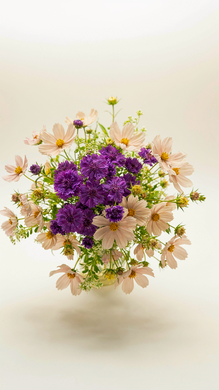
The practical application: identify your primary wildflower first, then choose one complementary tone that sits three to four stops darker or lighter on the value scale. Deep purple bachelor’s buttons paired with pale peach cosmos work. Mustard yarrow against navy lisianthus works. The secondary colors don’t need to match a traditional palette. They need to create a visual break. This single protocol separates styled bouquets from generic ones.
June Wedding Blooms: Beyond The Expected
What Grows Now, Not What Looks Good
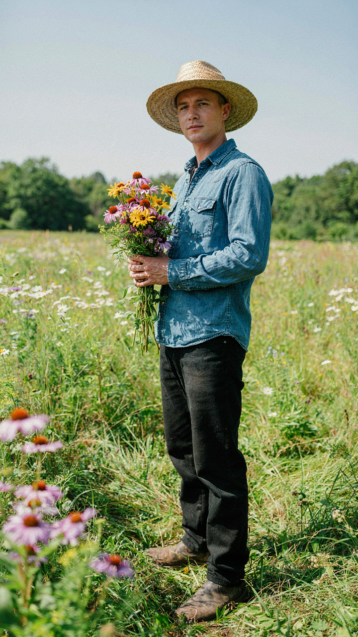
You want your June bouquet to feel intentional, not like you ordered from a catalog. That’s the real fear underneath—looking generic. Here’s the mechanism: most people choose flowers based on what photographs well or what’s traditionally associated with weddings, not what actually thrives in June. This creates sameness. Seasonal diversity works like ecological succession in biology—each species occupies its niche at a specific time, and fighting that costs money and limits your palette depth.
June wildflowers follow predictable blooming windows. In northern regions, you get peonies, roses, and early salvias. In southern zones, zinnias start appearing alongside native coreopsis. The palette you access depends entirely on your latitude and local growing conditions. Ignoring this forces you into imported, out-of-season stock that costs more and looks tired. The constraint is actually your advantage—work within what grows naturally and your bouquet gains coherence that forced combinations never achieve.
Source Locally, Design Distinctly
Skip the narrative that local flowers are “more sustainable” or “better for the environment.” That’s marketing noise. The real benefit is specificity. A florist pulling from regional wildflower abundance in June creates palettes impossible to replicate elsewhere because the actual species mix is unique to that place and time. You’re not designing for universal appeal—you’re designing for authenticity tied to geography.
Most regions have native wildflower species peaking in June that most florists won’t mention because they require relationships with local growers or foragers. Purple coneflower, black-eyed Susan, lupine in cooler zones, or blanket flower in drier climates create color stories that mass-market florists can’t access. Call local growers directly. Ask what blooms heavily in June. Build your palette from that list, not from what you want in theory. This approach guarantees your bouquet reflects actual local abundance rather than wishful thinking.
The DIY Wedding Bouquet: Strategic Color Selection
Dominant Hues Over Matching Everything
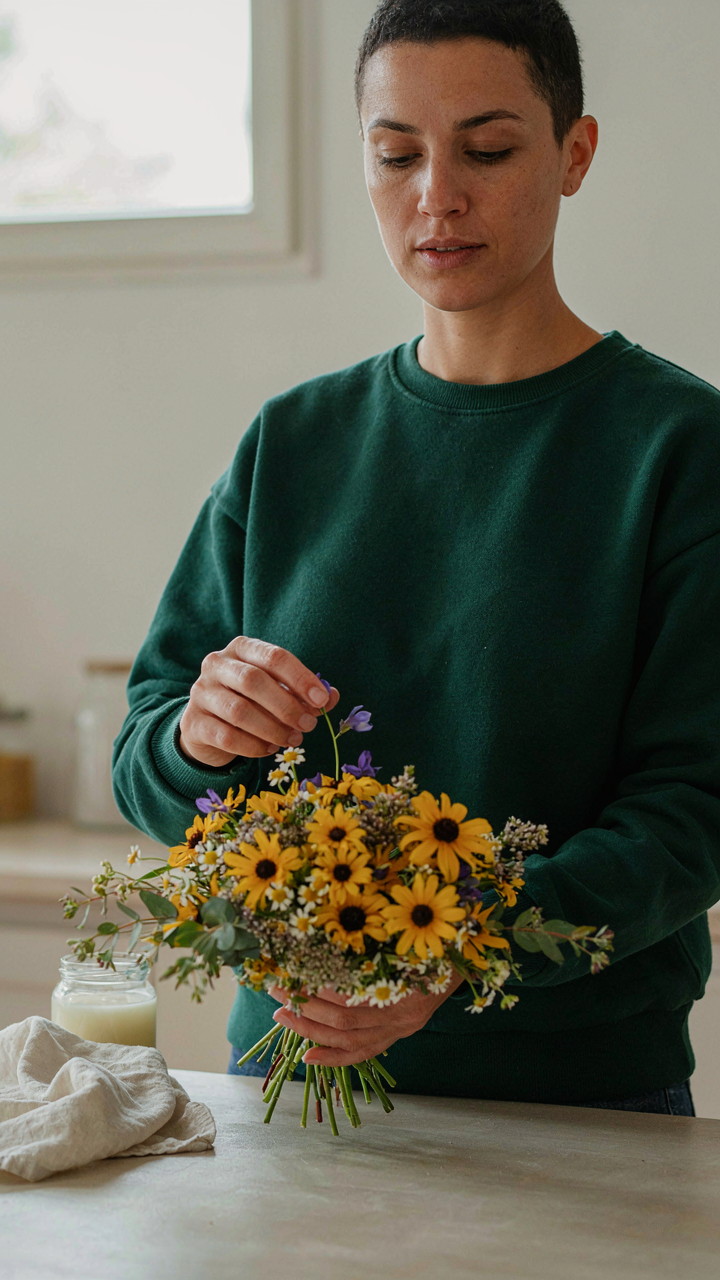
You want your bouquet to look intentional instead of accidental, which is why you’re reading this instead of just grabbing whatever’s in season. The mechanism is simple: your eye needs a clear anchor. In design hierarchy, the dominant color functions like the bass line in music—it sets the foundation everything else sits on top of. Most people reverse this by trying to match five flowers perfectly, which creates visual noise instead of cohesion.
Pick one color family and commit to it. That’s your dominant hue, occupying 50 to 60 percent of the bouquet’s visual weight. Wildflower palettes naturally support this because species cluster around warm or cool tones. Rudbeckia and blanket flower anchor warm schemes. Cornflower and delphinium anchor cool ones.
- Warm Dominants: Golden yellows, burnt oranges, deep reds. Use grasses and seed heads to extend the warmth without adding competing flower shapes.
- Cool Dominants: Purples, blues, soft pinks. These recede visually, so you need more volume to achieve presence without overcrowding the hand.
- Neutral Anchors: Cream, white, pale green. These work as dominants when you’re uncertain—they let secondary colors drive the story instead.
- Saturation Control: Match saturation levels across your chosen hue. A pale pink next to hot pink reads as a mistake, not a choice.
- Shape Repetition: Use the same dominant flower type in 3 to 5 stems minimum. This reinforces the hierarchy faster than color alone.
The bouquet holds together when your eye lands on the dominant color first, then moves to secondaries. Stop treating every flower as equal. Hierarchy is how you avoid the “grabbed at random” look.
Visual Tension Through Accent Colors
Tension in composition—borrowed from graphic design—means the viewer’s eye moves intentionally, not settling into boredom. A single accent color creates that friction. This isn’t about complementary color theory, which is half-true and overcomplicated. Tension happens when one element breaks the expectation you’ve established.
Place your accent color opposite the dominant one directionally, not on the color wheel. If warm yellows cluster on the left side of the hand, a small violet or deep burgundy stem on the right pulls the eye across. You’re not creating balance. You’re creating movement. The accent occupies maybe 10 to 15 percent of visual real estate but controls where attention travels. This is why a single stem of scabiosa or a tight cluster of small dark flowers rewires an entire arrangement’s energy without adding bulk.
Wildflower Wedding Activities: Integrating Your Palette
How Floral Choices Shape The Room’s Rhythm
You want your guests to feel like they’re in a designed space, not a random arrangement of flowers. Here’s what actually matters: wildflower palettes control visual flow and pacing through physical space the way rhythm controls music. Blues and purples recede, creating depth and slowing perceived movement. Warm oranges and yellows push forward and accelerate attention. This isn’t metaphor—it’s how human vision processes color temperature and saturation under specific lighting conditions.
The mechanism works through guest behavior. Warm-toned wildflower centerpieces draw people toward tables faster. Cool-toned arrangements make crowds linger in foyer areas longer. Monochromatic palettes (single-family colors like all purples with white filler) create formal zones people move through efficiently. Mixed palettes with high contrast stop people mid-stride to look closer. You choose this, not your florist. Most event planners never name this because they haven’t mapped it deliberately.
Extending Color Beyond The Table
Everyone puts flowers in a vase and calls it done. That’s incomplete thinking. Your wildflower palette functions as your event’s visual language across every touchpoint: ceremony arch, gift table, bar backdrop, even the exit space. Consistency here signals intentional design, not accident.
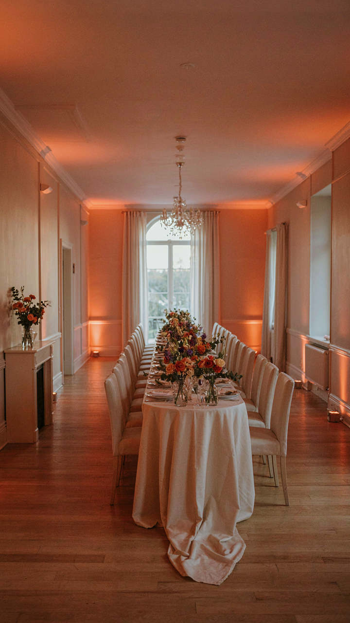
Pull your palette’s dominant color into linens, signage, and lighting gels. If your wildflowers are rust, violet, and cream, tint uplighting amber-warm and use linen runners in cream. Guests perceive this as cohesion, not decoration. The action step: choose your three-color palette first, then assign each color a zone in the venue before ordering flowers. This prevents the common trap of beautiful arrangements that fight everything around them.
The Anti Palette: Redefining Wildflower Bouquets

Certain Flowers Repel Each Other
You want permission to break the rules without looking careless. That’s the real fear here. The mechanism is contrast ratio: wildflowers exist on a spectrum of saturation and temperature, and pairing flowers from opposite ends of that spectrum creates visual noise instead of harmony. A deeply saturated magenta cosmos next to pale dusty miller doesn’t balance—it fragments. The problem isn’t that they’re different. It’s that they have no common language.
Stop treating wildflower bouquets like permission slips to throw everything together. Flowers that clash share one trait: they compete for attention rather than build it. Coral-toned gaillardia paired with cool-blue delphinium forces the eye to choose sides instead of moving through the arrangement. The real move is recognizing which flowers anchor a palette and which ones destabilize it. Anchor flowers stay steady across multiple arrangements. Destabilizers work only in rare conditions.
Impact Demands Constraint
Breaking conventions requires understanding what you’re breaking. Most advice tells you to follow color theory like it’s gospel. That’s incomplete. Color theory applies to paint and light, not dried stems and petal translucence. Wildflower bouquets live in daylight that changes. Your palette needs to account for how backlighting shifts warm tones toward orange and cool tones toward gray. Sunlit arrangements read differently than interior arrangements, and most people design for one context only.
Design for impact means eliminating what doesn’t earn its place. If a single flower doesn’t improve the arrangement by its presence, it degrades it by its absence of contribution. This is the mechanism: each flower must either anchor color, create transition, or generate focal point. Nothing else matters. Remove flowers that only add volume. Build your arrangement by defining these three roles first, then select species that fill them. Let the palette emerge from function, not from preference.
The Only Thing Holding Your Wildflower Bouquet Back Is Your Need For Control

You’re overthinking the palette. The real shift happens when you stop treating wildflower colors like a math problem and start trusting the chaos. Nature didn’t ask permission before mixing magenta with mustard. Go buy a bouquet today that makes zero sense on paper. Put it in your space. Live with it for three days. You’ll realize the best color palette is the one you actually stop apologizing for.