Introduction
A metrics dashboard is a powerful tool for tracking growth and performance in your business. This tool allows you to visualize important data all in one place. With a well-designed dashboard, you can monitor key performance indicators (KPIs) and make informed decisions. This seamless access to data can drastically improve your business strategies.
Creating and utilizing a metrics dashboard requires an understanding of what data matters most to your goals. It’s not just about collecting data but presenting it in a way that sparks action. By focusing on relevant metrics, you can pinpoint areas for improvement and steer your business toward success. This article will help you explore how to effectively use a dynamic metrics dashboard.
Understanding Metrics Dashboards

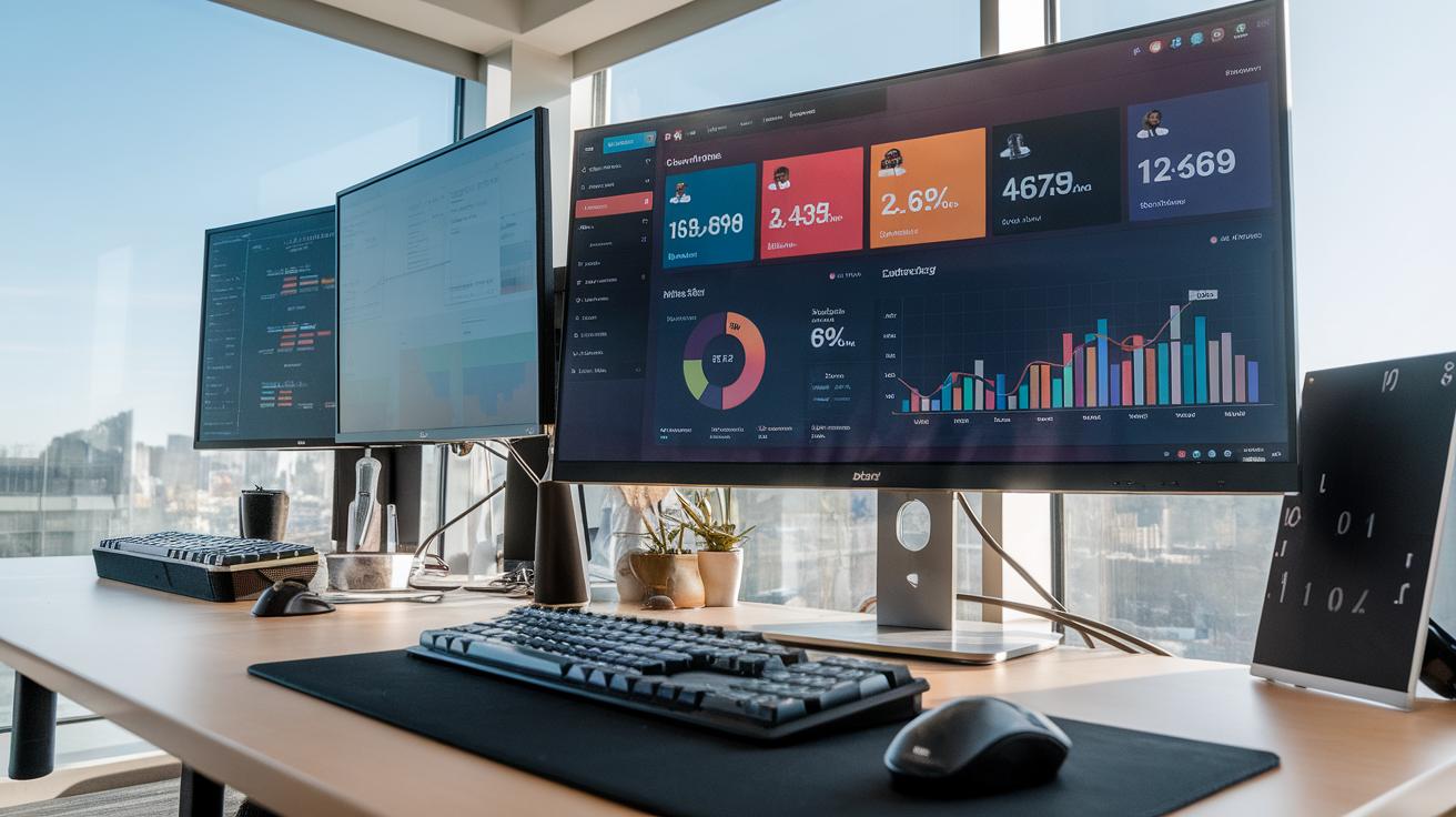
A metrics dashboard is a visual tool that displays key performance data for a business. Its main purpose is to simplify the understanding of complex data by presenting it in an easily digestible format. By combining various visual elements like graphs, charts, and tables, dashboards provide a comprehensive overview of business performance. You can instantly see where your company stands in relation to its goals.

When you use a metrics dashboard, you gain access to real-time data that helps inform important decisions. For example, a sales dashboard could show current sales figures, conversion rates, and customer feedback, all in one place. This allows you to quickly identify trends and areas needing improvement. Have you ever wondered how faster access to data could change your decision-making process? Dynamic dashboards can transform how you monitor growth, making them an invaluable asset in today’s competitive market.
Choosing Key Performance Indicators

Understanding the Right KPIs
Identifying the right Key Performance Indicators (KPIs) is critical for your metrics dashboard. Start by considering your business goals. What are you trying to achieve? Whether it’s increasing sales or improving customer satisfaction, align your KPIs with these targets. For example, if expanding your customer base is a goal, tracking new customer acquisition rate can provide useful insight.
Next, make your KPIs measurable and clear. Avoid vague terms. Instead of “increase revenue,” use “increase monthly sales by 10%.” Keep your dashboard focused. Too many KPIs can overwhelm. Limit your selection to those that provide actionable insights, helping you assess progress toward your goals effectively.
Involving Your Team
Engage your team in the selection process. Gather input from different departments, as they may have unique perspectives on what matters most. Ask them which metrics they find valuable in their roles. This teamwork fosters ownership and motivation. Regularly review your KPIs to maintain relevance. Business goals can change, so ensure your metrics stay aligned with your evolving objectives.
Designing an Effective Dashboard

Principles of Effective Dashboard Design
Creating an effective dashboard involves clear design principles. Start with clarity. Each metric should have a specific purpose. Avoid clutter by limiting the number of visuals. Display only what you need at a glance. This helps you focus on key data without distractions.
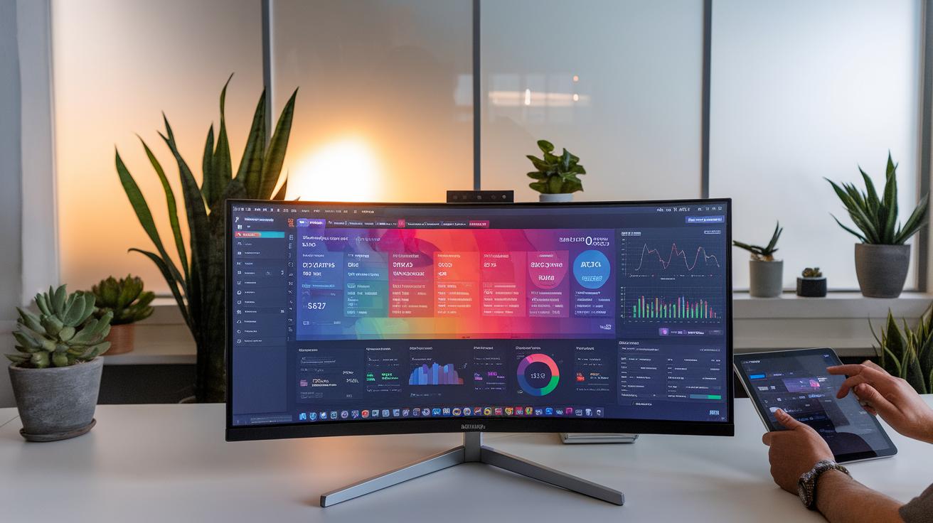
Simplicity is vital. Use straightforward layouts that guide the eye naturally. Group related metrics together. For instance, put sales figures and customer feedback side by side. This keeps the information relevant and easily understandable.
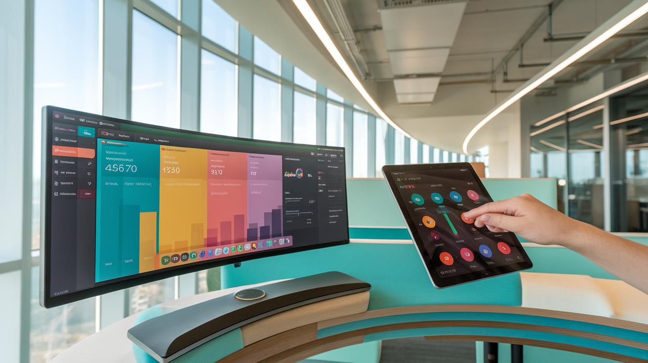
Usability matters too. Engage users with interactive elements like filters or drill-down options. You could let users view data by region or time frame. This capability allows for deeper insights and encourages exploration of the data.
Visual Elements That Enhance Understanding
Choose visual elements wisely. Bar charts can show progress over time, while pie charts illustrate proportions. Stick to a consistent color palette. This makes your dashboard visually appealing and easy to interpret. Avoid using too many colors, which can confuse the viewer.

Ask yourself: Do the visuals effectively communicate the message? Solicit feedback from users to improve the design continually. A dashboard is not static; it should evolve based on user needs and business goals. Keeping users in mind fosters better engagement and practical use of data.
Integrating Data Sources

Finding ways to combine different data sources into your metrics dashboard can significantly improve your business insights. Start by identifying the data sources you want to include, such as sales data, customer feedback, and website analytics. Use integration tools or software that can connect these sources seamlessly. This process ensures your dashboard presents a unified view of your performance metrics.
A comprehensive view allows you to spot trends quickly. For instance, if your sales are increasing but customer satisfaction declines, you can address problem areas promptly. You can track the performance of various departments on one screen rather than searching through multiple reports. Do you want to make better decisions? Integrating data sources simplifies your analysis and makes it easier to understand how one aspect of your business impacts another.
Analyzing Dashboard Data

You need to know how to analyze data in your metrics dashboard. Start by understanding what each metric represents. Look at trends rather than just numbers. For example, if you see sales increasing over three months, that indicates growth. A single spike may not tell the full story.
Break down complex data into smaller pieces. For instance, if your dashboard shows overall website traffic, dig deeper into which sources brought visitors. Are they coming from social media or search engines? This insight can help you decide where to focus your marketing efforts.
Ask yourself questions to guide your analysis. What patterns appear over time? Which metrics align with your business goals? Pay attention to outliers or anomalies, as they usually point to important issues. By doing this, you turn raw data into useful information.
Continuous Improvement with Your Dashboard

Regularly updating your metrics dashboard leads to better decision-making. You can’t make informed choices with outdated information. Set specific intervals for reviews. Monthly evaluations help identify trends and gaps. Don’t wait for issues to arise. Proactively adjust your metrics based on feedback from your team.

Incorporate suggestions from users of the dashboard. Are there metrics that aren’t useful? Replace them with ones that provide more insight. Keep the purpose of the dashboard clear: it should drive performance based on real-time data. Implement a method to gather user feedback after training sessions. What features are confusing? Address these areas promptly.
Tracking changes over time helps refine your dashboard. Collect data on how your updates affect team performance. Measure success through improved metrics that align with your goals. Encourage an environment where team members feel comfortable sharing their insights. This collaborative effort drives continuous improvement.
Case Studies of Successful Dashboards

Lowe’s: Inventory Visibility and Automation
Lowe’s modernized its digital ecosystem with a real-time sales and stock dashboard built in collaboration with Corra. By unifying inventory data across stores and online channels, the dashboard surfaced low-stock alerts and demand trends, enabling buyers to adjust orders and store managers to rebalance stock instantly. Within six months of rollout, Lowe’s recorded a 15 % reduction in order cancellation rates and linked 29 % more transactions to customer accounts, thanks to clearer visibility and automated reorder triggers.
Salesforce: Marketing Attribution and ROI Gains
Salesforce replaced fragmented campaign reporting with an attribution-modeling dashboard that pulled in spend and performance metrics from all its digital and offline channels. Marketers could now see click-through and conversion rates side by side, identify high-value touchpoints, and reallocate budget in near real time. In just one quarter, Salesforce drove a 10 % lift in revenue and boosted overall marketing ROI by 5 % through data-driven channel optimization.
Zendesk Customers: Data-Driven Service Excellence

A broad range of companies adopted Zendesk Support’s dashboards to track customer satisfaction (CSAT) scores, case volumes, and first-response times on a single pane. By monitoring these KPIs and surfacing at-risk tickets automatically, support teams could resolve issues faster and proactively address common pain points. Organizations using Zendesk Support saw a 15 % increase in customer satisfaction and a 20 % reduction in service costs over two quarters
Future Trends in Metrics Dashboards

AI Integration
The integration of AI in metrics dashboards is changing how businesses view their data. AI can process large volumes of information quickly, offering insights that manual analysis might miss. For instance, predictive analytics can forecast future trends based on historical data. Imagine identifying a potential drop in sales before it happens. With AI, your dashboard can alert you, allowing proactive measures.
Real-Time Data Analysis
Real-time data analysis is essential for making quick decisions. Businesses no longer have to wait days for reports. Streaming analytics presents live updates on key metrics. This immediacy enables you to react to market changes promptly. For example, if a marketing campaign performs poorly, you can adjust your strategy within hours instead of days. This speed can significantly improve your competitive advantage.
Enhanced User Experience
Dashboards are becoming more user-friendly. Customization options allow users to tailor their views to focus on metrics that matter most to them. You can create your layout, ensuring that vital information is front and center. This personalization promotes better understanding and engagement. Simple navigation and clear visualizations make it easier to interpret data, which boosts overall effectiveness in decision-making.
Conclusion and Next Steps

Key takeaways highlight the power of a dynamic metrics dashboard for monitoring growth and improving business insights. You can track essential performance metrics easily. Customizing your dashboard lets you focus on what matters most for your business. Use data visualization tools to make your information clear and engaging. This helps in making informed decisions quickly.

Actionable steps begin with identifying which metrics are most critical for your goals. Set specific targets to measure progress effectively. Regularly review and adjust your dashboard to reflect changes in your business needs. Encourage your team to engage with the metrics and provide feedback on the dashboard’s usability. How frequently do you analyze your performance? Consider this: improving your dashboard and updating metrics can enhance your business strategy significantly.
Conclusions
Employing a metrics dashboard can significantly elevate how you monitor and structure your business’s growth. The ability to visualize data and engage with KPIs transforms decision-making from guesswork to strategy. You gain a clearer perspective on your performance across various areas, paving the way for actionable insights.
As you implement your metrics dashboard, remember to regularly review and adjust the metrics you focus on. Business environments change, and your dashboard should evolve. Keeping your dashboard relevant ensures you always have your finger on the pulse of your organization.