
The Botanical Narrative Protocol: More Than Just Pretty Pictures
Story First, Plants Second
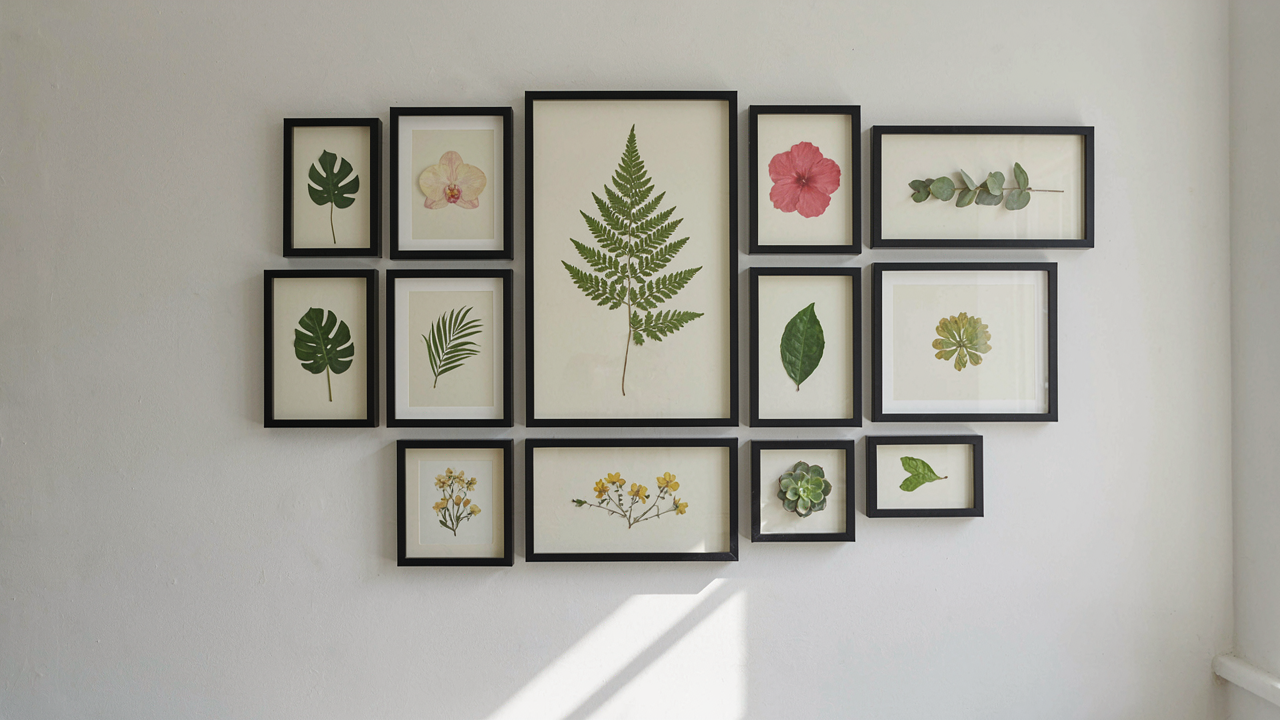
You want people to remember your space instead of scrolling past it. Most people treat gallery walls like decoration inventory, hanging whatever botanicals fit the wall size. That’s not strategy. That’s visual noise. The mechanism is narrative constraint: you’re building a story arc with plants, not filling a frame. Just like sequential art moves a reader through panels, a gallery wall moves the eye through a deliberate sequence of species, colors, and compositions that create meaning instead of clutter.
Start by identifying the emotional or thematic core before you pick a single frame. Are you showing the progression from seed to mature plant? Contrasting plant families side by side? Building a color story from pale to saturated? The theme becomes the filter. Everything else gets rejected. This eliminates the paralysis of infinite choice and forces discipline into the layout. When you have a clear narrative anchor, placement becomes obvious instead of arbitrary.
Tension Through Emptiness
The common advice is to fill the wall. It’s also wrong. Design borrows heavily from physics: pressure and resistance create force. In gallery wall terms, negative space is the resistance that makes your botanicals legible. A wall packed with frames creates visual fatigue. Strategic gaps between frames, white wall showing through, force the viewer’s eye to land on what matters instead of scanning an undifferentiated field.
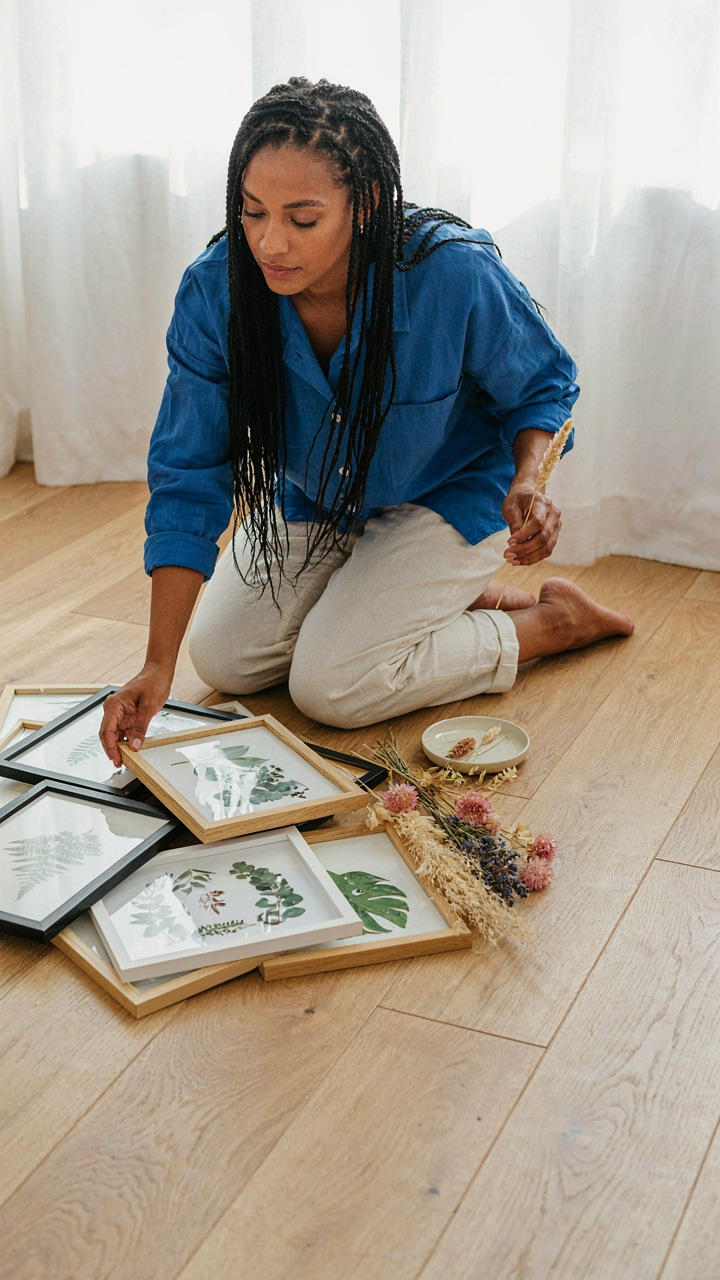
The tactic is deliberate asymmetry. Cluster frames tightly on one side or in the upper quadrant. Leave the lower or opposite side visually open. This imbalance compels attention toward the clustered area. Vary frame widths and botanical specimen sizes within your layout. Small pressed flowers next to oversized leaf specimens create rhythm. Test the layout on the floor first. If your eye wants to move through the arrangement instead of resting on a single spot, the tension is working.
Deconstructing The Plant And Photo Wall: Beyond Hobbyist Collections
Selecting Images That Trigger Recognition, Not Just Approval
You want people to think you’re cultured. That’s the real reason this matters. But the mechanism that actually works is cognitive resonance, not aesthetic agreement. Borrowed from neuroscience: activation energy is the threshold required for a neural pathway to fire. Your gallery wall’s images need to trigger recognition pathways in your viewer’s brain, not just land as “nice to look at.” This means choosing photographs and botanical prints that connect to lived experience, memory, or archetypal knowledge rather than trend-validated aesthetics.
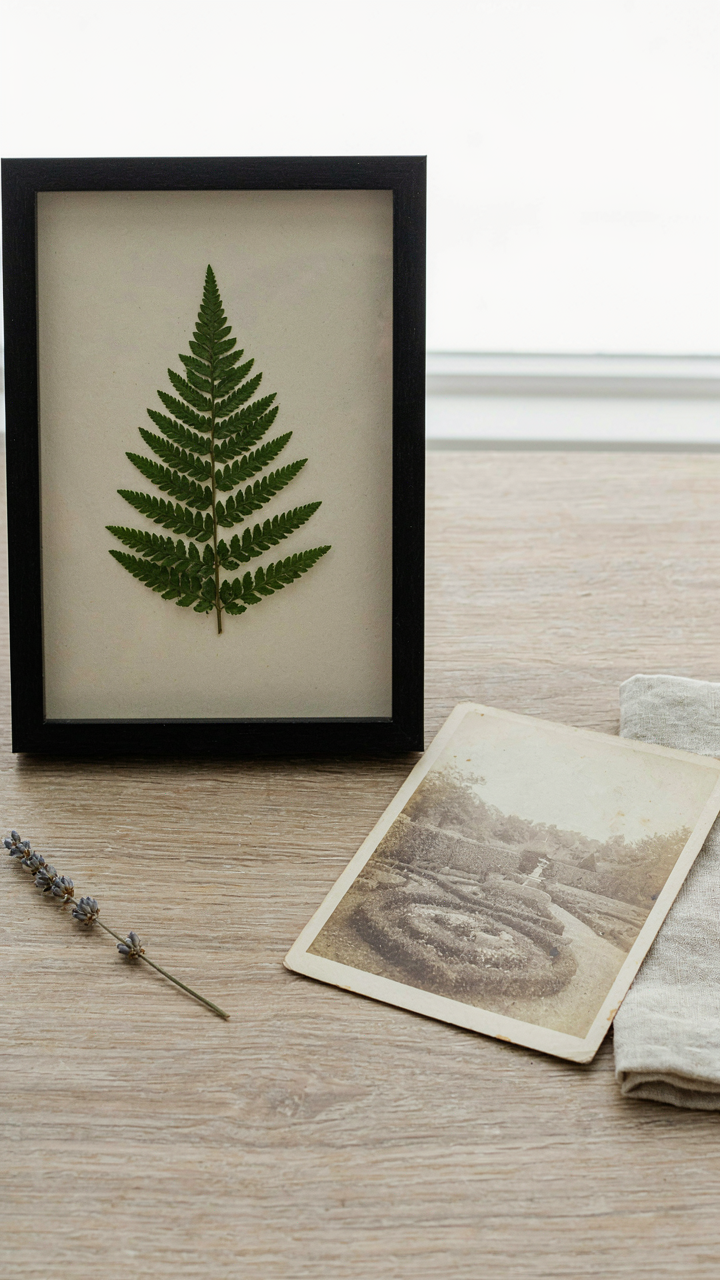
The common advice here is garbage: “Choose what speaks to you” or “Go with colors that match your space.” That’s decoration advice, not psychological design. What actually moves a viewer is specificity tied to universal experience. A pressed fern from a hike your family took decades ago creates neural activation in viewers because it signals something real. A mass-produced botanical print of a plant nobody knows registers as decoration. The difference is the presence of genuine historical or personal context embedded in the image. You curate by asking one question per piece: What truth or memory does this encode that someone else can sense, even if they don’t consciously know it?
Embedding Personal History Into Visual Language
Plant symbolism exists across cultures, but most people deploy it as window dressing. The real leverage is treating your gallery wall as a visual autobiography that reads as botanical. In semiotics, the study of signs and symbols, a sign carries meaning through three layers: icon (what it looks like), index (what it points to), and symbol (what it represents). Your wall should stack these layers deliberately. A photograph of climbing ivy isn’t just a plant image. It becomes an index pointing to a specific house or season, a symbol of patience or entanglement, an icon of the vine itself.
To integrate personal history without it looking like nostalgia you’re forcing on people, you control the ratio of legibility. Include one or two images that directly reference your history, then surround them with botanical imagery that echoes the same visual language without explaining itself. A pressed flower from a meaningful moment. A photograph of your grandmother’s garden. A print of the plant species that grows in your region’s native landscape. The pieces don’t announce their personal meaning. They coexist in a visual ecosystem that someone can sense as coherent without needing the backstory. The protocol: map three moments or places from your life, identify the plant or botanical element present in each, then source or create one visual representation per element.
The “Minimalist Interior Design” Illusion: Max Impact, Fewer Elements
Where You Place The Anchor Piece
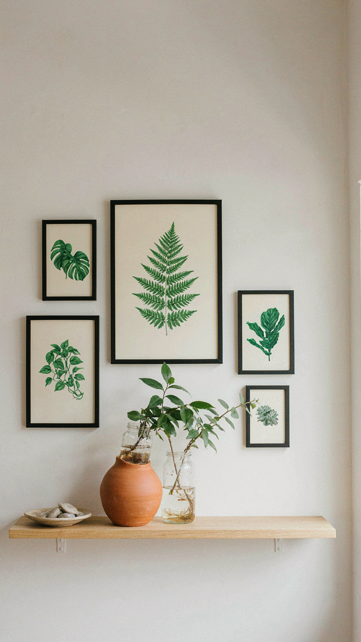
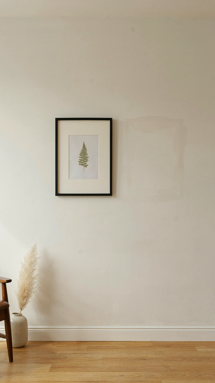
You want people to think you have refined taste without looking like you tried. That’s the real game here. The mechanism is visual weight distribution, borrowed straight from graphic design. In layout work, negative space isn’t empty—it’s load-bearing. On a botanical gallery wall, one large statement piece (a framed pressed fern collection or oversized botanical illustration) acts as your visual anchor. Place it off-center, typically in the upper two-thirds of the wall. This breaks symmetry and forces the viewer’s eye to work, which reads as intentional.
The secondary pieces orbit this anchor. A smaller botanical print below and to the right. A terracotta propagation vessel on a floating shelf three feet to the left. Distance matters more than proximity here. When elements breathe, each one lands harder. Cramped layouts trigger the opposite response—the eye skips everything because nothing commands attention. Measure your wall. Mark the anchor position before hanging anything.
What To Strip Away
Most people keep adding elements until the wall feels “full.” Wrong instruction. The job is to remove everything that doesn’t reinforce the anchor piece’s authority. A botanical gallery wall becomes noise when you mix too many frame styles, too many print scales, or too many botanical subjects competing for dominance. You need constraint, not variety for its own sake.
- Frame Material Consistency: Stick to one material family (all wood, all metal, all acrylic). Mixing frames creates visual friction. Your eye bounces between styles instead of settling on content.
- Print Taxonomy Clarity: Group by botanical family or by time period (Victorian botanicals versus modern minimalist herbals). Randomness reads as indecision, not eclecticism.
- Breathing Room Between Pieces: Leave at least 12 to 18 inches between frame edges. This isn’t wasted space. It’s what makes each piece visible as its own object rather than part of a collage.
- Accent Object Limitation: One or two propagation vessels or botanical artifacts maximum. Shelving with a dozen small objects flattens your wall into decoration instead of curation.
- Color Palette Boundaries: Choose two to three dominant colors in your frame mats and artwork. Introduces unity without sterility and prevents visual chaos that undermines the minimalist effect.
The minimalist botanical gallery wall works because restraint makes each piece weightier. Strip away clutter. Let silence do the work. When you hang the final piece, ask whether the wall would suffer if you removed it. If the answer is no, remove it before the event.
Vintage Landscape Reimagined: The Anti Trend Playbook
Where To Find Prints That Actually Matter
You want your wall to signal taste without screaming for attention. Here’s what you’re really after: prints that nobody else in your circle owns. The mechanism is scarcity perception. Your brain registers rarity before it registers beauty. Most people source from the same five mainstream botanical print sites and end up with derivative work that looks identical to three other homes in their neighborhood.
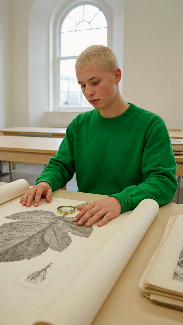
Go to natural history museum archives first. The Smithsonian, the Royal Botanic Gardens, and the British Library all digitize historical botanical illustrations from the 1700s and 1800s. These are public domain. Commission a local printer to produce them on archival paper at your exact dimensions. Estate sale listings, university collection deaccessions, and rare book dealers on AbeBooks stock original vintage prints. Botanical Survey of India publications, early Audubon Society editions, and regional flora guides from specific geographic areas (Japanese woodblock botanicals, Indian miniature paintings of plants, Victorian fern studies) give you material that has actual history embedded in it, not just generic leaves on white.
Framing That Functions As Architecture
Everyone assumes framing is about protection. Wrong. Framing is about creating visual weight and controlling how the eye moves through the composition. Museum mounting techniques use acid free mat board with beveled edges and museum glass that sits away from the print surface. This gap changes everything. It moves the print forward perceptually and creates shadow depth that your phone camera can barely capture but your eye registers immediately.
The frame material determines whether the botanical content reads as precious or overlooked. Metal frames in brass or steel convey restraint and contemporary sensibility. Solid wood frames in walnut or oak create formality but risk looking dated if you choose the wrong profile. Frameless museum mounting with just the mat and glass eliminates the frame question entirely and lets the print dominate. Get the mat color right by holding sample sheets directly against your wall. Off white reads warmer than cream. Warm white reads softer than cool white. This single choice determines whether the gallery wall feels approachable or austere. Measure twice before ordering frames. Inconsistent sizing across a gallery wall reads like indecision, not intentionality.
Updating House Aesthetics: The “Subtle Disruptor” Method
Remove What Doesn’t Belong First
You’re doing this because you think a gallery wall fixes a broken room. It doesn’t. A botanical gallery wall amplifies whatever chaos already exists. Think of your space like a signal-to-noise ratio in information theory: too much competing visual weight kills the impact of anything new you add. Start by identifying what actually works against the wall you’re planning. Dark furniture that absorbs light near your display area. Competing wall colors. Clashing material finishes on adjacent surfaces. Strip these out first, not because they’re “bad,” but because they create cognitive load that steals attention from the botanical arrangement itself.
The purge phase isn’t about minimalism. It’s about eliminating decision fatigue for your eye. When a visitor walks into the room, their attention should have a clear path to the gallery wall, not scatter across five competing focal points. Remove one element at a time and photograph the space. You’ll know something needs to go when the botanical display feels like it’s fighting for oxygen rather than commanding the room.
Layered Materials Create Depth Without Clutter
Texture operates like depth of field in photography: the right material combinations make flat walls feel dimensional. The mistake most people make is treating botanical gallery walls as purely visual experiences. They forget about touch surfaces and how light interacts with different finishes. Introduce one unexpected material near your display: a linen backing panel behind frames, raw wood shelving to hold specimens, or a textured wallpaper accent that complements but doesn’t match the frame finishes themselves.
The key is strategic contrast, not random addition. If your frames are uniform and sleek, add one tactile element like cork or unfinished wood to create a material dialogue. If your botanical prints use soft, organic imagery, balance them with one hard geometric form in metal or glass. This isn’t decoration. It’s architectural balance applied to wall design. Change the frame material, backing, or mounting surface every three to four pieces in the arrangement to signal intentional curation rather than accident.
Beyond The Wall Gallery: Cultivating A Visual Ecosystem
How Plants Support Each Other On Display
You want your gallery wall to feel intentional and elevated, not like decoration you assembled by accident. Here’s the mechanism: ecology teaches symbiosis, where organisms depend on each other to function. Your botanical wall works the same way. Each print, plant, frame, and negative space must support the others. Remove one element and the remaining pieces lose visual weight or balance. That’s not coincidence. It’s structure.
Real symbiosis means nothing thrives alone on your wall. A single botanical print gets lost in empty space. Add a complementary frame material, a preserved specimen, and deliberate negative space, and suddenly each piece amplifies the others. The viewer’s eye travels because the elements create pathways. The wall reads as complete because dependency built it that way. This isn’t about matching or coordinating. It’s about making sure every component has a reason to exist next to its neighbors.
The Wall Itself Becomes The Organism
Most gallery wall advice treats the wall like a static background where you arrange finished objects. Wrong. The wall is living composition that shifts with light, seasons, and how visitors move through the space. In systems thinking, self-regulation means the structure maintains balance without external control. Your botanical gallery wall does this when you design it to absorb changes without collapsing.
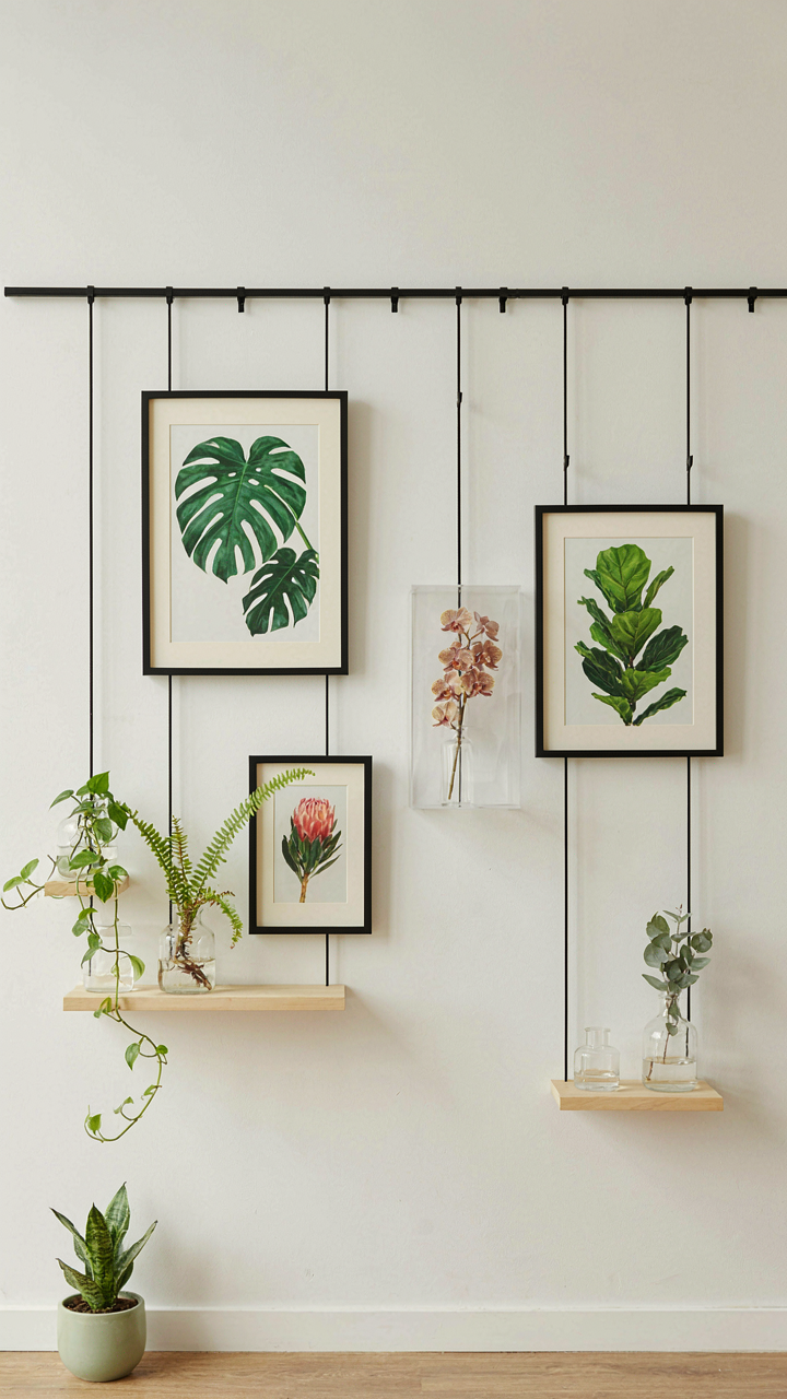
Build flexibility into the framework from the start. Use a modular hanging system, not permanent placement. Rotate pieces seasonally. Let new specimens or frames integrate without requiring a complete redesign. This prevents the wall from becoming a locked-in artifact. It becomes a system that survives additions and substitutions because the underlying structure was designed for evolution, not perfection. The mechanism: start with anchor pieces that hold visual weight, then build open pathways where new elements can sit without disrupting balance.
New Living Room, New Rules: Rejecting Generic Gallery Wall Ideas

Start With Constraints, Not Inspiration
You want a gallery wall that impresses people, which means you’re actually afraid of looking like everyone else. Here’s the mechanism: constraints force specificity. In design systems theory, constraint functions as a filter that eliminates noise and surfaces signal. With botanical walls, your real constraint isn’t “what plants do I like” but “what visual language will I actually live with for years.” Define this first: color palette limits, frame material non-negotiables, botanical category (pressed specimens versus photography versus living propagation), and scale rules. These become your decision boundaries before you ever search Pinterest.
Most people reverse this. They collect images, feel paralyzed by infinite options, then default to whatever’s trending. That’s how you end up with a wall that feels borrowed instead of owned. Your non-negotiables are the skeleton. Everything else gets evaluated against them, rejected or accepted in seconds. This isn’t restrictive. It’s liberating. You source faster, you second-guess less, and the wall actually looks intentional when it’s finished.
Timeless Over Seasonal Accommodation
The advice to swap out botanical art for holidays is incomplete marketing disguised as flexibility. Real timelessness doesn’t require rotation. Botanical imagery from the 18th and 19th centuries remained visually dominant for decades because the subjects transcend occasion, and the aesthetic doesn’t compete with ephemeral trends. Pressed ferns, botanical illustrations, and dried plant compositions maintain visual weight regardless of calendar month. Your gallery wall should anchor the room, not become seasonal furniture you shuffle based on what retailers are pushing.
Build with materials and subjects that age into relevance rather than trend into obscurity. Frame finishes in brass, walnut, or raw wood read consistently across years. Botanical subjects that appear in multiple historical periods (roses, palms, native wildflowers) carry cultural weight independent of the season. Commit to a direction, execute it completely, then leave it alone. The mechanism is simple: consistency compounds. A wall that stays the same for three years builds authority in the space. A wall you customize monthly broadcasts uncertainty.
The Investment Fallacy: Botanical Art Is Not Just Decor
What You’re Actually Paying For
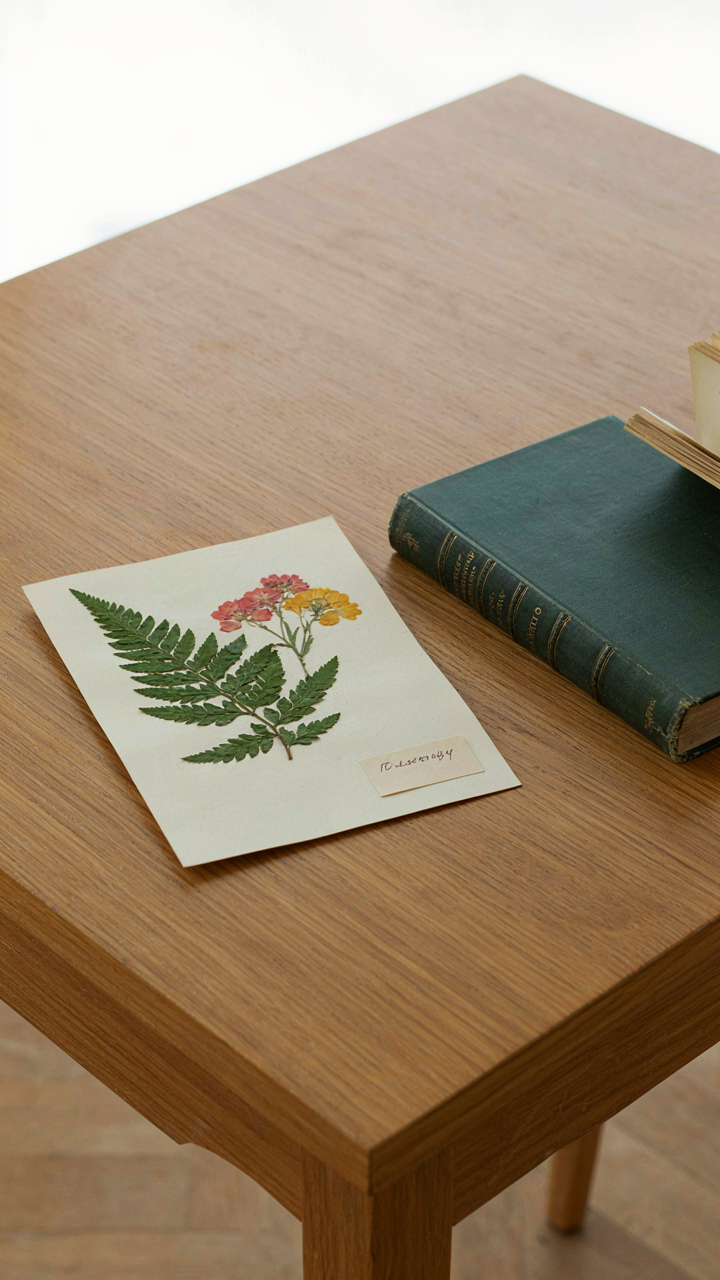
You want permission to spend money on something that looks nice. That’s the real question here. But botanical art functions like an asset in economics: it holds value through specificity, not through generic appeal. A framed pressed fern from a garden center depreciates the moment you buy it. A botanically accurate watercolor from a recognized illustrator or a hand-pressed specimen from a documented collection holds narrative weight that survives trends.
The mechanism is simple. People remember stories, not objects. When guests ask about a piece, you either say “I got it at HomeGoods” or you explain the provenance. One costs $40 and disappears into the wall. The other costs more and becomes part of your home’s identity. The price difference isn’t about materials. It’s about what the piece communicates about your judgment and intentionality.
Narrative Weight Over Surface Appeal
Common advice says fill your wall with whatever botanical images you like. Wrong. That approach produces visual noise that reads as decoration rather than curation. Real gallery walls work because each piece justifies its place through either historical significance, artistic technique, or documented origin.
A lithograph from the Victorian era of botanical illustration carries context that a modern print cannot replicate. A piece from a botanist’s personal collection, or one created by an artist with expertise in plant taxonomy, operates differently than mass-produced botanical imagery. The cost reflects the research embedded in the work, not just the frame. When you build a wall this way, you’re not decorating for an event. You’re creating a permanent record of deliberate choices that outlast the occasion itself.
The Unspoken Language Of Botanical Gallery Walls
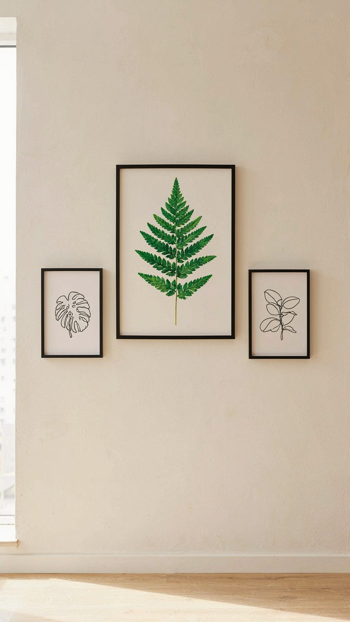
How Scale Shapes What People See
You want people to think you understand composition. That’s the real reason this matters. Scale isn’t decoration—it’s a control mechanism borrowed from visual hierarchy in graphic design. Varying the sizes of botanical prints and frames forces the eye to move through the wall in a specific sequence, creating perceived order where there’s actually none. A single oversized framed fern print anchors attention. Smaller botanical studies around it become supporting players, not equals. This prevents cognitive overload and makes the wall feel intentional rather than accumulated.
The common mistake is treating scale as “what looks balanced.” Wrong. Scale creates narrative direction. Position your largest botanical print at eye level—roughly 57 to 60 inches from floor to center. Descend to smaller pieces as you move outward. This isn’t about aesthetics; it’s about controlling where a viewer’s brain lands first, second, and third. Asymmetry with intentional scale variation reads as curated. Symmetry without it reads as indecisive. The spacing between frames matters less than the size progression itself.
Flora Selection As Coded Signal
Plant choice telegraphs status and intention faster than frame finish ever could. Victorian ferns signal historical knowledge and restraint. Tropical specimens like bird of paradise or monstera read contemporary and bold. Succulents suggest wellness culture affiliation. The flora you choose is a claim about your cultural positioning. Rare or extinct botanical specimens communicate scarcity consciousness. Common garden plants positioned in high-art contexts become ironic or intellectual statements. None of these readings are accidents—they’re encoded through decades of design precedent and what people learned to associate with specific plants in media and interior culture.
Combine flora selection with art style to sharpen the signal. Watercolor botanicals from the 18th century paired with botanical photography creates cognitive dissonance. That friction is intentional communication. Paired with vintage scientific illustrations, ferns become scholarly markers. Paired with modern minimalist line drawings, the same ferns become design-forward. Your flora choice plus your art style equals a single compressed statement about how you want to be read. Pick both with that equation in mind, not separately.
The Real Obstacle Isn’t Finding The Right Aesthetic; It’s Your Fear Of Committing To A Vision That Challenges The Bland Consensus
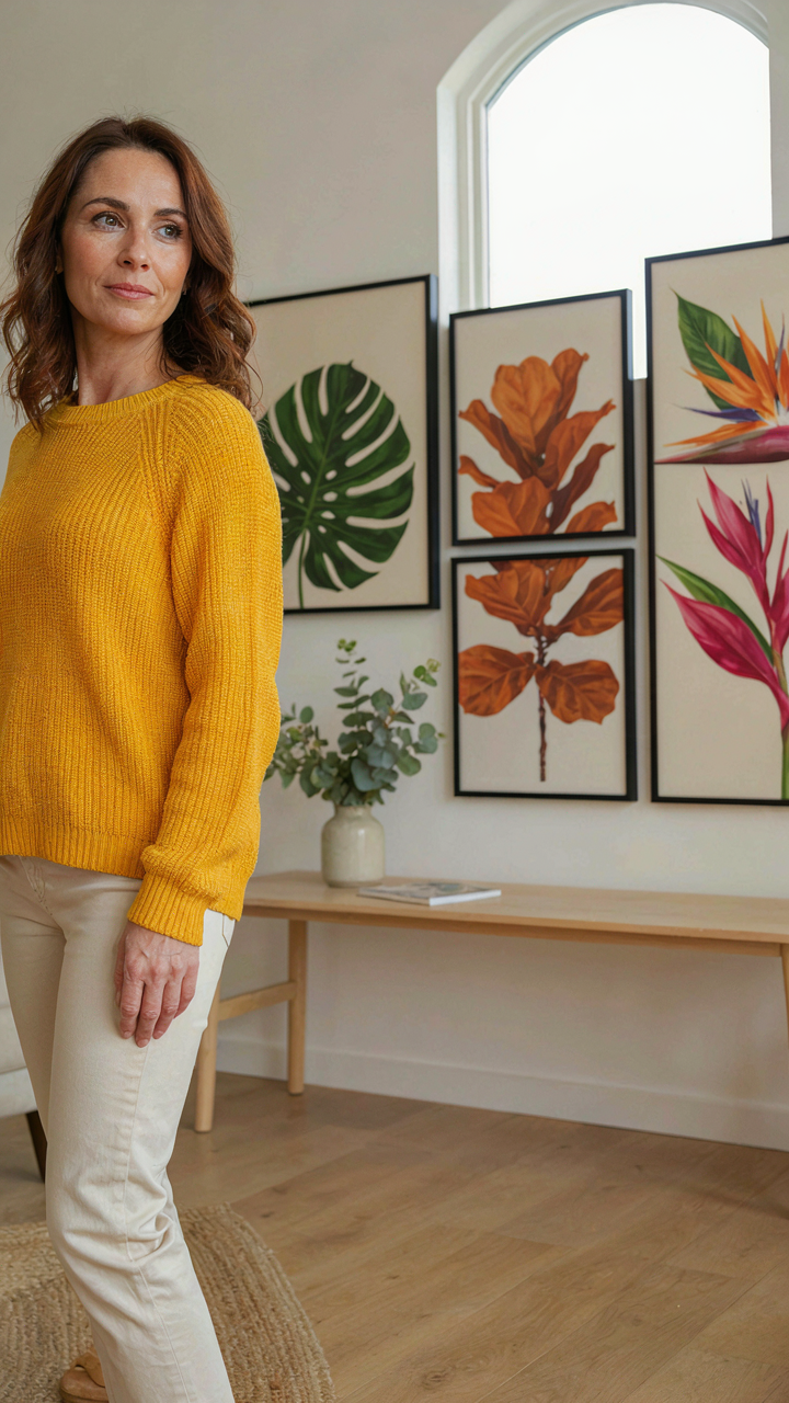
Most people never build a botanical gallery wall because they’re waiting for permission. They want certainty before they move. Stop waiting. Pick three plants or prints that actually move you, not the ones that look safe on Pinterest, and commit to them this week. Hang them. Live with them. The worst outcome is you rearrange. The real outcome is you stop living in beige and start living in intention. Your walls will betray who you actually are before you ever admit it to yourself.