
Introduction
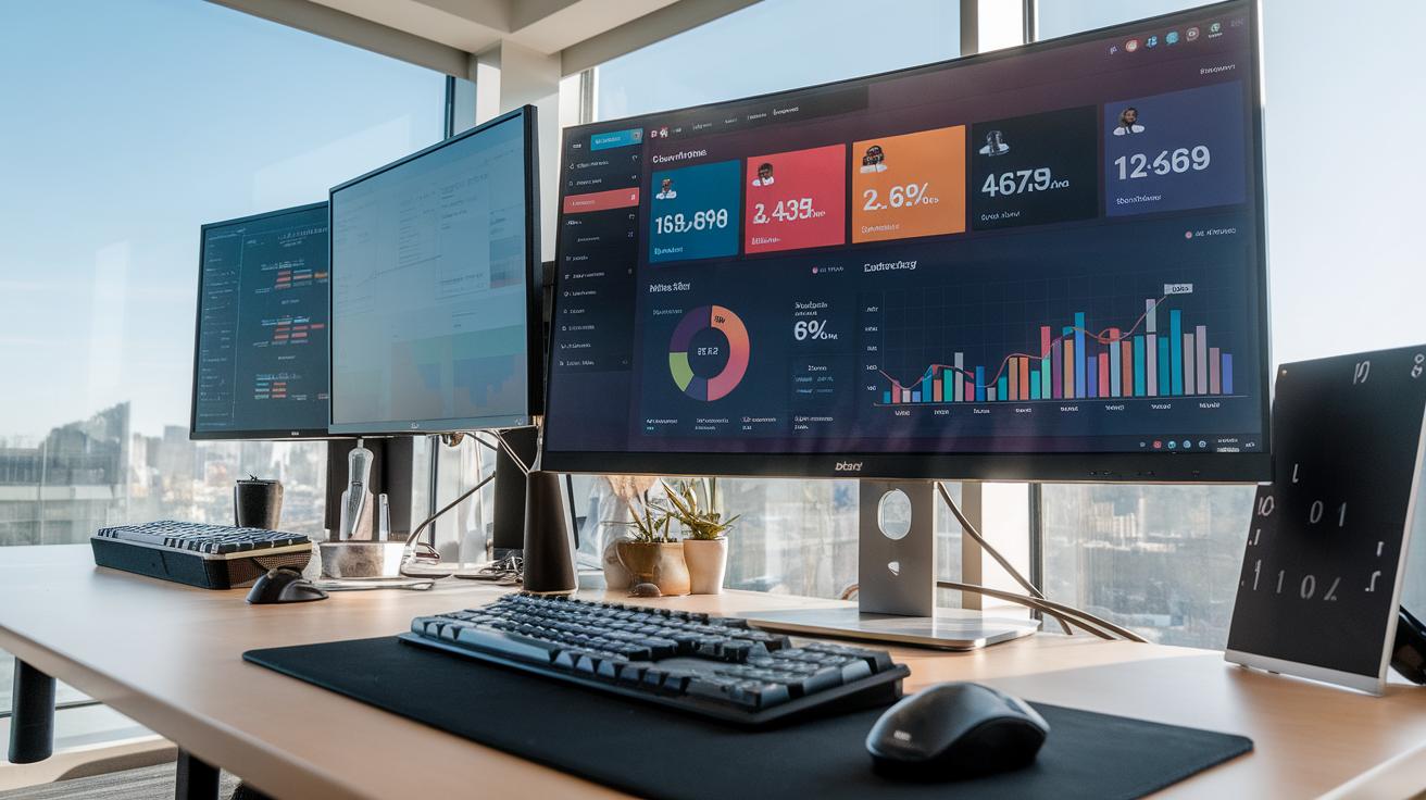
An analytics dashboard is a critical tool for businesses and organizations. It provides a visual representation of data, helping you to monitor key performance indicators and overall performance. With the right dashboard, you can quickly assess how your business is performing against goals. This tool aggregates vast data from various sources and presents it in a concise format. Understanding how to utilize this tool efficiently can lead to improved insights and decision-making.
Implementing an intuitive analytics dashboard requires careful planning. You must consider what data is most relevant to your objectives. By visualizing this data, you can identify trends, find opportunities for improvement, and make informed decisions. As you dive deeper into the workings of an analytics dashboard, you’ll discover its potential to transform raw data into actionable insights and ultimately visualize your path to success.
Understanding Analytics Dashboards

The Purpose and Evolution of Analytics Dashboards
Analytics dashboards are tools that display data visually. Their main purpose is to help you monitor performance, track key metrics, and make informed decisions. Over time, these dashboards have grown more sophisticated, evolving from basic spreadsheets to interactive visualizations. Initially, they catered to niche markets, but now they serve industries ranging from healthcare to finance. For example, a sales dashboard shows real-time sales figures while a healthcare dashboard tracks patient data and outcomes. The ability to customize these dashboards means that you can focus on what matters most to your organization. How have dashboards helped you or your business make better decisions?
Types of Dashboards and Their Applications
Dashboards fall into different categories based on their functions. Descriptive dashboards summarize past data to provide insights. For example, a weekly report can show trends over time. Another type is diagnostic dashboards, which help identify reasons behind certain outcomes. For instance, if sales drop, a diagnostic dashboard can pinpoint which product lines are underperforming. Predictive dashboards use historical data to forecast future trends, aiding businesses in planning. Each type serves a unique purpose. Which type do you think would be most beneficial for your needs? Understanding these types can transform how you use data every day.
Key Components of an Analytics Dashboard

Essential Elements
An effective analytics dashboard includes several key components that help you visualize data. First, charts provide a clear view of trends and patterns. Line charts show changes over time, while bar charts compare different categories. Pie charts illustrate parts of a whole, making it easier to see proportions. Consider which chart type best communicates your data story.

Graphs allow for quick interpretation of information. They can summarize large datasets, making complex information digestible. Tables present detailed numerical data that you can analyze closely. Use tables for specifics, but avoid clutter. Focus on clarity and conciseness.
Visual Design
Your dashboard layout impacts user interaction. Use color coding to highlight critical metrics, making important data stand out. Arrange elements logically, guiding viewers through the information easily. You might ask yourself, how quickly can someone grasp the key insights from your dashboard? Test it with real users to understand if your design works.
Choosing the Right Metrics

Selecting the right metrics for your analytics dashboard is vital. These metrics should reflect your business goals. Begin by clearly defining what you want to achieve. For example, if your aim is to increase sales, focus on metrics like revenue growth, conversion rates, and customer acquisition costs.
Consider your audience when choosing metrics. What matters to your team may differ from what stakeholders need. If you manage a marketing team, track engagement metrics such as click-through rates and social media interactions. For finance, monitor profit margins and expense ratios.
Regularly review your metrics. Are they still aligned with your goals? Metrics may need adjustment as your business evolves. Engage with your team. Ask for their input on which metrics are most relevant. This ensures everyone is on the same page and drives collective success.
Best Practices for Designing Dashboards

Layout and Simplicity
A clear layout helps users understand data quickly. Avoid clutter. Group related information together. This organization lets you find insights without feeling overwhelmed. Use grids to align visuals neatly. This creates a sense of order. The top of the dashboard should show critical metrics first. Consider using larger fonts for essential data. Small fonts can hide vital information and confuse users.
User Experience
User experience shapes how effectively people engage with your dashboard. Keep navigation simple. Users should understand what to do at a glance. Test your dashboard with real users. Gather feedback. Adjust based on their suggestions. Ask yourself, does it answer their questions? Are the visuals straightforward? Effective dashboards focus on usability. They encourage deeper analysis without requiring extensive training.
Integrating Data Sources

Integrating multiple data sources into your analytics dashboard can significantly enhance your decision-making process. When you combine data from various sources, you gain a more complete view of your business. This helps you make informed choices based on comprehensive insights rather than isolated information.

To integrate data effectively, begin by identifying the key sources relevant to your operations. These might include CRM systems, social media platforms, and financial databases. Use APIs or data connectors to link these sources to your dashboard. For example, if you use a CRM like Salesforce and want insights on marketing campaigns, connect your social media metrics to see how they impact sales.
Monitor the quality of data regularly. Inaccurate data can lead to poor decision-making. Set up validation rules to catch errors before they reach your dashboard. Think about how you can streamline data pipelines for efficiency. Are there automated tools you can use to keep everything up to date?
Avoiding Common Pitfalls

Building an analytics dashboard isn’t just about gathering data and displaying it. You need to avoid common pitfalls that lead to confusion and misinformation. One major mistake is overloading the dashboard with too much information. When your dashboard is cluttered, users may miss crucial data. Focus on the key metrics that matter most to your audience.
Another common error is ignoring user needs. Before creating the dashboard, ask yourself who will use it. What information do they need? Tailoring the dashboard to specific users leads to more effective insights. Also, avoid using complex jargon. Simplicity in language helps everyone understand the data easily.

Regular updates are also essential. Failing to refresh data can make your dashboard outdated. Set a schedule for periodic reviews and ensure the information remains relevant. Have you reviewed your dashboard lately? Taking these steps helps ensure your analytics dashboard truly drives success.
Case Studies and RealWorld Applications

Successful Implementations in Various Industries
Many businesses have successfully implemented analytics dashboards to drive decision-making. For example, a retail chain used a dashboard to track sales in real-time. They linked it to inventory levels and customer feedback. This integration allowed them to adjust stock based on current demand. The outcome? A 15% increase in sales over three months.
In healthcare, a hospital developed an analytics dashboard to monitor patient care metrics. They displayed information on patient wait times, treatment outcomes, and staffing levels. This led to a more efficient workflow and improved patient satisfaction scores. What can your organization learn from this approach?
Lessons Learned from Dashboard Deployments
Organizations discovered that clarity is vital. Dashboards that are cluttered do not help users. Simplicity and focus enhance usability. Businesses also learned the value of user feedback in dashboard design. Continuous adjustments based on input can lead to better results over time. What features would you include to make your dashboard more effective?
Future Trends in Analytics Dashboards


Artificial Intelligence in Analytics
A growing number of analytics dashboards now integrate artificial intelligence. This technology helps you uncover patterns in your data that might go unnoticed. For example, AI can suggest which metrics to focus on based on previous data trends. It learns from your actions and tailors recommendations, making decision-making simpler and more effective. Imagine having a dashboard that tells you the best time to launch a product based on historical data. How could this change your strategy?
Machine Learning for Predictive Analysis
Machine learning is another emerging trend in analytics dashboards. It enables your dashboard to perform predictive analysis. Instead of just reporting on what has happened, it forecasts future events. For instance, if you run a retail business, machine learning can predict sales trends based on seasonal changes and consumer behavior. This forward-looking view allows you to prepare effectively and respond to market demands quickly. What insights could you gain from such forecasting capabilities?
Getting Started with Your Dashboard

Building Your Analytics Dashboard
Your first step in creating an analytics dashboard is to define your objectives. What data do you want to track? Consider sales figures, website traffic, or customer feedback. Knowing your goals helps to shape the dashboard and ensures you gather meaningful data.

Select a tool that fits your needs. Software like Google Data Studio or Tableau offers user-friendly platforms ideal for beginners. Both provide templates and customization options to help you visualize your data. Explore tutorials specific to the tool you choose; they can save you time and frustration.
Conclusions
The benefits of using an analytics dashboard are clear. It not only enhances your ability to visualize data but also enables better strategic planning. When you can see your data clearly, making informed decisions becomes much easier. You can track progress against goals and spot areas that need attention.
Incorporating an analytics dashboard into your business strategy can lead to improved performance and greater success. By leveraging data effectively, you position your business for growth. Take the time to explore and customize your dashboard to reflect your unique needs. The right setup will help you stay ahead of the competition and drive your business forward.