
The Cottage Garden Color Illusion: Why Most Advice Fails

What “Cottage” Actually Means
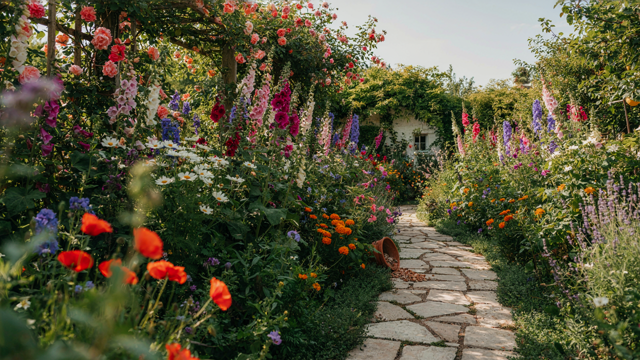
You want permission to break the rules and call it intentional. That’s the real draw here. But the word “cottage” doesn’t mean chaos or nostalgia or Pinterest aesthetic. It describes a practical constraint: gardens built on small properties by working people who needed food, medicine, and basic materials. Color happened by accident, not curation. Roses grew near the door because someone planted them there decades ago. Lavender spread because bees found it useful. The aesthetic we admire today is survivorship bias dressed up as design philosophy.
The cottage garden movement itself crystallized in the late 19th century, most notably through Gertrude Jekyll’s writings and garden designs. She documented existing working gardens and codified their informal structure into a deliberate style. This matters because it means the “authentic” cottage garden color palette wasn’t random. Plants thrived or failed based on soil, light, and climate. The colors you see in historical cottage gardens reflect what actually grew in those regions, not what looked good together on paper.
The Three Color Mistakes Everyone Makes
The dominant mistake is treating cottage gardens as maximalist dumping grounds. Generic advice says “plant everything colorful” or “let it grow wild and natural.” This is lazy and produces visual mud. You end up with colors that compete instead of coexist, making the space feel cluttered rather than abundant. Abundant gardens have structure. They use color to guide the eye, not overwhelm it.
The second mistake is assuming pastels equal cottage style. Pale pinks, soft blues, and whites became fashionable through 20th-century interpretations of cottage gardens, especially in English country house aesthetics. But this wasn’t universal. Working cottage gardens included deep crimsons, oranges, and strong yellows. Pastels worked in certain regions because they matched local plants and light conditions. Copying them without understanding your own site’s constraints guarantees failure. Start by identifying what actually thrives in your zone before deciding what colors matter.
Deconstructing The Cottage Garden Palette: Beyond Primary Hues
The Undertone Problem Nobody Names
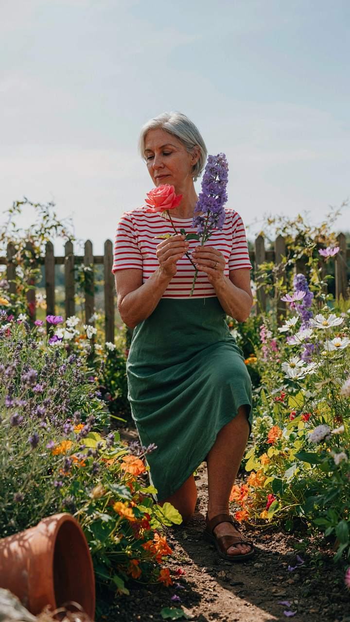
You want to know about color so you can copy what you see in magazines and feel like you nailed it. But here’s the mechanism: undertone is the difference between a plant that anchors your scheme and one that clashes silently. Undertones are the hidden pigment beneath a color’s surface—the cool blue hiding under a red, or the warm yellow under a green. In cottage gardens, two plants can appear the same hue until you place them together, then one feels wrong. This happens because you’re seeing undertone conflict, not hue conflict. Cottage gardens historically mixed plants without naming undertones, but the best ones succeed because gardeners instinctively matched them. Understanding undertone is the actual skill.
Most color advice stops at “use complementary colors” or “stick to a palette.” That’s incomplete. You need to know whether your reds lean toward blue or yellow, your purples toward red or blue, your pinks toward coral or mauve. A pink with yellow undertone (coral-leaning) placed next to a pink with blue undertone (mauve-leaning) creates visual noise, not harmony. The same principle applies to foliage. A blue-undertone hosta next to a yellow-undertone heuchera will compete for attention. Start by identifying one reference plant in your scheme, determine its undertone by comparing it against known warm and cool anchors, then match all other plants to that undertone family, not just the hue name.
How Light Sculpts What You Actually See
Light and shadow operate like value contrast in design—they amplify or diminish the perceived separation between adjacent colors. A pale lavender and pale pink sitting in full sun read as distinct. The same plants in filtered morning light blur together. This isn’t opinion; it’s optical physics applied to gardens. The intensity, angle, and duration of light hitting your plants changes how far apart colors appear on the spectrum. Cottage gardens in full sun demand more hue separation. Cottage gardens in dappled shade can use colors closer together because shadow naturally creates separation.
The second move is directional consistency. East-facing beds get warm morning light that strengthens yellows and reds. West-facing beds receive harsh afternoon light that can wash out pastels and intensify saturated colors. North-facing beds stay cool and muted. Your color scheme needs to account for the light direction your bed receives, because the same palette reads completely different under different light angles. If you’re placing a soft pink scheme, put it where it gets morning light, not west-facing afternoon blast. If you’re using deep burgundies and blues, west-facing sun will make them pop. Test your plants in the actual bed location at the actual time of day before committing them to soil.
The English Cottage Color Palette: Truths & Fictions

What Actually Grew There
You want permission to use colors that feel “authentic” without actually researching what grew in 18th-century English cottage gardens. The mechanism is simple: availability constraints determined palette, not aesthetics. Cottagers planted what survived their climate and soil, what neighbors shared as cuttings, and what vendors sold at market. Exotic specimens weren’t options. Roses, lavender, foxgloves, and hollyhocks dominated because they thrived with minimal intervention and produced seeds for next season.
Modern cottage gardens treat this constraint as inspiration rather than law. You can access plants from across the temperate world now, so the “English cottage” palette has expanded beyond what actual history allowed. The shift happened gradually as global trade made seeds and plants affordable. Understanding this distinction prevents you from conflating historical accuracy with visual impact. Choose what works for your site first, then build the scheme around those plants rather than forcing plants into a preconceived color story.
What Your Region Actually Supports
Cottage gardens weren’t uniform across England, yet design advice treats them as one fixed aesthetic. In economics, we call this a supply-side constraint: the plants available in Yorkshire differed materially from those thriving in Devon or Kent. Coastal regions favored salt-tolerant species. Heavy clay areas supported different perennials than chalk soils. Northern zones required cold-hardy plants; southern areas tolerated tender perennials that froze elsewhere. These weren’t style choices. They were survival logistics.
Your region determines the real foundation of your palette before you pick a single color. A cottage garden in Portland faces different growing realities than one in Boston, even though both claim the “cottage” label. Research what actually thrives in your hardiness zone, soil type, and moisture conditions first. Only then apply color theory. This inverts the common workflow where people choose colors abstractly, then struggle to find plants that fit. Start with viable plants, organize them by bloom time and foliage tone, and the palette builds itself from what can actually perform.
The Color Theory Combat Manual: Applying Principles To Garden Colour Palette
Where Opposite Colors Stop Competing
You want this section to validate that you have taste. You don’t. Color harmony isn’t taste—it’s physics. Complementary colors sit opposite each other on the color wheel: red and green, blue and orange, yellow and purple. Analogous colors sit adjacent: red, red-orange, orange. Cottage gardens use both, but most gardeners misread the mechanism. Complementary pairs amplify each other’s intensity when placed side by side. Analogous schemes create visual flow without shock.
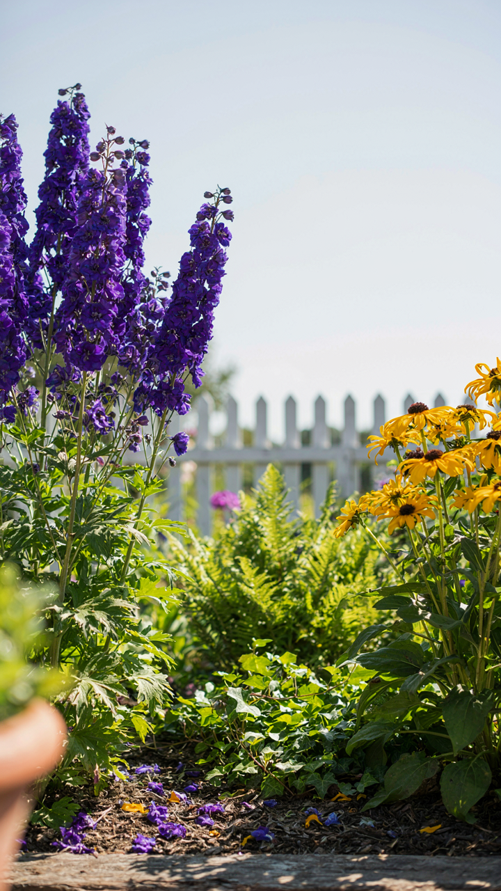
The real play is knowing which mechanism solves your specific problem. If your garden reads flat and boring, analogous schemes won’t fix it—you need the contrast of complementary pairs. Plant deep purple delphiniums against golden rudbeckia. The opposition forces your eye to register both plants. If your garden feels chaotic and your eye bounces everywhere, analogous schemes pull things into a coherent story. A run of coral, peach, and soft pink roses moves the viewer through space without friction.
Saturation And Value Do The Hidden Work
Color theory borrowed from painting shows that saturation and value—not hue alone—control whether a garden feels harmonious or fractured. Saturation measures how pure a color is: vivid red versus dusty mauve. Value measures how light or dark it is: pale pink versus deep crimson. Most gardeners obsess over which colors to plant together and ignore these two levers entirely. That’s the mistake.
A cottage garden with high-saturation colors everywhere becomes visually aggressive and exhausting. Pale pastels everywhere disappear into each other. The mechanism: reduce saturation in 70 percent of your planting, then deploy high-saturation plants as focal points. Deep burgundy smoke bush against pale lavender creates depth. A single bright orange poppy among muted grays anchors the eye. Build your palette by first choosing your value range—light, medium, or dark dominant—then decide where saturation spikes. This sequence prevents the garden from collapsing into either chaos or invisibility.
The Kinetic Garden Color Scheme: Motion, Time, And Perception
Growth Cycles Reshape Visual Weight
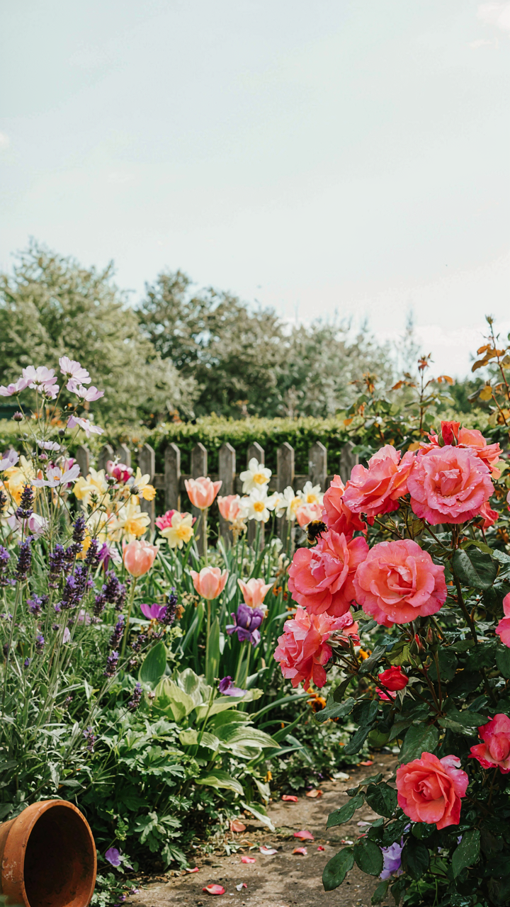
You want this section because you’re worried your garden will look static and boring once plants mature. Here’s what actually happens: biology gives us a mechanism called phenological stage shift. Early spring bulbs occupy visual space with intense color when the garden is otherwise bare, then recede as shrubs leaf out. That’s not decoration changing—that’s actual spatial dominance rotating between plant layers based on their growth timeline.
The garden’s color weight moves constantly through the year because different plants peak at different times. A cottage garden in March is 60% bulb color, 40% evergreen structure. By June, perennials and roses dominate. By September, late bloomers and foliage take over. This isn’t accidental; the eye perceives the same garden as three separate color compositions depending on when you’re looking at it. Plant growth cycles don’t just add plants—they change which colors the viewer actually sees.
Seasonal Shifts Create Deliberate Transitions
Common advice says to plant for “year-round interest.” That’s vague and misses the mechanism. Seasonal shifts in cottage gardens work because you’re designing multiple color schemes that sequence, not one scheme that persists. Spring bleeding heart and hellebores give way to early roses, which give way to late-blooming dahlias and salvias. Each transition erases the previous color story before saturation sets in.
The practical protocol is to map your garden’s color dominant plants by month, then intentionally space the peaks four to eight weeks apart. Plant early alliums (March-April), then late spring bulbs (April-May), then early roses (May-June), then early perennials (June-July), then mid-summer bloomers (July-August), then late bloomers (August-October). This staggering prevents color fatigue because the viewer’s eye resets when the dominant colors shift. The garden regenerates its visual impact without replanting.
The Cottagecore Color Palette: Avoiding Aesthetic Traps

Timeless Principles Over Social Media Cycles
You want to believe your garden will look good forever. Here’s what actually happens: cottagecore aesthetics trend, and you chase the color story everyone else copies. The mechanism is simple. Trend-driven palettes die because they’re built on scarcity and novelty, not on how colors actually function together in real soil and light.
Timeless cottage palettes work because they’re rooted in material constraint, not fashion. Historically, cottage gardens used colors that grew naturally in cool climates: deep purples from salvias, cream from roses, dusty pink from old varieties. These combinations persist because they solve a real problem—making limited space feel abundant without visual chaos. A palette built on what thrived locally and what gardeners could actually propagate beats any Instagram-sourced color story.
Authenticity Creates Restriction, Not Chaos
Borrowed from ecology, authenticity acts like a carrying capacity for your palette. You pick colors that match your climate, soil chemistry, and the existing structures on your property. That constraint forces coherence. Most advice tells you to “stay true to yourself,” which is vague nonsense. What matters is that your choices stem from observable fact, not aspirational feeling.
Your region’s native soil pH shifts which colors read warm or cool. Your house’s brick or stone palette already constrains what feels integrated versus imported. When you build your color scheme from these anchors instead of against them, the palette becomes automatic and resistant to trend. Document what actually grows in your zone, what survives your light conditions, and what the nearby architecture demands. Start there.
The Unconventional Garden Color Palette: Breaking The Rules
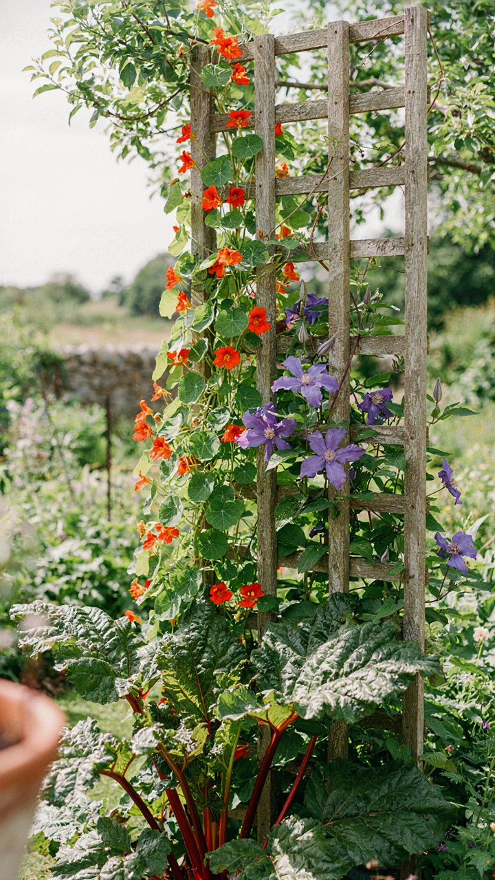
Clash Your Colors On Purpose
You want permission to break the rules because following them feels safe. Here’s the mechanism: contrast theory from physics applies directly to garden vision. Light wavelengths bend perception. A red flower next to purple doesn’t fight because they’re “wrong”—it reads as intentional tension because the eye processes different wavelengths simultaneously, creating visual weight. Most gardeners treat cottage gardens like they’re fragile. They stack pastels and call it romantic. That’s consensus thinking, and it’s lazy.
The real move is deploying opposite colors on the color wheel with deliberate spacing. Marigolds against blue delphiniums, orange nasturtiums climbing near purple clematis—these pairings read as bold, not chaotic, because the distance between plants prevents visual mud. The common advice says “use a color palette of three to five colors maximum.” Wrong. Cottage gardens historically used whatever thrived in the microclimate. What mattered was separation: repeat the same color in different zones so the eye tracks the pattern instead of seeing scrambled noise.
Texture Creates Depth Without Adding Color
Texture functions as visual weight in the same way color does, but gardeners ignore this entirely. A spiky foxtail lily against soft lamb’s ear creates contrast without adding a new hue to your scheme. This is a layering principle borrowed from fabric design and architecture. Matte and glossy surfaces catch light differently. Rough and smooth surfaces change how the eye moves through space. In cottage gardens, you exploit this by mixing plant forms: feathery fennel next to solid, chunky sedum; fine astilbe fern fronds next to architectural allium spheres.
The mechanism works because the brain processes form and color through separate neural channels. A monochromatic garden—all whites, for example—stays visually dead until you vary leaf texture and plant shape. Hostas, grasses, sedums, and flowering shrubs each interrupt light differently. Place fine-textured plants (baby’s breath, Queen Anne’s lace) behind bold architectural forms (ornamental rhubarb, cardoon) to build depth. The front-to-back progression matters more than adding colors. This creates perceived distance in small spaces and prevents the garden from reading as a flat, undifferentiated mass.
The Contrast Protocol: Mastering Visual Tension In Your Garden Color Palette
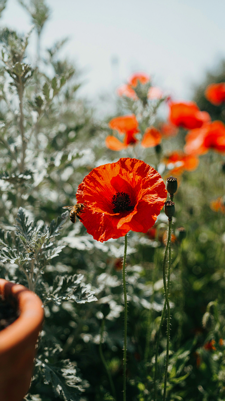
When Opposites Command Attention
You want people to look at your garden and think you know what you’re doing. The mechanism is borrowed from graphic design: contrast works because the human eye moves toward difference, not sameness. High contrast pairs colors opposite each other on the color wheel, creating visual stops that force attention. In cottage gardens, this isn’t about subtlety. It’s about velocity of perception.
The most direct high contrast approach uses complementary pairs. Red with green. Purple with yellow. Orange with blue. These combinations create maximum visual pop because they occupy opposite wavelengths on the spectrum. Cottage gardens historically used this without naming it, planting red poppies against silvery artemisia or purple delphiniums beside golden yarrow. The pairing works regardless of season or soil type because it’s physics, not opinion.
- Deep Purple With Bright Yellow: Delphiniums paired with golden rudbeckia create a jolt. The eye can’t ignore the pairing because the colors repel each other optically.
- Crimson Red Against Soft Gray Foliage: Red roses or dahlias against artemisia or lamb’s ear force the red forward. Gray acts as a visual accelerant, making red appear more intense.
- Orange With Deep Blue: Tiger lilies or calendula against delphiniums or veronica. Orange is warm and pushes forward; blue recedes. The tension creates perceived depth in a flat bed.
- White Blooms Against Dark Foliage: White flowers pop off dark purple sage, dark sedum, or burgundy heuchera. This isn’t subtle. It’s the highest contrast available in the visible spectrum.
- Hot Pink With Lime Green: Magenta phlox or cosmos paired with chartreuse hostas or golden oregano. The clash is intentional. It breaks the herbaceous monotony that kills most cottage gardens.
Plant high contrast pairs in clusters, not scattered. Three to five plants of the same color grouped together register as a visual unit. Isolated specimens get lost. The contrast protocol demands density enough to read from ten feet away. This is where most cottage gardeners fail: they plant one of everything and wonder why nothing stands out.
Layered Subtlety Without Boredom
This approach doesn’t mean dull. The common advice is that subtle contrast means using colors next to each other on the color wheel, and that’s technically true but incomplete. Real subtle contrast uses analogous colors with tonal shifts, creating harmony without visual noise. The mechanism is repetition with variation, which the brain reads as intentional rather than accidental.
Soft blue with purple with mauve works because they travel the same color family but shift in tone and saturation. Lavender with deeper purple sage with lighter blue veronica creates movement without screaming. Cottage gardens predating the Victorian era relied on this because available plants grew in narrower color ranges. Gardeners worked within constraint and discovered that restraint reads as sophistication.
The tonal shift matters more than color shift. Plant pale pink cosmos next to deeper mauve liatris next to dusty rose dianthus. These aren’t the same color, but they’re cousins. The eye travels smoothly between them because it recognizes relationship. White or silver foliage acts as a pause between color groups, letting the eye rest without breaking the composition. Subtle contrast works only with repetition across the bed. One cluster of soft pinks and one of dusty roses fifty feet apart creates disconnection, not flow. Four to six small groupings across the garden, each shifting slightly in tone, create narrative without drama.
The Subtlety Method: Cultivating Depth In Your Cottage Garden Color Palette
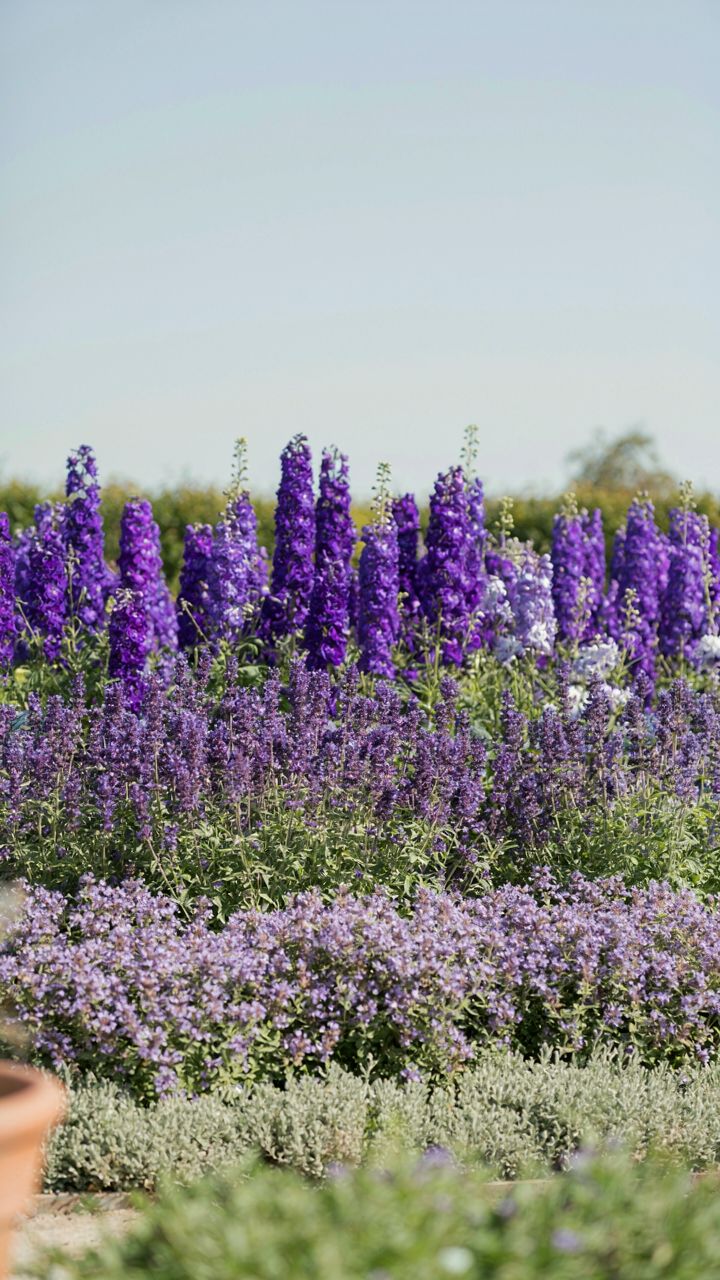
Monochromatic Depth Without Boring Flat Color
You want this section to work because you’re tired of cottage gardens looking like someone threw every color at the wall. Here’s the mechanism: monochromatic schemes don’t mean one color. They mean one hue family with deliberate tonal separation. Light lavender, medium lavender, deep purple. The tension between the values creates visual movement without the chaos of competing hues.
Most gardeners misunderstand monochromatic as “all the same color,” then plant it and wonder why it feels dead. You need minimum three tonal stops within your chosen hue. Combine pale pink roses with magenta cosmos and burgundy dahlias in the same bed. The eye tracks the shift in depth, not boredom. Plant specimens at different heights to amplify the tonal gaps you’ve created.
Strategic Green Architecture
Foliage isn’t filler. It’s the baseline that makes your color choices read clearly instead of noise. Think of it through signal and noise theory from information design: your flowers are the signal, your greens are the carrier wave. Without deliberate foliage selection, even good color choices disappear into visual static.
- Silver-leaved plants: Artemisia, dusty miller, and lamb’s ear absorb and reflect light differently than true greens, creating visual breaks between warm flower tones without adding competing hues.
- Blue-green foliage: Hostas, rue, and sea thrift offer cooler undertones that recede visually, letting warmer flowers advance and dominate the spatial hierarchy of your beds.
- Chartreuse accents: Euphorbia, golden marjoram, and lime hostas punch forward without clashing, giving your eye a landing spot between complementary flower colors.
- Deep burgundy foliage: Heuchera, Persian parsley, and smoke bush darken beds and anchor lighter flowers, preventing pastels from feeling washed out or timid.
- Textured gray-greens: Lavender, catmint, and santolina add matte surfaces that diffuse light, separating distinct flower blocks so each color reads as intentional rather than accidental.
Select foliage based on the light reflection you need, not based on what looks “nice” next to your flower choice. A matte gray-green behind bright pinks stops them from looking garish. A reflective silver behind pale yellows prevents them from vanishing. This is precision, not decoration.
Your Garden Color Palette: A Reflection Of Strategic Intent

Color Choices Signal Your Values
You want this section to validate that your taste is correct. Here’s the mechanism: color palette in cottage gardens functions like brand identity in marketing. You’re not choosing colors randomly. You’re signaling restraint, cultivation, or wildness to anyone who enters the space. The Victorian cottage garden used restrained palettes—mostly whites, soft pinks, and greens—because it communicated order and propriety. Modern cottage gardens often layer in bolder jewel tones because the cultural signal changed. Your palette announces what you believe good taste looks like.
The reason most gardeners fail here is they treat color as decoration instead of communication. They plant what photographs well on Instagram rather than what aligns with the garden’s actual purpose and their own visual sensibility. Start by naming what your palette should communicate: tranquility, abundance, formality, or abandon. That decision determines everything else. If you choose formality, you constrain the range and repeat colors systematically. If you choose abundance, you layer multiple tones and let spontaneity guide placement. The palette becomes the framework that makes every subsequent planting decision coherent.
Seasonal Shifts Demand Active Observation
Most advice tells you to “plan for year-round color,” which is incomplete. The real work is tracking what actually happens when seasons change, then adjusting in real time. Early spring cottage gardens lean cool: hellebores and crocuses deliver purples and whites against bare soil. Summer floods the space with warm tones: roses, delphiniums, and salvias saturate the palette. Autumn requires a pivot. Many gardeners plant as if the garden ends in September. It doesn’t. Asters, dahlias, and ornamental grasses shift the color temperature downward. You track these shifts by visiting the space every three days during transitions and noting what colors dominate or disappear.
Refinement happens through subtraction and replacement, not addition. If your spring palette overwhelms your autumn palette, you remove spring bulbs or relocate them to a separate area. If summer leaves dead zones of brown, you add late bloomers or persistent foliage that reads as intentional rather than neglected. Document color combinations that work—take photos with consistent lighting, time of day, and weather. Compare these photos six months apart. The gaps in your sequence reveal where active intervention is needed. This isn’t guesswork. It’s systematic evidence gathering that becomes your personal color design manual.
Your Garden’s True Obstacle Is Your Reliance On Curated Comfort, Not Your Lack Of A Perfect Palette
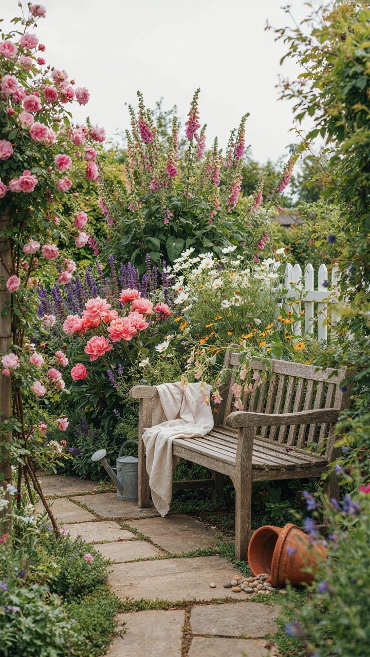
You’ve scrolled Pinterest for hours looking for the “right” color scheme. Stop. Your real problem isn’t finding colors—it’s planting what actually excites you instead of what looks safe in photos. Pick one plant you genuinely want tomorrow and place it. Watch how your garden demands colors around it. The palette writes itself when you stop waiting for permission. Your garden doesn’t need curation. It needs your taste, not Instagram’s.