
The Unspoken Language Of Vintage Botanical Art

What Your Collection Actually Says
You want people to think you’re educated without saying it outright. That’s the real game here. Vintage botanical prints work because they signal depth without demanding conversation. The mechanism is borrowed from economics: they function as a credence good, meaning their value exists partly in what others believe about them, not just in the object itself. A print from an 1880s naturalist’s expedition carries weight because it represents accumulated knowledge and scarcity, not because it shows flowers.
The collector who understands this distinction owns pieces with actual provenance. They know the difference between a reproduction print and a lithograph created during the era of original scientific illustration. Age alone doesn’t create value. Historical accuracy in the print’s production method, the artist’s reputation, and the rarity of that particular edition determine real worth. Most people skip this step entirely and buy aesthetic reproductions instead.
The Reproduction Problem No One Names
Common advice says to buy what speaks to you. That’s incomplete and costs you money. Mass-produced botanical prints flood the market because they’re cheap to manufacture and easy to market as vintage. The real distinction lies in production technique and printing era. Hand-colored lithographs from the 1700s to early 1900s command different prices and carry different weight than modern offset prints designed to look old.
Original prints came from specific sources: naturalist expeditions, botanical societies, or scientific publications. You verify this by examining the printing method, paper quality, and whether the image was colored by hand during the original period or colored later. Study the publication mark on the print’s margin. Legitimate vintage pieces identify their source clearly. This step separates collectors from decorators shopping for wall color.
Victorian Botanical: Beyond The Aesthetic Veneer
When European Power Met Plant Classification
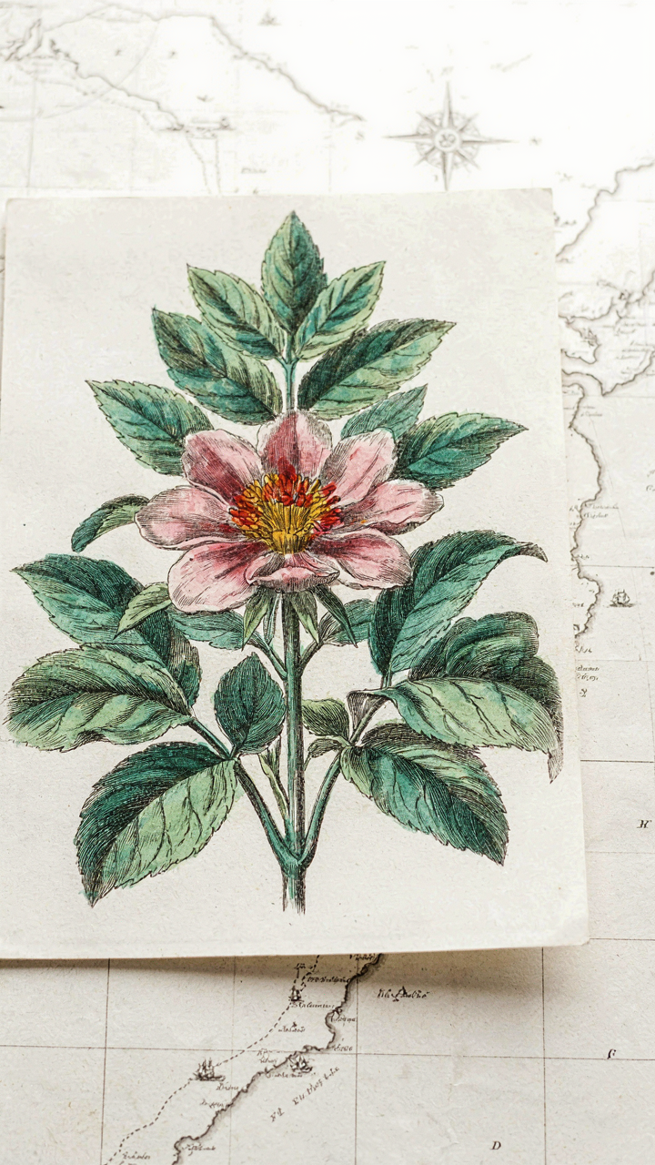
You want these prints on your wall because they signal intellectual taste without requiring you to read anything. That’s the real mechanism at work. But Victorian botanical prints emerged from something harder: the colonial expedition. European powers sent naturalists into unexplored territories to catalog flora, map resources, and assert dominance through knowledge. These prints documented that conquest. Artists like Pierre-Joseph Redouté worked from specimens brought back by collectors who risked their lives in hostile climates. The detail wasn’t decorative—it was competitive advantage.
The 19th century turned plant discovery into a status game. Wealthy patrons funded expeditions specifically to own the first documented images of rare species. Botanical illustration became proof of access to global resources and scientific networks. These weren’t mass-produced posters. They were hand-colored engravings that took weeks to complete, owned by people wealthy enough to commission them. Understanding this context changes how you evaluate an authentic Victorian botanical print versus a modern reproduction that trades on the aesthetic alone.
The Chart Was The Product
Most people treat botanical prints as decoration, then stop thinking. That’s incomplete. In scientific archaeology, we call primary sources the raw data—they’re the mechanism of knowledge itself, not just records of it. These prints functioned as peer-reviewed data before peer review existed. Botanists used them to describe new species to colleagues across Europe who’d never see the living plant. A single hand-colored plate could establish nomenclature, show reproductive structures, and prove discovery priority. Inaccurate work damaged a naturalist’s reputation permanently.
The precision wasn’t artistic flourish—it was methodology. Artists worked from dried specimens, dissected flowers to show internal anatomy, and included multiple growth stages on single plates. Botanical prints contained measurable information: leaf venation patterns, sepal count, stamen arrangement. Museums still use 200-year-old prints to verify historical plant identifications. When you hang an authentic Victorian botanical print, you’re displaying a scientific instrument that still functions. The visual appeal is the delivery system for something that matters.
The Scientific Illustration Botanical Method
Capturing What Actually Matters About Plants
You want these prints because they signal you understand depth. Most people grab botanical art for decoration. That’s surface-level thinking. The real mechanism is observation. Scientific botanical illustration exists because artists needed to document plant anatomy with precision so botanists could identify species, understand structure, and advance taxonomy. Every line serves identification, not aesthetics.
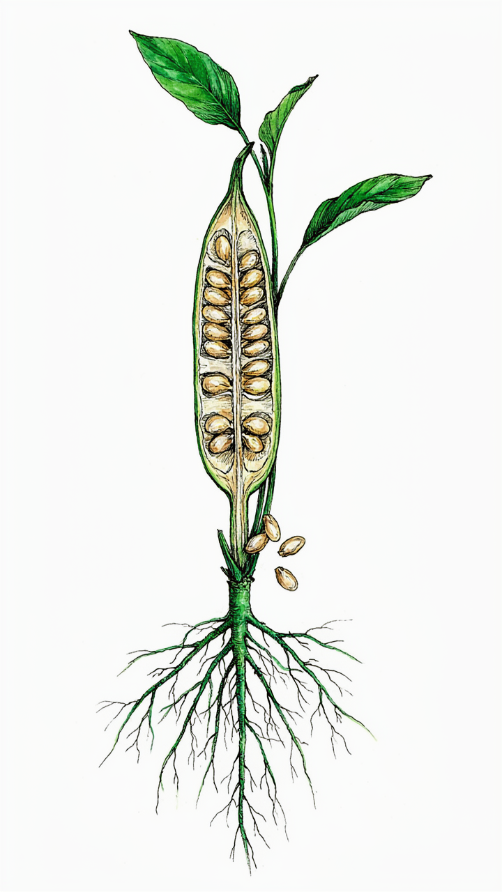
The difference between a scientific botanical print and generic floral art is specificity. Scientific illustrators mapped vein patterns, stamen configurations, seed pod cross-sections, and root systems. They rendered what made each plant taxonomically distinct. When you hang a scientific botanical print, you’re displaying a species document. The precision isn’t decoration. It’s evidence of knowledge translated into visual form.
The Taxonomical Structure Behind The Art
Taxonomy operates like architecture. It’s a system of classification that moves from broad categories to specific details. Victorian and pre-Victorian botanical illustrators treated their work the same way. They built prints using taxonomical hierarchy: showing the whole plant first, then detailed close-ups of reproductive structures, then cellular detail. This structure becomes the print’s visual logic.
The print’s composition reveals its purpose. A scientific botanical illustration prioritizes accuracy over symmetry. You’ll see plants positioned awkwardly because the artist needed to expose key identifying features. Magnified details appear alongside full specimens. This layout pattern was standardized across museum collections and botanical journals because it worked. When selecting vintage botanical prints, recognize this structure. It signals authentic scientific illustration versus decorative botanical artwork made for parlor walls without anatomical intent.
Botany Art: Curating Your Collection With Intent
The 20 Percent Rule For Print Selection
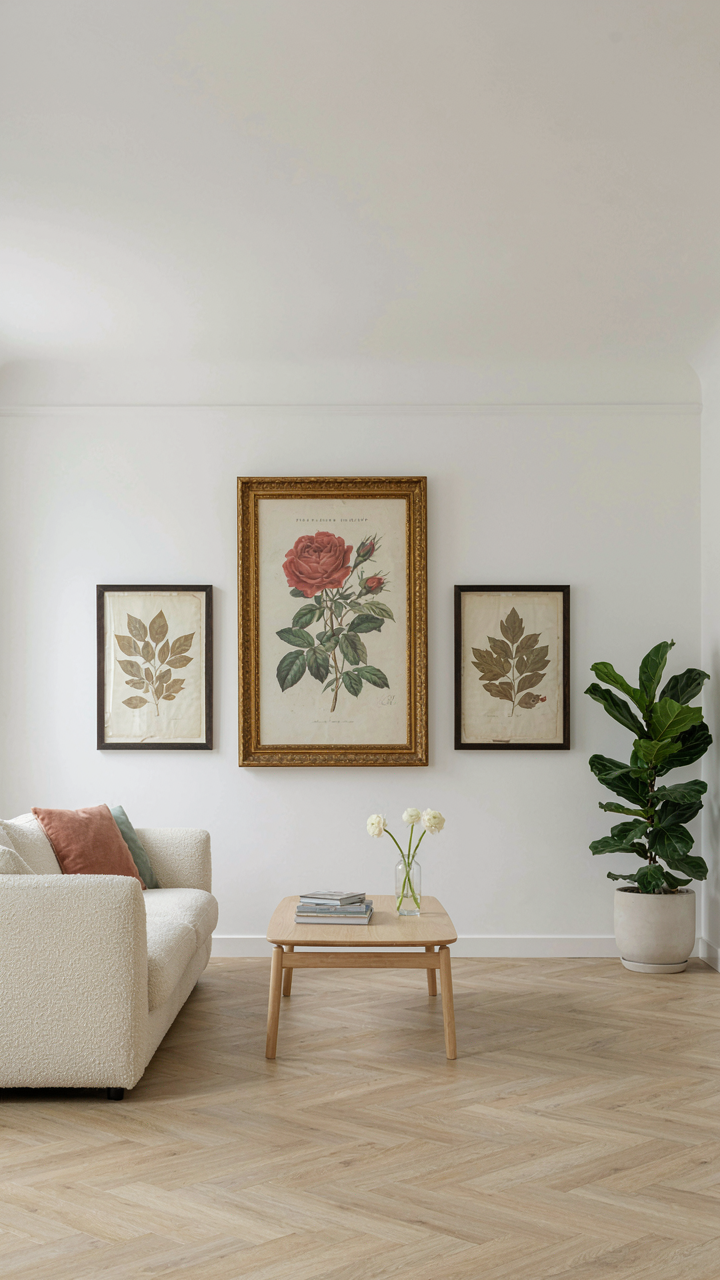
You want permission to spend money on something that won’t feel like clutter. Here’s the mechanism: economics calls this the Pareto Principle, and it applies to vintage botanical prints like this. Identify the single print style that dominates your space, then build around it. A Redouté rose print does the heavy lifting. Everything else supports that anchor without competing for attention.
Most collectors treat each print equally, which creates visual noise. Instead, commit to one dominant botanical family or artist by era. If you choose 18th-century hand-colored engravings, your other selections become decisions about variation within that constraint, not random additions. This constraint is what creates coherence. One strong choice eliminates a thousand weak ones.
Restraint Over Arrangement
The standard advice here is wrong. People say fill walls with gallery walls and layered layouts. That’s how you end up with a space that documents your indecision, not your taste. Minimalist display means negative space around each print functions as part of the design. The wall matters as much as the frame.
Hang one large vintage botanical print as a focal point, or two medium-sized prints with significant breathing room between them. Pairs of matching prints flank a doorway or window. This works because viewers process the relationship between objects and empty space simultaneously. Your eye settles on the print itself, not the surrounding clutter. Place your primary print at eye level, 57 to 60 inches from floor to center of frame, then position secondary pieces at least 18 inches away from that anchor point.
Vintage Scientific Illustration: Decoding The Epochs
When Taxonomy Became The Language Of Art
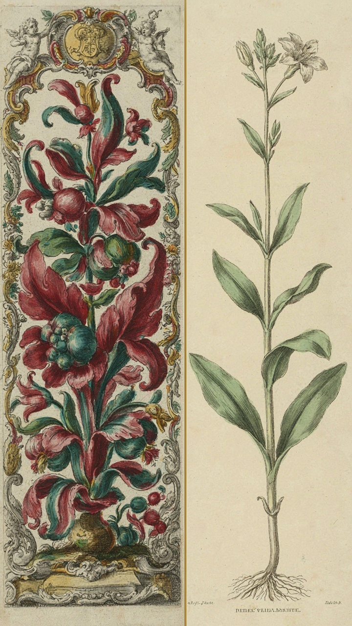
You want to know which prints hold value and which are decorative noise, but nobody says it plainly: dating botanical prints separates the investment-grade pieces from the rest. Taxonomy is the operating system here. Before Carl Linnaeus standardized binomial nomenclature in the 1750s, botanists drew plants as specimens to identify, not classify. Post-Linnaean prints shift the entire visual strategy. Artists moved from depicting individual oddities to rendering plants as units within a hierarchical system, which changed everything about composition, notation, and accuracy standards you see in the work.
Pre-Linnaean prints prioritize visual distinction and aesthetic detail over systematic accuracy. You see exaggerated proportions, theatrical arrangements, and ornamental borders that serve as visual anchors for memory. The shift accelerates after 1760. Post-Linnaean illustrations adopt standardized formats, cleaner typography for Latin binomials, and marginal diagrams isolating reproductive structures. The mechanism is simple: scientific consensus changed what counted as visual evidence, and the prints followed suit immediately.
European, Asian, And Colonial Print Traditions
Three distinct print cultures operated simultaneously from the 1600s onward, and mixing them up costs you credibility and money. European prints, particularly from the Dutch Golden Age and later from England and France, emphasize detail and commercial reproduction via engraving and hand-coloring. They prioritize public distribution and standardization. Asian botanical traditions, especially from China and Japan, embed plants within landscape composition and poetic tradition, subordinating accuracy to aesthetic cohesion and philosophical meaning about nature’s order.
Colonial prints occupy a third lane entirely. They emerged when European naturalists documented New World and tropical specimens for home audiences who had no reference for these plants. The visual strategy became almost anthropological: these prints had to convince skeptical viewers that such things existed. You see exaggerated scale, theatrical presentation, and heavy notation explaining unfamiliar structures. Each tradition answers a different economic and cultural need. When acquiring prints, this distinction determines authenticity claims and market positioning instantly.
Botanical Art Ideas: Strategic Placement For Impact
Gallery Wall As Narrative
You want people to think you’re cultured without having to explain why you bought these prints. The real mechanism is contrast. Botanical prints work because they break visual monotony, but only if you treat them like a sentence, not a decoration.
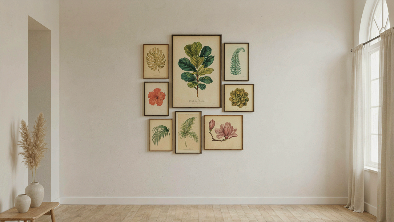
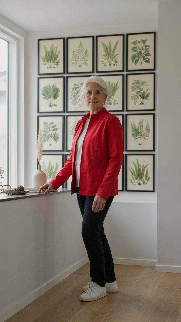
Galleries don’t arrange prints randomly. Museum curators follow botanical taxonomy or historical chronology because sequence creates meaning. Your wall should do the same. Pick a unifying thread: family grouping (all ferns, all orchids), geographic origin (Brazilian specimens, Alpine plants), or print era (19th-century lithographs, Victorian hand-colored engravings). This turns scattered images into a coherent argument.
- Botanical Family Grouping: Arrange prints by plant classification, like displaying all Rosaceae family specimens together. This mirrors herbarium organization and creates visual consistency through shared leaf structure and flower morphology.
- Chronological Arrangement: Mount prints in publication order across decades or centuries. Shows the evolution of botanical illustration technique, from hand-drawn to lithographic to early photographic processes.
- Geographic Clustering: Group prints by region of origin like European flora, tropical specimens, or native plants from a specific continent. Creates a visual journey that tells a story of botanical exploration.
- Color Progression: Sequence prints from light to dark or warm to cool tones. Guides the eye naturally across the wall and creates rhythm without relying on subject matter alone.
- Size and Frame Consistency: Mix print sizes but use matching frame styles and mats. Unifies disparate specimens while the size variation prevents monotony and maintains visual interest.
The anchor point matters. Place your largest or most detailed print where sight lines naturally land—typically the center or slightly left of center. Build outward from there. Don’t hang prints at random heights; align them to an invisible grid. This looks intentional instead of accidental, which is the entire difference between curation and clutter.
Scale And Proportion Relative To Wall Space
Most people get this backward. They buy small prints and hang them on large walls, which makes both the prints and the wall feel empty. The mechanism here is borrowed from architecture: negative space to positive space ratio.
A single botanical print needs wall around it to breathe, but that doesn’t mean drown it in emptiness. A 24×36 inch print demands a wall section of at least 60 square feet to feel intentional. If your wall is smaller, cluster three to five medium prints (8×10 to 11×14) instead of fighting the geometry. Oversized prints (40×50 inches and up) anchor entire rooms. Victorian botanicals from the 1800s were often issued in folios that included larger format sheets specifically designed as statement pieces. Modern reproductions follow the same principle: bigger prints establish authority in a space.
The distance from viewing area determines optimal print size. Hang prints within 18 inches of eye level for detail work. From 8 feet away, a 12×16 print registers as a detail. From 20 feet, it vanishes. Measure your typical viewing distance first, then size accordingly. A hallway viewed from one end demands larger prints than a powder room. Place your tape on the wall, stand where you’ll actually look at the print, and adjust dimensions until the print dominates your visual field without consuming it.
Vintage Botanical Prints: Frame Choices As Statement
Archival Framing Preserves Investment Value
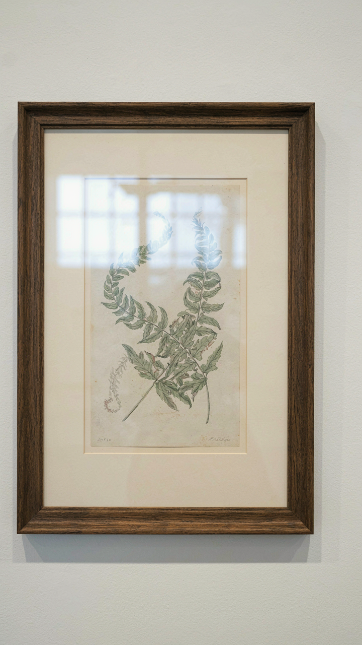
You care about this because a framed print sitting on your wall is an asset, and assets deteriorate or appreciate based on how you store them. The mechanism is simple: acid migration. Acidic materials (cheap mat board, wood pulp paper backing, standard glass) leach into the print over decades, causing yellowing, foxing, and fiber breakdown that no restorer can fully reverse. You’re not just decorating. You’re either building or destroying value with every frame choice.
Use acid-free mat board rated for archival standards (typically labeled as pH neutral or alkaline buffered). Pair it with UV-filtering glass or acrylic that blocks 99 percent of ultraviolet light, which fades inks and pigments used in 18th and 19th-century prints. Backing should be archival-quality paper or cotton rag, never standard cardboard. These materials cost more upfront but stop the clock on degradation. When you eventually sell or pass down the print, it remains intact instead of compromised.
Wood And Metal Frame Grammar
Borrowed from architecture, every frame is a load-bearing structure for the print inside it. The frame material you choose communicates historical accuracy while serving mechanical function. Wooden frames (typically ash, oak, or walnut in period pieces) expand and contract with humidity shifts. Metal frames (brass, aluminum, steel) remain dimensionally stable but conduct temperature differently and can corrode if not sealed properly.
Hardwood frames made from quarter-sawn oak or walnut were standard for botanical prints from 1850 through the early 1900s because they resisted warping. Modern alternatives using plywood or finger-jointed softwood look correct but fail mechanically within 15 years in humid environments. Metal frames became common after 1920 with industrial production. Match your frame material to the print’s era, not just its aesthetic. This alignment prevents the print from shifting inside a frame that moves differently than the art itself.
The Vintage Flowers Printable Dilemma: Original Vs. Reproduction
When A Reproduction Actually Matters
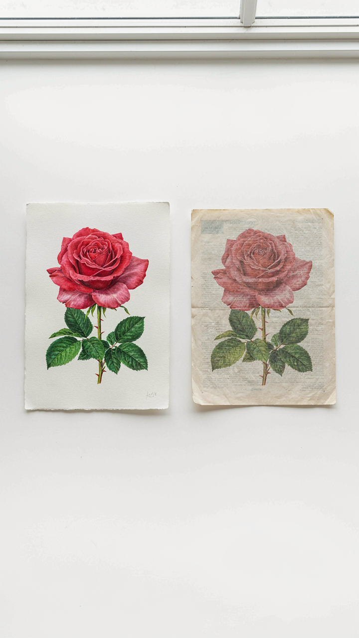
You want the original because you think it signals taste. That’s the real reason. But here’s what actually determines value: reproduction quality uses the same economic principle as manufacturing—fidelity to source material. A high-quality facsimile reproduction of a Pierre-Joseph Redouté print captures the hand-coloring technique and paper weight of the 1800s original in ways a generic inkjet never will. Most people conflate “reproduction” with “cheap copy.” They’re not the same thing. Facsimiles made from archival scans, printed on period-appropriate paper with accurate pigments, hold their visual integrity across decades. Mass-market botanical prints printed on thin stock fade and yellow predictably because the production process ignores what made the originals survive.
The distinction matters because you’re buying either preservation or degradation. Original prints cost thousands because they’re finite and require climate control. Legitimate facsimiles cost hundreds and deliver 90 percent of the visual impact without the conservation overhead. Reproductions fail when vendors print high-resolution digital files onto whatever paper costs least. They succeed when the printer respects the original’s material constraints. Your choice isn’t between authentic and fake—it’s between informed reproduction and thoughtless reproduction.
Spotting Quality In The Digital Market
Look for vendor transparency about source material and production method. Reputable sellers state which archive or collection their scan comes from, name the printing technique, and specify paper composition. They provide provenance because they understand that reproduction credibility rests on traceability. When a vendor lists only “vintage botanical print” without naming the artist, source date, or print method, they’re hiding the gap between promise and delivery. Museums like the Smithsonian and the New York Public Library release high-resolution botanical imagery into public domain with documented metadata. That’s your benchmark for what legitimate sourcing looks like.
Examine the physical specs listed on product pages. Quality facsimiles mention acid-free paper, specify weight in gsm, and note whether coloring is giclée or lithographic. Cheap reproductions omit this data because it would expose the difference. The paper weight matters tactilely—authentic botanical prints from the 1700s and 1800s used substantial stock, typically 150-200 gsm. Modern reproductions printed on thin paper immediately signal cost-cutting. Before purchasing, request a sample or close-up image showing paper texture and edge definition. If a vendor refuses or provides only marketing photography, move to another source.
Beyond Decoration: The Botanical Print As Investment
When Rarity Compounds
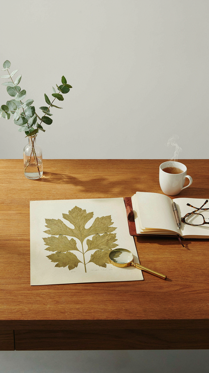
You want permission to spend serious money without feeling guilty about it. Here’s the mechanism: vintage botanical prints appreciate because supply is genuinely finite while institutional and private demand keeps climbing. A hand-colored lithograph from Pierre-Joseph Redouté’s Rosa series printed between 1817 and 1824 cannot be reprinted. Museums compete with collectors. Each sale establishes floor value for the next.
Provenance determines everything else. A print with documented collection history, exhibition records, or museum deaccessioning paperwork commands 40 to 60 percent premiums over identical prints with unknown backgrounds. Paper condition matters less than you think. Fading and minor foxing are expected. What kills value is aggressive restoration, backing sheet removal, or amateur flattening. Track the source: auction house records, dealer certifications, and previous owner documentation prove authenticity and chain of custody.
The Collector’s Systematic Advantage
Building value requires economics thinking applied to acquisition. Treat this like portfolio construction, not decorating. You buy undervalued segments before they trend upward. Focus on one genus, one artist, or one decade initially. Specialize ruthlessly. A collector owning fifteen exceptional fern studies by Henry Bradbury outperforms someone with thirty random botanicals across three centuries.
The real edge comes from patient opportunism. Estate sales and lesser auction houses occasionally price prints below market because appraisers miss attribution details or misidentify the original publication date. Document every acquisition with photographs, condition notes, and source records immediately upon purchase. This data compounds your collection’s resale value. When you eventually liquidate or donate, complete provenance documentation justifies 50 to 100 percent higher valuations than prints sold without supporting materials.
The Ignored Truth: Your Prints Reflect Your Intellectual Depth
Picking Prints That Resist Easy Answers
You care about this because you want people to assume you’re smarter than you actually are. The mechanism is simple: most people choose botanical prints based on color coordination or what fits the room. They optimize for aesthetics, which signals nothing except that you have eyes and a decorator. Real discernment operates like signal detection in information theory. The print becomes the signal; your ability to recognize its specificity becomes the noise filter separating you from people who buy generic florals.
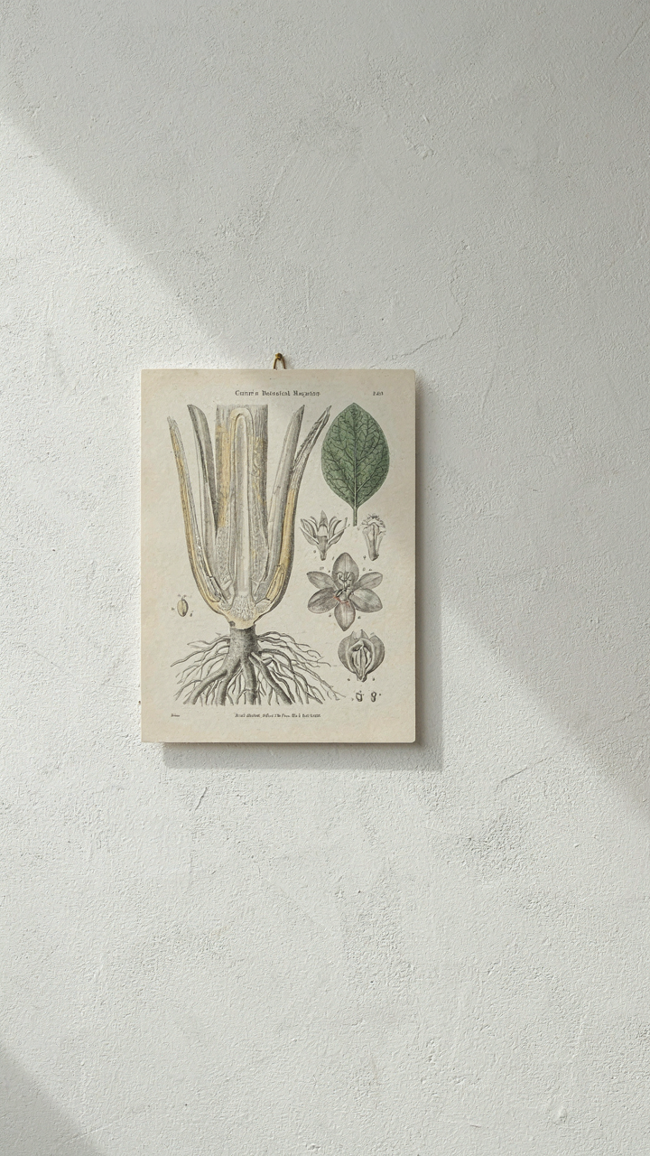
Historical botanical illustration exists on a spectrum from decorative to scientifically rigorous. An 18th-century Pierre-Joseph Redouté rose serves a different function than a 19th-century Curtis’s Botanical Magazine cross-section showing plant anatomy. The first reads as taste. The second reads as curiosity about how things actually work. Your selection process should mirror that distinction: ask whether the print teaches something or merely decorates something. The difference compounds over time as visitors either notice the deliberate choice or dismiss it as furniture.
What Your Choices Actually Communicate
Deliberate selection works because constraints reveal intent. Someone who owns a single hand-colored specimen from John James Audubon’s era has made a specific bet about what matters. Someone who frames five identical mass-printed botanicals from the same vendor has made a different bet entirely, though they rarely admit it. The communication channel opens when you choose against consensus: rare regional flora instead of the predictable garden staples, botanical studies with visible scientific notation instead of the polished final versions, prints from lesser-known illustrators with distinctive techniques instead of the canonical names everyone recognizes.
Your wall becomes a declaration of what you actually investigate versus what you perform investigating. Choose prints where the artist’s method is visible. Look for work that prioritizes accuracy over charm, regional specificity over universal beauty, technical precision over romantic appeal. This requires spending time understanding which lithographers developed which techniques, which botanists sponsored which illustrators, how watercolor versus engraving affects what information the print conveys. The act of asking these questions before purchase is the actual signal. The print hanging afterward is simply proof that you asked them.
The Real Obstacle Isn’t Finding The Right Print; It’s Overcoming Your Own Aversion To Informed Taste
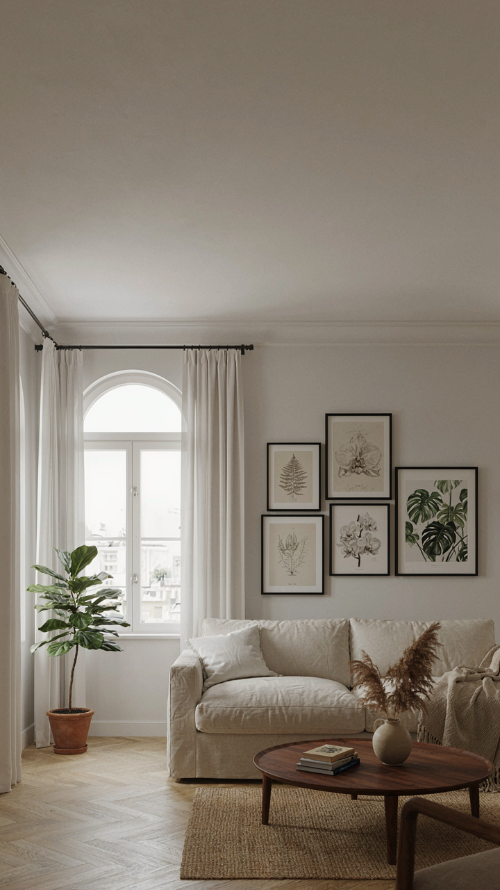
Most people don’t buy vintage botanical prints because they fear looking pretentious. They confuse taste with snobbery. Here’s the truth: taste is just pattern recognition. You’ve already learned to spot quality in music, clothes, or coffee. Botanical prints operate the same way. Stop waiting for permission to like something real. Pick one print today. Hang it where you see it every morning. Your eye will train itself faster than your mind can argue. Taste isn’t inherited or expensive. It’s just the willingness to commit to something that matters.